
Menu
▾
▴
gnuplot-info — For questions and discussion about gnuplot
You can subscribe to this list here.
| 2003 |
Jan
|
Feb
|
Mar
|
Apr
|
May
|
Jun
|
Jul
|
Aug
|
Sep
|
Oct
(2) |
Nov
(2) |
Dec
|
|---|---|---|---|---|---|---|---|---|---|---|---|---|
| 2004 |
Jan
(3) |
Feb
(1) |
Mar
(2) |
Apr
(22) |
May
(52) |
Jun
(43) |
Jul
(36) |
Aug
(59) |
Sep
(37) |
Oct
(55) |
Nov
(39) |
Dec
(36) |
| 2005 |
Jan
(64) |
Feb
(40) |
Mar
(62) |
Apr
(58) |
May
(256) |
Jun
(77) |
Jul
(80) |
Aug
(39) |
Sep
(56) |
Oct
(36) |
Nov
(113) |
Dec
(68) |
| 2006 |
Jan
(43) |
Feb
(64) |
Mar
(69) |
Apr
(60) |
May
(71) |
Jun
(53) |
Jul
(63) |
Aug
(63) |
Sep
(76) |
Oct
(85) |
Nov
(82) |
Dec
(73) |
| 2007 |
Jan
(75) |
Feb
(82) |
Mar
(84) |
Apr
(104) |
May
(67) |
Jun
(101) |
Jul
(107) |
Aug
(138) |
Sep
(128) |
Oct
(106) |
Nov
(112) |
Dec
(112) |
| 2008 |
Jan
(94) |
Feb
(87) |
Mar
(146) |
Apr
(169) |
May
(75) |
Jun
(26) |
Jul
(26) |
Aug
(7) |
Sep
(18) |
Oct
(53) |
Nov
(42) |
Dec
(19) |
| 2009 |
Jan
(43) |
Feb
(39) |
Mar
(18) |
Apr
(45) |
May
(66) |
Jun
(87) |
Jul
(56) |
Aug
(41) |
Sep
(56) |
Oct
(139) |
Nov
(98) |
Dec
(88) |
| 2010 |
Jan
(81) |
Feb
(79) |
Mar
(83) |
Apr
(97) |
May
(124) |
Jun
(84) |
Jul
(53) |
Aug
(85) |
Sep
(89) |
Oct
(50) |
Nov
(98) |
Dec
(78) |
| 2011 |
Jan
(97) |
Feb
(74) |
Mar
(68) |
Apr
(54) |
May
(63) |
Jun
(59) |
Jul
(65) |
Aug
(58) |
Sep
(37) |
Oct
(40) |
Nov
(59) |
Dec
(35) |
| 2012 |
Jan
(16) |
Feb
(56) |
Mar
(63) |
Apr
(25) |
May
(48) |
Jun
(58) |
Jul
(20) |
Aug
(13) |
Sep
(43) |
Oct
(35) |
Nov
(20) |
Dec
(17) |
| 2013 |
Jan
(22) |
Feb
(11) |
Mar
(51) |
Apr
(34) |
May
(57) |
Jun
(27) |
Jul
(70) |
Aug
(30) |
Sep
(38) |
Oct
(53) |
Nov
(40) |
Dec
(25) |
| 2014 |
Jan
(26) |
Feb
(35) |
Mar
(60) |
Apr
(12) |
May
(17) |
Jun
(15) |
Jul
(9) |
Aug
(18) |
Sep
(46) |
Oct
(18) |
Nov
(19) |
Dec
(15) |
| 2015 |
Jan
(17) |
Feb
(28) |
Mar
(21) |
Apr
(54) |
May
(36) |
Jun
(8) |
Jul
(30) |
Aug
(13) |
Sep
(3) |
Oct
(28) |
Nov
(3) |
Dec
(3) |
| 2016 |
Jan
(11) |
Feb
(9) |
Mar
(29) |
Apr
(10) |
May
(8) |
Jun
(5) |
Jul
(50) |
Aug
(57) |
Sep
(13) |
Oct
(5) |
Nov
(17) |
Dec
(11) |
| 2017 |
Jan
(3) |
Feb
(23) |
Mar
(16) |
Apr
(7) |
May
(15) |
Jun
(12) |
Jul
(48) |
Aug
(15) |
Sep
(3) |
Oct
(20) |
Nov
(28) |
Dec
(21) |
| 2018 |
Jan
(13) |
Feb
(21) |
Mar
(21) |
Apr
(7) |
May
(3) |
Jun
(7) |
Jul
(27) |
Aug
(38) |
Sep
(4) |
Oct
(30) |
Nov
(22) |
Dec
|
| 2019 |
Jan
(5) |
Feb
(16) |
Mar
(1) |
Apr
(9) |
May
(7) |
Jun
(20) |
Jul
(13) |
Aug
(3) |
Sep
(2) |
Oct
(2) |
Nov
(2) |
Dec
(4) |
| 2020 |
Jan
(6) |
Feb
(11) |
Mar
(1) |
Apr
(18) |
May
(4) |
Jun
(5) |
Jul
(12) |
Aug
(1) |
Sep
(3) |
Oct
(7) |
Nov
(1) |
Dec
(17) |
| 2021 |
Jan
(1) |
Feb
(11) |
Mar
(16) |
Apr
(6) |
May
(5) |
Jun
(1) |
Jul
(1) |
Aug
(2) |
Sep
(8) |
Oct
(10) |
Nov
(4) |
Dec
(4) |
| 2022 |
Jan
(9) |
Feb
(35) |
Mar
(4) |
Apr
|
May
(3) |
Jun
(49) |
Jul
(11) |
Aug
|
Sep
(5) |
Oct
(2) |
Nov
(16) |
Dec
(13) |
| 2023 |
Jan
|
Feb
(8) |
Mar
(3) |
Apr
|
May
(8) |
Jun
|
Jul
(5) |
Aug
|
Sep
|
Oct
(2) |
Nov
|
Dec
(2) |
| 2024 |
Jan
(6) |
Feb
(9) |
Mar
|
Apr
(26) |
May
(24) |
Jun
|
Jul
(4) |
Aug
(2) |
Sep
(1) |
Oct
(10) |
Nov
(9) |
Dec
|
| 2025 |
Jan
|
Feb
(22) |
Mar
|
Apr
(1) |
May
|
Jun
|
Jul
|
Aug
|
Sep
(1) |
Oct
(1) |
Nov
|
Dec
(4) |
| 2026 |
Jan
|
Feb
(24) |
Mar
(20) |
Apr
(18) |
May
(2) |
Jun
(2) |
Jul
(2) |
Aug
(3) |
Sep
|
Oct
|
Nov
|
Dec
|
|
From: Theo <th...@gm...> - 2013-04-11 18:04:10
|
what about an offset? ...with labels offset 1,1 # that's a fixed offset plot FILENAME using 3:4:1 notitle with labels offset 1,1 , '' using 3:4 title "ring points" with points ps 3 lw 5 pt 1 lt 7 or with the sgn(x) function dx = 20 # x-offset dy = 100 # y-offset plot FILENAME using ($3+sgn($3)*dx):($4+sgn($4)*dy):1 notitle with labels, '' using 3:4 title "ring points" with points ps 3 lw 5 pt 1 lt 7 |
|
From: Theo <th...@gm...> - 2013-04-11 11:12:14
|
Hi Aneesh, is there a reason why you use parametric plot? The following example: x1 = 1 # first point y1 = 3 x2 = 2 # second point y2 = 5 c = 0.5 # noise level f(x) = (y2-y1)/(x2-x1)*x + y2 - x2*(y2-y1)/(x2-x1) + c*(rand(0)-0.5) plot [x1:x2] f(x) gives me a 'noisy' line between the two points. Is it that what you looked for? Theo. |
|
From: <ma...@my...> - 2013-04-11 08:22:49
|
> try to replace 2 by 2.0, 1 by 1.0 etc. as you intend to work with floating > point numbers here. Hope this helps, Thanks. That worked. Kicking myself for not spotting that :-( Regards, mas |
|
From: <ma...@my...> - 2013-04-11 07:45:37
|
I have the following code:

f(x) = -1 + (2/x)*(((1-((2/3)*x**2))*exp(-x)) + \
      ((1+x)*exp(-2*x))) /\
      (1 + ((1+x+((1/3)*x**2))*exp(-x)))

set samples 500
set xrange [0.1:6]
set yrange [-1.2:0]
plot f(x)

The plot is not as expected (see attachment g1.png). But,if I use the same
expression, compute the values externally and then plot those values, the
graph is as expected (attachment g2.png).

Any pointers would be helpful.

Regards,

mas |
|
From: Theo <th...@gm...> - 2013-04-11 03:35:29
|
Thank you, Bernhard.

The code gives an error message:

Read 1 points
          No data to fit
          "Test.gp", line 186: error during fit

However, with adding an additional data point it works:

fit f(x0) '-' via x0
  0.5
  0.5
E
|
|
From: Hans-Bernhard B. <HBB...@t-...> - 2013-04-10 19:27:53
|
On 10.04.2013 19:46, Theo wrote:
> Now, I now would like to know what is x if y = f(x) = 0.5 and place it
> as a label. The problem is that the above function can not be simply
> rewritten as inverse function x = g(y)
>
> At least as an approximation, how could I extract x?
> Can I use the fitting capability of gnuplot to do that? I don't see how
> to do it. Any ideas?

This might work (didn't try):

   fit f(x0,T1,T2,T3,R1,R2,R3) '-' via x0
     0.5
   E
|
|
From: Theo <th...@gm...> - 2013-04-10 17:47:13
|
Hi all, I have a function e.g. like f(x,T1,T2,T3,R1,R2,R3) = R1*exp(-x/T1) + R2*exp(-x/T2) + R3*exp(-x/T3) When using fit f(x,T1,T2,T3,R1,R2,R3) 'FileName.dat' using 1:2 via T1,T2,T3,R1,R2,R3 I nicely get the best fitting constants T1,T2,T3,R1,R2,R3 Now, I now would like to know what is x if y = f(x) = 0.5 and place it as a label. The problem is that the above function can not be simply rewritten as inverse function x = g(y) At least as an approximation, how could I extract x? Can I use the fitting capability of gnuplot to do that? I don't see how to do it. Any ideas? Thanks, Theo. |
|
From: Amir S. <ami...@gm...> - 2013-04-08 10:43:59
|
Hi all, I am trying to plot a crown of 72 points with labels reporting the name of the point. The data file is structured like this: #ID x y z P01 1272.5113 -0.1213 1298.4915 P02 1272.5609 -113.2659 1293.49 P03 1272.6138 -225.5753 1278.7028 P04 1272.655 -336.1809 1254.1747 P05 1272.7575 -444.2176 1220.1453 I would like to have the label with ID of the points outside the crown. I have thought of a ternary operator: plot FILENAME using 3:4:1 notitle with labels at ($3>=0 ? $3+10 : $3-10),($4>=0 ? $4+10 : $4-10), \ FILENAME using 3:4 title "ring points" with points ps 3 lw 5 pt 1 lt 7 But it doesn't work. Where I am doing wrong? Thank you Amir |
|
From: aorakis <kyr...@li...> - 2013-04-04 02:28:48
|
Hello, I need some help getting a wireframe for my data in a 3D phase diagram. Using these commands: I can get this: <http://gnuplot.10905.n7.nabble.com/file/n17237/Screen_Shot_2013-04-04_at_3.08.08_PM.png> I want to be able to get a mesh or contour like the first few graphs from this link http://www.packtpub.com/article/3d-plot-using-gnuplot. I have tried using pm3d and dgrid3d, but no such luck. Any help would be greatly appreciated. Also, I can't seem to move the graph around with the mouse, any advice on that would be primo. I am using Mac OSX, terminal type set to 'Aqua'. Cheers -- View this message in context: http://gnuplot.10905.n7.nabble.com/Plotting-a-3D-Phase-Diagram-with-a-Wireframe-tp17237.html Sent from the Gnuplot - User mailing list archive at Nabble.com. |

|
From: Aneesh C. <ach...@gm...> - 2013-03-29 12:01:55
|
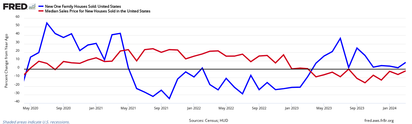
Hi, I'm new to this forum. I have a question related to gnuplot which I would appreciate help with. I'm trying to generate dummy data. This dummy data is in the form of data points lying on a straight line, but with "noise" i.e the points are randomly lying on either side on the original line so that when I plot it, there are many spikes and dips. This is to represent a "noisy" sensor reading. So far, I generated the original line using parametric plots like set parametric x(t) = a + b*(t) y(t) = c + d*(t) plot [0:2*pi] x(t), y(t) [please excuse any syntax error since I'm reproducing the code offhand ] where a,b,c,d were calculated from the two points x1,y1 and x2,y2 the line is connecting. I then try to generate some random points using x(t) and y(t) above so that the points somewhat represent the original line set parametric x2(t) = a + b*(t) * rand(0) y2(t) = c + d*(t) * rand(0) plot [0:2*pi] x2(t), y2(t) No matter what configuration of rand() I try, the random points generated either just form another perfect line , or the points are just concentrated near one end of the original line. I would like something like this plot: http://research.stlouisfed.org/fred2/graph/fredgraph.png?graph_id=82216 where the red line is the original line and the blue line the "noisy" values. Would appreciate if someone could help me out. Thanks. |
|
From: hang <she...@pk...> - 2013-03-29 09:00:40
|
I set my linestyle in this way set linetype 1 lt 2 lw 7 lc 0 The linetype 2 should be a long dash type, but as the linewidth being set to 7 in order to show it more clearly, the long dash was very uncomfortable, the other type are ever worse, like this: <http://gnuplot.10905.n7.nabble.com/file/n17221/test.jpg> How can I solve this without decreasing the lw ? Any suggestion would be appreciated! -- View this message in context: http://gnuplot.10905.n7.nabble.com/Linetype-become-dim-as-linewidth-large-tp17221.html Sent from the Gnuplot - User mailing list archive at Nabble.com. |

|
From: Baptiste <bap...@er...> - 2013-03-29 08:35:41
|
Hi all,
I am a new user of Gnuplot, and I would like to draw a Heat Map.
My original data are a 41x41 matrix where each line and row represent a
country and the value of the matrix are numeric value.
Such as:
                    Country1 Country2 …. CountryN
Country1         Z11            Z12     …..     Z1N
Country2         Z21            Z22     …..     Z2N
…
CountryN         ZN1            ZN2     …..    ZNN

I have already succeed in some steps but I still have some problems.
Here, what I have already done:
cd '/dir/'
set xrange [0.5:41.5]
set yrange [0.5:41.5] reverse
set xtics ("AUS" 1,"AUT" 2,"BEL" 3,"BGR" 4,"BRA" 5,"CAN" 6,"CHN" 7,"CYP"
8,"CZE" 9,"DEU" 10,"DNK" 11,"ESP" 12,"EST" 13,"FIN" 14,"FRA" 15,"GBR"
16,"GRC" 17,"HUN" 18,"IDN" 19,"IND" 20,"IRL" 21,"ITA" 22,"JPN" 23,"KOR"
24,"LTU" 25,"LUX" 26,"LVA" 27,"MEX" 28,"MLT" 29,"NLD" 30,"POL" 31,"PRT"
32,"ROM" 33,"RUS" 34,"SVK" 35,"SVN" 36,"SWE" 37,"TUR" 38,"TWN" 39,"USA"
40,"RoW" 41)
set ytics ("AUS" 1,"AUT" 2,"BEL" 3,"BGR" 4,"BRA" 5,"CAN" 6,"CHN" 7,"CYP"
8,"CZE" 9,"DEU" 10,"DNK" 11,"ESP" 12,"EST" 13,"FIN" 14,"FRA" 15,"GBR"
16,"GRC" 17,"HUN" 18,"IDN" 19,"IND" 20,"IRL" 21,"ITA" 22,"JPN" 23,"KOR"
24,"LTU" 25,"LUX" 26,"LVA" 27,"MEX" 28,"MLT" 29,"NLD" 30,"POL" 31,"PRT"
32,"ROM" 33,"RUS" 34,"SVK" 35,"SVN" 36,"SWE" 37,"TUR" 38,"TWN" 39,"USA"
40,"RoW" 41)
set datafile separator ";"
set pm3d map
set view map
splot '/file/.csv' matrix with image

But, I have two problems:
1) In the output file (below), it misses the first line and row of the
matrix, and the mapping between the content of the matrix (Zx,y) and the
countries is then shifted from one line and one row.
2) I would like to defined intervals for the palette colour according to the
value of the records. For instance, if the value of Zx,y is inferior to 1 so
in green, if Zx,y between 1 and 2 so in white, etc…
I have tried several things but these problems remain.
Thanks in advance

<http://gnuplot.10905.n7.nabble.com/file/n17220/EMCONS_96.png>

PS: Sorry for the English, I am French.


--
View this message in context: http://gnuplot.10905.n7.nabble.com/Heat-map-line-and-row-shift-problem-tp17220.html
Sent from the Gnuplot - User mailing list archive at Nabble.com.
|

|
From: Ethan A M. <EAM...@gm...> - 2013-03-29 01:53:08
|
On Thursday, 28 March 2013, Paul Wagner wrote: > Hello, > > how can I plot a function and vary its color within the plot? What do you want the color to depend on? > The only solution I've come up with is to write the x and y values to a file and > read it back using 'linecolor rgb variable'. Is there a more elegant > way, without writing a file? set xrange [XMIN:XMAX] plot '+' using 1:(f($1)):(color($1)) lc rgb variable where f(x) is the function you want to plot and color(x) returns the color you want it to have. |
|
From: Paul W. <pau...@gm...> - 2013-03-29 01:00:54
|
Hello, how can I plot a function and vary its color within the plot? The only solution I've come up with is to write the x and y values to a file and read it back using 'linecolor rgb variable'. Is there a more elegant way, without writing a file? Thanks, Paul |
|
From: Mauricio G. <ga...@fc...> - 2013-03-25 15:12:49
|
Hi all, I need to contact a person who maintains and updates the page “Tutorials, learning, and help" in the Gnuplot homepage (http://www.gnuplot.info/) but I do not found any email there. Somebody in this group knows the name and the email of someone who can do this update? Thanks a lot. Mauricio Galo |
|
From: BBands <bb...@gm...> - 2013-03-24 17:29:37
|
Your example data file had two columns, do 'using 1:2' might work better.

go slowly
only use essentials
elaborate later
Trouble shooting hint: 'using 0:n' invokes a special case where x
equals the line number of the data file.

      John

On Sun, Mar 24, 2013 at 10:06 AM, mikeincousa <mik...@gm...> wrote:
> posted the wrong block..
>
> Right one...
>
> set xdata time
> unset tics
> set timefmt "%Y-%m-%d"
> set xrange ["2013-03-11":"2013-03-15"]
> set yrange ["65.00":"70.00"]
> gnuplot> plot "/home/mike/QQQ2.txt" using 1:3
>                                                                 ^
>          warning: Skipping data file with no valid point.
|
|
From: BBands <bb...@gm...> - 2013-03-24 17:18:54
|
Try: set timefmt "%Y-%m-%d" as your data file uses '-' not '/'.

Also try the simplest plot command first and then add the formatting
stuff as needed.

     John

On Sat, Mar 23, 2013 at 6:38 PM, mikeincousa <mik...@gm...> wrote:
> I found the page in the book , but still I cannot see the errors in my ways.
|
|
From: mikeincousa <mik...@gm...> - 2013-03-24 17:06:29
|
posted the wrong block..

Right one...

set xdata time
unset tics
set timefmt "%Y-%m-%d"
set xrange ["2013-03-11":"2013-03-15"]
set yrange ["65.00":"70.00"]
gnuplot> plot "/home/mike/QQQ2.txt" using 1:3
                                                                ^
         warning: Skipping data file with no valid point.


--
View this message in context: http://gnuplot.10905.n7.nabble.com/Error-Need-full-using-spec-for-x-time-data-tp17207p17212.html
Sent from the Gnuplot - User mailing list archive at Nabble.com.
|
|
From: mikeincousa <mik...@gm...> - 2013-03-24 03:38:03
|
The fact that caret points to the y-values indicates a problem with the
y-data?
======

set xdata time
unset tics
set timefmt "%Y-%m-%d"
set xrange ["2013-03-11":"2013-03-15"]
set yrange ["65.00":"70.00"]
set timefmt "%m-%d-%y"
gnuplot> plot "/home/mike/QQQ2.txt" using 1:3
                                                                ^
         warning: Skipping data file with no valid point.


--
View this message in context: http://gnuplot.10905.n7.nabble.com/Error-Need-full-using-spec-for-x-time-data-tp17207p17211.html
Sent from the Gnuplot - User mailing list archive at Nabble.com.
|
|
From: mikeincousa <mik...@gm...> - 2013-03-24 01:38:33
|
I found the page in the book , but still I cannot see the errors in my ways.

Could you be more specific?
Does the file or the code contain typos?


I just noticed I am also getting a illegal month error.

I modeled my code from gnuplot> help time/date
====
 Suppose the file "data" contains records like

       03/21/95 10:00  6.02e23

 This file can be plotted by

       set xdata time
       set timefmt "%m/%d/%y"
Press return for more:
       set xrange ["03/21/95":"03/22/95"]
       set format x "%m/%d"
       set timefmt "%m/%d/%y %H:%M"
       plot "data" using 1:3

 which will produce xtic labels that look like "03/21".


--
View this message in context: http://gnuplot.10905.n7.nabble.com/Error-Need-full-using-spec-for-x-time-data-tp17207p17210.html
Sent from the Gnuplot - User mailing list archive at Nabble.com.
|
|
From: BBands <bb...@gm...> - 2013-03-23 23:52:24
|
http://gnuplot.sourceforge.net/docs_4.6/gnuplot.pdf page 113 John |
|
From: mikeincousa <mik...@gm...> - 2013-03-23 20:18:19
|
"Can't plot" might have been a more accurate subject line. I ran the same code with and without a space delimiter after "using" I ran various combinations of "using" and various combinations of "1" and "2" and "3." All runs generated error messages. -- View this message in context: http://gnuplot.10905.n7.nabble.com/Error-Need-full-using-spec-for-x-time-data-tp17207p17208.html Sent from the Gnuplot - User mailing list archive at Nabble.com. |
|
From: mikeincousa <mik...@gm...> - 2013-03-23 19:07:21
|
Very very beginner with gnuplot.

Simply seeking to graph stock series.

Where am I going wrong?

*Data:* (short span to avoid the blank line issue with nonconsecutive
dates--for now).
2013-03-11 68.81
2013-03-12 68.56
2013-03-13 68.47
2013-03-14 68.70
2013-03-15 68.51
#QQQ
*
Code*
set xdata time
set timefmt "%Y/%m/%d"
set xrange ["2013-03-11":"2013-03-15"]
set format x "%Y/%m/%d"
plot "/home/mike/QQQ2.txt" using1:2 [# or using1:3-see below]
*
Tests*
gnuplot> show xdata
	x is set to time

gnuplot> show timefmt
	read format for time on x axis is "%Y/%m/%d"
	read format for time on t axis is "%Y/%m/%d"
	read format for time on u axis is "%Y/%m/%d"

gnuplot> show xrange
	set xdata time
	set xrange [ "2013/01/01" : "2013/01/01" ] noreverse nowriteback

gnuplot> show format
	tic format is:
	  x-axis: "%Y/%m/%d"
	  y-axis: "% g"
	  x2-axis: "% g"
	  y2-axis: "% g"
	  z-axis: "% g"
	  cb-axis: "% g"

>>>>>>>>>>
gnuplot> *plot* "/home/mike/QQQ2.txt" using1:2
         Need full using spec for x time data

gnuplot> plot "/home/mike/QQQ2.txt" using1:3
         Need full using spec for x time data

-------->>/adding a space/ after using..

gnuplot> plot "/home/mike/QQQ2.txt" using 1:3
         warning: Skipping data file with no valid points
^
         Can't plot with an empty x range!

>>>>>*Reference*
Confusing, as are the others hits in response to the error msg.
http://gnuplot.10905.n7.nabble.com/Histograms-amp-co-td5731.html#a573


--
View this message in context: http://gnuplot.10905.n7.nabble.com/Error-Need-full-using-spec-for-x-time-data-tp17207.html
Sent from the Gnuplot - User mailing list archive at Nabble.com.
|
|
From: mineralfellow <min...@ya...> - 2013-03-22 14:05:40
|
Hi All, I am plotting stacked histograms, but the rectangular symbols generated by the program are quite small. I found a suggestion of how to make the symbols larger in a scatter plot, but I do not know how to apply this to histograms. I would appreciate any help! Cheers! -- View this message in context: http://gnuplot.10905.n7.nabble.com/How-do-I-make-the-symbols-used-in-histograms-larger-tp17205.html Sent from the Gnuplot - User mailing list archive at Nabble.com. |
|
From: blashimov <las...@gm...> - 2013-03-21 23:27:43
|
Hello, The colorbar labels are cut off, as in the width of the image as a whole is too small or something. I can't seem to get a fix to work, as set rmargin for example doesn't work with splot. Any ideas? Thanks. set term png set output "HNO3I.png" set xrange [1:1000] set yrange [1:1000] #set zrange [-1:3] #set cbrange [-1:3] set title "HNO3 Base Case (I) at 10 Hours" set xlabel "X-Location" set ylabel "Y-Location" set iso 1000 set samp 1000 unset key unset sur set view map set rmargin 35 set pm3d at b splot "HNO3.dat" using 1:2:3 with lines <http://gnuplot.10905.n7.nabble.com/file/n17204/HNO3I_%281%29.png> -- View this message in context: http://gnuplot.10905.n7.nabble.com/splot-set-view-map-colorbar-labels-cut-off-tp17204.html Sent from the Gnuplot - User mailing list archive at Nabble.com. |

635 messages has been excluded from this view by a project administrator.

