
Menu
▾
▴
gnuplot-info — For questions and discussion about gnuplot
You can subscribe to this list here.
| 2003 |
Jan
|
Feb
|
Mar
|
Apr
|
May
|
Jun
|
Jul
|
Aug
|
Sep
|
Oct
(2) |
Nov
(2) |
Dec
|
|---|---|---|---|---|---|---|---|---|---|---|---|---|
| 2004 |
Jan
(3) |
Feb
(1) |
Mar
(2) |
Apr
(22) |
May
(52) |
Jun
(43) |
Jul
(36) |
Aug
(59) |
Sep
(37) |
Oct
(55) |
Nov
(39) |
Dec
(36) |
| 2005 |
Jan
(64) |
Feb
(40) |
Mar
(62) |
Apr
(58) |
May
(256) |
Jun
(77) |
Jul
(80) |
Aug
(39) |
Sep
(56) |
Oct
(36) |
Nov
(113) |
Dec
(68) |
| 2006 |
Jan
(43) |
Feb
(64) |
Mar
(69) |
Apr
(60) |
May
(71) |
Jun
(53) |
Jul
(63) |
Aug
(63) |
Sep
(76) |
Oct
(85) |
Nov
(82) |
Dec
(73) |
| 2007 |
Jan
(75) |
Feb
(82) |
Mar
(84) |
Apr
(104) |
May
(67) |
Jun
(101) |
Jul
(107) |
Aug
(138) |
Sep
(128) |
Oct
(106) |
Nov
(112) |
Dec
(112) |
| 2008 |
Jan
(94) |
Feb
(87) |
Mar
(146) |
Apr
(169) |
May
(75) |
Jun
(26) |
Jul
(26) |
Aug
(7) |
Sep
(18) |
Oct
(53) |
Nov
(42) |
Dec
(19) |
| 2009 |
Jan
(43) |
Feb
(39) |
Mar
(18) |
Apr
(45) |
May
(66) |
Jun
(87) |
Jul
(56) |
Aug
(41) |
Sep
(56) |
Oct
(139) |
Nov
(98) |
Dec
(88) |
| 2010 |
Jan
(81) |
Feb
(79) |
Mar
(83) |
Apr
(97) |
May
(124) |
Jun
(84) |
Jul
(53) |
Aug
(85) |
Sep
(89) |
Oct
(50) |
Nov
(98) |
Dec
(78) |
| 2011 |
Jan
(97) |
Feb
(74) |
Mar
(68) |
Apr
(54) |
May
(63) |
Jun
(59) |
Jul
(65) |
Aug
(58) |
Sep
(37) |
Oct
(40) |
Nov
(59) |
Dec
(35) |
| 2012 |
Jan
(16) |
Feb
(56) |
Mar
(63) |
Apr
(25) |
May
(48) |
Jun
(58) |
Jul
(20) |
Aug
(13) |
Sep
(43) |
Oct
(35) |
Nov
(20) |
Dec
(17) |
| 2013 |
Jan
(22) |
Feb
(11) |
Mar
(51) |
Apr
(34) |
May
(57) |
Jun
(27) |
Jul
(70) |
Aug
(30) |
Sep
(38) |
Oct
(53) |
Nov
(40) |
Dec
(25) |
| 2014 |
Jan
(26) |
Feb
(35) |
Mar
(60) |
Apr
(12) |
May
(17) |
Jun
(15) |
Jul
(9) |
Aug
(18) |
Sep
(46) |
Oct
(18) |
Nov
(19) |
Dec
(15) |
| 2015 |
Jan
(17) |
Feb
(28) |
Mar
(21) |
Apr
(54) |
May
(36) |
Jun
(8) |
Jul
(30) |
Aug
(13) |
Sep
(3) |
Oct
(28) |
Nov
(3) |
Dec
(3) |
| 2016 |
Jan
(11) |
Feb
(9) |
Mar
(29) |
Apr
(10) |
May
(8) |
Jun
(5) |
Jul
(50) |
Aug
(57) |
Sep
(13) |
Oct
(5) |
Nov
(17) |
Dec
(11) |
| 2017 |
Jan
(3) |
Feb
(23) |
Mar
(16) |
Apr
(7) |
May
(15) |
Jun
(12) |
Jul
(48) |
Aug
(15) |
Sep
(3) |
Oct
(20) |
Nov
(28) |
Dec
(21) |
| 2018 |
Jan
(13) |
Feb
(21) |
Mar
(21) |
Apr
(7) |
May
(3) |
Jun
(7) |
Jul
(27) |
Aug
(38) |
Sep
(4) |
Oct
(30) |
Nov
(22) |
Dec
|
| 2019 |
Jan
(5) |
Feb
(16) |
Mar
(1) |
Apr
(9) |
May
(7) |
Jun
(20) |
Jul
(13) |
Aug
(3) |
Sep
(2) |
Oct
(2) |
Nov
(2) |
Dec
(4) |
| 2020 |
Jan
(6) |
Feb
(11) |
Mar
(1) |
Apr
(18) |
May
(4) |
Jun
(5) |
Jul
(12) |
Aug
(1) |
Sep
(3) |
Oct
(7) |
Nov
(1) |
Dec
(17) |
| 2021 |
Jan
(1) |
Feb
(11) |
Mar
(16) |
Apr
(6) |
May
(5) |
Jun
(1) |
Jul
(1) |
Aug
(2) |
Sep
(8) |
Oct
(10) |
Nov
(4) |
Dec
(4) |
| 2022 |
Jan
(9) |
Feb
(35) |
Mar
(4) |
Apr
|
May
(3) |
Jun
(49) |
Jul
(11) |
Aug
|
Sep
(5) |
Oct
(2) |
Nov
(16) |
Dec
(13) |
| 2023 |
Jan
|
Feb
(8) |
Mar
(3) |
Apr
|
May
(8) |
Jun
|
Jul
(5) |
Aug
|
Sep
|
Oct
(2) |
Nov
|
Dec
(2) |
| 2024 |
Jan
(6) |
Feb
(9) |
Mar
|
Apr
(26) |
May
(24) |
Jun
|
Jul
(4) |
Aug
(2) |
Sep
(1) |
Oct
(10) |
Nov
(9) |
Dec
|
| 2025 |
Jan
|
Feb
(22) |
Mar
|
Apr
(1) |
May
|
Jun
|
Jul
|
Aug
|
Sep
(1) |
Oct
(1) |
Nov
|
Dec
(4) |
| 2026 |
Jan
|
Feb
(24) |
Mar
(20) |
Apr
(18) |
May
(2) |
Jun
(2) |
Jul
(2) |
Aug
(3) |
Sep
|
Oct
|
Nov
|
Dec
|
|
From: Dang, S. <s....@fz...> - 2013-12-06 08:05:11
|
Hi everyone,

I have a script which returns me the following error:

"/home/siaufung/atat/glue/qe/example/Result/mapsrep.gnu", line 8: ';' expected


The script looks as follows (I have marked line 8):

set xlabel "concentration"
set ylabel "energy"
set title "Fitted Energies"
plot [0:1] \
'predstr.out' u 1:3 t "predicted" w p 2, \
'fit.out' u 1:3 t  "known str" w p 1, \
'gs.out' u 1:3 t "known gs" w linesp 3, \
'newgs.out' u 1:3 t "predicted gs" w p 4
pause -1
set title "Calculated Energies"
plot [0:1] \
'fit.out' u 1:2 t  "known str" w p 5, \
'gs.out' u 1:2 t "known gs" w linesp 6
pause -1
set title "Calculated and Fitted Energies"
plot [0:1] \
'fit.out' u 1:2 t  "calculated" w p 5, \
'fit.out' u 1:3 t  "fitted" w p 1
pause -1
set xlabel "diameter"
set ylabel "energy"
set title "ECI vs cluster diameter"
set nokey
set xzeroaxis
set xtics ("pair" 0,"5" 5,"10" 10,"15" 15, "trip" 20,"5" 25,"10" 30,"15" 35, "quad" 40,"5" 45,"10" 50,"15" 55)
plot [-5:60] 'clusinfo.out' u (($1-2)*20.+$2):($4)
pause -1
set title "Residuals of the fit (same order as in fit.out)"
set xtics autofreq
set ylabel "energy"
set xlabel "line number in fit.out"
plot 'fit.out' u 4
pause -1
set title "Fitted vs Calculated Energies"
set ylabel "predicted energy"
set xlabel "actual energy"
set nokey
plot \
'fit.out' u 2:3 w p 1,x
pause -1

This script has been generated automatically by a software package calles ATAT. I believe this is an issue related to the version of gnuplot I am using now, because at the time ATAT was developed, they were using older versions of it. Since I am no expert in gnuplot I have no idea what to modify.

Can somebody help me?

Many thanks.

Best, Siaufung Dang


------------------------------------------------------------------------------------------------
------------------------------------------------------------------------------------------------
Forschungszentrum Juelich GmbH
52425 Juelich
Sitz der Gesellschaft: Juelich
Eingetragen im Handelsregister des Amtsgerichts Dueren Nr. HR B 3498
Vorsitzender des Aufsichtsrats: MinDir Dr. Karl Eugen Huthmacher
Geschaeftsfuehrung: Prof. Dr. Achim Bachem (Vorsitzender),
Karsten Beneke (stellv. Vorsitzender), Prof. Dr.-Ing. Harald Bolt,
Prof. Dr. Sebastian M. Schmidt
------------------------------------------------------------------------------------------------
------------------------------------------------------------------------------------------------
|
|
From: Hans-Bernhard B. <HBB...@t-...> - 2013-12-05 22:02:45
|
On 05.12.2013 22:08, Peter Carlson wrote: > How can I make it so that the first tick, end left edge of the plot is > aligned to the first data element 133.198 - sorry if my last question > wasn't clearer. See "help autoscale" about the "fix" group of options. |
|
From: Peter C. <pe...@ho...> - 2013-12-05 21:29:18
|
How can I make it so that the first tick, end left edge of the plot is aligned to the first data element 133.198 - sorry if my last question wasn't clearer. Peter On 12/05/2013 11:20 AM, Hans-Bernhard Bröker wrote: > On 05.12.2013 17:43, howudodat wrote: > >> 2. the entire plot seems to be shifted. > > I don't think so. The left edge of your data is quite exactly where > 133.198 e6 should be on that scale. So: nothing shifted. > >> the xtics seem to be rounded with >> the tics being: 133.180 E6, 133.200, 133.220, 133.240, 133.260, 133.280, >> 133.300 E6 > > Yes, they are. So what? > |
|
From: Hans-Bernhard B. <HBB...@t-...> - 2013-12-05 19:20:54
|
On 05.12.2013 17:43, howudodat wrote: > I am having two issues with my spectrum plot. (visible at: > http://imagebin.org/280352) > 1. the plot command is being added to the graph as a label. How can I > disable that? See "help plot" and learn about your options, "title" in particular. > 2. the entire plot seems to be shifted. I don't think so. The left edge of your data is quite exactly where 133.198 e6 should be on that scale. So: nothing shifted. > the xtics seem to be rounded with > the tics being: 133.180 E6, 133.200, 133.220, 133.240, 133.260, 133.280, > 133.300 E6 Yes, they are. So what? |
|
From: <ke...@ne...> - 2013-12-05 19:00:47
|
On my linux system,
make test, make all, and make test/example  did not work for me:-(
On all other company software "make" fails about 75% of the time.
 "Cmake" fails 99% of the time. Just another layer of code that can go wrong and it dose!
 ./confiure&&make&&make install work 99% of the time.
 My system package installer and sudo apt-get work 88% of the time.


  I am so glad that in the doc they put the compile command. Most
of the time i have to go through failed make file and find all of stuff
i need to compile a program from the command line.


   Cheers kommrad,
         keghn
|
|
From: walter h. <wh...@bf...> - 2013-12-05 17:25:15
|
hi keghn, nice find, you can simple do: make tests NTL it works, but its not a library but an object file that you can use in your programms. re, wh Am 04.12.2013 21:28, schrieb keghn: > > Wow a c library that generates gnuplot plots! > > > Hello. > I got the example.c working on my Mint 14 mate 64 bit Linux system to work. > I down loaded the tar and uncompressed it into my home directory. > Did not have to cmake, make, or ./configure&&make&&sudo make install. > I just change to "home/keghn/gnuplot_i/test/" and type this in the > terminal: > > gcc example.c -I. ../src/gnuplot_i.c -o example > > ran it with: > > ./example > > And in the "example.c" had to change few lines: > > //#include "gnuplot_i.h" > #include "../src/gnuplot_i.h" > > Thanks all > Cheers > keghn > > > > > > -- > View this message in context: http://gnuplot.10905.n7.nabble.com/Memory-overload-in-real-time-plotting-tp17795p17863.html > Sent from the Gnuplot - User mailing list archive at Nabble.com. > > ------------------------------------------------------------------------------ > Sponsored by Intel(R) XDK > Develop, test and display web and hybrid apps with a single code base. > Download it for free now! > http://pubads.g.doubleclick.net/gampad/clk?id=111408631&iu=/4140/ostg.clktrk > _______________________________________________ > gnuplot-info mailing list > gnu...@li... > Membership management via: https://lists.sourceforge.net/lists/listinfo/gnuplot-info |
|
From: howudodat <pe...@ho...> - 2013-12-05 17:00:23
|
I am having two issues with my spectrum plot. (visible at: http://imagebin.org/280352) 1. the plot command is being added to the graph as a label. How can I disable that? 2. the entire plot seems to be shifted. the xtics seem to be rounded with the tics being: 133.180 E6, 133.200, 133.220, 133.240, 133.260, 133.280, 133.300 E6 the dataset however is: 133198120 -104.79 -104.43 -104.12 -104.69 -103.85 133198883 -105.15 -105.25 -104.03 -105.3 -104.94 133199646 -105.69 -105.4 -106.34 -105.43 -105.81 133200409 -104.84 -105.56 -104.66 -105.56 -106.05 133201172 -105.49 -105.56 -104.92 -106.34 -105.38 133201935 -105.72 -106.12 -106.11 -106.29 -105.66 133202698 -105.86 -105.68 -106.19 -105.8 -105.64 133203461 -105.4 -105.76 -106.14 -105.65 -105.39 133204224 -105.63 -105.17 -106.99 -106.29 -105.85 133204987 -105.48 -104.85 -106.11 -106.4 -107.38 133205750 -106.04 -105.91 -104.79 -106.24 -105.56 133206512 -105.96 -105.95 -106.27 -105.68 -105.97 133207275 -106.04 -105.36 -107.21 -105.51 -107.52 133208038 -106.74 -104.97 -106.34 -105.85 -106.19 133208801 -106.33 -105.35 -105.51 -106.41 -106.21 133209564 -106.03 -105.87 -106.25 -106.69 -105.85 133210327 -105.29 -106.13 -105.68 -105.62 -106.7 133211090 -105.95 -106.41 -105.25 -105.77 -105.47 133211853 -106.95 -105.78 -106.38 -106.53 -106.48 133212616 -105.52 -105.5 -106.53 -106.77 -106.84 133213379 -105.71 -106 -105.96 -106.3 -106.55 133214142 -105.57 -105.93 -106.64 -105.07 -106.82 133214905 -105.95 -105.55 -105.65 -106.03 -107.27 133215668 -106.95 -105.62 -107.26 -106.6 -106.54 133216431 -105.62 -105.65 -106.21 -105.73 -106.79 133217194 -106.28 -105.68 -105.73 -106.46 -106.86 133217957 -106.19 -106.4 -106.07 -106.32 -106.71 133218719 -106.64 -104.9 -105.93 -105.53 -106.68 133219482 -106.78 -106.17 -106.75 -106.2 -106.36 133220245 -106.34 -106.24 -106.3 -105.97 -107.14 133221008 -106.55 -105.75 -105.86 -106.72 -106.29 133221771 -105.2 -105.7 -105.39 -106.39 -107.62 and thus the plot "appears" to be shifted in the graph, the first line being at 133.198 here is the plot command: set output filename.'-spectrum.png' set title titlename."-spectrum" set format x "%.0s e%S" set format y "%.0f" set ylabel "time (secs)" set xlabel "frequency" set xrange[*:*] noreverse plot filename.'.csv' nonuniform matrix using 2:1:3 with image Peter -- View this message in context: http://gnuplot.10905.n7.nabble.com/labels-and-data-offset-tp17867.html Sent from the Gnuplot - User mailing list archive at Nabble.com. |
|
From: <ke...@ne...> - 2013-12-04 20:34:04
|
This is the place: http://ndevilla.free.fr/gnuplot/ And you want: Download gnuplot_i-2.11.tar.gz |
|
From: keghn <ke...@ne...> - 2013-12-04 20:28:36
|
 Wow a c library that generates gnuplot plots!


 Hello.
 I got the example.c working on my Mint 14 mate 64 bit Linux system to work.
 I down loaded the tar and uncompressed  it into my home directory.
 Did not have to cmake, make, or ./configure&&make&&sudo make install.
 I just change to "home/keghn/gnuplot_i/test/" and type this in the
terminal:

gcc example.c -I. ../src/gnuplot_i.c -o example

ran it with:

./example

 And in the "example.c" had to change few lines:

//#include "gnuplot_i.h"
#include "../src/gnuplot_i.h"

  Thanks all
     Cheers
        keghn


--
View this message in context: http://gnuplot.10905.n7.nabble.com/Memory-overload-in-real-time-plotting-tp17795p17863.html
Sent from the Gnuplot - User mailing list archive at Nabble.com.
|
|
From: Geraldo R. <gfs...@gm...> - 2013-12-03 04:14:17
|
Hi walter, PNG terminal is not affected. I tried to change font size and scale in cairolatex terminal but it doesn't give the desired result when I compile my thesis. The legend doesn't fit in the key box. I also tried to change key font but it doesn't work either. But I tried nothing with key margins. gnuplot documentation says that: *When using the TeX or other terminal where formatting information is embedded in the string, gnuplot can only estimate the correctly exact width of the string for key positioning.* I would like to find a way to improve this estimative, because it's not working for me. 2013/12/2 <gnu...@li...> > Today's Topics: > > 7. Title doesn't fit in the key box (Geraldo Rebouças) > ---------- Mensagem encaminhada ---------- > From: "Geraldo Rebouças" <gfs...@gm...> > To: gnu...@li... > Cc: > Date: Sat, 30 Nov 2013 19:02:26 -0200 > Subject: [Gnuplot-info] Title doesn't fit in the key box > Hi folks, > > I'm using cairolatex to plot graphs from my thesis and I'm having some > troubles with the key box. When I compile my thesis, I have the following > output: > > https://www.dropbox.com/s/evvs4k7dxpddb7k/example.png > > I tried to change font size in the .tex file but it didn't work for all > graphs. > > I'm using gnuplot 4.6 patchlevel 1 > > Thank's in advance! > > -- > Geraldo F. de S. Rebouças > Professor Substituto, ECT/UFRN > Mestrando em Engenharia Mecânica, PPGEM/UFRN > --------------------------- > Esta mensagem é destinada exclusivamente a(s) pessoa(s) indicada(s) como > destinatário(s), podendo conter informações confidenciais, protegidas por > lei. A transmissão incorreta da mensagem não acarreta a perda de sua > confidencialidade. Caso esta mensagem tenha sido recebida por engano, > solicitamos que seja devolvida ao remetente e apagada imediatamente de seu > sistema. É vedado a qualquer pessoa que não seja destinatário, usar, > revelar, distribuir ou copiar ainda que parcialmente esta mensagem. > > > > ---------- Mensagem encaminhada ---------- > From: walter harms <wh...@bf...> > To: gnu...@li... > Cc: > Date: Mon, 02 Dec 2013 09:42:09 +0100 > Subject: Re: [Gnuplot-info] Title doesn't fit in the key box > > > Am 30.11.2013 22:02, schrieb Geraldo Rebouças: > > Hi folks, > > > > I'm using cairolatex to plot graphs from my thesis and I'm having some > > troubles with the key box. When I compile my thesis, I have the following > > output: > > > > https://www.dropbox.com/s/evvs4k7dxpddb7k/example.png > > > > I tried to change font size in the .tex file but it didn't work for all > > graphs. > > > > I'm using gnuplot 4.6 patchlevel 1 > > > > Thank's in advance! > > > > When you try a png output is that affected also ? > did you play with ''set key'' margin ? > > re, > wh > > > ------------------------------------------------------------------------------ > Rapidly troubleshoot problems before they affect your business. Most IT > organizations don't have a clear picture of how application performance > affects their revenue. With AppDynamics, you get 100% visibility into your > Java,.NET, & PHP application. Start your 15-day FREE TRIAL of AppDynamics > Pro! > http://pubads.g.doubleclick.net/gampad/clk?id=84349351&iu=/4140/ostg.clktrk > _______________________________________________ > gnuplot-info mailing list > gnu...@li... > Membership management via: > https://lists.sourceforge.net/lists/listinfo/gnuplot-info > > -- Geraldo F. de S. Rebouças Professor Substituto, ECT/UFRN Mestrando em Engenharia Mecânica, PPGEM/UFRN |

|
From: walter h. <wh...@bf...> - 2013-12-02 08:42:19
|
Am 30.11.2013 22:02, schrieb Geraldo Rebouças: > Hi folks, > > I'm using cairolatex to plot graphs from my thesis and I'm having some > troubles with the key box. When I compile my thesis, I have the following > output: > > https://www.dropbox.com/s/evvs4k7dxpddb7k/example.png > > I tried to change font size in the .tex file but it didn't work for all > graphs. > > I'm using gnuplot 4.6 patchlevel 1 > > Thank's in advance! > When you try a png output is that affected also ? did you play with ''set key'' margin ? re, wh |
|
From: Geraldo R. <gfs...@gm...> - 2013-11-30 21:02:33
|
Hi folks, I'm using cairolatex to plot graphs from my thesis and I'm having some troubles with the key box. When I compile my thesis, I have the following output: https://www.dropbox.com/s/evvs4k7dxpddb7k/example.png I tried to change font size in the .tex file but it didn't work for all graphs. I'm using gnuplot 4.6 patchlevel 1 Thank's in advance! -- Geraldo F. de S. Rebouças Professor Substituto, ECT/UFRN Mestrando em Engenharia Mecânica, PPGEM/UFRN --------------------------- Esta mensagem é destinada exclusivamente a(s) pessoa(s) indicada(s) como destinatário(s), podendo conter informações confidenciais, protegidas por lei. A transmissão incorreta da mensagem não acarreta a perda de sua confidencialidade. Caso esta mensagem tenha sido recebida por engano, solicitamos que seja devolvida ao remetente e apagada imediatamente de seu sistema. É vedado a qualquer pessoa que não seja destinatário, usar, revelar, distribuir ou copiar ainda que parcialmente esta mensagem. |
|
From: Vesnog <ong...@gm...> - 2013-11-30 21:01:36
|
Thanks for your answers, I will try the methods mentioned. By the way I already have a file of z[i] vs. PDF_Gaussian as two columns. My intention is to plot the histogram of the resulting Gaussian which is not evenly spaced since the argument of the Gaussian is not evenly spaced. -- View this message in context: http://gnuplot.10905.n7.nabble.com/Gnuplot-Summed-y-Values-over-an-Interval-tp17855p17858.html Sent from the Gnuplot - User mailing list archive at Nabble.com. |
|
From: Leo B. <l_b...@us...> - 2013-11-30 20:15:07
|
> Date: Sat, 30 Nov 2013 09:28:09 -0800 > From: Vesnog <ong...@gm...> > > Greetings, > > My purpose is to plot x vs. summed y values over a certain x interval. How > can I do so? Later I will calculate the mean, variance and median of the > data from this plot. I think it should be possible in Gnuplot someway. Any > help and suggestion is welcome and appreciated. How about: total=0; ssq=0; sum=0; stat(y) = (total=total+1, ssq=y**2+ssq, sum=y+sum); mean(x) = sum/(1.0*total); mlvar(x) = ssq/(1.0*total) - mean(1)**2; plot [0:5] '-' using 1:(stat($2)) notitle 0 0 1 1 2 2 3 3 4 4 e The plot command loops over the data set, and stat computes the total number of data points, and running sum and sum of squares; it returns the running sum. mean and mlvar do what they say they do. Leo > > P.S: I have a RNG and the random numbers generated are given as an argument > to Gaussian PDF, my aim is to find the mean, variance and median from this > accumulated data. |
|
From: Thomas S. <t.s...@fz...> - 2013-11-30 19:11:47
|
Vesnog <ongunarisev <at> gmail.com> writes: > > My purpose is to plot x vs. summed y values over a certain x interval. How > can I do so? Later I will calculate the mean, variance and median of the > data from this plot. I think it should be possible in Gnuplot someway. Any > help and suggestion is welcome and appreciated. > > P.S: I have a RNG and the random numbers generated are given as an argument > to Gaussian PDF, my aim is to find the mean, variance and median from this > accumulated data. > an example: we use a simple random generator producing something like a normal distribution and write the numbers to a file: gnuplot> set print 'ts.dat' gnuplot> do for [i=0:10000] {print (rand(0)*2.-1.)+(rand(0)*2.-1.)+(rand(0)*2.-1.)} gnuplot> unset print we may plot the density function of these numbers by binning the data and using the 'smooth frequency' option of the plot command (to give all numbers the same weight we set the y-value to 1.): gnuplot> binwidth=0.05 gnuplot> round(x) = floor(x + 0.5) gnuplot> plot 'ts.dat' using (round($1/binwidth)*binwidth):(1.) smooth frequency with linespoints we now have a nice distribution in our plot canvas but to use these data points we need to write them into a file: gnuplot> set table 'ts.tab' gnuplot> replot gnuplot> unset table this file we use for plotting the distribution: gnuplot> plot 'ts.tab' with linespoints or for fitting a gaussian function to it: gnuplot> gauss(x,a,x0,sigma)=a/(sigma*sqrt(2.*pi))*exp(-(x-x0)**2/(2.*sigma**2)) gnuplot> fit gauss(x,a,x0,sigma) 'ts.tab' via a, x0, sigma gnuplot> plot 'ts.tab' with linespoints, gauss(x,a,x0,sigma) that's all. |
|
From: Vesnog <ong...@gm...> - 2013-11-30 17:28:16
|
Greetings, My purpose is to plot x vs. summed y values over a certain x interval. How can I do so? Later I will calculate the mean, variance and median of the data from this plot. I think it should be possible in Gnuplot someway. Any help and suggestion is welcome and appreciated. P.S: I have a RNG and the random numbers generated are given as an argument to Gaussian PDF, my aim is to find the mean, variance and median from this accumulated data. -- View this message in context: http://gnuplot.10905.n7.nabble.com/Gnuplot-Summed-y-Values-over-an-Interval-tp17855.html Sent from the Gnuplot - User mailing list archive at Nabble.com. |
|
From: sfeam <eam...@gm...> - 2013-11-23 01:41:22
|
On Friday, November 22, 2013 11:00:50 PM Pu Ke wrote:
> Hi all,
>          I would like to remove the polar axis(that bold horizontal
> line), but do not know how to do it.  I recently update the version from
> 4.4 to 4.6, it seems the polar axis is a new feature. Do I need to fall
> back to earlier version?

    unset raxis


>          I am sorry for the naive question, I am new to gnuplot. Thank you !
>
>
> <http://cncs.bnu.edu.cn/>
> ----------------------------------------------------------------------------
> -- Shape the Mobile Experience: Free Subscription
> Software experts and developers: Be at the forefront of tech innovation.
> Intel(R) Software Adrenaline delivers strategic insight and game-changing
> conversations that shape the rapidly evolving mobile landscape. Sign up now.
> http://pubads.g.doubleclick.net/gampad/clk?id=63431311&iu=/4140/ostg.clktrk
> _______________________________________________
> gnuplot-info mailing list
> gnu...@li...
> Membership management via:
> https://lists.sourceforge.net/lists/listinfo/gnuplot-info
|
|
From: Pu Ke <kd...@gm...> - 2013-11-22 15:01:10
|
Hi all,
         I would like to remove the polar axis(that bold horizontal
line), but do not know how to do it.  I recently update the version from
4.4 to 4.6, it seems the polar axis is a new feature. Do I need to fall
back to earlier version?
         I am sorry for the naive question, I am new to gnuplot. Thank you !


<http://cncs.bnu.edu.cn/>
|
|
From: Craig D. <def...@bo...> - 2013-11-19 20:51:11
|
On Nov 19, 2013, at 1:48 PM, Hans-Bernhard Bröker <HBB...@t-...> wrote: > On 19.11.2013 21:26, Craig DeForest wrote: > >> That doesn't actually answer my question. > > It answered the question you asked. Not my fault if that wasn't the question actually wanted to ask. > >> Sure, the two styles of calling produce different internal state -- but do they ever produce different plot output? > > That depends entirely on what your _next_ plot command looks like. > Oh, please. Okay, I'll try again: Sure, the two styles of calling produce different internal state -- but do they ever produce different plot output for the current plot (disregarding any additional commands sent later)? |
|
From: Hans-Bernhard B. <HBB...@t-...> - 2013-11-19 20:48:42
|
On 19.11.2013 21:26, Craig DeForest wrote: > That doesn't actually answer my question. It answered the question you asked. Not my fault if that wasn't the question actually wanted to ask. > Sure, the two styles of calling produce different internal state -- but do they ever produce different plot output? That depends entirely on what your _next_ plot command looks like. |
|
From: Craig D. <def...@bo...> - 2013-11-19 20:26:46
|
On Nov 19, 2013, at 1:23 PM, Hans-Bernhard Bröker <HBB...@t-...> wrote: > On 19.11.2013 19:48, Craig DeForest wrote: > >> Is there a functional difference between these two cases? >> >> set xrange [0:10] >> plot '-' using 1 notitle with lines >> >> and >> >> plot [0:10] '-' using 1 notitle with lines > > Yes. Just "show xrange" after each of those to see for yourself. > > To answer such questions, you can always "save" the state of gnuplot to a file after such a command in a fresh, interactive session, and compare the resulting files. > That doesn't actually answer my question. Sure, the two styles of calling produce different internal state -- but do they ever produce different plot output? |
|
From: Hans-Bernhard B. <HBB...@t-...> - 2013-11-19 20:23:56
|
On 19.11.2013 19:48, Craig DeForest wrote: > Is there a functional difference between these two cases? > > set xrange [0:10] > plot '-' using 1 notitle with lines > > and > > plot [0:10] '-' using 1 notitle with lines Yes. Just "show xrange" after each of those to see for yourself. To answer such questions, you can always "save" the state of gnuplot to a file after such a command in a fresh, interactive session, and compare the resulting files. |
|
From: Craig D. <def...@bo...> - 2013-11-19 18:49:06
|
Is there a functional difference between these two cases? set xrange [0:10] plot '-' using 1 notitle with lines and plot [0:10] '-' using 1 notitle with lines More generally, is there ever a reason one would want to use one vs. the other? Currently the Perl module PDL::Graphics::Gnuplot supports syntax to generate either of those case, but it would simplify the syntax and the API if we didn't have to keep both of those cases. |
|
From: Bo J. <li...@f7...> - 2013-11-17 21:07:51
|
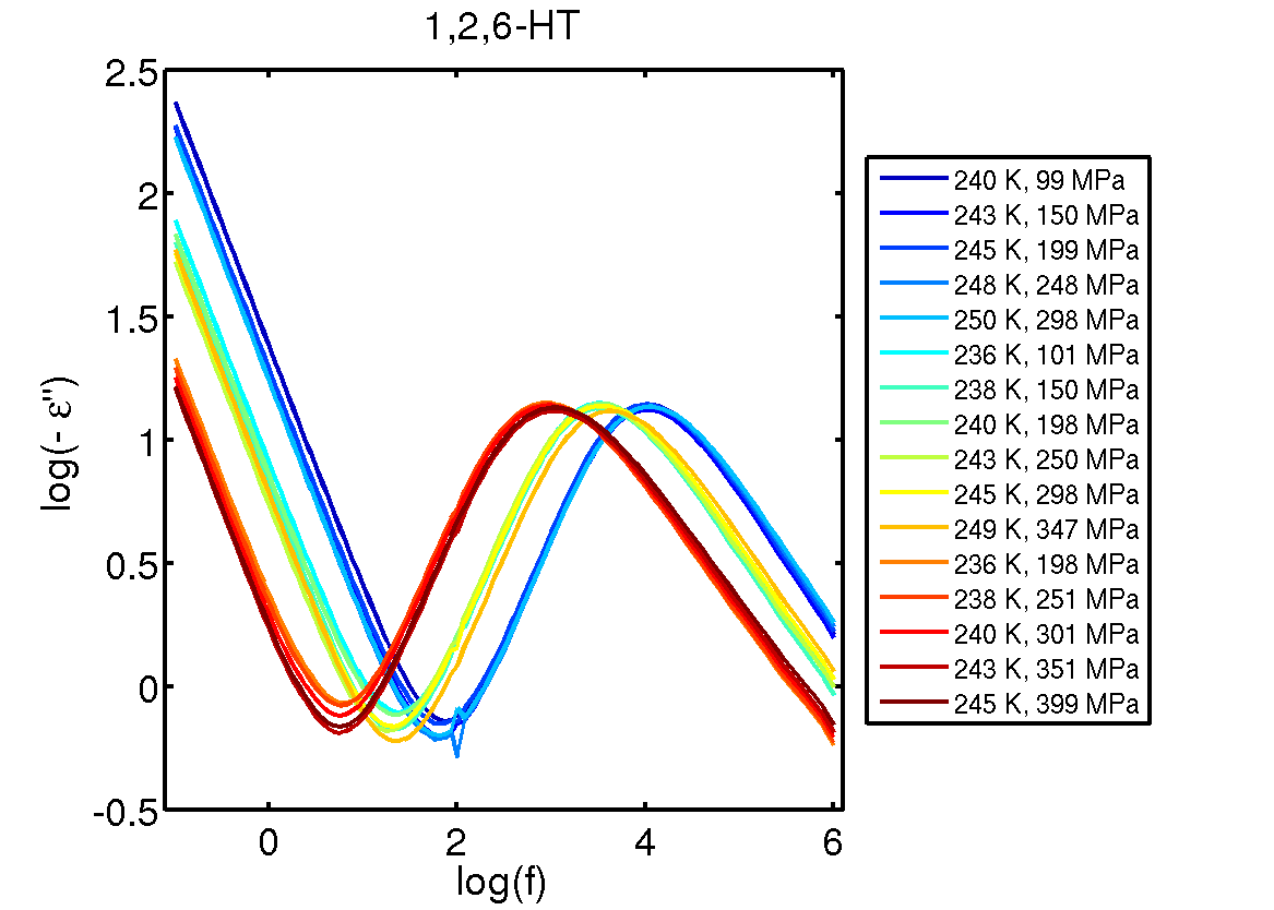
Hi all, I would like some advise to how to structure data in the best way. I need to make plots containing spectra as function of temperature (as the one shown on : http://glass.ruc.dk/data/data/J_Chem_Phys_139_101101_data/126HT/126HT.png ) I have all data in Matlab and normally makes specialized output files for the final print quality plotting in gnuplot. However, how do I structure this kind of data? I would like if the plotting script automatically loop over the spectra (the number of spectra could be written to a file if needed) and for each spectrum * The line style should change (in a controlled manner) * The title/legend should automatically be read and added. * On some plots labels should be added, which should also be read from a file. An alternative would be to make Matlab output the plot lines, and in this way performing the loop. Best Bo |
|
From: Hans-Bernhard B. <HBB...@t-...> - 2013-11-10 22:41:15
|
On 08.11.2013 23:45, Ethan Merritt wrote:
> 3 possibilities:
>
> # automatic, but may not place it where you want
> set timestamp

The location can be changed, though.  See "help set timestamp".

> # create a label wherever you like
> # see "help timefmt" for available format options
> set label N at x, y strftime(time("%d/%m/%Y",0))
>
> # same idea but use the output of a shell command
> set label N at x, y system("date")

But note that the latter two are not dynamic, i.e. the command has to be
run again before every plot to make sure you have the correct timestamp,
particularly if you have not just the date, but also the time in there.
|
635 messages has been excluded from this view by a project administrator.

