
Menu
▾
▴
gnuplot-info — For questions and discussion about gnuplot
You can subscribe to this list here.
| 2003 |
Jan
|
Feb
|
Mar
|
Apr
|
May
|
Jun
|
Jul
|
Aug
|
Sep
|
Oct
(2) |
Nov
(2) |
Dec
|
|---|---|---|---|---|---|---|---|---|---|---|---|---|
| 2004 |
Jan
(3) |
Feb
(1) |
Mar
(2) |
Apr
(22) |
May
(52) |
Jun
(43) |
Jul
(36) |
Aug
(59) |
Sep
(37) |
Oct
(55) |
Nov
(39) |
Dec
(36) |
| 2005 |
Jan
(64) |
Feb
(40) |
Mar
(62) |
Apr
(58) |
May
(256) |
Jun
(77) |
Jul
(80) |
Aug
(39) |
Sep
(56) |
Oct
(36) |
Nov
(113) |
Dec
(68) |
| 2006 |
Jan
(43) |
Feb
(64) |
Mar
(69) |
Apr
(60) |
May
(71) |
Jun
(53) |
Jul
(63) |
Aug
(63) |
Sep
(76) |
Oct
(85) |
Nov
(82) |
Dec
(73) |
| 2007 |
Jan
(75) |
Feb
(82) |
Mar
(84) |
Apr
(104) |
May
(67) |
Jun
(101) |
Jul
(107) |
Aug
(138) |
Sep
(128) |
Oct
(106) |
Nov
(112) |
Dec
(112) |
| 2008 |
Jan
(94) |
Feb
(87) |
Mar
(146) |
Apr
(169) |
May
(75) |
Jun
(26) |
Jul
(26) |
Aug
(7) |
Sep
(18) |
Oct
(53) |
Nov
(42) |
Dec
(19) |
| 2009 |
Jan
(43) |
Feb
(39) |
Mar
(18) |
Apr
(45) |
May
(66) |
Jun
(87) |
Jul
(56) |
Aug
(41) |
Sep
(56) |
Oct
(139) |
Nov
(98) |
Dec
(88) |
| 2010 |
Jan
(81) |
Feb
(79) |
Mar
(83) |
Apr
(97) |
May
(124) |
Jun
(84) |
Jul
(53) |
Aug
(85) |
Sep
(89) |
Oct
(50) |
Nov
(98) |
Dec
(78) |
| 2011 |
Jan
(97) |
Feb
(74) |
Mar
(68) |
Apr
(54) |
May
(63) |
Jun
(59) |
Jul
(65) |
Aug
(58) |
Sep
(37) |
Oct
(40) |
Nov
(59) |
Dec
(35) |
| 2012 |
Jan
(16) |
Feb
(56) |
Mar
(63) |
Apr
(25) |
May
(48) |
Jun
(58) |
Jul
(20) |
Aug
(13) |
Sep
(43) |
Oct
(35) |
Nov
(20) |
Dec
(17) |
| 2013 |
Jan
(22) |
Feb
(11) |
Mar
(51) |
Apr
(34) |
May
(57) |
Jun
(27) |
Jul
(70) |
Aug
(30) |
Sep
(38) |
Oct
(53) |
Nov
(40) |
Dec
(25) |
| 2014 |
Jan
(26) |
Feb
(35) |
Mar
(60) |
Apr
(12) |
May
(17) |
Jun
(15) |
Jul
(9) |
Aug
(18) |
Sep
(46) |
Oct
(18) |
Nov
(19) |
Dec
(15) |
| 2015 |
Jan
(17) |
Feb
(28) |
Mar
(21) |
Apr
(54) |
May
(36) |
Jun
(8) |
Jul
(30) |
Aug
(13) |
Sep
(3) |
Oct
(28) |
Nov
(3) |
Dec
(3) |
| 2016 |
Jan
(11) |
Feb
(9) |
Mar
(29) |
Apr
(10) |
May
(8) |
Jun
(5) |
Jul
(50) |
Aug
(57) |
Sep
(13) |
Oct
(5) |
Nov
(17) |
Dec
(11) |
| 2017 |
Jan
(3) |
Feb
(23) |
Mar
(16) |
Apr
(7) |
May
(15) |
Jun
(12) |
Jul
(48) |
Aug
(15) |
Sep
(3) |
Oct
(20) |
Nov
(28) |
Dec
(21) |
| 2018 |
Jan
(13) |
Feb
(21) |
Mar
(21) |
Apr
(7) |
May
(3) |
Jun
(7) |
Jul
(27) |
Aug
(38) |
Sep
(4) |
Oct
(30) |
Nov
(22) |
Dec
|
| 2019 |
Jan
(5) |
Feb
(16) |
Mar
(1) |
Apr
(9) |
May
(7) |
Jun
(20) |
Jul
(13) |
Aug
(3) |
Sep
(2) |
Oct
(2) |
Nov
(2) |
Dec
(4) |
| 2020 |
Jan
(6) |
Feb
(11) |
Mar
(1) |
Apr
(18) |
May
(4) |
Jun
(5) |
Jul
(12) |
Aug
(1) |
Sep
(3) |
Oct
(7) |
Nov
(1) |
Dec
(17) |
| 2021 |
Jan
(1) |
Feb
(11) |
Mar
(16) |
Apr
(6) |
May
(5) |
Jun
(1) |
Jul
(1) |
Aug
(2) |
Sep
(8) |
Oct
(10) |
Nov
(4) |
Dec
(4) |
| 2022 |
Jan
(9) |
Feb
(35) |
Mar
(4) |
Apr
|
May
(3) |
Jun
(49) |
Jul
(11) |
Aug
|
Sep
(5) |
Oct
(2) |
Nov
(16) |
Dec
(13) |
| 2023 |
Jan
|
Feb
(8) |
Mar
(3) |
Apr
|
May
(8) |
Jun
|
Jul
(5) |
Aug
|
Sep
|
Oct
(2) |
Nov
|
Dec
(2) |
| 2024 |
Jan
(6) |
Feb
(9) |
Mar
|
Apr
(26) |
May
(24) |
Jun
|
Jul
(4) |
Aug
(2) |
Sep
(1) |
Oct
(10) |
Nov
(9) |
Dec
|
| 2025 |
Jan
|
Feb
(22) |
Mar
|
Apr
(1) |
May
|
Jun
|
Jul
|
Aug
|
Sep
(1) |
Oct
(1) |
Nov
|
Dec
(4) |
| 2026 |
Jan
|
Feb
(24) |
Mar
(20) |
Apr
(18) |
May
(2) |
Jun
(2) |
Jul
(2) |
Aug
(3) |
Sep
|
Oct
|
Nov
|
Dec
|
|
From: Rafael F. <raf...@gn...> - 2016-07-02 02:30:41
|
Hello there. I'd like to create a horizontal percentage stacked bar graph from a datfile, but learning gnuplot's syntax is kinda hard so far. My datfile have 4 columns: first three columns provide integer values for each bar, while the last one provides each bar's legend. Can someone please help setting a script to generate such graph? Thanks in advance. Best regards, Rafael Fontenelle |
|
From: Ethan M. <eam...@gm...> - 2016-07-01 17:10:17
|
On Friday, July 01, 2016 10:21:29 AM Grothausmann, Roman Dr. wrote:
> Dear mailing list members,
>
>
> When plotting data with kernel-densities with filled-curves I can't find a
> way to make the filling reach down to y=0 (using gnuplot-5.0.3). This is
> especially visible if the x-range "crops" the kdensity plot before it gets
> close to y=0. However plotting x**2-2 has no problems to "pull down" the
> filling to any y=a. For example the script below does not fill the plot.
> When removing "=0" it gets filled but for a kdensity plot looks odd as the
> filling does not go down to y=0. Even with any other y=a for a>0 there is
> no filling, e.g. y=0.01:
>
> if (GPVAL_VERSION < 5.0) {print "This script needs gnuplot-5.x\n"; exit;}
>
> bin=17
> sigma=3
> col=1
>
> set samples 1000
> set boxwidth bin
> bin (x,s)= s* int(x/s)
>
> STATS_records=7
> plot [0:180][-0.01:0.1] "-" u col:(1. / STATS_records) smooth kdensity
> bandwidth sigma with filledcurves y=0
> 10
> 11
> 30
> 35
> 180
> 180
> 180
> e
>
>
> Any help or hints are very much appreciated
> Roman

I do not know why the filledcurves style is failing in conjunction with
smoothing, but a work-around is to plot  first to a datablock and then plot
the smoothed curve in a separate step:

set table $SMOOTHED
plot $original_data using col:(weight) smooth kdensity bandwidth sigma
unset table
plot $SMOOTHED using 1:2 with filledcurves y=0

    Ethan
|
|
From: Mauricio G. (D. de Cartografia) <ga...@fc...> - 2016-07-01 13:53:14
|
Dear Yeping Sun, In the following page you have some examples that may help you. Link: http://www2.fct.unesp.br/docentes/carto/galo/web/gnuplot/gnu_exemplos2.htm Bye M. Galo ----- Mensagem original ----- De: "sunyeping" <sun...@al...> Para: "gnuplot-info" <gnu...@li...> Enviadas: Sexta-feira, 1 de julho de 2016 4:18:25 Assunto: [Gnuplot-info] plot a contour map from a matrix Dear all, I want to plot a contour map from a 37 by 37 matrix. I only know the range of the x and y value (say, the range of x is -3.3 to 3.3, and so is that of y). the 37x37 values can be treated as z values. Does anyone know the gnuplot codes for this? Thanks in advance! Yeping Sun ------------------------------------------------------------------------------ Attend Shape: An AT&T Tech Expo July 15-16. Meet us at AT&T Park in San Francisco, CA to explore cutting-edge tech and listen to tech luminaries present their vision of the future. This family event has something for everyone, including kids. Get more information and register today. http://sdm.link/attshape _______________________________________________ gnuplot-info mailing list gnu...@li... Membership management via: https://lists.sourceforge.net/lists/listinfo/gnuplot-info |
|
From: Grothausmann, R. Dr. <gro...@mh...> - 2016-07-01 08:21:37
|
Dear mailing list members,


When plotting data with kernel-densities with filled-curves I can't find a way
to make the filling reach down to y=0 (using gnuplot-5.0.3). This is especially
visible if the x-range "crops" the kdensity plot before it gets close to y=0.
However plotting x**2-2 has no problems to "pull down" the filling to any y=a.
For example the script below does not fill the plot. When removing "=0" it gets
filled but for a kdensity plot looks odd as the filling does not go down to y=0.
Even with any other y=a for a>0 there is no filling, e.g. y=0.01:

if (GPVAL_VERSION < 5.0) {print "This script needs gnuplot-5.x\n"; exit;}

bin=17
sigma=3
col=1

set samples 1000
set boxwidth bin
bin (x,s)= s* int(x/s)

STATS_records=7
plot [0:180][-0.01:0.1] "-" u col:(1. / STATS_records) smooth kdensity bandwidth
sigma with filledcurves y=0
10
11
30
35
180
180
180
e


Any help or hints are very much appreciated
Roman
|
|
From: Tatsuro M. <tma...@ya...> - 2016-07-01 08:01:05
|
----- Original Message ----- > From: mikeincousa > To: gnuplot-info > Cc: > Date: 2016/7/1, Fri 11:57 > Subject: [Gnuplot-info] V 5.0 | pdf | portriat frame | Window 10 or Unbuntu 16.04 > > Is there a way to output directly to a pdf in portrait frame? > > The only terminal that outputs directly is the one for postscript output? > > Any other way to easily skin this? > Dis you try cairopdf terminal? Tatsuro |
|
From: Grothausmann, R. Dr. <gro...@mh...> - 2016-07-01 07:53:35
|
On 24/06/16 09:57, Grothausmann, Roman Dr. wrote: > I checked > show variables all > for variables containing fitting values. GPVAL_TERM_XMIN fits viewbox-x and > GPVAL_TERM_XMAX-GPVAL_TERM_XMIN fits viewbox-width; > GPVAL_TERM_YMAX-GPVAL_TERM_YMIN fits viewbox-height but GPVAL_TERM_YMIN does NOT > fit viewbox-y. Found that these values do the trick: GPVAL_TERM_XMIN GPVAL_TERM_YSIZE / GPVAL_TERM_SCALE - GPVAL_TERM_YMAX GPVAL_TERM_XMAX - GPVAL_TERM_XMIN GPVAL_TERM_YMAX - GPVAL_TERM_YMIN The problem was that SVG y-direction is down while gnuplot's y-direction is up. > Any help or hints are very much appreciated > Roman > > ------------------------------------------------------------------------------ > Attend Shape: An AT&T Tech Expo July 15-16. Meet us at AT&T Park in San > Francisco, CA to explore cutting-edge tech and listen to tech luminaries > present their vision of the future. This family event has something for > everyone, including kids. Get more information and register today. > http://sdm.link/attshape > _______________________________________________ > gnuplot-info mailing list > gnu...@li... > Membership management via: https://lists.sourceforge.net/lists/listinfo/gnuplot-info > -- Dr. Roman Grothausmann Tomographie und Digitale Bildverarbeitung Tomography and Digital Image Analysis Institut für Funktionelle und Angewandte Anatomie, OE 4120 Medizinische Hochschule Hannover Carl-Neuberg-Str. 1 D-30625 Hannover Tel. +49 511 532-2900 |
|
From: sunyeping <sun...@al...> - 2016-07-01 07:18:40
|
Dear all, I want to plot a contour map from a 37 by 37 matrix. I only know the range of the x and y value (say, the range of x is -3.3 to 3.3, and so is that of y). the 37x37 values can be treated as z values. Does anyone know the gnuplot codes for this? Thanks in advance! Yeping Sun |
|
From: mikeincousa <mik...@gm...> - 2016-07-01 04:07:43
|
Is there a way to output directly to a pdf in portrait frame? The only terminal that outputs directly is the one for postscript output? Any other way to easily skin this? -- View this message in context: http://gnuplot.10905.n7.nabble.com/V-5-0-pdf-portriat-frame-Window-10-or-Unbuntu-16-04-tp20180.html Sent from the Gnuplot - User mailing list archive at Nabble.com. |
|
From: Kevin O. <rko...@gm...> - 2016-06-30 23:06:43
|
I am attempting to generate a polar wind direction plot where 0 degrees is up (north), 90 is right (east), etc. This means that the angle moves clockwise as it increases instead of counter-clockwise. Is there an easy way to do this in gnuplot or will I need to transpose values to do it? Additionally, I am labeling the axes 'N', '', 'E', and 'W'. By default, the 'E' and 'W' are rotated, but I would like them vertical. I tried "rotate by", but that does not do the trick. Can this be done? Thanks! -- Kevin Oberman, Part time kid herder and retired Network Engineer E-mail: rko...@gm... PGP Fingerprint: D03FB98AFA78E3B78C1694B318AB39EF1B055683 |
|
From: BBands <bb...@gm...> - 2016-06-27 16:49:02
|
Some of the examples here ought to get you on the right track: https://commons.wikimedia.org/wiki/Category:PNG_created_with_Gnuplot_code John PS At first I wasn't going to reply, but this seems like a a nice gp resource for everybody so I thought I'd share it. On Fri, Jun 24, 2016 at 6:46 PM, mikeincousa <mik...@gm...> wrote: > I am way rusty with GNUplot, and I do not have recent calculus background > (not that I was ever so good in it anyway). > > I have searched and searched but cannot find any example code for Cornu > Spirals. > > Could someone provide some basic examples. > > Briefly, I am trying to replicate portions of French curves. > > Thanks > > > > -- > View this message in context: > http://gnuplot.10905.n7.nabble.com/Euler-Cornu-spiral-tp20169.html > Sent from the Gnuplot - User mailing list archive at Nabble.com. > > > ------------------------------------------------------------------------------ > Attend Shape: An AT&T Tech Expo July 15-16. Meet us at AT&T Park in San > Francisco, CA to explore cutting-edge tech and listen to tech luminaries > present their vision of the future. This family event has something for > everyone, including kids. Get more information and register today. > http://sdm.link/attshape > _______________________________________________ > gnuplot-info mailing list > gnu...@li... > Membership management via: > https://lists.sourceforge.net/lists/listinfo/gnuplot-info > |
|
From: mikeincousa <mik...@gm...> - 2016-06-25 02:56:33
|
I am way rusty with GNUplot, and I do not have recent calculus background (not that I was ever so good in it anyway). I have searched and searched but cannot find any example code for Cornu Spirals. Could someone provide some basic examples. Briefly, I am trying to replicate portions of French curves. Thanks -- View this message in context: http://gnuplot.10905.n7.nabble.com/Euler-Cornu-spiral-tp20169.html Sent from the Gnuplot - User mailing list archive at Nabble.com. |
|
From: Grothausmann, R. Dr. <gro...@mh...> - 2016-06-24 07:57:15
|
Dear mailing list members, Is there any way to set the SVG viewbox to the auto-calculated margins after plotting? Or any other way to get an SVG with all margins set to 0 BUT not losing everything outside the margins like annotations? I tried: set terminal svg set lmargin 0 set rmargin 0 set tmargin 0 set bmargin 0 set xlabel "test" but the output SVG does not contain any text/elements outside the margins. When not setting the margins to 0, and adjusting the viewbox of the SVG afterwards (with the border coords found via inkscape) works, but I can't find a way to get the auto-computed margin values to e.g. create a sed-command that adjusts the viewbox accordingly after gnuplot finished. I checked show variables all for variables containing fitting values. GPVAL_TERM_XMIN fits viewbox-x and GPVAL_TERM_XMAX-GPVAL_TERM_XMIN fits viewbox-width; GPVAL_TERM_YMAX-GPVAL_TERM_YMIN fits viewbox-height but GPVAL_TERM_YMIN does NOT fit viewbox-y. I could find no other value in the list that would fit or allow to calculate the correct value for viewbox-y as later found via inkscape. Any help or hints are very much appreciated Roman |
|
From: Dave H. <da...@ho...> - 2016-06-01 00:35:42
|
Gnuplot 5.0 pl 3, on MacOS 10.11.5 I'm seeing a couple of glitches in Gnuplot, and I cannot see where I stuffed up. Browse over to www.horsfall.org/gptest and view the files therein; they are a cut-down version of a script I use to plot my BP etc (note that my dates use the format d/m/y, as I am not American; later graphs use the more conventional yy/mm/dd, which actually sorts). The gap towards the end of April is where I spent a week in hospital, but note the sole dot in the middle; there is no datum for it, and anyway I don't recall dashing home midway through my unintended confinement :-) What would be causing it? It's driving me nuts. The other glitch is the datum for 18/4/16 (146), which did not go off the scale but should have (at the time my scale was 0:140, since a BP of over 140 means Trouble), but that's not so important. Help, anyone? -- Dave Horsfall DTM (VK2KFU) "Those who don't understand security will suffer." |
|
From: Mauricio G. (D. de Cartografia) <ga...@fc...> - 2016-05-20 13:47:56
|
Simon In your data set you have the angles “theta” and “phi”. To know the correct set of equations you should inform two thinks: - Your “theta” angles is the horizontal angle or de vertical angle? - Your vertical angle starts on the vertical axis Z or in the horizontal plane? By knowing these answer it will be possible to define the equations without doubt. M. Galo ----- Mensagem original ----- De: "Simon Lenz" <s_l...@cs...> Para: gnu...@li... Enviadas: Sexta-feira, 13 de maio de 2016 10:29:15 Assunto: [Gnuplot-info] Weird spherical mapping? Hello, I'm trying to plot some 3D points defined in spherical coordinates. (like this https://upload.wikimedia.org/wikipedia/commons/thumb/6/69/Kugelkoord-def.svg/300px-Kugelkoord-def.svg.png) So as specified in the wikipedia article[1] the spherical->carthesian conversion should works like this: x = r * sin(theta) * cos(phi) y = r * sin(theta) * sin(phi) z = r * cos(theta) My problem is now, that as documented in (set mapping spherical) gnuplot does the spherical->carthesian conversion like this: x = r * cos(theta) * cos(phi) y = r * sin(theta) * cos(phi) z = r * sin(phi) For me this seems like an odd non-standard way of doing things. But on the other side, I'm not really familiar with the whole thing. How can I achieve an output with correct corrdinates for my data? thanks in advace, Simon --------- script: set xlabel "x" set ylabel "y" set zlabel "z" set xrange [-1:1] set yrange [-1:1] set zrange [-1:1] set mapping spherical set angles degrees splot 'test.dat' pause -1 data: #theta phi r 0 0 1 90 180 1 [1] https://en.wikipedia.org/wiki/Spherical_coordinate_system#Cartesian_coordinates ------------------------------------------------------------------------------ Mobile security can be enabling, not merely restricting. Employees who bring their own devices (BYOD) to work are irked by the imposition of MDM restrictions. Mobile Device Manager Plus allows you to control only the apps on BYO-devices by containerizing them, leaving personal data untouched! https://ad.doubleclick.net/ddm/clk/304595813;131938128;j _______________________________________________ gnuplot-info mailing list gnu...@li... Membership management via: https://lists.sourceforge.net/lists/listinfo/gnuplot-info |
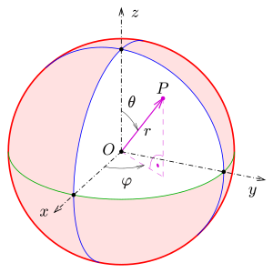)
|
From: Hans-Bernhard B. <HBB...@t-...> - 2016-05-13 17:05:49
|
Am 13.05.2016 um 15:29 schrieb Simon Lenz: > So as specified in the wikipedia article[1] the spherical->carthesian > conversion should works like this: That's overstating things a bit. The notion that there is "the" mapping is incorrect. There are various ways of defining spherical coordinates, not just one. And Wikipedia knows that, too. You just have to read the entire article, not just look at a single isolated formula. > For me this seems like an odd non-standard way of doing things. Given there is no actual standard, nothing can really be non-standard. gnuplot's spherical coordinates follow the conventions used in geography, where latitude zero is at the equator, instead of a pole. |
|
From: Simon L. <s_l...@cs...> - 2016-05-13 16:00:41
|
Hello, I'm trying to plot some 3D points defined in spherical coordinates. (like this https://upload.wikimedia.org/wikipedia/commons/thumb/6/69/Kugelkoord-def.svg/300px-Kugelkoord-def.svg.png) So as specified in the wikipedia article[1] the spherical->carthesian conversion should works like this: x = r * sin(theta) * cos(phi) y = r * sin(theta) * sin(phi) z = r * cos(theta) My problem is now, that as documented in (set mapping spherical) gnuplot does the spherical->carthesian conversion like this: x = r * cos(theta) * cos(phi) y = r * sin(theta) * cos(phi) z = r * sin(phi) For me this seems like an odd non-standard way of doing things. But on the other side, I'm not really familiar with the whole thing. How can I achieve an output with correct corrdinates for my data? thanks in advace, Simon --------- script: set xlabel "x" set ylabel "y" set zlabel "z" set xrange [-1:1] set yrange [-1:1] set zrange [-1:1] set mapping spherical set angles degrees splot 'test.dat' pause -1 data: #theta phi r 0 0 1 90 180 1 [1] https://en.wikipedia.org/wiki/Spherical_coordinate_system#Cartesian_coordinates |
|
From: Derek L. <de...@bo...> - 2016-05-13 13:22:38
|
> On May 13, 2016, at 7:05 AM, Martin Ward wrote: > > On 13/05/16 13:54, Sávio Ramos wrote: >> I want to plot x**2 >> >> gnuplot> set xrange [-1:1] >> gnuplot> set yrange [0:1] >> gnuplot> plot x**2 >> >> >> But, the scale of the axis is diferent. I need exactly the same. > > set xrange [-1:1] > set yrange [0:1] > set size ratio 0.5 > plot x**2 > Or you could do it in a way that is independent of your chosen xrange and yrange, using a negative value for 'set size ratio': set xrange [-1:1] set yrange [0:1] set size ratio -1 plot x**2 set yrange [-1:1] replot See the manual for "set size". Derek |
|
From: Martin W. <ma...@gk...> - 2016-05-13 13:05:36
|
On 13/05/16 13:54, Sávio Ramos wrote: > I want to plot x**2 > > gnuplot> set xrange [-1:1] > gnuplot> set yrange [0:1] > gnuplot> plot x**2 > > > But, the scale of the axis is diferent. I need exactly the same. set xrange [-1:1] set yrange [0:1] set size ratio 0.5 plot x**2 -- Martin Dr Martin Ward STRL Principal Lecturer & Reader in Software Engineering ma...@gk... http://www.cse.dmu.ac.uk/~mward/ Erdos number: 4 G.K.Chesterton web site: http://www.cse.dmu.ac.uk/~mward/gkc/ Mirrors: http://www.gkc.org.uk and http://www.gkc.org.uk/gkc |
|
From: Sávio R. <sav...@gm...> - 2016-05-13 12:54:23
|
I want to plot x**2 gnuplot> set xrange [-1:1] gnuplot> set yrange [0:1] gnuplot> plot x**2 But, the scale of the axis is diferent. I need exactly the same. []'s -- Sávio M Ramos Arquiteto, Rio, RJ Só uso Linux desde 2000 www.debian.org |
|
From: theozh <th...@gm...> - 2016-05-05 05:32:44
|
- a meaningful subject would help (not just "help") - I do not see an image attached (I guess you can't attach images in the newsgroup) - I cannot easily reproduce your plot since I do not have the data files nor the directory structure And actually: What is your question? So I can just guess that you might mean: "How to avoid overlapping of horizontal keys?" My quick answer would be: make them smaller. Thank you for posting - a minimal code example to easily reproduce your result - or a link to your plot result |
|
From: P. A. G. <pag...@tu...> - 2016-05-04 22:08:54
|
I am in a tight spot and need to get this done quickly. I have placed my key top horizontal, I have four items in the key and they are overlapping all on the right side. I'm attaching my gnu script and a copy of my plot. thanks, Pat |
|
From: Martin W. <ma...@gk...> - 2016-04-21 17:35:03
|
On 21/04/16 13:01, theozh wrote: > set rmargin manually in screen coordinates such that you get a squared > graph. For this, it might be convenient to define variables "PlotWidth" > and "PlotHeight". That does the trick, thanks! For some reason I didn't think of setting a right margin and moving the colorbox into it! Also: thanks for the tip about defining variables and putting a decimal point into the numbers to ensure floating point computations. -- Martin Dr Martin Ward STRL Principal Lecturer & Reader in Software Engineering ma...@gk... http://www.cse.dmu.ac.uk/~mward/ Erdos number: 4 G.K.Chesterton web site: http://www.cse.dmu.ac.uk/~mward/gkc/ Mirrors: http://www.gkc.org.uk and http://www.gkc.org.uk/gkc |
|
From: theozh <th...@gm...> - 2016-04-21 12:14:46
|
sorry, of course, the definition of the variables has to come first. PlotWidth=318. # decimal point to avoid integer division PlotHeight=256. # see above set terminal png size PlotWidth,PlotHeight font "Arial,10" set output 'out.png' ... |
|
From: theozh <th...@gm...> - 2016-04-21 12:02:00
|
set rmargin manually in screen coordinates such that you get a squared graph. For this, it might be convenient to define variables "PlotWidth" and "PlotHeight". In the code below I added a "control" graph in the wxt terminal. Skip the lines if you don't need it. Apart from this: a question from my side to the gnuplot-experts: If I leave out the decimal points in the definition for PlotWidth and PlotHeight, I will get an empty graph because the (integer) division is obviously zero and as a consequence rmargin is set at screen 0. If I anyway load the same gnuplot code a second time, gnuplot crashes/ends immediately. Is this a bug or a feature? ################### gnuplot example ##################### reset set terminal png size PlotWidth,PlotHeight font "Arial,10" set output 'out.png' PlotWidth=318. # decimal point to avoid integer division PlotHeight=256. # see above set lmargin 0 set rmargin at screen (PlotHeight/PlotWidth) set tmargin 0 set bmargin 0 set colorbox user size 0.05,0.8 origin 0.85,0.1 plot[0:1][0:1] '-' u 1:2:3 with image 0 0 0 0 1 1 1 0 2 1 1 3 e set output set term wxt size PlotWidth,PlotHeight replot ################# end of example ###################### |
|
From: Martin W. <ma...@gk...> - 2016-04-21 09:12:52
|
I am plotting some 2D data (a heatmap) which needs to be "pixel perfect" and include a colorbox. I want no margins, so I use "set lmargin 0" etc. I can then set the terminal size to the exact size of the plot, with an extra margin for the colorbox. But the top and bottom numbers in the colorbox are clipped. I need to shrink the colorbox, so that it is not clipped, but get it to be placed to the right of the plot. I can only change the size and origin of the colorbox using the "user" option: which also causes plot to be expanded to the full width of the image, with the colorbox placed on top of it. This plot file illustrates the problem: ################### gnuplot example ##################### set lmargin 0 set rmargin 0 set tmargin 0 set bmargin 0 set terminal png size 318,256 set out 'out.png' # By default, the box is to the right of the plot # but the numbers are clipped top and bottom. # # If we uncomment this line, the box moves over the plot # and is clipped on the right. The plot is wider: #set colorbox user # If we uncomment this line, the box is smaller and not clipped, # but is still over the plot, and the plot is wider: #set colorbox user size 0.05,0.8 origin 0.8,0.1 plot[0:1][0:1] '-' u 1:2:3 with image 0 0 0 0 1 1 1 0 2 1 1 3 e ################# end of example ###################### -- Martin Dr Martin Ward STRL Principal Lecturer & Reader in Software Engineering ma...@gk... http://www.cse.dmu.ac.uk/~mward/ Erdos number: 4 G.K.Chesterton web site: http://www.cse.dmu.ac.uk/~mward/gkc/ Mirrors: http://www.gkc.org.uk and http://www.gkc.org.uk/gkc |
635 messages has been excluded from this view by a project administrator.

