
Menu
▾
▴
gnuplot-info — For questions and discussion about gnuplot
You can subscribe to this list here.
| 2003 |
Jan
|
Feb
|
Mar
|
Apr
|
May
|
Jun
|
Jul
|
Aug
|
Sep
|
Oct
(2) |
Nov
(2) |
Dec
|
|---|---|---|---|---|---|---|---|---|---|---|---|---|
| 2004 |
Jan
(3) |
Feb
(1) |
Mar
(2) |
Apr
(22) |
May
(52) |
Jun
(43) |
Jul
(36) |
Aug
(59) |
Sep
(37) |
Oct
(55) |
Nov
(39) |
Dec
(36) |
| 2005 |
Jan
(64) |
Feb
(40) |
Mar
(62) |
Apr
(58) |
May
(256) |
Jun
(77) |
Jul
(80) |
Aug
(39) |
Sep
(56) |
Oct
(36) |
Nov
(113) |
Dec
(68) |
| 2006 |
Jan
(43) |
Feb
(64) |
Mar
(69) |
Apr
(60) |
May
(71) |
Jun
(53) |
Jul
(63) |
Aug
(63) |
Sep
(76) |
Oct
(85) |
Nov
(82) |
Dec
(73) |
| 2007 |
Jan
(75) |
Feb
(82) |
Mar
(84) |
Apr
(104) |
May
(67) |
Jun
(101) |
Jul
(107) |
Aug
(138) |
Sep
(128) |
Oct
(106) |
Nov
(112) |
Dec
(112) |
| 2008 |
Jan
(94) |
Feb
(87) |
Mar
(146) |
Apr
(169) |
May
(75) |
Jun
(26) |
Jul
(26) |
Aug
(7) |
Sep
(18) |
Oct
(53) |
Nov
(42) |
Dec
(19) |
| 2009 |
Jan
(43) |
Feb
(39) |
Mar
(18) |
Apr
(45) |
May
(66) |
Jun
(87) |
Jul
(56) |
Aug
(41) |
Sep
(56) |
Oct
(139) |
Nov
(98) |
Dec
(88) |
| 2010 |
Jan
(81) |
Feb
(79) |
Mar
(83) |
Apr
(97) |
May
(124) |
Jun
(84) |
Jul
(53) |
Aug
(85) |
Sep
(89) |
Oct
(50) |
Nov
(98) |
Dec
(78) |
| 2011 |
Jan
(97) |
Feb
(74) |
Mar
(68) |
Apr
(54) |
May
(63) |
Jun
(59) |
Jul
(65) |
Aug
(58) |
Sep
(37) |
Oct
(40) |
Nov
(59) |
Dec
(35) |
| 2012 |
Jan
(16) |
Feb
(56) |
Mar
(63) |
Apr
(25) |
May
(48) |
Jun
(58) |
Jul
(20) |
Aug
(13) |
Sep
(43) |
Oct
(35) |
Nov
(20) |
Dec
(17) |
| 2013 |
Jan
(22) |
Feb
(11) |
Mar
(51) |
Apr
(34) |
May
(57) |
Jun
(27) |
Jul
(70) |
Aug
(30) |
Sep
(38) |
Oct
(53) |
Nov
(40) |
Dec
(25) |
| 2014 |
Jan
(26) |
Feb
(35) |
Mar
(60) |
Apr
(12) |
May
(17) |
Jun
(15) |
Jul
(9) |
Aug
(18) |
Sep
(46) |
Oct
(18) |
Nov
(19) |
Dec
(15) |
| 2015 |
Jan
(17) |
Feb
(28) |
Mar
(21) |
Apr
(54) |
May
(36) |
Jun
(8) |
Jul
(30) |
Aug
(13) |
Sep
(3) |
Oct
(28) |
Nov
(3) |
Dec
(3) |
| 2016 |
Jan
(11) |
Feb
(9) |
Mar
(29) |
Apr
(10) |
May
(8) |
Jun
(5) |
Jul
(50) |
Aug
(57) |
Sep
(13) |
Oct
(5) |
Nov
(17) |
Dec
(11) |
| 2017 |
Jan
(3) |
Feb
(23) |
Mar
(16) |
Apr
(7) |
May
(15) |
Jun
(12) |
Jul
(48) |
Aug
(15) |
Sep
(3) |
Oct
(20) |
Nov
(28) |
Dec
(21) |
| 2018 |
Jan
(13) |
Feb
(21) |
Mar
(21) |
Apr
(7) |
May
(3) |
Jun
(7) |
Jul
(27) |
Aug
(38) |
Sep
(4) |
Oct
(30) |
Nov
(22) |
Dec
|
| 2019 |
Jan
(5) |
Feb
(16) |
Mar
(1) |
Apr
(9) |
May
(7) |
Jun
(20) |
Jul
(13) |
Aug
(3) |
Sep
(2) |
Oct
(2) |
Nov
(2) |
Dec
(4) |
| 2020 |
Jan
(6) |
Feb
(11) |
Mar
(1) |
Apr
(18) |
May
(4) |
Jun
(5) |
Jul
(12) |
Aug
(1) |
Sep
(3) |
Oct
(7) |
Nov
(1) |
Dec
(17) |
| 2021 |
Jan
(1) |
Feb
(11) |
Mar
(16) |
Apr
(6) |
May
(5) |
Jun
(1) |
Jul
(1) |
Aug
(2) |
Sep
(8) |
Oct
(10) |
Nov
(4) |
Dec
(4) |
| 2022 |
Jan
(9) |
Feb
(35) |
Mar
(4) |
Apr
|
May
(3) |
Jun
(49) |
Jul
(11) |
Aug
|
Sep
(5) |
Oct
(2) |
Nov
(16) |
Dec
(13) |
| 2023 |
Jan
|
Feb
(8) |
Mar
(3) |
Apr
|
May
(8) |
Jun
|
Jul
(5) |
Aug
|
Sep
|
Oct
(2) |
Nov
|
Dec
(2) |
| 2024 |
Jan
(6) |
Feb
(9) |
Mar
|
Apr
(26) |
May
(24) |
Jun
|
Jul
(4) |
Aug
(2) |
Sep
(1) |
Oct
(10) |
Nov
(9) |
Dec
|
| 2025 |
Jan
|
Feb
(22) |
Mar
|
Apr
(1) |
May
|
Jun
|
Jul
|
Aug
|
Sep
(1) |
Oct
(1) |
Nov
|
Dec
(4) |
| 2026 |
Jan
|
Feb
(24) |
Mar
(20) |
Apr
(18) |
May
(2) |
Jun
(2) |
Jul
(2) |
Aug
(3) |
Sep
|
Oct
|
Nov
|
Dec
|
|
From: Matusevita, IĮ <mat...@gm...> - 2010-03-01 09:51:34
|
Hello, I would like to draw some simple lines/curves on the pm3d map. I need to do this quickly and qualitatively. The best what I can do is the result of this script: # I need to generate figure with LaTeX labels set terminal epslatex color set output "Fig.tex" unset origin # So I draw a pm3d map... set multiplot set pm3d map set palette negative set size square set xlabel "$\\gamma_1$" set ylabel "$\\gamma_2$" unset key splot [-50:50][-50:50] x # ...and then I draw one line on the pm3d map unset pm3d unset xlabel unset ylabel set size square 0.6999999999999999999 set origin 0.11345, 0.12894 set style line 1 lt 2 lc rgb "black" lw 2 plot [-50:50][-50:50] 3.42366-x ls 1 unset size unset origin unset multiplot As one can see, the result is not good because it is difficult to put the figure with line on the pm3d map accurately. May be someone knows the better way to solve my problem? Thank you in advance. Aris M. |
|
From: GPS <gpo...@gm...> - 2010-03-01 01:22:08
|
Hi I'm new user, but about test command I would like to add a bit information, and I would like to take shared the script wrote by Mr. Rhubbell. set terminal png size 2000,2000 set output "gnuplot-pngtest.png" test quit If you use a big image (e.g. 2000x2000) gnuplot shows many others styles and colors. Good luck! __________________________________ Guilherme Poleszuk dos Santos Rosa 2010/2/26 rhubbell <Rhu...@ih...> > On Fri, 26 Feb 2010 12:38:11 -0600 > Jon wrote: > > > I would like to use dotted line, dotted-dashed line, dotted-long dashed > > line etc, to draw graphs, is there way to do that with gnuplot? What I > > found from the gnuplot manual that only dashed line is supported, is > > this the case? Thank > > gnuplot > set terminal > hit enter to show terminal types available > > set terminal png > set output "gnuplot-pngtest.png" > test > quit > > now use your favorite image viewer to view gnuplot-pngtest.png > > > ------------------------------------------------------------------------------ > Download Intel® Parallel Studio Eval > Try the new software tools for yourself. Speed compiling, find bugs > proactively, and fine-tune applications for parallel performance. > See why Intel Parallel Studio got high marks during beta. > http://p.sf.net/sfu/intel-sw-dev > _______________________________________________ > gnuplot-info mailing list > gnu...@li... > https://lists.sourceforge.net/lists/listinfo/gnuplot-info > |
|
From: coleTEK <fo...@co...> - 2010-02-27 01:16:11
|
Hi how can I suppress gnuplot warnings. Ideally I would like to suppress all them. Or alternatively warnings such as Warning: empty x range [3.20252e+08:3.20252e+08], adjusting to [3.17049e+08:3.23454e+08] Warning: empty y range [1.01054:1.01054], adjusting to [1.00043:1.02065] -- View this message in context: http://old.nabble.com/Suppress-Gnuplot-warnings-tp27714126p27714126.html Sent from the Gnuplot - User mailing list archive at Nabble.com. |
|
From: rhubbell <Rhu...@iH...> - 2010-02-26 23:17:33
|
On Fri, 26 Feb 2010 12:38:11 -0600 Jon wrote: > I would like to use dotted line, dotted-dashed line, dotted-long dashed > line etc, to draw graphs, is there way to do that with gnuplot? What I > found from the gnuplot manual that only dashed line is supported, is > this the case? Thank gnuplot set terminal hit enter to show terminal types available set terminal png set output "gnuplot-pngtest.png" test quit now use your favorite image viewer to view gnuplot-pngtest.png |
|
From: Hans-Bernhard B. <HBB...@t-...> - 2010-02-26 20:00:39
|
Jon wrote: > I would like to use dotted line, dotted-dashed line, dotted-long dashed line > etc, to draw graphs, is there way to do that with gnuplot? What I found from > the gnuplot manual that only dashed line is supported, is this the case? Strange. Care telling where in the gnuplot manual you read that? That said, 'dashed' does actually mean "patterned", and that usually does include some dottet, dot-dashed and other patterned lines. It all depends on the terminal driver though. |
|
From: Jon <dev...@gm...> - 2010-02-26 19:25:46
|
I want to draw all my graphs in gray scale, is there way to specify this? What I can find is dark and one scale of gray. Thanks, |
|
From: Jon <dev...@gm...> - 2010-02-26 18:38:19
|
I would like to use dotted line, dotted-dashed line, dotted-long dashed line etc, to draw graphs, is there way to do that with gnuplot? What I found from the gnuplot manual that only dashed line is supported, is this the case? Thanks, |
|
From: Hans-Bernhard B. <HBB...@t-...> - 2010-02-25 21:15:04
|
dsw...@on... wrote: > I want comment out my data sets in the plot, drawing an arrow and > labeling it with text e.g. with "missing data" for a gap in > timeseries. There are serveral objects for plotting arrows, lines etc., > but I can't find a object for drawing text elements in a plot?! How can > I put text in the plot? See "help label". |
|
From: <dsw...@on...> - 2010-02-24 20:12:47
|
Hi! I am a new user of gnuplot. I use gnuplot for plotting my measurement data. This works very well. I want comment out my data sets in the plot, drawing an arrow and labeling it with text e.g. with "missing data" for a gap in timeseries. There are serveral objects for plotting arrows, lines etc., but I can't find a object for drawing text elements in a plot?! How can I put text in the plot? Many thanks, Dietrich |
|
From: Thomas S. <t.s...@fz...> - 2010-02-24 11:56:16
|
for those bracket like symbols you could combine a box and a white line
overwriting one box side:

datafile.dat:
200 47 47
500 71 64 19
1000 87 78 38
2000 100 100 55
4000 93 101 55

plot script:
reset
mx(a,b)=10**((log10(b)-log10(a))*0.5+log10(a))
set xrange [125:8000]
set logscale x
set xtics ( "125"  125, "" mx( 125, 250), \
            "250"  250, "" mx( 250, 500), \
            "500"  500, "" mx( 500,1000), \
           "1000" 1000, "" mx(1000,2000), \
           "2000" 2000, "" mx(2000,4000), \
           "4000" 4000, "" mx(4000,8000), \
           "8000" 8000)
set grid
set yrange [-10:130] reverse
set ytics 0,10,120

unset bars
set linestyle 10 linecolor rgb 'white' pointtype -1
xdel=0.06
ydel=3.0

plot \
'datafile.dat' using 1:2 with linespoints pointtype 2 pointsize 3, \
'' using 1:3 with linespoints pointtype 6 pointsize 3, \
'' using 1:4:(10**(log10($1)-xdel)):(10**(log10($1)+xdel)):4:($4+ydel) with
boxxyerrorbars, \
'' using 1:($4+ydel):(10**(log10($1)-xdel)):(10**(log10($1)+xdel)) with
xerrorbars linestyle 10


t putkonen wrote:
>
> Audiograms are used in hearing tests, and they look something like the
> following:
>
> http://www.mydr.com.au/files/images/categories/hearing/audiogrammixedv2.jpg
>
> I've tried to create an audiogram using gnuplot, but I ran into problems.
> It
> was very easy to do the following tasks:
>
> - set tics for x and y
> - set x scale as logarithmic
> - draw grid
> - draw lines
>
> However, I couldn't figure out how to include custom symbols to the chart.
> The example picture shows some of the symbols that can be used. Also othe
> symbols exist.
>
> I created the symbols and stored them to PNG files, but when I used plot
> command with the images I found several issues:
>
> - Image is plotted so, that it's left upper corner is in the given
> coordinates. Instead, the image's center point should be in the given
> coordinates.
> - Plotting images don't work with logarithmic scale (which makes sense
> since
> they are plotted utilizing the chart's coordinates, but it isn't feasible
> in
> this case)
> - PNG transparency doesn't seem to work
>
> What I would like to do is tell gnuplot to plot my image to specific
> coordinates so that I give center point of the image and size of the
> plotted
> image in pixels (x & y). If this is not possible can I somehow achieve
> similar result?
>
> I could even superimpose the symbols to a bitmap plot using e.g.
> Imagemagick
> if there was a way to find out the correct position (for example, x and y
> pixel locations of 70 dB & 1000 Hz).
> ------------------------------------------------------------------------------
> Download Intel® Parallel Studio Eval
> Try the new software tools for yourself. Speed compiling, find bugs
> proactively, and fine-tune applications for parallel performance.
> See why Intel Parallel Studio got high marks during beta.
> http://p.sf.net/sfu/intel-sw-dev
> _______________________________________________
> gnuplot-info mailing list
> gnu...@li...
> https://lists.sourceforge.net/lists/listinfo/gnuplot-info
>
>

--
View this message in context: http://old.nabble.com/Trying-to-create-audiogram-chart-with-gnuplot---need-help-including-custom-symbols-tp27691462p27714173.html
Sent from the Gnuplot - User mailing list archive at Nabble.com.
|

|
From: GPS <gpo...@gm...> - 2010-02-24 02:34:00
|
Hi Mr. Hans-Bernhard! Your explanation is very interesting and it should be appear in the next edition of "Gnuplot in action" book as well the explaning that Mr. Thomas posted about this issue. Those tips explained what was my problem.... thank you very much!!! I'm using the Thomas' suggest but think in a scale factor is interesting too... As we brazilian sometimes say: "Living and learning", for today I learn a bit more with you. Thanks again!! Sorry my english :| __________________________________ Guilherme Poleszuk dos Santos Rosa 2010/2/23 Hans-Bernhard Bröker <HBB...@t-...> > Guilherme Poleszuk wrote: > > I believe that are a problem with "fit" function when I use xdata time, >> because X values are converted to second since 2000/01/01 ( I think! ) and >> this number get big compared to Y values... >> > > Exactly. Fit is somewhat allergic to parameter values of wildly different > magnitude. The issue is not unique to time-date axes, but those do have a > tendency to get hit by it more often than others because they tend to pick > up big figures, like the number of seconds in a day (or a year, even), as > factors that end up in the parameters. > > The solution is to shift or scale the problem to get the expected > parameters into similar magnitude ranges. E.g. it might help to define your > model function to take days instead of seconds as its argument > > fit f(x/86400) 'data' u 1:4 via a, b > > or (like Thomas suggested already), shift the zero point of your x axis. > > Note that the usual simple forms of the straight line equation > > y = m*x + y0 > y = m*(x -x0) > > may suffer from ginormous extrapolation from a very short piece of curve > all the way to the point of x=0 (or y=0), causing parameters like x0 or y0 > to be entirely dominated by rounding error. > > > |
|
From: Hans-Bernhard B. <HBB...@t-...> - 2010-02-23 23:20:30
|
Guilherme Poleszuk wrote: > I believe that are a problem with "fit" function when I use xdata time, > because X values are converted to second since 2000/01/01 ( I think! ) and > this number get big compared to Y values... Exactly. Fit is somewhat allergic to parameter values of wildly different magnitude. The issue is not unique to time-date axes, but those do have a tendency to get hit by it more often than others because they tend to pick up big figures, like the number of seconds in a day (or a year, even), as factors that end up in the parameters. The solution is to shift or scale the problem to get the expected parameters into similar magnitude ranges. E.g. it might help to define your model function to take days instead of seconds as its argument fit f(x/86400) 'data' u 1:4 via a, b or (like Thomas suggested already), shift the zero point of your x axis. Note that the usual simple forms of the straight line equation y = m*x + y0 y = m*(x -x0) may suffer from ginormous extrapolation from a very short piece of curve all the way to the point of x=0 (or y=0), causing parameters like x0 or y0 to be entirely dominated by rounding error. |
|
From: Egil K. <eg...@kv...> - 2010-02-23 14:41:23
|
On 02/23/2010 01:00 AM, Hans-Bernhard Bröker wrote:
> Egil Kvaleberg wrote:
>
>> Setting the yrange manually to [8.0:13.0] obviously fixes this, but I
>> really would need to have autoscale to do this for me, but have found no
>> way of achieving that. Have I overlooked something?
>
> Only the "help offsets".
>
Marvelous, a "set offset 0, 0, 0.1, 0.1" fixed my problem perfectly! Thanks!

Since I had problem making the association myself, I could suggest the
following
added to "help autoscale":

    To add an additional margin between plotted data and the graph
boundary lines,
    use 'set offset'.

Or something along those lines.

Egil
|
|
From: GPS <gpo...@gm...> - 2010-02-23 14:30:15
|
Hi Mr Thomas
Thank you very much for help me. Your tip helps a lot!
Have a very nice day!
__________________________________
Guilherme Poleszuk dos Santos Rosa
2010/2/23 Thomas Sefzick <t.s...@fz...>
>
> just set the 'origin' of the fit in the middle of your time data:
>
> toffset=strptime("%Y/%m/%d %H:%M","2010/02/20 23:28")
> f(x)=a + b*(x-toffset)
> fit f(x) "watthour.txt" using 1:4 via a,b
>
> so that 'a' and 'b' are not influencing each other.
>
>
> Guilherme Poleszuk wrote:
> >
> > Hi!
> >
> > I am a new user of gnuplot and my version is 4.2 patchlevel 6. I'm having
> > a
> > trouble with "fit" function when I use xdata time as X axis values. Here
> > my
> > script and data set.
> >
> > # watthour.gnu
> > # =========== < cut here
> > reset
> > set terminal png size 800,500 font comic 12 enhanced truecolor
> > set output "watthour.png"
> > set xdata time
> > set timefmt "%Y/%m/%d %H:%M"
> > set label "Powered by GnuPlot 4.2" at graph 0.87,-1.7 center font
> > "lhandw,10"
> > textcolor rgb "#800080"
> > show label
> > set key below left vertical title "Variables"
> > set border 3
> > set xtics rotate by 45 offset graph -0.075,-0.30 textcolor rgb "#008000"
> > nomirror
> > set ytics nomirror textcolor rgb "#008000" nomirror
> > set format x "%d%b %Hh"
> > set format x "%N"
> > set format y "%6.1f"
> > set xtics 86400
> > set ytics 2
> > set mxtics 12
> > set mytics 5
> > f(x)=a + b*x
> > fit f(x) "watthour.txt" using 1:4 via a,b
> > set title "Kilowatts - 2010\n Fit Model: f(t) = a + b.t " font "comic,
> 12"
> > textcolor rgb "#800080"
> > plot f(x) t"Projection" with lines 2, "watthour.txt" using 1:4 t "KWh"
> > with
> > points 3
> > # =========== < cut here
> >
> >
> >
> > # watthour.txt
> > # =========== < cut here
> > #YYYY MM DD hh mm U KWh
> > 2010/02/19 23:36 3 22835.1
> > 2010/02/20 08:05 3 22839.0
> > 2010/02/20 10:32 3 22839.8
> > 2010/02/20 11:32 3 22840.1
> > 2010/02/20 12:49 3 22840.8
> > 2010/02/20 23:28 3 22845.5
> > 2010/02/21 01:40 3 22846.8
> > 2010/02/21 13:45 3 22851.5
> > 2010/02/21 22:09 3 22855.6
> > 2010/02/22 18:06 3 22864.5
> > 2010/02/22 22:14 3 22866.0
> > # =========== < cut here
> >
> >
> >
> > I believe that are a problem with "fit" function when I use xdata time,
> > because X values are converted to second since 2000/01/01 ( I think! )
> and
> > this number get big compared to Y values... the algorith to "fit" the
> data
> > to
> > the model has some dificulties with this. The curve not pass near of the
> > points, of course, it not pass over them, but should be pass so near
> > because
> > it is a adjustment with "least squares"!! My data set file don't have
> > outliers
> > to cause the problem that I report here.
> >
> > I tried do some tests with this same data, changing time near year 2000
> > and
> > the fit curv was diferent, but it curve should be the same angular
> > coeficient.
> > Is it a bug or I'm commiting a mistake.
> >
> > Thank you very much!
> >
> > __________________________________
> > Guilherme Poleszuk dos Santos Rosa
> > São Paulo, Brazil
> >
> >
> >
> ------------------------------------------------------------------------------
> > Download Intel® Parallel Studio Eval
> > Try the new software tools for yourself. Speed compiling, find bugs
> > proactively, and fine-tune applications for parallel performance.
> > See why Intel Parallel Studio got high marks during beta.
> > http://p.sf.net/sfu/intel-sw-dev
> > _______________________________________________
> > gnuplot-info mailing list
> > gnu...@li...
> > https://lists.sourceforge.net/lists/listinfo/gnuplot-info
> >
> >
>
> --
> View this message in context:
> http://old.nabble.com/Fit-trouble-when-I-use-xdata-time-%28fit-isn%27t-so-good%29-tp27698343p27702229.html
> Sent from the Gnuplot - User mailing list archive at Nabble.com.
>
>
>
> ------------------------------------------------------------------------------
> Download Intel® Parallel Studio Eval
> Try the new software tools for yourself. Speed compiling, find bugs
> proactively, and fine-tune applications for parallel performance.
> See why Intel Parallel Studio got high marks during beta.
> http://p.sf.net/sfu/intel-sw-dev
> _______________________________________________
> gnuplot-info mailing list
> gnu...@li...
> https://lists.sourceforge.net/lists/listinfo/gnuplot-info
>
|
|
From: Thomas S. <t.s...@fz...> - 2010-02-23 11:59:17
|
just set the 'origin' of the fit in the middle of your time data:
toffset=strptime("%Y/%m/%d %H:%M","2010/02/20 23:28")
f(x)=a + b*(x-toffset)
fit f(x) "watthour.txt" using 1:4 via a,b
so that 'a' and 'b' are not influencing each other.
Guilherme Poleszuk wrote:
>
> Hi!
>
> I am a new user of gnuplot and my version is 4.2 patchlevel 6. I'm having
> a
> trouble with "fit" function when I use xdata time as X axis values. Here
> my
> script and data set.
>
> # watthour.gnu
> # =========== < cut here
> reset
> set terminal png size 800,500 font comic 12 enhanced truecolor
> set output "watthour.png"
> set xdata time
> set timefmt "%Y/%m/%d %H:%M"
> set label "Powered by GnuPlot 4.2" at graph 0.87,-1.7 center font
> "lhandw,10"
> textcolor rgb "#800080"
> show label
> set key below left vertical title "Variables"
> set border 3
> set xtics rotate by 45 offset graph -0.075,-0.30 textcolor rgb "#008000"
> nomirror
> set ytics nomirror textcolor rgb "#008000" nomirror
> set format x "%d%b %Hh"
> set format x "%N"
> set format y "%6.1f"
> set xtics 86400
> set ytics 2
> set mxtics 12
> set mytics 5
> f(x)=a + b*x
> fit f(x) "watthour.txt" using 1:4 via a,b
> set title "Kilowatts - 2010\n Fit Model: f(t) = a + b.t " font "comic, 12"
> textcolor rgb "#800080"
> plot f(x) t"Projection" with lines 2, "watthour.txt" using 1:4 t "KWh"
> with
> points 3
> # =========== < cut here
>
>
>
> # watthour.txt
> # =========== < cut here
> #YYYY MM DD hh mm U KWh
> 2010/02/19 23:36 3 22835.1
> 2010/02/20 08:05 3 22839.0
> 2010/02/20 10:32 3 22839.8
> 2010/02/20 11:32 3 22840.1
> 2010/02/20 12:49 3 22840.8
> 2010/02/20 23:28 3 22845.5
> 2010/02/21 01:40 3 22846.8
> 2010/02/21 13:45 3 22851.5
> 2010/02/21 22:09 3 22855.6
> 2010/02/22 18:06 3 22864.5
> 2010/02/22 22:14 3 22866.0
> # =========== < cut here
>
>
>
> I believe that are a problem with "fit" function when I use xdata time,
> because X values are converted to second since 2000/01/01 ( I think! ) and
> this number get big compared to Y values... the algorith to "fit" the data
> to
> the model has some dificulties with this. The curve not pass near of the
> points, of course, it not pass over them, but should be pass so near
> because
> it is a adjustment with "least squares"!! My data set file don't have
> outliers
> to cause the problem that I report here.
>
> I tried do some tests with this same data, changing time near year 2000
> and
> the fit curv was diferent, but it curve should be the same angular
> coeficient.
> Is it a bug or I'm commiting a mistake.
>
> Thank you very much!
>
> __________________________________
> Guilherme Poleszuk dos Santos Rosa
> São Paulo, Brazil
>
>
> ------------------------------------------------------------------------------
> Download Intel® Parallel Studio Eval
> Try the new software tools for yourself. Speed compiling, find bugs
> proactively, and fine-tune applications for parallel performance.
> See why Intel Parallel Studio got high marks during beta.
> http://p.sf.net/sfu/intel-sw-dev
> _______________________________________________
> gnuplot-info mailing list
> gnu...@li...
> https://lists.sourceforge.net/lists/listinfo/gnuplot-info
>
>
--
View this message in context: http://old.nabble.com/Fit-trouble-when-I-use-xdata-time-%28fit-isn%27t-so-good%29-tp27698343p27702229.html
Sent from the Gnuplot - User mailing list archive at Nabble.com.
|
|
From: Guilherme P. <gpo...@gm...> - 2010-02-23 04:25:20
|
Hi! I am a new user of gnuplot and my version is 4.2 patchlevel 6. I'm having a trouble with "fit" function when I use xdata time as X axis values. Here my script and data set. # watthour.gnu # =========== < cut here reset set terminal png size 800,500 font comic 12 enhanced truecolor set output "watthour.png" set xdata time set timefmt "%Y/%m/%d %H:%M" set label "Powered by GnuPlot 4.2" at graph 0.87,-1.7 center font "lhandw,10" textcolor rgb "#800080" show label set key below left vertical title "Variables" set border 3 set xtics rotate by 45 offset graph -0.075,-0.30 textcolor rgb "#008000" nomirror set ytics nomirror textcolor rgb "#008000" nomirror set format x "%d%b %Hh" set format x "%N" set format y "%6.1f" set xtics 86400 set ytics 2 set mxtics 12 set mytics 5 f(x)=a + b*x fit f(x) "watthour.txt" using 1:4 via a,b set title "Kilowatts - 2010\n Fit Model: f(t) = a + b.t " font "comic, 12" textcolor rgb "#800080" plot f(x) t"Projection" with lines 2, "watthour.txt" using 1:4 t "KWh" with points 3 # =========== < cut here # watthour.txt # =========== < cut here #YYYY MM DD hh mm U KWh 2010/02/19 23:36 3 22835.1 2010/02/20 08:05 3 22839.0 2010/02/20 10:32 3 22839.8 2010/02/20 11:32 3 22840.1 2010/02/20 12:49 3 22840.8 2010/02/20 23:28 3 22845.5 2010/02/21 01:40 3 22846.8 2010/02/21 13:45 3 22851.5 2010/02/21 22:09 3 22855.6 2010/02/22 18:06 3 22864.5 2010/02/22 22:14 3 22866.0 # =========== < cut here I believe that are a problem with "fit" function when I use xdata time, because X values are converted to second since 2000/01/01 ( I think! ) and this number get big compared to Y values... the algorith to "fit" the data to the model has some dificulties with this. The curve not pass near of the points, of course, it not pass over them, but should be pass so near because it is a adjustment with "least squares"!! My data set file don't have outliers to cause the problem that I report here. I tried do some tests with this same data, changing time near year 2000 and the fit curv was diferent, but it curve should be the same angular coeficient. Is it a bug or I'm commiting a mistake. Thank you very much! __________________________________ Guilherme Poleszuk dos Santos Rosa São Paulo, Brazil |
|
From: Hans-Bernhard B. <HBB...@t-...> - 2010-02-23 00:00:29
|
Egil Kvaleberg wrote: > Setting the yrange manually to [8.0:13.0] obviously fixes this, but I > really would need to have autoscale to do this for me, but have found no > way of achieving that. Have I overlooked something? Only the "help offsets". |
|
From: Hans-Bernhard B. <HBB...@t-...> - 2010-02-22 23:58:36
|
alaarman wrote: > The all represent different measurements of the same experiment. Therefore, > i'd like to create a errorlines where all this data is combined to get the > average, minX and maxX. To automate this I wrote the script below. ... and you did it entirely in gnuplot. The way it turned out suggests rather heavily that that was a bad idea. gnuplot learned a good deal of new tricks on this front in recent times, but it's still not a data processing engine per se. This would have been a whole lot simpler in awk, perl or any numerical programming language of your choice. |
|
From: alaarman <a.w...@ew...> - 2010-02-22 18:15:49
|
I have multiple data files which all look like this:
core  instance1 instance2 ...
1 34 32 ...
2 32 32 ...
3 25 43 ...
.. ...

The all represent different measurements of the same experiment. Therefore,
i'd like to create a errorlines where all this data is combined to get the
average, minX and maxX. To automate this I wrote the script below. But Im
getting into a swamp of complex recursive functions which only perform
simple tasks. So I guess my question is, can this be done more efficiently?

Thanks!
Regards,

Alfons

### configuration ###

filenames   = "dve div2"
fileset     = "1 2 3 4"
function    = "speedup"
cols        = "11 12 13"
num_cols    = 13

### plot code ###

mem=0
id(x) = x
first(x) = $1==1 ? mem=x : mem
time(x) = filename eq DVE ? (x/($1)) : x
speedup(x) = first(x)/time(x)

#comb=product("a b", "c d")
#print comb #yields: a_c a_d b_c b_d
#print w(word(com,2), 2) #yields: d
concat_ar(x,ar,i,s1,s2) = x . s1 . word(ar,i+1) .(i<words(ar)-1 ? s2.
concat_ar(x,ar,i+1,s1,s2) : "")
product1(ar1,ar2,i) =   concat_ar(word(ar1,i+1), ar2, 0, "_", " ")
.(i<words(ar1)-1 ? " ". product1(ar1,ar2,i+1) : "")
product(x, y) = product1(x,y,0)
w(x,n) = n==1 ? x[1:strstrt(x,"_")-1] : w(x[strstrt(x,"_")+1:*], n-1)

#print join("dve", "1 2 3") #yields: < join 1 2 | join - 3
fn(name,index) = (filename=name). "-". index .".dat"
join1(n,ar,i) = words(ar)==1 ? fn(name,ar) : i+2 == words(ar) ? \
                '< join '. fn(n, word(ar,i+1)) ." ". fn(n, word(ar,i+2)) : \
                join1(n,ar,i+1) ." | join - ". fn(n, word(ar,i+1))
join(n,ar)=join1(n,ar,0)

cols_tot(i) = i <= (words(fileset)-1)*num_cols+1 ? column(i) +
cols_tot(i+num_cols) : column(i)
cols_avg(i) = cols_tot(i) / words(fileset)
cols_max(i) = i <= (words(fileset)-1)*num_cols+1 ?
(column(i)>(rec=cols_max(i+num_cols)) ? column(i) : rec ) : column(i)
cols_min(i) = i <= (words(fileset)-1)*num_cols+1 ?
(column(i)<(rec=cols_min(i+num_cols)) ? column(i) : rec ) : column(i)

plot [.8:16] for [tuple in product(filenames, cols)] \
                    join(name=w(tuple,1), fileset) \
        using 1:(@function(cols_avg(w(tuple,2)))): \
                (@function(cols_min(w(tuple,2)))): \
                (@function(cols_max(w(tuple,2)))) \
        title column(w(tuple,2)) \
        with errorlines;
--
View this message in context: http://old.nabble.com/GNUplot-script-for-graphs-from-multiple-data-files-tp27690178p27690178.html
Sent from the Gnuplot - User mailing list archive at Nabble.com.
|
|
From: t p. <tee...@gm...> - 2010-02-22 17:56:15
|
Audiograms are used in hearing tests, and they look something like the following: http://www.mydr.com.au/files/images/categories/hearing/audiogrammixedv2.jpg I've tried to create an audiogram using gnuplot, but I ran into problems. It was very easy to do the following tasks: - set tics for x and y - set x scale as logarithmic - draw grid - draw lines However, I couldn't figure out how to include custom symbols to the chart. The example picture shows some of the symbols that can be used. Also othe symbols exist. I created the symbols and stored them to PNG files, but when I used plot command with the images I found several issues: - Image is plotted so, that it's left upper corner is in the given coordinates. Instead, the image's center point should be in the given coordinates. - Plotting images don't work with logarithmic scale (which makes sense since they are plotted utilizing the chart's coordinates, but it isn't feasible in this case) - PNG transparency doesn't seem to work What I would like to do is tell gnuplot to plot my image to specific coordinates so that I give center point of the image and size of the plotted image in pixels (x & y). If this is not possible can I somehow achieve similar result? I could even superimpose the symbols to a bitmap plot using e.g. Imagemagick if there was a way to find out the correct position (for example, x and y pixel locations of 70 dB & 1000 Hz). |
|
From: Rajarshi T. <raj...@gm...> - 2010-02-22 14:49:42
|
Hi friends, I have to plot a scaler quantity on a 3d regular grid. 1 1 1 0.2 1 1 2 0 1 1 3 0.5 - - - Is there a way of plotting it in gnuplot, so that i can place a color at given point using $4, and fill the region between the points using some interpolating scheme, like what we do in pm3d in a 2d plots? Thanks in advance Rajarshi |
|
From: Egil K. <eg...@kv...> - 2010-02-22 14:38:21
|
Suppose you have a data set in a file "test.dat" like this: 1 10.0 2 9.0 3 9.0 4 11.0 5 12.0 6 12.0 Using the default autoscaling to plot, like this plot "test.dat" with lines gives an ugly result. The plotted line between 2 and 3, and also between 5 and 6 on the X-axis gets hidden by the graph border, and especially for the case between 5 and 6, it is especially misleading since the observer will be led to believe there is no data between 5 and 6. Setting the yrange manually to [8.0:13.0] obviously fixes this, but I really would need to have autoscale to do this for me, but have found no way of achieving that. Have I overlooked something? The logic I am after is that if the autorange reaches an exact tic, it should extend the range to the next one, in either end. It seems like an obvious thing? Sincerely, Egil Kvaleberg |
|
From: Tim C. <tc...@gp...> - 2010-02-20 17:07:22
|
I need to splot pm3d (or similar) where the plot fills the .png output size, ie. no background, no tics, no title, nothing. For weeks now I have trawled the web, read and read, nothing, but plenty of other people try and find the solution too. Some workaround using image post processing software. If there is an answer I suggest it is put into the FAQ. There is talk about with image but never concrete examples which demonstrate this working. Here is a tiny example. The color oval needs to touch the image borders. http://www.gpsl.net/data/plain_demo.png If you provide an answer, thank you. |
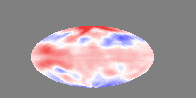
|
From: Martin B. <m.b...@st...> - 2010-02-17 14:36:04
|
thanks, this is working! It is possible to specify color ranges from 0.0 to 1.0 or from 0 to 255 (both is working). Martin On Mi, 2010-02-17 at 03:21 -0800, Thomas Sefzick wrote: > plot 'image.rgb' with rgbimage > > see 'help rgbimage' > > > Martin Becker-5 wrote: > > > > Hello, > > > > I want to plot images with gnuplot 4.2.4-6. > > I wrote a small C program that extracts RGB values for each pixel and > > stores it to a ASCII-file which should be supported. > > The first column is the x-position, the second the y-position, the rest > > are the rgb values: > > 0 0 255 255 255 > > 1 0 255 255 255 > > 2 0 255 255 255 > > 3 0 255 255 255 > > 4 0 255 255 255 > > 5 0 255 255 255 > > 6 0 255 255 255 > > 7 0 255 255 255 > > 8 0 255 255 255 > > 9 0 255 255 255 > > ... > > The first pixels are all white. > > First question: Should I use a range from 0 to 255 or from 0 to 1? > > > > Second question: How can I now plot that data? > > In the demo scripts I can only find examples with binary data. > > I tried many options similar to: > > plot 'image.rgb' format='%uchar%uchar%uchar' using ($3+$4+$5) with > > rgbimage > > and > > plot 'image.rgb' array=(1852x917) with rgbimage > > when using implicit xy-coordinates (without the first columns). > > > > I'm sure someone can point me to the solution. > > > > Thanks for your help! > > > > Martin |
|
From: Thomas S. <t.s...@fz...> - 2010-02-17 11:21:19
|
plot 'image.rgb' with rgbimage see 'help rgbimage' Martin Becker-5 wrote: > > Hello, > > I want to plot images with gnuplot 4.2.4-6. > I wrote a small C program that extracts RGB values for each pixel and > stores it to a ASCII-file which should be supported. > The first column is the x-position, the second the y-position, the rest > are the rgb values: > 0 0 255 255 255 > 1 0 255 255 255 > 2 0 255 255 255 > 3 0 255 255 255 > 4 0 255 255 255 > 5 0 255 255 255 > 6 0 255 255 255 > 7 0 255 255 255 > 8 0 255 255 255 > 9 0 255 255 255 > ... > The first pixels are all white. > First question: Should I use a range from 0 to 255 or from 0 to 1? > > Second question: How can I now plot that data? > In the demo scripts I can only find examples with binary data. > I tried many options similar to: > plot 'image.rgb' format='%uchar%uchar%uchar' using ($3+$4+$5) with > rgbimage > and > plot 'image.rgb' array=(1852x917) with rgbimage > when using implicit xy-coordinates (without the first columns). > > I'm sure someone can point me to the solution. > > Thanks for your help! > > Martin > > > ------------------------------------------------------------------------------ > SOLARIS 10 is the OS for Data Centers - provides features such as DTrace, > Predictive Self Healing and Award Winning ZFS. Get Solaris 10 NOW > http://p.sf.net/sfu/solaris-dev2dev > _______________________________________________ > gnuplot-info mailing list > gnu...@li... > https://lists.sourceforge.net/lists/listinfo/gnuplot-info > > -- View this message in context: http://old.nabble.com/loading-an-image-tp26861974p27622247.html Sent from the Gnuplot - User mailing list archive at Nabble.com. |
635 messages has been excluded from this view by a project administrator.