Re: [Audacity-quality] Sync-lock-look
A free multi-track audio editor and recorder
Brought to you by:
aosiniao
|
From: Gale A. <ga...@au...> - 2010-10-16 17:42:24
|
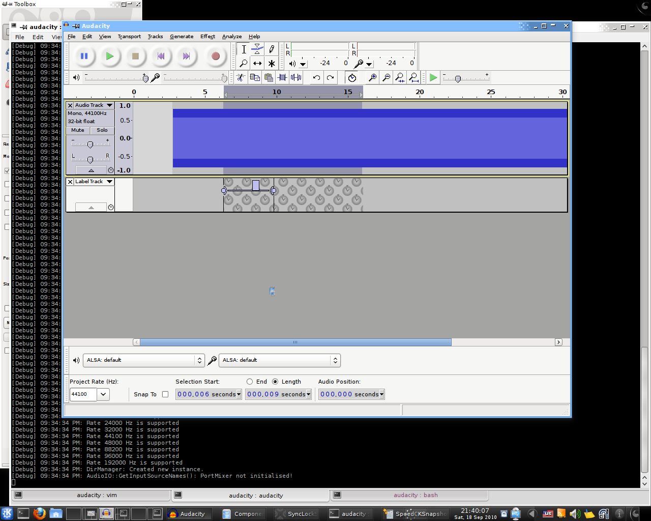
| From Bill Wharrie <bi...@go...> | Fri, 15 Oct 2010 11:40:36 -0400 | Subject: [Audacity-quality] Sync-lock-look > The Mac nightly build Audacity 1.3.13-alpha-Oct 15 2010 (Unicode) > still has the "non-tilted" sync-lock background. That's because Al hasn't had time to work on the tiles alignment or the suggested dotted line for the Sync-Locked selection. So there is nothing missing from the Mac 1.3.13 that exists on the other platforms. > I'd like to get started on the documentation of the sync-lock feature, > but need to know when the final version of the background is settled. Thanks for volunteering. Is it possible though to work with images of the tiles and Sync-Locked selections as they are now? This ought to be documented in time for 1.3.13 Beta being released, and the look of Sync-Lock may not necessarily be finished by then. If you want to keep up with code commits, you can join the audacity-svn Google group: http://groups.google.com/group/audacity-svn Gale > On 20-Sep-10, at 1:11 AM, Al Dimond wrote: > > > On Sunday, September 19, 2010 18:55:24 Gale Andrews wrote: > >> | From Steve the Fiddle <ste...@gm...> > >> | Sun, 19 Sep 2010 22:59:26 +0100 > >> | Subject: [Audacity-quality] Sync-lock-look > >> | > >>> Personally I prefer the more dense version - I find it easier to > >>> see the boundaries. > >> > >> That's exactly why I suggested marking the boundaries with a dotted > >> line (while still retaining less densely spaced tiles, so you are > >> still aware of the selection if it's very wide). The dotted line > >> could be either the same colour as the body of the clock tile, or > >> the colour of the clock hands, and the tiles are within that > >> boundary. It would make short selections much easier to > >> see/comfortable to look at. It would also provide a way to resolve > >> bug 222 without just assuming it's invalid: > >> http://bugzilla.audacityteam.org/show_bug.cgi?id=222 > >> > > > > You've brought this suggestion up a few times and I've always liked it > > in principle. There are be some challenges and design choices, and I'm > > pretty busy, but I'll try to have something next weekend. > > > >> Of course the dotted line looks "different" to the normal selection > >> but I think that's to the good if it's subtle. > >> > > > > I'm thinking maybe we could draw the dotted line subtly over the > > waveform, and then we could add a similar solid line for the real > > selection -- sometimes with very loud tracks the real selection is > > hard to see. An alpha-blended selection would be really good... > > probably post-2.0, along with many other waveform-drawing reforms > > (surely in 2010 we have the processing power to do better than we do > > now). > > > > - Al > > > >> I agree Al's "denser" variant is too dense (try it with one quiet > >> audio track and a region label selected underneath, vertically > >> fitted). > >> > >> I think the tilted square looks slightly less "mechanistic" anyway > >> - a bit more comforting, like real "wallpaper". > >> > >>> On a closely related issue, I've been making some alternative > >>> graphics for the sync-lock button but I can't work out how to > >>> put them into Audacity. I'd quite like to see it for real before > >>> submitting my > >> > >> See: > >> http://code.google.com/p/audacity/source/detail?r=10665 > >> http://code.google.com/p/audacity/source/detail?r=10673 > >> > >> > >> > >> Gale > >> > >>> On Sun, Sep 19, 2010 at 10:06 PM, Al Dimond > >>> > >>> <bus...@gm...> wrote: > >>>> On Monday, September 13, 2010 23:51:07 Vaughan Johnson wrote: > >>>>> Great. Go for it! Thx, V > >>>> > >>>> I've tried some different things and these are the ones that > >>>> are reasonable. First, tiles with 45-degree pattern. > >>>> > >>>> http://aldimond.users.sourceforge.net/clocktiles45-1.png > >>>> http://aldimond.users.sourceforge.net/clocktiles45-2.png > >>>> > >>>> Unfortunately this one is somewhat more dense than the > >>>> original. I think it's too dense... > >>>> > >>>> Second, a tilted-square grid: > >>>> > >>>> http://aldimond.users.sourceforge.net/clocktiles-tilt1.png > >>>> > >>>> This one required some code changes (I could have done it > >>>> without code changes and a 70x70 tile, but this way it's > >>>> easier to adjust -- I can make the tiles slightly more or less > >>>> dense without having to change the graphics). It satisfies my > >>>> design constraint and reduces density, so I'm pretty happy > >>>> with it. > >>>> > >>>> - Al |