Menu
▾
▴
tuxpaint-devel — General discussion list for Tux Paint developers
You can subscribe to this list here.
| 2005 |
Jan
|
Feb
|
Mar
(15) |
Apr
(5) |
May
(12) |
Jun
(15) |
Jul
(21) |
Aug
(2) |
Sep
(14) |
Oct
(32) |
Nov
(47) |
Dec
(39) |
|---|---|---|---|---|---|---|---|---|---|---|---|---|
| 2006 |
Jan
(33) |
Feb
(59) |
Mar
(17) |
Apr
(5) |
May
|
Jun
(6) |
Jul
(7) |
Aug
(19) |
Sep
(64) |
Oct
(161) |
Nov
(9) |
Dec
(23) |
| 2007 |
Jan
(6) |
Feb
(46) |
Mar
(55) |
Apr
(41) |
May
(43) |
Jun
(44) |
Jul
(46) |
Aug
(25) |
Sep
(16) |
Oct
(29) |
Nov
(50) |
Dec
(64) |
| 2008 |
Jan
(11) |
Feb
(18) |
Mar
(52) |
Apr
(37) |
May
(40) |
Jun
(78) |
Jul
(85) |
Aug
(31) |
Sep
(23) |
Oct
(13) |
Nov
(19) |
Dec
(37) |
| 2009 |
Jan
(36) |
Feb
(24) |
Mar
(86) |
Apr
(43) |
May
(36) |
Jun
(151) |
Jul
(23) |
Aug
(40) |
Sep
(11) |
Oct
(91) |
Nov
(68) |
Dec
(27) |
| 2010 |
Jan
|
Feb
(11) |
Mar
(79) |
Apr
(50) |
May
(26) |
Jun
(44) |
Jul
(31) |
Aug
(6) |
Sep
(2) |
Oct
(16) |
Nov
(11) |
Dec
(4) |
| 2011 |
Jan
(14) |
Feb
(5) |
Mar
(22) |
Apr
(1) |
May
(5) |
Jun
(5) |
Jul
(13) |
Aug
(1) |
Sep
(3) |
Oct
(18) |
Nov
(15) |
Dec
(25) |
| 2012 |
Jan
(1) |
Feb
(9) |
Mar
(41) |
Apr
(32) |
May
|
Jun
(2) |
Jul
(5) |
Aug
(2) |
Sep
|
Oct
|
Nov
|
Dec
(2) |
| 2013 |
Jan
|
Feb
(5) |
Mar
(16) |
Apr
(21) |
May
(3) |
Jun
(1) |
Jul
(1) |
Aug
|
Sep
|
Oct
(13) |
Nov
(1) |
Dec
(3) |
| 2014 |
Jan
|
Feb
(12) |
Mar
(6) |
Apr
(35) |
May
|
Jun
(12) |
Jul
(35) |
Aug
(98) |
Sep
(3) |
Oct
(8) |
Nov
(4) |
Dec
(1) |
| 2015 |
Jan
(4) |
Feb
(9) |
Mar
(58) |
Apr
(9) |
May
(15) |
Jun
(23) |
Jul
|
Aug
(32) |
Sep
(12) |
Oct
(21) |
Nov
(5) |
Dec
(14) |
| 2016 |
Jan
(6) |
Feb
(3) |
Mar
(37) |
Apr
(18) |
May
(5) |
Jun
(8) |
Jul
|
Aug
(21) |
Sep
(5) |
Oct
(20) |
Nov
(4) |
Dec
(6) |
| 2017 |
Jan
(2) |
Feb
|
Mar
|
Apr
(19) |
May
(8) |
Jun
(3) |
Jul
(3) |
Aug
(5) |
Sep
|
Oct
(4) |
Nov
(4) |
Dec
(6) |
| 2018 |
Jan
(3) |
Feb
|
Mar
|
Apr
|
May
(1) |
Jun
|
Jul
|
Aug
(4) |
Sep
(4) |
Oct
|
Nov
|
Dec
(3) |
| 2019 |
Jan
|
Feb
|
Mar
(5) |
Apr
|
May
|
Jun
(2) |
Jul
(1) |
Aug
(3) |
Sep
(14) |
Oct
(2) |
Nov
(1) |
Dec
|
| 2020 |
Jan
|
Feb
|
Mar
(1) |
Apr
(1) |
May
(2) |
Jun
|
Jul
|
Aug
(3) |
Sep
(15) |
Oct
(9) |
Nov
(11) |
Dec
(7) |
| 2021 |
Jan
(12) |
Feb
(2) |
Mar
(16) |
Apr
|
May
|
Jun
(11) |
Jul
|
Aug
(4) |
Sep
(24) |
Oct
(68) |
Nov
(61) |
Dec
|
| 2022 |
Jan
(42) |
Feb
(17) |
Mar
(20) |
Apr
(2) |
May
(23) |
Jun
(4) |
Jul
(6) |
Aug
|
Sep
(27) |
Oct
(4) |
Nov
(10) |
Dec
(31) |
| 2023 |
Jan
(4) |
Feb
(18) |
Mar
(8) |
Apr
(11) |
May
(18) |
Jun
(47) |
Jul
(1) |
Aug
(1) |
Sep
|
Oct
(1) |
Nov
(1) |
Dec
(2) |
| 2024 |
Jan
(10) |
Feb
|
Mar
|
Apr
(3) |
May
(4) |
Jun
(3) |
Jul
(6) |
Aug
|
Sep
(2) |
Oct
(1) |
Nov
|
Dec
(3) |
| 2025 |
Jan
(2) |
Feb
(11) |
Mar
(3) |
Apr
(1) |
May
(22) |
Jun
(5) |
Jul
(15) |
Aug
(5) |
Sep
|
Oct
|
Nov
|
Dec
|
|
From: Bill K. <nb...@so...> - 2023-02-10 10:40:55
|
When a starter image or template is not the exact same size as the canvas, it will of course be scaled up or down. We do not change the aspect ratio (change the shape, aka squash or stretch) of the picture, though. If the aspect ratio is not the same as the canvas (which it frequently is note), it will scale up as large as it can and then "smear" the edges that did not fill the canvas. This can look really weird & ugly, especially with the photographic ones (e.g., the rocky beach template). I just started work to allow option files (plaintext config files with the same name as the image file, but with ".dat" extension; same as we do with stamps and brushes) to allow this to be overridden for some starters & templates. I have done so already with the wool mill machinery, the rocky beach, and the reef (2-layer starter). They've all been set to use the same option, "autoscale=both". The "autoscale" option allows you to tell Tux Paint whether it's okay to scale the image up so much that the edges will be cropped away. For example, a wide starter on a narrow canvas can be scaled up so that it fits vertically, with the left/right sides getting discarded. And conversely, a narrow starter on a wide canvas can be scaled up so that it fits horizontally, with the top/bottom discarded. If it only makes sense to allow one dimension to be discarded (i.e., right & left is okay, but cutting off the top & bottom would be bad), you can specify either "autoscale=horizontal" or "autoscale=vertical". If no scaling is specified, it will scale up as much as it can without cropping anything, like it has been doing already. Now, though, you can also specify whether or not to "smear" (which will be the default), or to simply use a solid background color (which you specify with "background=..." in the file; it supports 6- and 3-digit hex (e.g., #FFFFFF & #000) and decimal, just like the color palette file does. This would be good for B&W coloring-book style starters (e.g., the skull SVG) which can sometimes end up with a very faint edge getting smeared all the way down the canvas. Note: If the "autoscale=both" option is set, the image will NEVER have any bare edges, no matter the shape of the canvas. So the background setting (smear, or use a background color) is moot. I posted a tweet on Twitter showing the rocky beach template, with before & after in both portrait & landscape canvases of rather extreme sizes (Tux Paint running at 1280x640 and 640x960). https://twitter.com/billkendrick/status/1623989004436901890 For the rocky beach template, for example, I don't think what's at the extreme edges "matters". And I'd prefer to have a drawing that looks like some nice rocks, regardless of my canvas' aspect ratio, rather than weird smeary edges. :) I need to test this a bunch more, document it (EXTENDING), and add sensible defaults for any starters & templates that would benefit from the different settings. I cannot guarantee that Tux Paint will behave very well with starters & templates [*] if you save a drawing, quit, change the canvas size (via setting a different window size), launch Tux Paint again, and open the image up again. However, I don't think it's done a great job with this _already_, so I'm not super concerned. What you'll see is that I only apply this "scale & crop?" and "background color or smear?" decision when loading the actual starter/template images, and don't do it to the saved drawing. It also gets a little tricky because as of late, we jam some of the starter & template stuff (including the entire background and foregrounds?!) into the PNG files, if I recall correctly. Basically, woe is me, I don't think I can make this "perfect"... but I think this improvement is probably beneficial. Holler if you have other ideas or concerns! -bill! [*] Starters would be more adversely affected since there is a top layer that applies itself to the image after every modification (paint, stamp, etc.) Warped & zoom-in/out effects could be seen. Templates are less of a concern, as they only come into play -- the same way as the starters' background layers -- when you use the Eraser tool. PS - This is https://sourceforge.net/p/tuxpaint/feature-requests/190/ |
|
From: Pere P. i C. <per...@gm...> - 2023-02-08 23:21:57
|
That was in a debug build, a more regular build speeds up a lot Check it at https://provant.freeddns.org/pere/public_html/developing/20230109/ Best Pere El dc. 08 de 02 de 2023 a les 13:29 +0100, en/na Pere Pujal i Carabantes va escriure: > Hi Bill, and all, > > El 7 de febrer de 2023 10:43:18 CET, Bill Kendrick <nb...@so...> ha escrit: > > > > I got a little obsessed over the "bloom" effect, and was struggling to > > understand Fast Fourier Transforms to get it done. Maybe some day. > > In the end, I brute-forced it and came up with an okay-looking (if not > > awesome, and not fast) effect. It's in the Git repo, please try it out. > > (Pere, let me know how it performs on Android... it's a lot of math!) > > I like this effect :) > > I've build Tux Paint for Android and found Bloom performs fine in my 2016 midrange phone. > Compared with Rush, Bloom is faster, it takes about 8 seconds to perform in fullscreen, > Rush takes about the double. > > I've noticed a couple of minor things: > Rush lacks progressbar > Googly eyes have the same icon and button string in both sizes making > hard to diferentiate between them. > > > > > > Thanks in advance! > > HTH > Pere |
|
From: Pere P. i C. <per...@gm...> - 2023-02-08 12:30:01
|
Hi Bill, and all, El 7 de febrer de 2023 10:43:18 CET, Bill Kendrick <nb...@so...> ha escrit: > >I got a little obsessed over the "bloom" effect, and was struggling to >understand Fast Fourier Transforms to get it done. Maybe some day. >In the end, I brute-forced it and came up with an okay-looking (if not >awesome, and not fast) effect. It's in the Git repo, please try it out. >(Pere, let me know how it performs on Android... it's a lot of math!) I like this effect :) I've build Tux Paint for Android and found Bloom performs fine in my 2016 midrange phone. Compared with Rush, Bloom is faster, it takes about 8 seconds to perform in fullscreen, Rush takes about the double. I've noticed a couple of minor things: Rush lacks progressbar Googly eyes have the same icon and button string in both sizes making hard to diferentiate between them. > >Thanks in advance! HTH Pere |
|
From: Bill K. <nb...@so...> - 2023-02-07 09:43:40
|
I got a little obsessed over the "bloom" effect, and was struggling to understand Fast Fourier Transforms to get it done. Maybe some day. In the end, I brute-forced it and came up with an okay-looking (if not awesome, and not fast) effect. It's in the Git repo, please try it out. (Pere, let me know how it performs on Android... it's a lot of math!) Thanks in advance! -- -bill! Sent from my computer |
|
From: Pere P. i C. <per...@gm...> - 2023-01-31 22:58:51
|
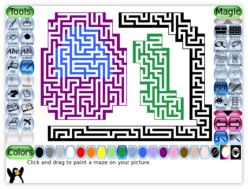
El dt. 31 de 01 de 2023 a les 09:50 -0800, en/na Bill Kendrick va escriure: > Since adding the "Googly Eyes" magic tool to what will become > Tux Paint 0.9.29, I've added four more! > > The "Maze" magic tool lets you 'paint' randomly-generated mazes > over your picture. You can create a few separate discontiguous > areas, and connect them later (within the same session of using > the tool). That last part was tricky, but rewarding. > > https://tuxpaint.org/latest/sshots/tuxpaint-0.9.29-maze.png Maze at 1920x1080, magic fullscreen let some areas with a solid color without maze, don't know if this is by design, increasing the limit to 100000 works fine in my box and I get no more solid color areas. while (state != STATE_DONE && iter < 100000); Not sure what could happen in low end devices, but here, even slowing Tux Paint with valgrind takes less than 2 seconds to do the magic fullscreen effect. I could not test in bigger displays, now Tux Paint refuses to increase the window size over the display size even if asked to do so. Other than that, the new magic tools look nice :) HTH Pere > > > My teenage son showed me a Scratch programming project [1] which > simulated circular brush strokes, by sampling parts of a background > and then selecting random spots on the image and drawing a stroke that > was at a 90-degree angle to the direction the point was, to the > cursor. I turned this into the "Circles" magic tool. I made a > variation that skips the 90-degree step, and called it "Rays". > You can see the results here: > > https://tuxpaint.org/latest/sshots/tuxpaint-0.9.29-circles-rays.png > https://twitter.com/TuxPaintTweets/status/1619582449830486016 > > > I then decided to see how it looked if I had the effect 'follow' > the mouse, rather than stay in one place, which you can see > demonstrated here: > > https://twitter.com/TuxPaintTweets/status/1619621388847050756 > > However, in the end, instead of doing that, I took the "Rays" effect, > shrunk it down, made it draw based on your chosen color (rather than > sampling from the existing image), and called it "Fur". Here it is, > together with "Googly Eyes" and "Bricks" to make a picture of Cookie > Monster from Sesame Street! ;) > > https://twitter.com/TuxPaintTweets/status/1619926974453157890/photo/1 > > Anyway, please try them out & give any feedback. Thanks! > |
|
From: Bill K. <nb...@so...> - 2023-01-31 17:50:33
|
Since adding the "Googly Eyes" magic tool to what will become Tux Paint 0.9.29, I've added four more! The "Maze" magic tool lets you 'paint' randomly-generated mazes over your picture. You can create a few separate discontiguous areas, and connect them later (within the same session of using the tool). That last part was tricky, but rewarding. https://tuxpaint.org/latest/sshots/tuxpaint-0.9.29-maze.png My teenage son showed me a Scratch programming project [1] which simulated circular brush strokes, by sampling parts of a background and then selecting random spots on the image and drawing a stroke that was at a 90-degree angle to the direction the point was, to the cursor. I turned this into the "Circles" magic tool. I made a variation that skips the 90-degree step, and called it "Rays". You can see the results here: https://tuxpaint.org/latest/sshots/tuxpaint-0.9.29-circles-rays.png https://twitter.com/TuxPaintTweets/status/1619582449830486016 I then decided to see how it looked if I had the effect 'follow' the mouse, rather than stay in one place, which you can see demonstrated here: https://twitter.com/TuxPaintTweets/status/1619621388847050756 However, in the end, instead of doing that, I took the "Rays" effect, shrunk it down, made it draw based on your chosen color (rather than sampling from the existing image), and called it "Fur". Here it is, together with "Googly Eyes" and "Bricks" to make a picture of Cookie Monster from Sesame Street! ;) https://twitter.com/TuxPaintTweets/status/1619926974453157890/photo/1 Anyway, please try them out & give any feedback. Thanks! -- -bill! Sent from my computer |
|
From: Bill K. <nb...@so...> - 2023-01-25 10:52:50
|
When using the Zoom and Perspective tools, the currently-chosen
color is used as a solid background color "behind" the altered
(e.g., shrunk via zoom) version of your drawing.

You can change the color at any time, however it is not reflected
in the picture until you adjust the zoom factor or perspective
angles.

I've rectified this, which involved making Magic tools'
"XYZ_set_color()" function accept more arguments.  (Before, it was
only getting a "magic_api *" and the three "Uint8" values
corresponding to the red, green, and blue values of the new color.)

Now, it also receives an "int" corresponding to which of the Magic
tool object's individual tools is being used (I usually give the
variable the name "which"), a snapshot of the canvas, and the
canvas itself (both "SDL_Surface *"s), and an "SDL_Rect *"
(I usually name it "update_rect") to send back the area of the
canvas that was updated, so Tux Paint can refresh it.

I've updated _all_ other magic tool source (.c) files, but two
things:

(1) These new, as-of-yet unused (and in most cases, never-to-be used)
    arguments are not flagged with "ATTRIBUTE_UNUSED", so building
    Tux Paint will result in a lot of "unused parameter" warnings.

    Also, I went on a copy/paste spree to add the new variables,
    so many places where the r/g/b value variables had that flag
    lost it, so now they are _also_ going to throw "unused parameter"
    warnings.

    I'll try to go back in and clean this up soon.  Bedtime now, though!

(2) While we look for whether or not all Magic API functions exist in
    the compiled object files _at all_, we do not currently check that
    they're actually accepting the arguments we feeding into them!

    So for example, if I had left any "set_color()" functions
    accepting only the API pointer and RGB values, they would not
    get fed a couple of "SDL_Surface *" pointers, and use their
    values as some of the color variables. :-[

    We're using SDL_LoadFunction(), which just returns a "void*",
    which we cast to an expected function declaration.
    I'm not sure how (or whether it's even feasible) to try and check
    that the function that we're loading from the Magic's object file
    actually accepts parameters we expect it to, and in the right
    order. [*]

    If anyone has clever ideas here, I'm all ears.


[*] For a while, I've pondered making Tux Paint's magic API more
    event-driven than function-based (like Qualcomm BREW was on
    mobile devices).

    In other words, each object would have an overarching function
    that accepted events, and responds to them (or ignores them) as
    needed.

    That way, if for example a Magic tool doesn't use colors at all,
    it could just ignore the incoming event (not even test for it
    in an "if" or "switch/case").  And there wouldn't be any need
    to waste a bunch of space declaring an empty function like:

      void XYZ_set_color(...<lots of arguments>...)
      {
      }

    This would require a MAJOR overhaul to _every_ Magic source file.
    And since the API changes rarely (I've now bumped it up to
    "version 7", and it took about 15 years to get there :-) ), I'm
    not sure it's worth the effort.  We don't really have people
    scrambling to write Magic tools.


Anyway, just an FYI /slash/ late night ramble...

--
-bill!
Sent from my computer
|
|
From: Bill K. <nb...@so...> - 2023-01-04 08:22:28
|
I recently upgraded to Ubuntu 22.04 LTS, and it seems
that I have Python 3 now, not Python 2.  So the ancient old
scripts that manage the Tux Paint Stamps description text files
(".txt"), and the gettext translation catalog
("tuxpaint-stamps.pot" and the dozens of ".po" files) stopped
working for me.

So, I stabbed at the dark and Googled a bunch, and I believe I
got it all working properly now.

However, if anyone who's still out here is _versed_ in Python,
please look over the scripts and let me know if anything needs
adjusting (or feel free to play with it in the Git repo;
or in a fork of the 'tuxpaint-stamps' repository, and send me
a Pull Request over on SourceForge, if you'd prefer).

In the end, my goal was that, when running "createpo.sh" (which runs
"txt2po.py"), that the ".pot" and ".po" files in the "po/"
subdirectory were not changed in any unexpected ways (per a `git diff`).

And similarly, that running "createtxt.sh" (which runs "po2txt.py")
didn't cause a ton of unexpected changed to the description ".txt"
files found in the "stamps/..." hierarchy of directories.

So far so good!  Running it tonight, it did catch up with some
PO changes that have come in since the June 2022 release of
the Stamps package.  And ALL translations to the description of
the "seasonal/hanukkah/dreydl-shin" stamp went away, because
the main English string at the top changed, so nothing matched it
in the PO files... as expected!

Thanks in advance, and happy new year!!!

--
-bill!
Sent from my computer
|
|
From: Bill K. <nb...@so...> - 2022-12-31 01:13:55
|
On Fri, Dec 30, 2022 at 11:17:11PM +0100, Pere Pujal i Carabantes wrote: <snip> > "large googly eye" and "small googly eye" are going untranslated to the > final string, other than that it is nice :) Oops, yep! I'll fix it tonight :) Thanks for testing! -bill! |
|
From: Pere P. i C. <per...@gm...> - 2022-12-30 22:17:28
|
El dj. 29 de 12 de 2022 a les 16:21 -0800, en/na Bill Kendrick va escriure: > I recently added a "Googly Eyes" Magic tool to Tux Paint > (it appears as two options; small and large variations, > not unlike "Bricks" tool). > > Please pull from master, try it out, and report any issues! > Thanks & happy new year everyone!!! > "large googly eye" and "small googly eye" are going untranslated to the final string, other than that it is nice :) Happy new year too Pere |
|
From: Bill K. <nb...@so...> - 2022-12-30 00:21:55
|
I recently added a "Googly Eyes" Magic tool to Tux Paint (it appears as two options; small and large variations, not unlike "Bricks" tool). Please pull from master, try it out, and report any issues! Thanks & happy new year everyone!!! -- -bill! Sent from my computer |
|
From: Shin-ichi T. <dol...@wm...> - 2022-12-22 21:13:50
|
>Are there fonts that have hiragana but not katakana? >Are there fonts that have katakana but not hiragana? Not sure. That sounds strange if such one exist, though. >Oh. This might depend on the platform. (GNOME, KDE, MacOS...) >I thought the OS would provide an input method to handle kanji. No, Tux Paint does not suppot inputting kanji on any platform. Regarding the UI font, my preference is to fix it to ja.ttf included in the package. (This was my background thougt when I replaced it with modern nice one) |
|
From: Albert C. <aca...@gm...> - 2022-12-22 20:09:43
|
> Thanks. Added 'Yen' to spare-1a. Sorry, don't bother. I just realized that Unicode unified the Yen and Yuan, so you can't distinguish them. I had incorrectly thought that one of the symbols had only a single horizontal bar. I guess they look the same??? Also, the Yen symbol is in ISO 8859-1 (Latin 1) and will thus be available in many fonts that do not support Japanese. >>I don't see all three Japanese glyph sets: katakana, hiragana, kanji > > I used two kanji in 'spare-1a' and one hiragana and one katakana in > 'spare-9b'. > I think this is enough for me so far. Are there fonts that have hiragana but not katakana? Are there fonts that have katakana but not hiragana? If such fonts exist, you probably want to rank them below the fonts that have both. >>Is anything else required to downrate fonts that would render the >>kanji in the Traditional Chinese, Simplified Chinese, or Korean style? > > No, I don't think so, because there is no way to input kanji with text > or label tool so far. Oh. This might depend on the platform. (GNOME, KDE, MacOS...) I thought the OS would provide an input method to handle kanji. It's kind of a problem, isn't it? I know kids don't learn that first, but eventually they will want to use kanji I think. You could put the most important ones in a stamp collection. Maybe this is terrible, but you could add an option to start Tux Paint with all the ASCII letters mapped to kanji. That is enough for 52 of them. Type an "A" and you get a kanji, etc. |
|
From: Shin-ichi T. <dol...@wm...> - 2022-12-22 14:22:51
|
On Wed, 21 Dec 2022 02:01:57 -0800, Bill Kendrick wrote: >Shin-ichi, I see you had added '1a' and '9a', but leat '1b' and '9b' >with the msgid _as_ the msgstr (something I just removed from most of >the other PO files). > >I'd assume it makes more sense to leave them blank / untranslated >(`msgstr ""`), rather than do that. But I didn't want to stomp on >your work. Thoughts? (Albert too, of course!) It was just to keep translation ratio as 100% ;-p I removed them. On Wed, 21 Dec 2022 06:21:45 -0500, Albert Cahalan wrote: >> ja.po-msgstr "漢字" >> ja.po:msgstr "<1>spare-1b" >> ja.po-msgstr "あア" >> ja.po:msgstr "<9>spare-9b" > >I don't see the Yen, which should be compared with the Yuan to >ensure that they are distinct. (some fonts mix them up, or used to) Thanks. Added 'Yen' to spare-1a. >I don't see all three Japanese glyph sets: katakana, hiragana, kanji I used two kanji in 'spare-1a' and one hiragana and one katakana in 'spare-9b'. I think this is enough for me so far. >Is anything else required to downrate fonts that would render the >kanji in the Traditional Chinese, Simplified Chinese, or Korean style? No, I don't think so, because there is no way to input kanji with text or label tool so far. Thanks! -- Shin-ichi TOYAMA <dol...@wm...> |
|
From: Albert C. <aca...@gm...> - 2022-12-21 11:21:57
|
> I noticed a lot of translators, back when these strings existed > (but were not utilized) either translated them literally, or put > the string, as-is, in the "msgstr" field of their POs. This will work correctly. It is the intended usage, more or less. > I've attempted to remove all of those (replaced with `msgstr ""`). I guess this works too, but it sure wasn't intended usage. > ca.po-msgstr "aa" > ca.po-msgstr "aa" > ca.po-msgstr "eèéëcç" > ca.po-msgstr "EÉÈËCÇ" needs «» needs Euro symbol > ca@valencia.po-msgstr "aa" > ca@valencia.po-msgstr "aa" > ca@valencia.po-msgstr "eèéëcÇ" > ca@valencia.po-msgstr "EÉÈËCÇ" needs «» needs Euro symbol > de.po-msgstr "aa" > de.po-msgstr "aa" > de.po-msgstr "äüöß" > de.po-msgstr "ÄÜÖ" needs both cases for ßẞ needs «» needs Euro symbol needs center dot (for multiplication) > hu.po-msgstr "áíűőüöúóé" > hu.po-msgstr "ÁÍŰŐÜÖÓÉ" maybe needs Euro symbol maybe needs low and high quote marks > is.po-msgstr "aa" > is.po-msgstr "AA" > is.po-msgstr "ðéíóúþæö" > is.po-msgstr "ÐÉÍÓÚÞÆÖ" maybe needs Euro symbol maybe needs low and high quote marks > it.po-msgstr "aa" > it.po-msgstr "aa" > it.po-msgstr "èòàì" > it.po-msgstr "ÈÒÀÌ" needs «» needs Euro symbol > ja.po-msgstr "漢字" > ja.po:msgstr "<1>spare-1b" > ja.po-msgstr "あア" > ja.po:msgstr "<9>spare-9b" I don't see the Yen, which should be compared with the Yuan to ensure that they are distinct. (some fonts mix them up, or used to) I don't see all three Japanese glyph sets: katakana, hiragana, kanji Is anything else required to downrate fonts that would render the kanji in the Traditional Chinese, Simplified Chinese, or Korean style? (FYI, many of these characters were unified by the Unicode Consortium, but the graphical appearance has distinctions that people care about) > I'd assume it makes more sense to leave them blank / untranslated > (`msgstr ""`), rather than do that. But I didn't want to stomp on > your work. Thoughts? (Albert too, of course!) There had been the thought originally that the translators could supply the weight numbers. Maybe the <9> would be parsed, so it could instead be <23> or <-4> or whatever. Perhaps that is needlessly complicated. It may be enough to have just the 4 choices. Increasing that to 9 choices, without getting fancy, is not so hard. (would likely be 1a, 1b, 1c, 5a, 5b, 5c, 9a, 9b, 9c) Leaving them untranslated: the repeated characters match, causing failure, so a harmless 0 is added. Translating them to an empty string: I think this too might be a 0, but in any case it is a constant value and thus harmless. Performance could be a tiny bit better with empty strings. > Should we drop a note onto the tuxpaint-i18n@ mailing list to ask > translators to look at this again? Yes, but maybe wait until the above is all cleared up. |
|
From: Bill K. <nb...@so...> - 2022-12-21 10:02:07
|
On Wed, Dec 21, 2022 at 12:09:05AM +0900, Shin-ichi TOYAMA wrote: > Hi! > > I enabled the spare characters for font scoring, and added following > comment for "<1>spare-1a". <snip> I noticed a lot of translators, back when these strings existed (but were not utilized) either translated them literally, or put the string, as-is, in the "msgstr" field of their POs. I've attempted to remove all of those (replaced with `msgstr ""`). https://sourceforge.net/p/tuxpaint/tuxpaint/ci/0257d37b2716eb46edf598f584bf03df4a08f33e/ Here's what I see in there now, per this command: grep -A 1 "spare-" *.po | grep msgstr | grep -v '""' ca.po-msgstr "aa" ca.po-msgstr "aa" ca.po-msgstr "eèéëcç" ca.po-msgstr "EÉÈËCÇ" ca@valencia.po-msgstr "aa" ca@valencia.po-msgstr "aa" ca@valencia.po-msgstr "eèéëcÇ" ca@valencia.po-msgstr "EÉÈËCÇ" de.po-msgstr "aa" de.po-msgstr "aa" de.po-msgstr "äüöß" de.po-msgstr "ÄÜÖ" gd.po:msgstr "<1>spare-1a" gd.po:msgstr "<1>spare-1b" gd.po:msgstr "<9>spare-9a" gd.po:msgstr "<9>spare-9b" [oops I missed this! hard to edit ~130 files at once at 2am ;-) ] hu.po-msgstr "áíűőüöúóé" hu.po-msgstr "ÁÍŰŐÜÖÓÉ" is.po-msgstr "aa" is.po-msgstr "AA" is.po-msgstr "ðéíóúþæö" is.po-msgstr "ÐÉÍÓÚÞÆÖ" it.po-msgstr "aa" it.po-msgstr "aa" it.po-msgstr "èòàì" it.po-msgstr "ÈÒÀÌ" ja.po-msgstr "漢字" ja.po:msgstr "<1>spare-1b" ja.po-msgstr "あア" ja.po:msgstr "<9>spare-9b" Shin-ichi, I see you had added '1a' and '9a', but leat '1b' and '9b' with the msgid _as_ the msgstr (something I just removed from most of the other PO files). I'd assume it makes more sense to leave them blank / untranslated (`msgstr ""`), rather than do that. But I didn't want to stomp on your work. Thoughts? (Albert too, of course!) Should we drop a note onto the tuxpaint-i18n@ mailing list to ask translators to look at this again? -bill! |
|
From: Shin-ichi T. <dol...@wm...> - 2022-12-20 15:09:17
|
Hi!
I enabled the spare characters for font scoring, and added following
comment for "<1>spare-1a".
----------------------------------------------------------------
If neccessary, translate any of following strings using at least
two locale specific characters required to render your language.
Then, the scores for those fonts having such characters will increase.
You can use two different weight for scoring, 1 or 9, according
to the importance.
----------------------------------------------------------------
Please feel free to point out any odd or missing phrase.
Thanks.
On Sun, 18 Dec 2022 02:19:34 -0800, Bill Kendrick wrote:
>
>Peeking in before bedtime. Hi Albert, been a while! :-D
>Thanks for the guidance here. I'm glad to see some motion here,
>and wonder if a small bit of documentation somewhere on the
>Tux Paint site (under /help/po/<something>), or maybe even in
>the program's own documentation (adding to the EXTENDING doc's
>"Translations" section) might be in order?!
>
>I recently tried to tweak the comments in dirwalk.c to help
>get the comment-based docs we _did_ have to appear in the
>POT & PO files (they were missing(!)), which is a step in
>the right direction. :)
>
>-bill!
>
>On Sun, Dec 18, 2022 at 05:00:10AM -0500, Albert Cahalan wrote:
>> >>Would this chunk of currently unused code help you?
>> >>
>> >> // translation spares -- design not finalized
>> >>#if 0
>> >> user_font_styles[num_font_styles]->score +=
>> >> charset_works(font, gettext("<1>spare-1a"));
>> >> user_font_styles[num_font_styles]->score +=
>> >> charset_works(font, gettext("<1>spare-1b"));
>> >> user_font_styles[num_font_styles]->score +=
>> >> charset_works(font, gettext("<9>spare-9a")) * 9;
>> >> user_font_styles[num_font_styles]->score +=
>> >> charset_works(font, gettext("<9>spare-9b")) * 9;
>> >>#endif
>> >>
>> >>It should not impact English, but that could use documentation!
>> >>The text has repeated digits, either "1" or "9", causing the font
>> >>to be considered bad, and thus the score does not increase.
>> >>
>> >>So you could translate like this:
>> >>
>> >>"<9>spare-9a" becomes a pair of hiragana.
>> >>"<9>spare-9b" becomes a pair of katakana.
>> >>"<1>spare-1a" becomes a pair of kanji.
>> >>"<1>spare-1b" becomes the Yen and Yuan currency symbols.
>> >
>> > Oh, I think it will be the one I wanted to have!
>> >
>> > Of course I've noticed this unused part, but did not recognize the
>> > difference to the one I proposed.
>> >
>> > Yes, the key is that original string has two same characters, is'nt
>> > it! How clever!
>> >
>> > Do you mind if I enable this block now ?
>>
>> If it meets your needs, you should enable it. It was intended to
>> help you, but I wasn't sure if it would be the right thing.
>> I left it disabled because I was unsure if it would be suitable.
>>
>> Maybe you should add some comments to document it.
>> If any paragraph from my email has been helpful, feel free
>> to put it in a comment.
>>
>> Notice that two of them are multiplied by 9. That gives them
>> a stronger influence over font order. I think you'll want to use
>> those for hiragana and katakana, and to use the others for
>> kanji and the yen symbol. If you need more spares, add them.
>>
>>
>> _______________________________________________
>> Tuxpaint-devel mailing list
>> Tux...@li...
>> https://lists.sourceforge.net/lists/listinfo/tuxpaint-devel
>
--
Shin-ichi TOYAMA <dol...@wm...>
|
|
From: Albert C. <aca...@gm...> - 2022-12-18 22:06:21
|
On 12/18/22, Bill Kendrick <nb...@so...> wrote: > > Peeking in before bedtime. Hi Albert, been a while! :-D Yeah, I got a job and 13 homeschooled kids. > Thanks for the guidance here. I'm glad to see some motion here, > and wonder if a small bit of documentation somewhere on the Probably yes, but first, is this the right design? Certainly it will work, and maybe that is enough. I had been pondering some way to make the weights adjustable by the translators. For example, where it has "<9>", the code could be made to parse that. Perhaps that ability just isn't worthwhile. A few fixed weight choices, like the 1 and 9 currently in the code, might be plenty. Adding a weight of 5 is easy enough. Just the existing 1 and 9 could be enough. |
|
From: Bill K. <nb...@so...> - 2022-12-18 10:19:46
|
Peeking in before bedtime.  Hi Albert, been a while! :-D
Thanks for the guidance here.  I'm glad to see some motion here,
and wonder if a small bit of documentation somewhere on the
Tux Paint site (under /help/po/<something>), or maybe even in
the program's own documentation (adding to the EXTENDING doc's
"Translations" section) might be in order?!

I recently tried to tweak the comments in dirwalk.c to help
get the comment-based docs we _did_ have to appear in the
POT & PO files (they were missing(!)), which is a step in
the right direction. :)

-bill!

On Sun, Dec 18, 2022 at 05:00:10AM -0500, Albert Cahalan wrote:
> >>Would this chunk of currently unused code help you?
> >>
> >>          // translation spares -- design not finalized
> >>#if 0
> >>          user_font_styles[num_font_styles]->score +=
> >>            charset_works(font, gettext("<1>spare-1a"));
> >>          user_font_styles[num_font_styles]->score +=
> >>            charset_works(font, gettext("<1>spare-1b"));
> >>          user_font_styles[num_font_styles]->score +=
> >>            charset_works(font, gettext("<9>spare-9a")) * 9;
> >>          user_font_styles[num_font_styles]->score +=
> >>            charset_works(font, gettext("<9>spare-9b")) * 9;
> >>#endif
> >>
> >>It should not impact English, but that could use documentation!
> >>The text has repeated digits, either "1" or "9", causing the font
> >>to be considered bad, and thus the score does not increase.
> >>
> >>So you could translate like this:
> >>
> >>"<9>spare-9a" becomes a pair of hiragana.
> >>"<9>spare-9b" becomes a pair of katakana.
> >>"<1>spare-1a" becomes a pair of kanji.
> >>"<1>spare-1b" becomes the Yen and Yuan currency symbols.
> >
> > Oh, I think it will be the one I wanted to have!
> >
> > Of course I've noticed this unused part, but did not recognize the
> > difference to the one I proposed.
> >
> > Yes, the key is that original string has two same characters, is'nt
> > it! How clever!
> >
> > Do you mind if I enable this block now ?
>
> If it meets your needs, you should enable it. It was intended to
> help you, but I wasn't sure if it would be the right thing.
> I left it disabled because I was unsure if it would be suitable.
>
> Maybe you should add some comments to document it.
> If any paragraph from my email has been helpful, feel free
> to put it in a comment.
>
> Notice that two of them are multiplied by 9. That gives them
> a stronger influence over font order. I think you'll want to use
> those for hiragana and katakana, and to use the others for
> kanji and the yen symbol. If you need more spares, add them.
>
>
> _______________________________________________
> Tuxpaint-devel mailing list
> Tux...@li...
> https://lists.sourceforge.net/lists/listinfo/tuxpaint-devel

--
-bill!
Sent from my computer
|
|
From: Albert C. <aca...@gm...> - 2022-12-18 10:00:22
|
>>Would this chunk of currently unused code help you?
>>
>>          // translation spares -- design not finalized
>>#if 0
>>          user_font_styles[num_font_styles]->score +=
>>            charset_works(font, gettext("<1>spare-1a"));
>>          user_font_styles[num_font_styles]->score +=
>>            charset_works(font, gettext("<1>spare-1b"));
>>          user_font_styles[num_font_styles]->score +=
>>            charset_works(font, gettext("<9>spare-9a")) * 9;
>>          user_font_styles[num_font_styles]->score +=
>>            charset_works(font, gettext("<9>spare-9b")) * 9;
>>#endif
>>
>>It should not impact English, but that could use documentation!
>>The text has repeated digits, either "1" or "9", causing the font
>>to be considered bad, and thus the score does not increase.
>>
>>So you could translate like this:
>>
>>"<9>spare-9a" becomes a pair of hiragana.
>>"<9>spare-9b" becomes a pair of katakana.
>>"<1>spare-1a" becomes a pair of kanji.
>>"<1>spare-1b" becomes the Yen and Yuan currency symbols.
>
> Oh, I think it will be the one I wanted to have!
>
> Of course I've noticed this unused part, but did not recognize the
> difference to the one I proposed.
>
> Yes, the key is that original string has two same characters, is'nt
> it! How clever!
>
> Do you mind if I enable this block now ?

If it meets your needs, you should enable it. It was intended to
help you, but I wasn't sure if it would be the right thing.
I left it disabled because I was unsure if it would be suitable.

Maybe you should add some comments to document it.
If any paragraph from my email has been helpful, feel free
to put it in a comment.

Notice that two of them are multiplied by 9. That gives them
a stronger influence over font order. I think you'll want to use
those for hiragana and katakana, and to use the others for
kanji and the yen symbol. If you need more spares, add them.
|
|
From: Shin-ichi T. <dol...@wm...> - 2022-12-18 08:31:35
|
Hi!

On Sun, 18 Dec 2022 02:35:18 -0500, Albert Cahalan wrote:

>Would this chunk of currently unused code help you?
>
>          // translation spares -- design not finalized
>#if 0
>          user_font_styles[num_font_styles]->score +=
>            charset_works(font, gettext("<1>spare-1a"));
>          user_font_styles[num_font_styles]->score +=
>            charset_works(font, gettext("<1>spare-1b"));
>          user_font_styles[num_font_styles]->score +=
>            charset_works(font, gettext("<9>spare-9a")) * 9;
>          user_font_styles[num_font_styles]->score +=
>            charset_works(font, gettext("<9>spare-9b")) * 9;
>#endif
>
>It should not impact English, but that could use documentation!
>The text has repeated digits, either "1" or "9", causing the font
>to be considered bad, and thus the score does not increase.
>
>So you could translate like this:
>
>"<9>spare-9a" becomes a pair of hiragana.
>"<9>spare-9b" becomes a pair of katakana.
>"<1>spare-1a" becomes a pair of kanji.
>"<1>spare-1b" becomes the Yen and Yuan currency symbols.

Oh, I think it will be the one I wanted to have!

Of course I've noticed this unused part, but did not recognize the
difference to the one I proposed.

Yes, the key is that original string has two same characters, is'nt
it! How clever!

Do you mind if I enable this block now ?
|
|
From: Albert C. <aca...@gm...> - 2022-12-18 07:35:25
|
> By the way, I have not still understand well why the evaluation string
> are separated to some categories like 'cases', 'line-like' and so on.

It makes sense for ASCII. Probably you should leave that
untranslated. I don't know how much you care about ASCII.

> Because of this, as pere pointed out, just adding Japanese characters to
> just one category may not push it on top, therfore, I suppose that I
> have to add them to multiple categories, if I want to see them on top.
>
> In addition, I still feel a little unconfortable that there is no
> suitable existing category for Hiragana and Katakana, although I know it
> does not matter where to put them.

Would this chunk of currently unused code help you?

          // translation spares -- design not finalized
#if 0
          user_font_styles[num_font_styles]->score +=
            charset_works(font, gettext("<1>spare-1a"));
          user_font_styles[num_font_styles]->score +=
            charset_works(font, gettext("<1>spare-1b"));
          user_font_styles[num_font_styles]->score +=
            charset_works(font, gettext("<9>spare-9a")) * 9;
          user_font_styles[num_font_styles]->score +=
            charset_works(font, gettext("<9>spare-9b")) * 9;
#endif

It should not impact English, but that could use documentation!
The text has repeated digits, either "1" or "9", causing the font
to be considered bad, and thus the score does not increase.

So you could translate like this:

"<9>spare-9a" becomes a pair of hiragana.
"<9>spare-9b" becomes a pair of katakana.
"<1>spare-1a" becomes a pair of kanji.
"<1>spare-1b" becomes the Yen and Yuan currency symbols.

If you really want to force all fonts to support Japanese,
you can translate the "qx" and "QX" strings. Append a pair
of katakana, a pair of hiragana, and a pair of kanji.
It shouldn't matter if you add the pairs to "qx" or "QX".
Those are only distinct because English users don't want
to completely disqualify fonts that lack the case distinction.

If you force all fonts to support Japanese, then you
lose all kinds of silly decorative fonts. For example,
there might be a font that contains pictures of animals
in place of the ASCII letters, so "A" is a monkey and "B"
is an elephant and so on.
|
|
From: Shin-ichi T. <dol...@wm...> - 2022-12-18 07:09:18
|
My current conclusion is not to add Japanese characters to the ASCII strings for scoring, and to give up showing the fonts supporting Japanese characters on top. If I add more than two Japanese characters, for example, to 'Oo', this will disable scoring for the fonts which does not support Japanese characters based on case distinction. And this will be the same for any other category such as line-llike, circle-like and so on. This is not the result I want to see. I just wanted to see the locale fonts on top, and leave the other scoring as they are. On Sun, 18 Dec 2022 14:24:36 +0900, Shin-ichi TOYAMA wrote: >Thank you again! > >I noticed that there is a quite bad side effect in "ABC...xyz" approach >that it overly score the fonts which render the string correctly if the >string is not translated. > >Then, I reverted dirwalk.c. Sorry for the mess. > >By the way, I have not still understand well why the evaluation string >are separated to some categories like 'cases', 'line-like' and so on. > >Because of this, as pere pointed out, just adding Japanese characters to >just one category may not push it on top, therfore, I suppose that I >have to add them to multiple categories, if I want to see them on top. > >In addition, I still feel a little unconfortable that there is no >suitable existing category for Hiragana and Katakana, although I know it >does not matter where to put them. > >However, I will do what I have to do in the existing method so far. > >Thanks. > > >On Sat, 17 Dec 2022 21:39:53 -0500, Albert Cahalan wrote: >>> I understand adding locale characters to the existing criteria works. >>> >>> However, I am a little at a loss where to put them, because; >>> >>> * Japanese has no upper/lower cases distinction. >>> * No common/special Japanese panctuations is used in Tux Paint. >>> * Numbers are not different to those in ASCII. >>> * It has no line-like/circle-like characters. >>> >>> In addition, I think it would be reasonable to give high priority to the >>> fonts supporting locale specific characters. >>> >>> I've pushed the change already, and would like to keep it if this has no >>> side effect. >> >>I would prefer the original design. It is not beneficial to have >>a second string that is redundant. This only makes the code >>more confusing for translators to use. >> >>In the original design, the only flaw I can see is that the >>intended usage was not documented very well. >> >>The entire reason to have the string be translated with gettext was >>to support languages like Japanese. It was meant for you to use. >>If there are now two strings, why would the original one need to be >>translated at all? This does not make sense. >> >>It doesn't matter that Japanese lacks uppercase/lowercase, >>has no line-like or circle-like characters, or shares numbers >>with ASCII. You should simply add Japanese characters. >>Leave the ASCII characters too, if it is at all reasonable for >>a Japanese person to use them. >> >>So to summarize proper usage: >> >>Add characters that matter, choosing a few that are most likely >>to be missing or indistinct. Remove any characters that have >>no value at all. Most likely, you add characters but do not remove >>any characters. >> >>My suggestion for Japanese specifically: >> >>Leave the ASCII. Add two katakana, two hirigana, and two kanji. >>Add the Yen symbol. Maybe add the Yuan symbol, in case there >>are fonts that unify them. If there exists a pair of characters that >>appear distinct in a good Japanese font but might be identical or >>missing in a Chinese or Korean font, be sure to add them. >> >>It is highly likely that multiple translators have make mistakes. >>Nearly all translations should retain the ASCII, adding a few >>new characters. >> >>For example, German should add: ẞßβÖö€ >>That prefers fonts that distinguish lowercase eszett >>from beta (a Greek letter) and uppercase eszett. >> >> >>_______________________________________________ >>Tuxpaint-devel mailing list >>Tux...@li... >>https://lists.sourceforge.net/lists/listinfo/tuxpaint-devel > > -- Shin-ichi TOYAMA <dol...@wm...> |
|
From: Shin-ichi T. <dol...@wm...> - 2022-12-18 05:24:52
|
Thank you again! I noticed that there is a quite bad side effect in "ABC...xyz" approach that it overly score the fonts which render the string correctly if the string is not translated. Then, I reverted dirwalk.c. Sorry for the mess. By the way, I have not still understand well why the evaluation string are separated to some categories like 'cases', 'line-like' and so on. Because of this, as pere pointed out, just adding Japanese characters to just one category may not push it on top, therfore, I suppose that I have to add them to multiple categories, if I want to see them on top. In addition, I still feel a little unconfortable that there is no suitable existing category for Hiragana and Katakana, although I know it does not matter where to put them. However, I will do what I have to do in the existing method so far. Thanks. On Sat, 17 Dec 2022 21:39:53 -0500, Albert Cahalan wrote: >> I understand adding locale characters to the existing criteria works. >> >> However, I am a little at a loss where to put them, because; >> >> * Japanese has no upper/lower cases distinction. >> * No common/special Japanese panctuations is used in Tux Paint. >> * Numbers are not different to those in ASCII. >> * It has no line-like/circle-like characters. >> >> In addition, I think it would be reasonable to give high priority to the >> fonts supporting locale specific characters. >> >> I've pushed the change already, and would like to keep it if this has no >> side effect. > >I would prefer the original design. It is not beneficial to have >a second string that is redundant. This only makes the code >more confusing for translators to use. > >In the original design, the only flaw I can see is that the >intended usage was not documented very well. > >The entire reason to have the string be translated with gettext was >to support languages like Japanese. It was meant for you to use. >If there are now two strings, why would the original one need to be >translated at all? This does not make sense. > >It doesn't matter that Japanese lacks uppercase/lowercase, >has no line-like or circle-like characters, or shares numbers >with ASCII. You should simply add Japanese characters. >Leave the ASCII characters too, if it is at all reasonable for >a Japanese person to use them. > >So to summarize proper usage: > >Add characters that matter, choosing a few that are most likely >to be missing or indistinct. Remove any characters that have >no value at all. Most likely, you add characters but do not remove >any characters. > >My suggestion for Japanese specifically: > >Leave the ASCII. Add two katakana, two hirigana, and two kanji. >Add the Yen symbol. Maybe add the Yuan symbol, in case there >are fonts that unify them. If there exists a pair of characters that >appear distinct in a good Japanese font but might be identical or >missing in a Chinese or Korean font, be sure to add them. > >It is highly likely that multiple translators have make mistakes. >Nearly all translations should retain the ASCII, adding a few >new characters. > >For example, German should add: ẞßβÖö€ >That prefers fonts that distinguish lowercase eszett >from beta (a Greek letter) and uppercase eszett. > > >_______________________________________________ >Tuxpaint-devel mailing list >Tux...@li... >https://lists.sourceforge.net/lists/listinfo/tuxpaint-devel -- Shin-ichi TOYAMA <dol...@wm...> |
|
From: Albert C. <aca...@gm...> - 2022-12-18 02:40:05
|
> I understand adding locale characters to the existing criteria works. > > However, I am a little at a loss where to put them, because; > > * Japanese has no upper/lower cases distinction. > * No common/special Japanese panctuations is used in Tux Paint. > * Numbers are not different to those in ASCII. > * It has no line-like/circle-like characters. > > In addition, I think it would be reasonable to give high priority to the > fonts supporting locale specific characters. > > I've pushed the change already, and would like to keep it if this has no > side effect. I would prefer the original design. It is not beneficial to have a second string that is redundant. This only makes the code more confusing for translators to use. In the original design, the only flaw I can see is that the intended usage was not documented very well. The entire reason to have the string be translated with gettext was to support languages like Japanese. It was meant for you to use. If there are now two strings, why would the original one need to be translated at all? This does not make sense. It doesn't matter that Japanese lacks uppercase/lowercase, has no line-like or circle-like characters, or shares numbers with ASCII. You should simply add Japanese characters. Leave the ASCII characters too, if it is at all reasonable for a Japanese person to use them. So to summarize proper usage: Add characters that matter, choosing a few that are most likely to be missing or indistinct. Remove any characters that have no value at all. Most likely, you add characters but do not remove any characters. My suggestion for Japanese specifically: Leave the ASCII. Add two katakana, two hirigana, and two kanji. Add the Yen symbol. Maybe add the Yuan symbol, in case there are fonts that unify them. If there exists a pair of characters that appear distinct in a good Japanese font but might be identical or missing in a Chinese or Korean font, be sure to add them. It is highly likely that multiple translators have make mistakes. Nearly all translations should retain the ASCII, adding a few new characters. For example, German should add: ẞßβÖö€ That prefers fonts that distinguish lowercase eszett from beta (a Greek letter) and uppercase eszett. |
49 messages has been excluded from this view by a project administrator.