Menu
▾
▴
matplotlib-devel — matplotlib developers
You can subscribe to this list here.
| 2003 |
Jan
|
Feb
|
Mar
|
Apr
|
May
|
Jun
|
Jul
|
Aug
|
Sep
|
Oct
(1) |
Nov
(33) |
Dec
(20) |
|---|---|---|---|---|---|---|---|---|---|---|---|---|
| 2004 |
Jan
(7) |
Feb
(44) |
Mar
(51) |
Apr
(43) |
May
(43) |
Jun
(36) |
Jul
(61) |
Aug
(44) |
Sep
(25) |
Oct
(82) |
Nov
(97) |
Dec
(47) |
| 2005 |
Jan
(77) |
Feb
(143) |
Mar
(42) |
Apr
(31) |
May
(93) |
Jun
(93) |
Jul
(35) |
Aug
(78) |
Sep
(56) |
Oct
(44) |
Nov
(72) |
Dec
(75) |
| 2006 |
Jan
(116) |
Feb
(99) |
Mar
(181) |
Apr
(171) |
May
(112) |
Jun
(86) |
Jul
(91) |
Aug
(111) |
Sep
(77) |
Oct
(72) |
Nov
(57) |
Dec
(51) |
| 2007 |
Jan
(64) |
Feb
(116) |
Mar
(70) |
Apr
(74) |
May
(53) |
Jun
(40) |
Jul
(519) |
Aug
(151) |
Sep
(132) |
Oct
(74) |
Nov
(282) |
Dec
(190) |
| 2008 |
Jan
(141) |
Feb
(67) |
Mar
(69) |
Apr
(96) |
May
(227) |
Jun
(404) |
Jul
(399) |
Aug
(96) |
Sep
(120) |
Oct
(205) |
Nov
(126) |
Dec
(261) |
| 2009 |
Jan
(136) |
Feb
(136) |
Mar
(119) |
Apr
(124) |
May
(155) |
Jun
(98) |
Jul
(136) |
Aug
(292) |
Sep
(174) |
Oct
(126) |
Nov
(126) |
Dec
(79) |
| 2010 |
Jan
(109) |
Feb
(83) |
Mar
(139) |
Apr
(91) |
May
(79) |
Jun
(164) |
Jul
(184) |
Aug
(146) |
Sep
(163) |
Oct
(128) |
Nov
(70) |
Dec
(73) |
| 2011 |
Jan
(235) |
Feb
(165) |
Mar
(147) |
Apr
(86) |
May
(74) |
Jun
(118) |
Jul
(65) |
Aug
(75) |
Sep
(162) |
Oct
(94) |
Nov
(48) |
Dec
(44) |
| 2012 |
Jan
(49) |
Feb
(40) |
Mar
(88) |
Apr
(35) |
May
(52) |
Jun
(69) |
Jul
(90) |
Aug
(123) |
Sep
(112) |
Oct
(120) |
Nov
(105) |
Dec
(116) |
| 2013 |
Jan
(76) |
Feb
(26) |
Mar
(78) |
Apr
(43) |
May
(61) |
Jun
(53) |
Jul
(147) |
Aug
(85) |
Sep
(83) |
Oct
(122) |
Nov
(18) |
Dec
(27) |
| 2014 |
Jan
(58) |
Feb
(25) |
Mar
(49) |
Apr
(17) |
May
(29) |
Jun
(39) |
Jul
(53) |
Aug
(52) |
Sep
(35) |
Oct
(47) |
Nov
(110) |
Dec
(27) |
| 2015 |
Jan
(50) |
Feb
(93) |
Mar
(96) |
Apr
(30) |
May
(55) |
Jun
(83) |
Jul
(44) |
Aug
(8) |
Sep
(5) |
Oct
|
Nov
(1) |
Dec
(1) |
| 2016 |
Jan
|
Feb
|
Mar
(1) |
Apr
|
May
|
Jun
(2) |
Jul
|
Aug
(3) |
Sep
(1) |
Oct
(3) |
Nov
|
Dec
|
| 2017 |
Jan
|
Feb
(5) |
Mar
|
Apr
|
May
|
Jun
|
Jul
(3) |
Aug
|
Sep
(7) |
Oct
|
Nov
|
Dec
|
| 2018 |
Jan
|
Feb
|
Mar
|
Apr
|
May
|
Jun
|
Jul
(2) |
Aug
|
Sep
|
Oct
|
Nov
|
Dec
|
|
From: Benjamin R. <ben...@ou...> - 2015-02-18 16:31:49
|
The problem I have with hcl is that while it is technically "colorful" (or whatever the term may be), only the reds really come out because the other colors are only used when either really light or really dark. Perhaps squashing the brightness range a bit and let the natural lightness of yellow and the natural darkness of blue come through on their own. (does that even make any sense to anybody else? it makes sense in my head, but I am certainly am not an expert in color perception) Ben Root P.S. - Of course, my own color perception weirdness might be at play here and the colormap looks perfectly fine to everybody else... On Wed, Feb 18, 2015 at 11:17 AM, Maximilian Albert < max...@gm...> wrote: > 2015-02-17 1:23 GMT+01:00 Michael Waskom <mw...@st...>: > >> See [here](http://nbviewer.ipython.org/gist/mwaskom/6a43a3b94eca4a9e2e8b) >> for a quick and dirty implementation that should get a general idea. This >> probably ins't the best way to do it -- anyone should feel free to build on >> this. >> > > This is very neat! Great job. Incidentally, when I stumbled upon the > earthobservatory blog a while ago this particular colormap also caught my > eye as a potential candidate, so I'm glad you suggested it as a starting > point for a new matplotlib default. > > Out of curiosity, I applied Nathaniel's "viscm" function (from the > previous thread) to the colormap from your notebook (screenshot attached). > Interestingly, while it confirms that the lightness and hue angle increase > more or less linearly, the "colourfulness" goes up and down in waves, even > though you designed the chroma to increase linearly, too. I'm not sure > whether this is because "colourfulness" and "chroma" are actually two > different concepts, or whether it has to do with inaccuracies and/or > clamping during the conversion between various colour spaces. It could also > be the case that the colormath and pycam02ucs modules use different > conversion formulas (in which case it would be good to know which is "more > accurate"; not sure there is even an objective measure for "accuracy" in > this case). Also, there seems to be something strange going on at the dark > (blue) end of the colormap, but this could again be due to clamping. > > I'd love to play a bit more with your example notebook but not sure I'll > be able to do so before the weekend (or early next week). > > Cheers, > Max > > > ------------------------------------------------------------------------------ > Download BIRT iHub F-Type - The Free Enterprise-Grade BIRT Server > from Actuate! Instantly Supercharge Your Business Reports and Dashboards > with Interactivity, Sharing, Native Excel Exports, App Integration & more > Get technology previously reserved for billion-dollar corporations, FREE > > http://pubads.g.doubleclick.net/gampad/clk?id=190641631&iu=/4140/ostg.clktrk > _______________________________________________ > Matplotlib-devel mailing list > Mat...@li... > https://lists.sourceforge.net/lists/listinfo/matplotlib-devel > > |
|
From: Eric M. <ew...@re...> - 2015-02-18 16:19:38
|
Hi, I posted on the user list a while back about saving editable text using the postscript backend [1]. There I was informed that this was changed a few years ago to individually place glyphs. It looks to me, that this change was about correctly supporting unicode in this backend [2]. Would the project be open to changing this to produce text runs when all of the characters are ascii? This way, the general unicode case should still work but runs of text where the special handling is not necessary should result in editable text. I'm happy to work up a patch, but I don't want to spend the time if there is no hope of it being merged. My use case is to be able to make some tweaks to figures post mpl. In my case this tends to be to either combine figures from several sources into a single coherent figure or to adjust the figure size or spacing slightly so the final figure fits into the space available. All of this can be done in mpl directly, but in terms of effective use of my time, opening the figure in Corel Draw, Inkscape or Illustrator is much faster since I can get the figure 90% of the way there quickly and easily using mpl. Eric 1. http://thread.gmane.org/gmane.comp.python.matplotlib.general/34816 2. https://github.com/matplotlib/matplotlib/commit/80321a3b489994748b79e41bc34a65f836a9a03f |
|
From: Maximilian A. <max...@gm...> - 2015-02-18 16:17:58
|
2015-02-17 1:23 GMT+01:00 Michael Waskom <mw...@st...>: > See [here](http://nbviewer.ipython.org/gist/mwaskom/6a43a3b94eca4a9e2e8b) > for a quick and dirty implementation that should get a general idea. This > probably ins't the best way to do it -- anyone should feel free to build on > this. > This is very neat! Great job. Incidentally, when I stumbled upon the earthobservatory blog a while ago this particular colormap also caught my eye as a potential candidate, so I'm glad you suggested it as a starting point for a new matplotlib default. Out of curiosity, I applied Nathaniel's "viscm" function (from the previous thread) to the colormap from your notebook (screenshot attached). Interestingly, while it confirms that the lightness and hue angle increase more or less linearly, the "colourfulness" goes up and down in waves, even though you designed the chroma to increase linearly, too. I'm not sure whether this is because "colourfulness" and "chroma" are actually two different concepts, or whether it has to do with inaccuracies and/or clamping during the conversion between various colour spaces. It could also be the case that the colormath and pycam02ucs modules use different conversion formulas (in which case it would be good to know which is "more accurate"; not sure there is even an objective measure for "accuracy" in this case). Also, there seems to be something strange going on at the dark (blue) end of the colormap, but this could again be due to clamping. I'd love to play a bit more with your example notebook but not sure I'll be able to do so before the weekend (or early next week). Cheers, Max |
|
From: Michael W. <mw...@st...> - 2015-02-18 02:46:33
|
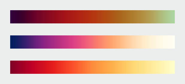
Hey Olga, On Tue, Feb 17, 2015 at 6:24 PM, Olga Botvinnik <obo...@uc...> wrote: > Out of curiosity, what are the advantages of the HCL colormap over YlGnBu > for continuous values? I'm biased towards YlGnBu because green is my > favorite color and want to know what makes HCL objectively better for > perceiving values. > Perceptually, the luminance ramp is probably a bit more linear, but that's not a huge deal. The main functional advantage to using *some* kind of Hcl based map is that it lets matplotlib tweak more parameters. This particular Hcl map has a bit more hue variation than YlBuGn, and I think the saturation channel is doing something different than what the colorbrewer maps do. So it appears a little bit more "colorful", which I think was one of the objectives. I think there's some argument for matplotlib creating a novel colormap for its default rather than just using one of the preset colorbrewer ones. It would be nice to have a bit more well-defined visual identity, and having people say "oh hey that's the matplotlib colormap, it looks really nice!" might have good marketing benefits. I like the colorbrewer palettes and use them often, but it seems kind of boring to take an existing colormap that lots of packages have and make it the default. > I added YlGnBu_r versions of those plots just below yours: > http://nbviewer.ipython.org/gist/olgabot/6a619ef21c178801ff77 > > It seems it's a little more "extreme" than HCL, as in it lights are > lighter and its darks are darker. From the color research, is this less > desirable? > Well, that could be changed in the Hcl version by setting different endpoints for the lightness ramp. I was trying to get something similar to parula, which doesn't cover as extreme of a lightness range and is more saturated on both ends than the color brewer palettes. I would imagine the reasoning for this is that it might let the map represent categorical or divergent data a little bit better without much cost to sequential data, but I am not sure. Also, if you map a line or scatter plot with YlGnBu, the lightest colors might not be visible on a white background, whereas I think the yellow I used would be ok. This might be something to keep in mind as the map that gets chosen will likely be the default for plt.scatter. But like I said, I didn't spend much time thinking about exactly where the endpoints should be, so it's possible one would want more dynamic luminance range. Michael > On Mon Feb 16 2015 at 9:28:56 PM Benjamin Root <ben...@ou...> wrote: > >> Do remember that I have a PR to add linestyle cycling, which would >> greatly mitigate problems for colorblindness and non-color publications. >> >> I also prefer it for slideshows as projectors at conferences tend to have >> crappy colors anyway (was at a radar conference when the projector's red >> crapped out while the presenter was building up suspense about the really, >> really impressive radar image of a supercell on the next slide) >> >> Ben Root >> On Feb 16, 2015 7:24 PM, "Michael Waskom" <mw...@st...> wrote: >> >>> See [here](http://nbviewer.ipython.org/gist/mwaskom/6a43a3b94eca4a9e2e8b) >>> for a quick and dirty implementation that should get a general idea. This >>> probably ins't the best way to do it -- anyone should feel free to build on >>> this. >>> >>> On Mon, Feb 16, 2015 at 3:38 PM, Eric Firing <ef...@ha...> wrote: >>> >>>> On 2015/02/16 1:29 PM, Michael Waskom wrote: >>>> >>>> Nathaniel's January 9 message in that thread (can't figure out how to >>>>> link to it in the archives) had a suggestion that I thought was very >>>>> promising, to do something similar to Parula but rotate around the hue >>>>> circle the other direction so that the hues would go blue - purple - >>>>> red >>>>> - yellow. I don't think we've seen an example of exactly what it would >>>>> look like, but I reckon it would be similar to the middle colormap here >>>>> http://earthobservatory.nasa.gov/blogs/elegantfigures/ >>>>> files/2013/08/three_perceptual_palettes_618.png >>>>> (from the elegant figures block series linked above), which I've always >>>>> found quite attractive. >>>>> >>>> >>>> Certainly it can be considered--but we have to have a real >>>> implementation. >>>> >>>> >>> >>> >>> ------------------------------------------------------------------------------ >>> Download BIRT iHub F-Type - The Free Enterprise-Grade BIRT Server >>> from Actuate! Instantly Supercharge Your Business Reports and Dashboards >>> with Interactivity, Sharing, Native Excel Exports, App Integration & more >>> Get technology previously reserved for billion-dollar corporations, FREE >>> >>> http://pubads.g.doubleclick.net/gampad/clk?id=190641631&iu=/4140/ostg.clktrk >>> _______________________________________________ >>> Matplotlib-devel mailing list >>> Mat...@li... >>> https://lists.sourceforge.net/lists/listinfo/matplotlib-devel >>> >>> ------------------------------------------------------------ >> ------------------ >> Download BIRT iHub F-Type - The Free Enterprise-Grade BIRT Server >> from Actuate! Instantly Supercharge Your Business Reports and Dashboards >> with Interactivity, Sharing, Native Excel Exports, App Integration & more >> Get technology previously reserved for billion-dollar corporations, FREE >> http://pubads.g.doubleclick.net/gampad/clk?id=190641631& >> iu=/4140/ostg.clktrk_______________________________________________ >> Matplotlib-devel mailing list >> Mat...@li... >> https://lists.sourceforge.net/lists/listinfo/matplotlib-devel >> > |
|
From: Olga B. <obo...@uc...> - 2015-02-18 02:24:50
|
Out of curiosity, what are the advantages of the HCL colormap over YlGnBu for continuous values? I'm biased towards YlGnBu because green is my favorite color and want to know what makes HCL objectively better for perceiving values. I added YlGnBu_r versions of those plots just below yours: http://nbviewer.ipython.org/gist/olgabot/6a619ef21c178801ff77 It seems it's a little more "extreme" than HCL, as in it lights are lighter and its darks are darker. From the color research, is this less desirable? On Mon Feb 16 2015 at 9:28:56 PM Benjamin Root <ben...@ou...> wrote: > Do remember that I have a PR to add linestyle cycling, which would greatly > mitigate problems for colorblindness and non-color publications. > > I also prefer it for slideshows as projectors at conferences tend to have > crappy colors anyway (was at a radar conference when the projector's red > crapped out while the presenter was building up suspense about the really, > really impressive radar image of a supercell on the next slide) > > Ben Root > On Feb 16, 2015 7:24 PM, "Michael Waskom" <mw...@st...> wrote: > >> See [here](http://nbviewer.ipython.org/gist/mwaskom/6a43a3b94eca4a9e2e8b) >> for a quick and dirty implementation that should get a general idea. This >> probably ins't the best way to do it -- anyone should feel free to build on >> this. >> >> On Mon, Feb 16, 2015 at 3:38 PM, Eric Firing <ef...@ha...> wrote: >> >>> On 2015/02/16 1:29 PM, Michael Waskom wrote: >>> >>> Nathaniel's January 9 message in that thread (can't figure out how to >>>> link to it in the archives) had a suggestion that I thought was very >>>> promising, to do something similar to Parula but rotate around the hue >>>> circle the other direction so that the hues would go blue - purple - red >>>> - yellow. I don't think we've seen an example of exactly what it would >>>> look like, but I reckon it would be similar to the middle colormap here >>>> http://earthobservatory.nasa.gov/blogs/elegantfigures/ >>>> files/2013/08/three_perceptual_palettes_618.png >>>> (from the elegant figures block series linked above), which I've always >>>> found quite attractive. >>>> >>> >>> Certainly it can be considered--but we have to have a real >>> implementation. >>> >>> >> >> >> ------------------------------------------------------------------------------ >> Download BIRT iHub F-Type - The Free Enterprise-Grade BIRT Server >> from Actuate! Instantly Supercharge Your Business Reports and Dashboards >> with Interactivity, Sharing, Native Excel Exports, App Integration & more >> Get technology previously reserved for billion-dollar corporations, FREE >> >> http://pubads.g.doubleclick.net/gampad/clk?id=190641631&iu=/4140/ostg.clktrk >> _______________________________________________ >> Matplotlib-devel mailing list >> Mat...@li... >> https://lists.sourceforge.net/lists/listinfo/matplotlib-devel >> >> ------------------------------------------------------------ > ------------------ > Download BIRT iHub F-Type - The Free Enterprise-Grade BIRT Server > from Actuate! Instantly Supercharge Your Business Reports and Dashboards > with Interactivity, Sharing, Native Excel Exports, App Integration & more > Get technology previously reserved for billion-dollar corporations, FREE > http://pubads.g.doubleclick.net/gampad/clk?id=190641631& > iu=/4140/ostg.clktrk_______________________________________________ > Matplotlib-devel mailing list > Mat...@li... > https://lists.sourceforge.net/lists/listinfo/matplotlib-devel > |
|
From: Neal B. <ndb...@gm...> - 2015-02-17 15:28:43
|
I plotted a large number of bars on a bargraph. I am not surprised memory usage and time to draw are bad on the initial view. But I'd expect as I zoom in more and more, the time to draw should improve - there's less to draw. This does not appear to be the case. -- -- Those who don't understand recursion are doomed to repeat it |
|
From: Nelle V. <nel...@gm...> - 2015-02-17 09:30:54
|
Thanks again Thomas for the release ! Cheers, N On 17 February 2015 at 06:09, Thomas Caswell <tca...@gm...> wrote: > Hello all, > > We are pleased to announce the release of matplotlib v1.4.3! > > Wheels, windows binaries and the source tarball are available through both > source-forge [1] and pypi (via pip). Additionally the source is available > tarball is available from github [2] and mac-wheels from > http://wheels.scikit-image.org/. > > This is the last planned bug-fix release in the 1.4 series. > > Many bugs are fixed including: > > fixing drawing of edge-only markers in AGG > fix run-away memory usage when using %inline or saving with a tight bounding > box with QuadMesh artists > improvements to wx and tk gui backends > > Additionally the webagg and nbagg backends were brought closer to > feature parity with the desktop backends with the addition of keyboard > and scroll events thanks to Steven Silvester. > > The next planned release will be based on the 1.4.x series but will change > the default colors and be tagged as version v2.0. The target release date is > in the next month or two. > > The next feature release will be v2.1 targeted for around SciPy in July. > > Tom > > > [1] > https://sourceforge.net/projects/matplotlib/files/matplotlib/matplotlib-1.4.3/ > > [2] https://github.com/matplotlib/matplotlib/releases/tag/v1.4.3 > > > > ------------------------------------------------------------------------------ > Download BIRT iHub F-Type - The Free Enterprise-Grade BIRT Server > from Actuate! Instantly Supercharge Your Business Reports and Dashboards > with Interactivity, Sharing, Native Excel Exports, App Integration & more > Get technology previously reserved for billion-dollar corporations, FREE > http://pubads.g.doubleclick.net/gampad/clk?id=190641631&iu=/4140/ostg.clktrk > _______________________________________________ > Matplotlib-devel mailing list > Mat...@li... > https://lists.sourceforge.net/lists/listinfo/matplotlib-devel > |
|
From: Todd <tod...@gm...> - 2015-02-17 08:56:56
|
I wasn't referring to just the default colors, but the default style in general. Things like background, line thickness, padding, ticks, etc. I thought that there was agreement that the default matplotlib style is not optimal, and that the point of the 2.0 release was to put all the stylistic changes in one release so people don't have to keep changing their unit tests. On Feb 8, 2015 11:04 PM, "Thomas Caswell" <tca...@gm...> wrote: > > To overhauling all of the default colors, I think that is still in the cards, but some one who is not me needs to drive that. > > The goal of pulling pyplot out of backend_bases is exactly that, to be able to do everything using the OO interface in a convenient way. > > Tom > > On Sun Feb 08 2015 at 4:50:51 PM Todd <tod...@gm...> wrote: >> >> >> On Feb 8, 2015 1:13 AM, "Thomas Caswell" <tca...@gm...> wrote: >> > >> > Hey all, >> > >> > To start with, the 2.0 release is pending a choice of new default color map. I think that when we pick that we should cut 2.0 off of the last release and then the next minor release turns into 2.1. If we want to do other breaking changes we will just do a 3.0 when that happens. It makes sense to me to bundle default color changes as one set of breaking changes and code API changes as another. >> >> I thought there was going to be a complete overhaul of the default theme? Has that idea been abandoned? >> >> > - making OO interface easier to use interactively (if interactive, auto-redraw at sensible time) >> > >> > - pull the pyplot state machine out of backend_bases and expose the figure_manager classes >> >> Do either of these mean that it will be possible to use the OO interface without needing to go through pyplot? >> >> ------------------------------------------------------------------------------ >> >> Dive into the World of Parallel Programming. The Go Parallel Website, >> sponsored by Intel and developed in partnership with Slashdot Media, is your >> hub for all things parallel software development, from weekly thought >> leadership blogs to news, videos, case studies, tutorials and more. Take a >> look and join the conversation now. http://goparallel.sourceforge.net/_______________________________________________ >> Matplotlib-devel mailing list >> Mat...@li... >> https://lists.sourceforge.net/lists/listinfo/matplotlib-devel |
|
From: Benjamin R. <ben...@ou...> - 2015-02-17 05:28:23
|
Do remember that I have a PR to add linestyle cycling, which would greatly mitigate problems for colorblindness and non-color publications. I also prefer it for slideshows as projectors at conferences tend to have crappy colors anyway (was at a radar conference when the projector's red crapped out while the presenter was building up suspense about the really, really impressive radar image of a supercell on the next slide) Ben Root On Feb 16, 2015 7:24 PM, "Michael Waskom" <mw...@st...> wrote: > See [here](http://nbviewer.ipython.org/gist/mwaskom/6a43a3b94eca4a9e2e8b) > for a quick and dirty implementation that should get a general idea. This > probably ins't the best way to do it -- anyone should feel free to build on > this. > > On Mon, Feb 16, 2015 at 3:38 PM, Eric Firing <ef...@ha...> wrote: > >> On 2015/02/16 1:29 PM, Michael Waskom wrote: >> >> Nathaniel's January 9 message in that thread (can't figure out how to >>> link to it in the archives) had a suggestion that I thought was very >>> promising, to do something similar to Parula but rotate around the hue >>> circle the other direction so that the hues would go blue - purple - red >>> - yellow. I don't think we've seen an example of exactly what it would >>> look like, but I reckon it would be similar to the middle colormap here >>> http://earthobservatory.nasa.gov/blogs/elegantfigures/ >>> files/2013/08/three_perceptual_palettes_618.png >>> (from the elegant figures block series linked above), which I've always >>> found quite attractive. >>> >> >> Certainly it can be considered--but we have to have a real implementation. >> >> > > > ------------------------------------------------------------------------------ > Download BIRT iHub F-Type - The Free Enterprise-Grade BIRT Server > from Actuate! Instantly Supercharge Your Business Reports and Dashboards > with Interactivity, Sharing, Native Excel Exports, App Integration & more > Get technology previously reserved for billion-dollar corporations, FREE > > http://pubads.g.doubleclick.net/gampad/clk?id=190641631&iu=/4140/ostg.clktrk > _______________________________________________ > Matplotlib-devel mailing list > Mat...@li... > https://lists.sourceforge.net/lists/listinfo/matplotlib-devel > > |
|
From: Thomas C. <tca...@gm...> - 2015-02-17 05:09:08
|
Hello all, We are pleased to announce the release of matplotlib v1.4.3! Wheels, windows binaries and the source tarball are available through both source-forge [1] and pypi (via pip). Additionally the source is available tarball is available from github [2] and mac-wheels from http://wheels.scikit-image.org/. This is the last planned bug-fix release in the 1.4 series. Many bugs are fixed including: - fixing drawing of edge-only markers in AGG - fix run-away memory usage when using %inline or saving with a tight bounding box with QuadMesh artists - improvements to wx and tk gui backends Additionally the webagg and nbagg backends were brought closer to feature parity with the desktop backends with the addition of keyboard and scroll events thanks to Steven Silvester. The next planned release will be based on the 1.4.x series but will change the default colors and be tagged as version v2.0. The target release date is in the next month or two. The next feature release will be v2.1 targeted for around SciPy in July. Tom [1] https://sourceforge.net/projects/matplotlib/files/matplotlib/matplotlib-1.4.3/ [2] https://github.com/matplotlib/matplotlib/releases/tag/v1.4.3 |
|
From: Michael W. <mw...@st...> - 2015-02-17 00:24:12
|
See [here](http://nbviewer.ipython.org/gist/mwaskom/6a43a3b94eca4a9e2e8b) for a quick and dirty implementation that should get a general idea. This probably ins't the best way to do it -- anyone should feel free to build on this. On Mon, Feb 16, 2015 at 3:38 PM, Eric Firing <ef...@ha...> wrote: > On 2015/02/16 1:29 PM, Michael Waskom wrote: > > Nathaniel's January 9 message in that thread (can't figure out how to >> link to it in the archives) had a suggestion that I thought was very >> promising, to do something similar to Parula but rotate around the hue >> circle the other direction so that the hues would go blue - purple - red >> - yellow. I don't think we've seen an example of exactly what it would >> look like, but I reckon it would be similar to the middle colormap here >> http://earthobservatory.nasa.gov/blogs/elegantfigures/ >> files/2013/08/three_perceptual_palettes_618.png >> (from the elegant figures block series linked above), which I've always >> found quite attractive. >> > > Certainly it can be considered--but we have to have a real implementation. > > |
|
From: Michael W. <mw...@st...> - 2015-02-16 23:39:20
|
It's helped by pulling the green towards blue and the red towards yellow, but they are probably the hardest to distinguish in the set. Which emphasizes that, while it's good to start with a colorblind-friendly set of colors, the person making the figure also has the responsibility to choose how to use those colors carefully so that the categories that are most important to distinguish aren't colored with red and green. On Mon, Feb 16, 2015 at 3:32 PM, Eric Firing <ef...@ha...> wrote: > On 2015/02/16 1:19 PM, Michael Waskom wrote: > >> Here are two palettes that are optimized for colorblindness: >> http://www.cookbook-r.com/Graphs/Colors_%28ggplot2%29/# >> a-colorblind-friendly-palette >> >> > Strange--they have both red and green, so I would never have expected them > to work. The yellow looks too light to work well on a light background, > especially for projecting slides. > > Eric > |
|
From: Eric F. <ef...@ha...> - 2015-02-16 23:38:42
|
On 2015/02/16 1:29 PM, Michael Waskom wrote: > Nathaniel's January 9 message in that thread (can't figure out how to > link to it in the archives) had a suggestion that I thought was very > promising, to do something similar to Parula but rotate around the hue > circle the other direction so that the hues would go blue - purple - red > - yellow. I don't think we've seen an example of exactly what it would > look like, but I reckon it would be similar to the middle colormap here > http://earthobservatory.nasa.gov/blogs/elegantfigures/files/2013/08/three_perceptual_palettes_618.png > (from the elegant figures block series linked above), which I've always > found quite attractive. Certainly it can be considered--but we have to have a real implementation. |
|
From: Eric F. <ef...@ha...> - 2015-02-16 23:32:49
|
On 2015/02/16 1:19 PM, Michael Waskom wrote: > Here are two palettes that are optimized for colorblindness: > http://www.cookbook-r.com/Graphs/Colors_%28ggplot2%29/#a-colorblind-friendly-palette > Strange--they have both red and green, so I would never have expected them to work. The yellow looks too light to work well on a light background, especially for projecting slides. Eric |
|
From: Michael W. <mw...@st...> - 2015-02-16 23:29:41
|
On Mon, Feb 16, 2015 at 2:01 PM, Eric Firing <ef...@ha...> wrote: > > Here is what I think is the most recent extensive thread: > http://comments.gmane.org/gmane.comp.python.matplotlib.devel/13122 ... > 1) A greyscale has been proposed; it satisfies several of the criteria > very well, but misses by omitting hue entirely. It is proposed as a way > to force users to choose something other than the default; I don't think > this is a good *competitive* strategy. > > 2) YlGnBu or YlGnBu_r seems to me to be a viable candidate. It has the > great advantage that we already have it. It seems to rate well by most > of the criteria illustrated via Nathaniel's > https://github.com/njsmith/pycam02ucs viscm() tool. (Perceptual distance > is a little jumpy.) > > Others? > Nathaniel's January 9 message in that thread (can't figure out how to link to it in the archives) had a suggestion that I thought was very promising, to do something similar to Parula but rotate around the hue circle the other direction so that the hues would go blue - purple - red - yellow. I don't think we've seen an example of exactly what it would look like, but I reckon it would be similar to the middle colormap here http://earthobservatory.nasa.gov/blogs/elegantfigures/files/2013/08/three_perceptual_palettes_618.png (from the elegant figures block series linked above), which I've always found quite attractive. |
|
From: Michael W. <mw...@st...> - 2015-02-16 23:21:34
|
On Mon, Feb 16, 2015 at 3:19 PM, Michael Waskom <mw...@st...> wrote: > Here are two palettes that are optimized for colorblindness actually I should say I have no idea if those are optimal, but the simulations do suggest they work well. |
|
From: Michael W. <mw...@st...> - 2015-02-16 23:20:17
|
On Mon, Feb 16, 2015 at 3:15 PM, Eric Firing <ef...@ha...> wrote: > Does anyone have a suggestion for a colorblind-friendly cycle? Maybe > omit the green and tack a gray on the end? I haven't checked, so I > don't know if this would work well. > Here are two palettes that are optimized for colorblindness: http://www.cookbook-r.com/Graphs/Colors_%28ggplot2%29/#a-colorblind-friendly-palette Seaborn has a `colorblind` palette that is somewhere between these colors and the standard matplotlib/seaborn set. It's intended to be a little better than deep (which actually isn't too bad in terms of red vs green), but it's not been extensively tested or optimized. > It is common to have plots with two curves, and the present blue, green > pair is not very high-contrast; having the first two colors be blue and > red would be better, I think. > +1 |
|
From: Eric F. <ef...@ha...> - 2015-02-16 23:15:33
|
On 2015/02/16 12:42 PM, Paul Hobson wrote: > There are several cycles in seaborn. Is it safe to assume that you mean > the 'deep' palette? Yes, in the sense that when I wrote the message I was just looking at seaborn's tutorial showing the default, which is 'deep'--but I didn't know it then. A good case could be made for "dark"; it has better contrast among all the colors. It might be better than "deep" for line plots, especially when the lines are thin. The main point was to get at least one plausible choice on the table. Does anyone have a suggestion for a colorblind-friendly cycle? Maybe omit the green and tack a gray on the end? I haven't checked, so I don't know if this would work well. It is common to have plots with two curves, and the present blue, green pair is not very high-contrast; having the first two colors be blue and red would be better, I think. Eric > On Mon, Feb 16, 2015 at 14:40 Eric Firing <ef...@ha... > <mailto:ef...@ha...>> wrote: > > On 2015/02/16 12:01 PM, Eric Firing wrote: > > > > > Proposals for the new color cycle for line plots? > > Here is a proposal: we simply adopt seaborn's cycle. > > Eric |
|
From: Paul H. <pmh...@gm...> - 2015-02-16 22:42:22
|
There are several cycles in seaborn. Is it safe to assume that you mean the 'deep' palette? On Mon, Feb 16, 2015 at 14:40 Eric Firing <ef...@ha...> wrote: > On 2015/02/16 12:01 PM, Eric Firing wrote: > > > > > Proposals for the new color cycle for line plots? > > Here is a proposal: we simply adopt seaborn's cycle. > > Eric > > > ------------------------------------------------------------ > ------------------ > Download BIRT iHub F-Type - The Free Enterprise-Grade BIRT Server > from Actuate! Instantly Supercharge Your Business Reports and Dashboards > with Interactivity, Sharing, Native Excel Exports, App Integration & more > Get technology previously reserved for billion-dollar corporations, FREE > http://pubads.g.doubleclick.net/gampad/clk?id=190641631& > iu=/4140/ostg.clktrk > _______________________________________________ > Matplotlib-devel mailing list > Mat...@li... > https://lists.sourceforge.net/lists/listinfo/matplotlib-devel > |
|
From: Eric F. <ef...@ha...> - 2015-02-16 22:40:14
|
On 2015/02/16 12:01 PM, Eric Firing wrote: > > Proposals for the new color cycle for line plots? Here is a proposal: we simply adopt seaborn's cycle. Eric |
|
From: Eric F. <ef...@ha...> - 2015-02-16 22:01:34
|
For a long time there has been discussion of replacing the matplotlib default color map and color cycle, but we still haven't done it. We need a clear set of criteria, and a small set of good alternatives, leading to a decision, a PR, and a release. Now is the time. Here is what I think is the most recent extensive thread: http://comments.gmane.org/gmane.comp.python.matplotlib.devel/13122 Early in that thread Nathaniel Smith proposed the following criteria: - sequential, not diverging - perceptually uniform - still perceptually uniform when converted to greyscale - variation in hue is good - colorblind-friendly - hue ramp should work even without the luminance variation I added: - aesthetically pleasing Probably not all of these can be met perfectly at once, but they seem like good goals. The one most likely to be controversial is the first. I propose that we not bother arguing about it, but just accept Nathaniel's recommendation. For actual proposals: 1) A greyscale has been proposed; it satisfies several of the criteria very well, but misses by omitting hue entirely. It is proposed as a way to force users to choose something other than the default; I don't think this is a good *competitive* strategy. 2) YlGnBu or YlGnBu_r seems to me to be a viable candidate. It has the great advantage that we already have it. It seems to rate well by most of the criteria illustrated via Nathaniel's https://github.com/njsmith/pycam02ucs viscm() tool. (Perceptual distance is a little jumpy.) Others? Proposals for the new color cycle for line plots? Proposed release strategy: We will close the 1.4.x line with 1.4.3, in the process of being released now. The next step is the color change release, 2.0, based on 1.4.3, but with any additional bug fixes and other reasonably non-risky changes that are ready to go. Any substantial new features will then go in a subsequent point release. Eric |
|
From: Matthew B. <mat...@gm...> - 2015-02-16 21:35:09
|
Hi, On Mon, Feb 16, 2015 at 1:26 PM, Paul Kuin <np...@gm...> wrote: > Ah, since it is a proper name it should be capitalised, but it never was. I > think that it should remain uncapitalised and that you want to propose an > alternative, like a change in type for the proper name matplotlib. Could be > typescript, or something else. I'm guessing the type-setters would object to always using typewriter (or other special) font for matplotlib, as it would quickly get tiring on the eye. Cheers, Matthew |
|
From: Thomas K. <th...@kl...> - 2015-02-16 19:39:09
|
On 16 February 2015 at 10:53, Nelle Varoquaux <nel...@gm...> wrote: > 2. you are used to having sentences start with capital letter, but > this is mostly cultural. German People capitalize almost all Words in > a Sentence. It just looks weird too… > FWIW, I tried naming a few small projects with all-lowercase names, and I find it really hard to not capitalise them at the start of a sentence. It looks far more wrong to me than capitalised Nouns in the middle of a sentence. You may say this is specific to English, but most documentation is going to be written in English. My experience with IPython (aka "iPython") suggests that no-one outside the project actually cares or even remembers how you capitalise your project name. ;-) Thomas |
|
From: Paul H. <pmh...@gm...> - 2015-02-16 19:38:27
|
Perhaps this is a bit a of tangent, but what is exactly is the distinction between the project and the software? Is it as simple as: software = code and project = code + mailing list + documentation + managing issues on github? On Mon, Feb 16, 2015 at 11:04 AM, Matthew Brett <mat...@gm...> wrote: > Hi, > > On Mon, Feb 16, 2015 at 10:53 AM, Nelle Varoquaux > <nel...@gm...> wrote: > >>>>> > >>>>> IMO, never. > >>>> > >>>> > >>>> Rationale, please? > >>> > >>> > >>> Consistency: it is never capitalized in matplotlib's documentation. > >> > >> > >> True, and a valid point--but we could easily change that. Wouldn't it > make > >> it bit more readable if sentences always started with a capital letter? > >> Starting with lower case just looks wrong and artificial. > > > > I'm going to give two bad reasons to keep it this way: > > 1. backward compatibility :p > > 2. you are used to having sentences start with capital letter, but > > this is mostly cultural. German People capitalize almost all Words in > > a Sentence. It just looks weird too… (There is the other extreme: > > people who don't seem to know where the shift button on their keyboard > > is when writing an email.) > > > > I'm actually fine with changing it, but I think we should try as much > > as possible to be consistent. > > I suppose everyone would agree that <pre>matplotlib</pre> should never > be capitalized. I guess also that your (Ben's) typsetters will not > often be using <pre></pre> formatted matplotlib. In that case I would > say Matplotlib is a English proper noun and standard capitalization > rules apply. It would probably be confusing to try and distinguish > between the project and the software with capitalization. > > Does it matter that the book and the mpl documentation have a > different convention? > > Cheers, > > Matthew > > > ------------------------------------------------------------------------------ > Download BIRT iHub F-Type - The Free Enterprise-Grade BIRT Server > from Actuate! Instantly Supercharge Your Business Reports and Dashboards > with Interactivity, Sharing, Native Excel Exports, App Integration & more > Get technology previously reserved for billion-dollar corporations, FREE > > http://pubads.g.doubleclick.net/gampad/clk?id=190641631&iu=/4140/ostg.clktrk > _______________________________________________ > Matplotlib-devel mailing list > Mat...@li... > https://lists.sourceforge.net/lists/listinfo/matplotlib-devel > |
|
From: Matthew B. <mat...@gm...> - 2015-02-16 19:05:35
|
Hi, On Mon, Feb 16, 2015 at 10:53 AM, Nelle Varoquaux <nel...@gm...> wrote: >>>>> >>>>> IMO, never. >>>> >>>> >>>> Rationale, please? >>> >>> >>> Consistency: it is never capitalized in matplotlib's documentation. >> >> >> True, and a valid point--but we could easily change that. Wouldn't it make >> it bit more readable if sentences always started with a capital letter? >> Starting with lower case just looks wrong and artificial. > > I'm going to give two bad reasons to keep it this way: > 1. backward compatibility :p > 2. you are used to having sentences start with capital letter, but > this is mostly cultural. German People capitalize almost all Words in > a Sentence. It just looks weird too… (There is the other extreme: > people who don't seem to know where the shift button on their keyboard > is when writing an email.) > > I'm actually fine with changing it, but I think we should try as much > as possible to be consistent. I suppose everyone would agree that <pre>matplotlib</pre> should never be capitalized. I guess also that your (Ben's) typsetters will not often be using <pre></pre> formatted matplotlib. In that case I would say Matplotlib is a English proper noun and standard capitalization rules apply. It would probably be confusing to try and distinguish between the project and the software with capitalization. Does it matter that the book and the mpl documentation have a different convention? Cheers, Matthew |
127 messages has been excluded from this view by a project administrator.
