Menu
▾
▴
matplotlib-devel — matplotlib developers
You can subscribe to this list here.
| 2003 |
Jan
|
Feb
|
Mar
|
Apr
|
May
|
Jun
|
Jul
|
Aug
|
Sep
|
Oct
(1) |
Nov
(33) |
Dec
(20) |
|---|---|---|---|---|---|---|---|---|---|---|---|---|
| 2004 |
Jan
(7) |
Feb
(44) |
Mar
(51) |
Apr
(43) |
May
(43) |
Jun
(36) |
Jul
(61) |
Aug
(44) |
Sep
(25) |
Oct
(82) |
Nov
(97) |
Dec
(47) |
| 2005 |
Jan
(77) |
Feb
(143) |
Mar
(42) |
Apr
(31) |
May
(93) |
Jun
(93) |
Jul
(35) |
Aug
(78) |
Sep
(56) |
Oct
(44) |
Nov
(72) |
Dec
(75) |
| 2006 |
Jan
(116) |
Feb
(99) |
Mar
(181) |
Apr
(171) |
May
(112) |
Jun
(86) |
Jul
(91) |
Aug
(111) |
Sep
(77) |
Oct
(72) |
Nov
(57) |
Dec
(51) |
| 2007 |
Jan
(64) |
Feb
(116) |
Mar
(70) |
Apr
(74) |
May
(53) |
Jun
(40) |
Jul
(519) |
Aug
(151) |
Sep
(132) |
Oct
(74) |
Nov
(282) |
Dec
(190) |
| 2008 |
Jan
(141) |
Feb
(67) |
Mar
(69) |
Apr
(96) |
May
(227) |
Jun
(404) |
Jul
(399) |
Aug
(96) |
Sep
(120) |
Oct
(205) |
Nov
(126) |
Dec
(261) |
| 2009 |
Jan
(136) |
Feb
(136) |
Mar
(119) |
Apr
(124) |
May
(155) |
Jun
(98) |
Jul
(136) |
Aug
(292) |
Sep
(174) |
Oct
(126) |
Nov
(126) |
Dec
(79) |
| 2010 |
Jan
(109) |
Feb
(83) |
Mar
(139) |
Apr
(91) |
May
(79) |
Jun
(164) |
Jul
(184) |
Aug
(146) |
Sep
(163) |
Oct
(128) |
Nov
(70) |
Dec
(73) |
| 2011 |
Jan
(235) |
Feb
(165) |
Mar
(147) |
Apr
(86) |
May
(74) |
Jun
(118) |
Jul
(65) |
Aug
(75) |
Sep
(162) |
Oct
(94) |
Nov
(48) |
Dec
(44) |
| 2012 |
Jan
(49) |
Feb
(40) |
Mar
(88) |
Apr
(35) |
May
(52) |
Jun
(69) |
Jul
(90) |
Aug
(123) |
Sep
(112) |
Oct
(120) |
Nov
(105) |
Dec
(116) |
| 2013 |
Jan
(76) |
Feb
(26) |
Mar
(78) |
Apr
(43) |
May
(61) |
Jun
(53) |
Jul
(147) |
Aug
(85) |
Sep
(83) |
Oct
(122) |
Nov
(18) |
Dec
(27) |
| 2014 |
Jan
(58) |
Feb
(25) |
Mar
(49) |
Apr
(17) |
May
(29) |
Jun
(39) |
Jul
(53) |
Aug
(52) |
Sep
(35) |
Oct
(47) |
Nov
(110) |
Dec
(27) |
| 2015 |
Jan
(50) |
Feb
(93) |
Mar
(96) |
Apr
(30) |
May
(55) |
Jun
(83) |
Jul
(44) |
Aug
(8) |
Sep
(5) |
Oct
|
Nov
(1) |
Dec
(1) |
| 2016 |
Jan
|
Feb
|
Mar
(1) |
Apr
|
May
|
Jun
(2) |
Jul
|
Aug
(3) |
Sep
(1) |
Oct
(3) |
Nov
|
Dec
|
| 2017 |
Jan
|
Feb
(5) |
Mar
|
Apr
|
May
|
Jun
|
Jul
(3) |
Aug
|
Sep
(7) |
Oct
|
Nov
|
Dec
|
| 2018 |
Jan
|
Feb
|
Mar
|
Apr
|
May
|
Jun
|
Jul
(2) |
Aug
|
Sep
|
Oct
|
Nov
|
Dec
|
|
From: Thomas C. <tca...@gm...> - 2015-03-10 11:47:58
|
Right on no longer supporting 1.5, but this code never got updated. This is a bit of a bigger job than I first anticipated as numpy has deprecated the norm kwarg, so we probably should too. On Tue, Mar 10, 2015, 07:19 OceanWolf <jui...@ya...> wrote: > Tom, ``When we drop numpy 1.5''? I thought we already had... I mean we > only test numpy 1.6 on Travis... > > For the rebinning exercise, I don't have time to look, but I would > expect a similar trick to imshow, quiver, etcetera when I want to > compare to a baseline (e.g. for animation). Namely I calculate the > normalisation parameters first, and then apply those parameters on > subsequent plots. > > To ease the user, we could add a method to return the binning parameters > from a single binning exercise, and then give an option to pass those > params in to subsequent plots. > > ------------------------------------------------------------ > ------------------ > Dive into the World of Parallel Programming The Go Parallel Website, > sponsored > by Intel and developed in partnership with Slashdot Media, is your hub for > all > things parallel software development, from weekly thought leadership blogs > to > news, videos, case studies, tutorials and more. Take a look and join the > conversation now. http://goparallel.sourceforge.net/ > _______________________________________________ > Matplotlib-devel mailing list > Mat...@li... > https://lists.sourceforge.net/lists/listinfo/matplotlib-devel > |
|
From: OceanWolf <jui...@ya...> - 2015-03-10 11:18:54
|
Tom, ``When we drop numpy 1.5''? I thought we already had... I mean we only test numpy 1.6 on Travis... For the rebinning exercise, I don't have time to look, but I would expect a similar trick to imshow, quiver, etcetera when I want to compare to a baseline (e.g. for animation). Namely I calculate the normalisation parameters first, and then apply those parameters on subsequent plots. To ease the user, we could add a method to return the binning parameters from a single binning exercise, and then give an option to pass those params in to subsequent plots. |
|
From: OceanWolf <jui...@ya...> - 2015-03-10 10:44:30
|
One thing to note, that the backend structure will hopefully change soon with a huge refactor of the backends. Take a look https://github.com/matplotlib/matplotlib/pull/4143 for the current progress and feel free to give your comments. As a status update, I currently work on the WebAgg backend (which of the backends I have converted, seems the most obfuscated of them all) and have just finished reading through, and marking up the code with TODOs ready for refactor of that backend. I will also update the MEP page to flesh out parts that I feel need more detail. Best, OceanWolf |
|
From: Thomas C. <tca...@gm...> - 2015-03-08 20:16:09
|
Cool. There is a lot of code there to digest so I don't have anything technically sensible to say yet, but in principle/abstract this seems like a good idea. This also ties back into the MEP25 (figure serialization) discussion and the discussion I was having with Eric Firing in the comments of https://github.com/matplotlib/matplotlib/pull/4172 (yes, a less than ideal place) about adopting a more structured framework for mpl artists attributes(ex make them into IPython Configurable/use traitlets) and the larger discussion started at scipy last year about providing style sheets. The current style library and rcparams tools provide (several) context managers so you can mostly avoid damaging the global state. The ability to apply style once the figure has been drawn is a feature request I have seen go by several times. Another major limitation of the rcparam approach is that to add new parameters can modifying code pretty deep in the core of the library. Tom On Sat, Mar 7, 2015 at 9:39 PM Drain, Theodore R (392P) < the...@jp...> wrote: > Last year we implemented an object oriented plotting style system for our > users and I was able to convince our management that we should open source > it. You can find it here: https://github.com/nasa/mplStyle > > Many (most?) of the existing MPL style systems seem to be built around RC > parameters which doesn't work very well for us. For a large system that > can create plots in many different scripts/GUI's, we really can't change > global settings (RC's) to affect how a plot looks as it ends up screwing up > plots in other areas. So we designed an OO based style system that allows > you to create/save/load styles and apply them to individual plot elements > (text, lines, axes, figures, etc). > > This code was extracted from a much larger project so it wasn't really > written as a standalone library or designed to follow MPL's naming and > coding conventions. i.e. don't assume the internals exhibit any great > design - I was mostly concerned with getting a stand alone package that > worked in the minimum amount of effort. It does work fine, every method > has documentation, and test cases are included (feel free to email me or > use github if you find any problems) but my real hope is that it either > serves as an inspiration for building a standard MPL OO style system (or > perhaps it can be morphed into that over time). > > Some of the features include: > - Object oriented style objects (no changes to global RC parameters) > - Apply styles to whole figures or to individual plot elements (artists, > patches, axes, etc) > - Save and load styles into human editable files > - Apply styles by name or by style object > - Styles remember what they were applied to and can be told to re-apply > after changes. This is great way to try out style settings without having > to regenerate a plot. > - Plot elements can be tagged with a name. The tag name can later be used > as a target in the style application. This is great feature for plotting > libraries as it allows a script to create plot elements with a set of names > and the caller can apply various styles to the plot elements by using those > names. This separates plot creation from plot styling and makes plotting > code much easier to reuse as users don't need to edit the plotting script > just to change the style of a line. > > Please take a look and let us know what you think. > Ted > ps: FYI for clarity I wasn't the primary author of this code - James Evans > get's that honor with various contributions from a variety of people who > work on our development team. > ------------------------------------------------------------ > ------------------ > Dive into the World of Parallel Programming The Go Parallel Website, > sponsored > by Intel and developed in partnership with Slashdot Media, is your hub for > all > things parallel software development, from weekly thought leadership blogs > to > news, videos, case studies, tutorials and more. Take a look and join the > conversation now. http://goparallel.sourceforge.net/ > _______________________________________________ > Matplotlib-devel mailing list > Mat...@li... > https://lists.sourceforge.net/lists/listinfo/matplotlib-devel > |
|
From: Benjamin R. <ben...@ou...> - 2015-03-08 16:46:48
|
Achyut, As I am sure everyone else on this list is sick of hearing, I have a book that will be coming out soon that can help explain many of your questions. It has a chapter explaining some of the differences between the interactive backends and how backends work, in general. The book is in the prefinal stage right now and will be going to the printer in the next week (I hope!). Stay tuned to this page for updates: https://www.packtpub.com/application-development/interactive-applications-using-matplotlib Cheers! Ben Root On Sat, Mar 7, 2015 at 9:14 PM, Achyut Rastogi <ras...@gm...> wrote: > Thank you Tom > I read the qt backend and the first comment said about rendering from qt > to agg, thank for the explaination, so if I don't understand some parts of > the backend is this where I ask. > > On 5:47AM, Sun, Mar 8, 2015 Thomas Caswell <tca...@gm...> wrote: > >> Achyut, >> >> Thank your for your interest, mpl on touch devices sounds super cool! >> >> The easiest course is probably to develop a backend modeled after the >> {qt,wx,gtk}Agg backends which embed an Agg backend into the gui framework >> of choice. In those cases we rely on Agg to handle the mpl specific >> drawing tasks and then embed the resulting bitmap into the GUI. A majority >> of the work in the gui backends deals window/widget creation and the >> plumbing required to convert interaction events from the GUI into the >> internal events mpl uses. >> >> Tom >> >> On Sat, Mar 7, 2015 at 4:15 PM Achyut Rastogi <ras...@gm...> >> wrote: >> >>> Hello , I am a novice gsoc aspirant and I want to write a backend for >>> kivy, I read some of the other conversations on the mailing list and I know >>> about the template you guys provide but I am having trouble getting >>> started, can you please help me get up-to speed. I would be great help if >>> you could tell me what all I need to know of matplotlib to write a good >>> backend. >>> Thank You >>> Achyut Rastogi >>> >> ------------------------------------------------------------ >>> ------------------ >>> Dive into the World of Parallel Programming The Go Parallel Website, >>> sponsored >>> by Intel and developed in partnership with Slashdot Media, is your hub >>> for all >>> things parallel software development, from weekly thought leadership >>> blogs to >>> news, videos, case studies, tutorials and more. Take a look and join the >>> conversation now. http://goparallel.sourceforge.net/ >>> _______________________________________________ >>> Matplotlib-devel mailing list >>> Mat...@li... >>> https://lists.sourceforge.net/lists/listinfo/matplotlib-devel >>> >> > > ------------------------------------------------------------------------------ > Dive into the World of Parallel Programming The Go Parallel Website, > sponsored > by Intel and developed in partnership with Slashdot Media, is your hub for > all > things parallel software development, from weekly thought leadership blogs > to > news, videos, case studies, tutorials and more. Take a look and join the > conversation now. http://goparallel.sourceforge.net/ > _______________________________________________ > Matplotlib-devel mailing list > Mat...@li... > https://lists.sourceforge.net/lists/listinfo/matplotlib-devel > > |
|
From: Drain, T. R (392P) <the...@jp...> - 2015-03-08 02:39:08
|
Last year we implemented an object oriented plotting style system for our users and I was able to convince our management that we should open source it. You can find it here: https://github.com/nasa/mplStyle Many (most?) of the existing MPL style systems seem to be built around RC parameters which doesn't work very well for us. For a large system that can create plots in many different scripts/GUI's, we really can't change global settings (RC's) to affect how a plot looks as it ends up screwing up plots in other areas. So we designed an OO based style system that allows you to create/save/load styles and apply them to individual plot elements (text, lines, axes, figures, etc). This code was extracted from a much larger project so it wasn't really written as a standalone library or designed to follow MPL's naming and coding conventions. i.e. don't assume the internals exhibit any great design - I was mostly concerned with getting a stand alone package that worked in the minimum amount of effort. It does work fine, every method has documentation, and test cases are included (feel free to email me or use github if you find any problems) but my real hope is that it either serves as an inspiration for building a standard MPL OO style system (or perhaps it can be morphed into that over time). Some of the features include: - Object oriented style objects (no changes to global RC parameters) - Apply styles to whole figures or to individual plot elements (artists, patches, axes, etc) - Save and load styles into human editable files - Apply styles by name or by style object - Styles remember what they were applied to and can be told to re-apply after changes. This is great way to try out style settings without having to regenerate a plot. - Plot elements can be tagged with a name. The tag name can later be used as a target in the style application. This is great feature for plotting libraries as it allows a script to create plot elements with a set of names and the caller can apply various styles to the plot elements by using those names. This separates plot creation from plot styling and makes plotting code much easier to reuse as users don't need to edit the plotting script just to change the style of a line. Please take a look and let us know what you think. Ted ps: FYI for clarity I wasn't the primary author of this code - James Evans get's that honor with various contributions from a variety of people who work on our development team. |
|
From: Achyut R. <ras...@gm...> - 2015-03-08 02:14:39
|
Thank you Tom
I read the qt backend and the first comment said about rendering from qt to
agg, thank for the explaination, so if I don't understand some parts of the
backend is this where I ask.

On 5:47AM, Sun, Mar 8, 2015 Thomas Caswell <tca...@gm...> wrote:

> Achyut,
>
> Thank your for your interest, mpl on touch devices sounds super cool!
>
> The easiest course is probably to develop a backend modeled after the
> {qt,wx,gtk}Agg backends which embed an Agg backend into the gui framework
> of choice.  In those cases we rely on Agg to handle the mpl specific
> drawing tasks and then embed the resulting bitmap into the GUI.  A majority
> of the work in the gui backends deals window/widget creation and the
> plumbing required to convert interaction events from the GUI into the
> internal events mpl uses.
>
> Tom
>
> On Sat, Mar 7, 2015 at 4:15 PM Achyut Rastogi <ras...@gm...>
> wrote:
>
>> Hello , I am a novice gsoc aspirant and I want to write a backend for
>> kivy, I read some of the other conversations on the mailing list and I know
>> about the template you guys provide but I am having trouble getting
>> started, can you please help me get up-to speed. I would be great help if
>> you could tell me what all I need to know of matplotlib  to write a good
>> backend.
>> Thank You
>> Achyut Rastogi
>>
> ------------------------------------------------------------
>> ------------------
>> Dive into the World of Parallel Programming The Go Parallel Website,
>> sponsored
>> by Intel and developed in partnership with Slashdot Media, is your hub
>> for all
>> things parallel software development, from weekly thought leadership
>> blogs to
>> news, videos, case studies, tutorials and more. Take a look and join the
>> conversation now. http://goparallel.sourceforge.net/
>> _______________________________________________
>> Matplotlib-devel mailing list
>> Mat...@li...
>> https://lists.sourceforge.net/lists/listinfo/matplotlib-devel
>>
>
|
|
From: Tomo L. <laz...@gm...> - 2015-03-08 01:47:34
|
Sorry for the spam, but I just wanted to say that I now understand that I should be using plt.xlim to zoom in on the x-axis rather than changing the bins. When I zoom in with that, the bin height is indeed constant as expected. On Sat, Mar 7, 2015 at 8:00 PM, Tomo Lazovich <laz...@gm...> wrote: > Thanks for the suggestion...I will see how numpy handles this. > > Sorry for not being clearer earlier. Tom is right that by "zooming" I > meant changing the bins so that they covered a smaller range. Is there a > better way of "zooming" in on an axis so that I don't have this issue? > > Thanks! > > Tomo > > On Sat, Mar 7, 2015 at 7:39 PM, Thomas Caswell <tca...@gm...> wrote: > >> Paul, >> >> Note that by zoom the op means they are changing the bins, not actual >> zooming(by just changing the x axis). >> >> I was going to say we deal with normalization by delegating to numpy, but >> we actually handle it internally (with a note that when we drop np 1.5 to >> make numpy do it). >> I think the best course of action here is to do that conversion and >> forward this feature request to numpy (if it does not already do this). >> >> Tom >> >> On Sat, Mar 7, 2015, 18:29 Paul Hobson <pmh...@gm...> wrote: >> >>> IMO, this seems like a bug. I would expect bars to change height with >>> zoom/limit levels. >>> -p >>> >>> — >>> Sent from Mailbox <https://www.dropbox.com/mailbox> >>> >>> >>> On Sat, Mar 7, 2015 at 4:20 PM, Tomo Lazovich <laz...@gm...> >>> wrote: >>> >>>> Hello matplotlib developers, >>>> >>>> I'm not sure if this is the right mailing list for this question, so >>>> please re-direct me if it is not. >>>> >>>> I am wondering whether it is possible to have a histogram in pyplot >>>> normalized to the total length of the list input, rather than just the bins >>>> showing on the plot (i.e. include those entries in the "overflow" and >>>> "underflow", off the right and left edges of the plot). As far as I can >>>> tell, the normed option of pyplot.hist currently makes it so that the area >>>> under the bins showing is 1. This can lead to a situation like the one >>>> pasted below, where when I look at the whole histogram the bins have >>>> certain values but when I try to zoom in to see one part of the plot better >>>> those values change. >>>> >>>> I can think of two ways to solve this as of now: >>>> >>>> 1) Use the weights option to scale each entry by 1/len(input) rather >>>> than using normed=True. >>>> 2) Somehow add the contents of the overflow to the last bin of the >>>> plot, which would keep the normalizations constant for earlier bins even if >>>> you extend the axes. >>>> >>>> Is there a better way of doing this? If the option does not currently >>>> exist, I am also happy to help implement it if the community would find it >>>> desirable. >>>> >>>> Thanks for your help! >>>> >>>> Tomo Lazovich >>>> >>>> P.S. Here is a toy example of what I mean: >>>> >>>> >> import numpy as np >>>> >> import matplotlib.pyplot as plt >>>> >> h1 = [0, 0, 0, 1, 1, 2, 3] >>>> >> my_bins = np.linspace(-0.5, 4.5, 6) >>>> >> plt.hist(h1, bins=my_bins, normed=True) >>>> >> plt.show() >>>> >>>> gives >>>> >>>> <image.png> >>>> >>>> >>>> Now, if I change the range on the x axis that I would like plot: >>>> >>>> >> my_bins2 = np.linspace(-0.5, 1.5, 3) >>>> >> plt.hist(h1, bins=my_bins2, normed=True) >>>> >> plt.show() >>>> >>>> <image.png> >>>> >>>> >>>> The y values have changed to 0.6 and 0.4 because the normalization does >>>> not include the values that are cut off to the right of the plot. >>>> >>> >>> ------------------------------------------------------------ >>> ------------------ >>> Dive into the World of Parallel Programming The Go Parallel Website, >>> sponsored >>> by Intel and developed in partnership with Slashdot Media, is your hub >>> for all >>> things parallel software development, from weekly thought leadership >>> blogs to >>> news, videos, case studies, tutorials and more. Take a look and join the >>> conversation now. http://goparallel.sourceforge.net/ >>> _______________________________________________ >>> Matplotlib-devel mailing list >>> Mat...@li... >>> https://lists.sourceforge.net/lists/listinfo/matplotlib-devel >>> >> > |
|
From: Tomo L. <laz...@gm...> - 2015-03-08 01:00:36
|
Thanks for the suggestion...I will see how numpy handles this. Sorry for not being clearer earlier. Tom is right that by "zooming" I meant changing the bins so that they covered a smaller range. Is there a better way of "zooming" in on an axis so that I don't have this issue? Thanks! Tomo On Sat, Mar 7, 2015 at 7:39 PM, Thomas Caswell <tca...@gm...> wrote: > Paul, > > Note that by zoom the op means they are changing the bins, not actual > zooming(by just changing the x axis). > > I was going to say we deal with normalization by delegating to numpy, but > we actually handle it internally (with a note that when we drop np 1.5 to > make numpy do it). > I think the best course of action here is to do that conversion and > forward this feature request to numpy (if it does not already do this). > > Tom > > On Sat, Mar 7, 2015, 18:29 Paul Hobson <pmh...@gm...> wrote: > >> IMO, this seems like a bug. I would expect bars to change height with >> zoom/limit levels. >> -p >> >> — >> Sent from Mailbox <https://www.dropbox.com/mailbox> >> >> >> On Sat, Mar 7, 2015 at 4:20 PM, Tomo Lazovich <laz...@gm...> wrote: >> >>> Hello matplotlib developers, >>> >>> I'm not sure if this is the right mailing list for this question, so >>> please re-direct me if it is not. >>> >>> I am wondering whether it is possible to have a histogram in pyplot >>> normalized to the total length of the list input, rather than just the bins >>> showing on the plot (i.e. include those entries in the "overflow" and >>> "underflow", off the right and left edges of the plot). As far as I can >>> tell, the normed option of pyplot.hist currently makes it so that the area >>> under the bins showing is 1. This can lead to a situation like the one >>> pasted below, where when I look at the whole histogram the bins have >>> certain values but when I try to zoom in to see one part of the plot better >>> those values change. >>> >>> I can think of two ways to solve this as of now: >>> >>> 1) Use the weights option to scale each entry by 1/len(input) rather >>> than using normed=True. >>> 2) Somehow add the contents of the overflow to the last bin of the plot, >>> which would keep the normalizations constant for earlier bins even if you >>> extend the axes. >>> >>> Is there a better way of doing this? If the option does not currently >>> exist, I am also happy to help implement it if the community would find it >>> desirable. >>> >>> Thanks for your help! >>> >>> Tomo Lazovich >>> >>> P.S. Here is a toy example of what I mean: >>> >>> >> import numpy as np >>> >> import matplotlib.pyplot as plt >>> >> h1 = [0, 0, 0, 1, 1, 2, 3] >>> >> my_bins = np.linspace(-0.5, 4.5, 6) >>> >> plt.hist(h1, bins=my_bins, normed=True) >>> >> plt.show() >>> >>> gives >>> >>> <image.png> >>> >>> >>> Now, if I change the range on the x axis that I would like plot: >>> >>> >> my_bins2 = np.linspace(-0.5, 1.5, 3) >>> >> plt.hist(h1, bins=my_bins2, normed=True) >>> >> plt.show() >>> >>> <image.png> >>> >>> >>> The y values have changed to 0.6 and 0.4 because the normalization does >>> not include the values that are cut off to the right of the plot. >>> >> >> ------------------------------------------------------------ >> ------------------ >> Dive into the World of Parallel Programming The Go Parallel Website, >> sponsored >> by Intel and developed in partnership with Slashdot Media, is your hub >> for all >> things parallel software development, from weekly thought leadership >> blogs to >> news, videos, case studies, tutorials and more. Take a look and join the >> conversation now. http://goparallel.sourceforge.net/ >> _______________________________________________ >> Matplotlib-devel mailing list >> Mat...@li... >> https://lists.sourceforge.net/lists/listinfo/matplotlib-devel >> > |
|
From: Thomas C. <tca...@gm...> - 2015-03-08 00:40:03
|
Paul, Note that by zoom the op means they are changing the bins, not actual zooming(by just changing the x axis). I was going to say we deal with normalization by delegating to numpy, but we actually handle it internally (with a note that when we drop np 1.5 to make numpy do it). I think the best course of action here is to do that conversion and forward this feature request to numpy (if it does not already do this). Tom On Sat, Mar 7, 2015, 18:29 Paul Hobson <pmh...@gm...> wrote: > IMO, this seems like a bug. I would expect bars to change height with > zoom/limit levels. > -p > > — > Sent from Mailbox <https://www.dropbox.com/mailbox> > > > On Sat, Mar 7, 2015 at 4:20 PM, Tomo Lazovich <laz...@gm...> wrote: > >> Hello matplotlib developers, >> >> I'm not sure if this is the right mailing list for this question, so >> please re-direct me if it is not. >> >> I am wondering whether it is possible to have a histogram in pyplot >> normalized to the total length of the list input, rather than just the bins >> showing on the plot (i.e. include those entries in the "overflow" and >> "underflow", off the right and left edges of the plot). As far as I can >> tell, the normed option of pyplot.hist currently makes it so that the area >> under the bins showing is 1. This can lead to a situation like the one >> pasted below, where when I look at the whole histogram the bins have >> certain values but when I try to zoom in to see one part of the plot better >> those values change. >> >> I can think of two ways to solve this as of now: >> >> 1) Use the weights option to scale each entry by 1/len(input) rather than >> using normed=True. >> 2) Somehow add the contents of the overflow to the last bin of the plot, >> which would keep the normalizations constant for earlier bins even if you >> extend the axes. >> >> Is there a better way of doing this? If the option does not currently >> exist, I am also happy to help implement it if the community would find it >> desirable. >> >> Thanks for your help! >> >> Tomo Lazovich >> >> P.S. Here is a toy example of what I mean: >> >> >> import numpy as np >> >> import matplotlib.pyplot as plt >> >> h1 = [0, 0, 0, 1, 1, 2, 3] >> >> my_bins = np.linspace(-0.5, 4.5, 6) >> >> plt.hist(h1, bins=my_bins, normed=True) >> >> plt.show() >> >> gives >> >> <image.png> >> >> >> Now, if I change the range on the x axis that I would like plot: >> >> >> my_bins2 = np.linspace(-0.5, 1.5, 3) >> >> plt.hist(h1, bins=my_bins2, normed=True) >> >> plt.show() >> >> <image.png> >> >> >> The y values have changed to 0.6 and 0.4 because the normalization does >> not include the values that are cut off to the right of the plot. >> > > ------------------------------------------------------------ > ------------------ > Dive into the World of Parallel Programming The Go Parallel Website, > sponsored > by Intel and developed in partnership with Slashdot Media, is your hub for > all > things parallel software development, from weekly thought leadership blogs > to > news, videos, case studies, tutorials and more. Take a look and join the > conversation now. http://goparallel.sourceforge.net/ > _______________________________________________ > Matplotlib-devel mailing list > Mat...@li... > https://lists.sourceforge.net/lists/listinfo/matplotlib-devel > |
|
From: Paul H. <pmh...@gm...> - 2015-03-08 00:28:49
|
IMO, this seems like a bug. I would expect bars to change height with zoom/limit levels. -p — Sent from Mailbox On Sat, Mar 7, 2015 at 4:20 PM, Tomo Lazovich <laz...@gm...> wrote: > Hello matplotlib developers, > I'm not sure if this is the right mailing list for this question, so please > re-direct me if it is not. > I am wondering whether it is possible to have a histogram in pyplot > normalized to the total length of the list input, rather than just the bins > showing on the plot (i.e. include those entries in the "overflow" and > "underflow", off the right and left edges of the plot). As far as I can > tell, the normed option of pyplot.hist currently makes it so that the area > under the bins showing is 1. This can lead to a situation like the one > pasted below, where when I look at the whole histogram the bins have > certain values but when I try to zoom in to see one part of the plot better > those values change. > I can think of two ways to solve this as of now: > 1) Use the weights option to scale each entry by 1/len(input) rather than > using normed=True. > 2) Somehow add the contents of the overflow to the last bin of the plot, > which would keep the normalizations constant for earlier bins even if you > extend the axes. > Is there a better way of doing this? If the option does not currently > exist, I am also happy to help implement it if the community would find it > desirable. > Thanks for your help! > Tomo Lazovich > P.S. Here is a toy example of what I mean: >>> import numpy as np >>> import matplotlib.pyplot as plt >>> h1 = [0, 0, 0, 1, 1, 2, 3] >>> my_bins = np.linspace(-0.5, 4.5, 6) >>> plt.hist(h1, bins=my_bins, normed=True) >>> plt.show() > gives > [image: Inline image 1] > Now, if I change the range on the x axis that I would like plot: >>> my_bins2 = np.linspace(-0.5, 1.5, 3) >>> plt.hist(h1, bins=my_bins2, normed=True) >>> plt.show() > [image: Inline image 2] > The y values have changed to 0.6 and 0.4 because the normalization does not > include the values that are cut off to the right of the plot. |
|
From: Tomo L. <laz...@gm...> - 2015-03-08 00:20:19
|
Hello matplotlib developers, I'm not sure if this is the right mailing list for this question, so please re-direct me if it is not. I am wondering whether it is possible to have a histogram in pyplot normalized to the total length of the list input, rather than just the bins showing on the plot (i.e. include those entries in the "overflow" and "underflow", off the right and left edges of the plot). As far as I can tell, the normed option of pyplot.hist currently makes it so that the area under the bins showing is 1. This can lead to a situation like the one pasted below, where when I look at the whole histogram the bins have certain values but when I try to zoom in to see one part of the plot better those values change. I can think of two ways to solve this as of now: 1) Use the weights option to scale each entry by 1/len(input) rather than using normed=True. 2) Somehow add the contents of the overflow to the last bin of the plot, which would keep the normalizations constant for earlier bins even if you extend the axes. Is there a better way of doing this? If the option does not currently exist, I am also happy to help implement it if the community would find it desirable. Thanks for your help! Tomo Lazovich P.S. Here is a toy example of what I mean: >> import numpy as np >> import matplotlib.pyplot as plt >> h1 = [0, 0, 0, 1, 1, 2, 3] >> my_bins = np.linspace(-0.5, 4.5, 6) >> plt.hist(h1, bins=my_bins, normed=True) >> plt.show() gives [image: Inline image 1] Now, if I change the range on the x axis that I would like plot: >> my_bins2 = np.linspace(-0.5, 1.5, 3) >> plt.hist(h1, bins=my_bins2, normed=True) >> plt.show() [image: Inline image 2] The y values have changed to 0.6 and 0.4 because the normalization does not include the values that are cut off to the right of the plot. |
|
From: Thomas C. <tca...@gm...> - 2015-03-08 00:17:17
|
Achyut,

Thank your for your interest, mpl on touch devices sounds super cool!

The easiest course is probably to develop a backend modeled after the
{qt,wx,gtk}Agg backends which embed an Agg backend into the gui framework
of choice.  In those cases we rely on Agg to handle the mpl specific
drawing tasks and then embed the resulting bitmap into the GUI.  A majority
of the work in the gui backends deals window/widget creation and the
plumbing required to convert interaction events from the GUI into the
internal events mpl uses.

Tom

On Sat, Mar 7, 2015 at 4:15 PM Achyut Rastogi <ras...@gm...>
wrote:

> Hello , I am a novice gsoc aspirant and I want to write a backend for
> kivy, I read some of the other conversations on the mailing list and I know
> about the template you guys provide but I am having trouble getting
> started, can you please help me get up-to speed. I would be great help if
> you could tell me what all I need to know of matplotlib  to write a good
> backend.
> Thank You
> Achyut Rastogi
> ------------------------------------------------------------
> ------------------
> Dive into the World of Parallel Programming The Go Parallel Website,
> sponsored
> by Intel and developed in partnership with Slashdot Media, is your hub for
> all
> things parallel software development, from weekly thought leadership blogs
> to
> news, videos, case studies, tutorials and more. Take a look and join the
> conversation now. http://goparallel.sourceforge.net/
> _______________________________________________
> Matplotlib-devel mailing list
> Mat...@li...
> https://lists.sourceforge.net/lists/listinfo/matplotlib-devel
>
|
|
From: Achyut R. <ras...@gm...> - 2015-03-07 18:45:37
|
Hello , I am a novice gsoc aspirant and I want to write a backend for kivy, I read some of the other conversations on the mailing list and I know about the template you guys provide but I am having trouble getting started, can you please help me get up-to speed. I would be great help if you could tell me what all I need to know of matplotlib to write a good backend. Thank You Achyut Rastogi |
|
From: Rob C. <rob...@gm...> - 2015-03-06 16:17:16
|
Hi, One final reminder that I am a mentor for two Google Summer of Code projects that involve extensive matplotlib GUI development for python scientific software. The INCF (incf.org) is sponsoring two GSOC projects that will directly benefit PyDSTool (http://pydstool.sf.net), a math modeling toolbox for science and engineering that some of you will know. One, if not both, of the projects will involve significant technical usage of MPL's 2D GUI widgets but, more excitingly, to build new types of model visualization tools over MPL. MPL has been chosen to maximize platform independence and minimize reliance on additional user installation of third party libraries, and is well suited for the prototyping of application front ends for research code. http://incf.org/gsoc/2015/proposals/#-span--span----nbsp---span---span--span-neuroscience-model-exploration-and-development-tools-for-pydstool--span- High level knowledge of math and the theoretical principles of cell biology are beneficial but not required. Applications can begin right away! Read more about the process here: http://www.google-melange.com/gsoc/homepage/google/gsoc2015 Thanks, Rob |
|
From: Fabio Z. <fab...@tu...> - 2015-03-04 11:36:55
|
OK made a pull request with the first changes (1): #4187. Cheers, F On 03/03/2015 10:56 PM, Benjamin Root wrote: > The website is generated by sphinx from the docstrings and other > components in the doc/ directory of the matplotlib project. The file for > the home page can be found: > https://github.com/matplotlib/matplotlib/blob/master/doc/_templates/index.html > > By the way, the file for the "Documenting mpl" page is here: > https://github.com/matplotlib/matplotlib/blob/master/doc/devel/documenting_mpl.rst > > And, like I said, even if you don't get around to actually making any > changes, at the very least, I would file these issues as "bugs" to our > issue tracker. > > Cheers! > Ben Root > > On Tue, Mar 3, 2015 at 4:40 PM, Fabio Zanini > <fab...@tu... <mailto:fab...@tu...>> > wrote: > > Hi Ben, > > Well, excellent or not I just hope it helps a bit. I can put some effort > if people agree that this is useful, though I am quite busy at the > moment. Who's currently actually managing the website? > > Thx! > F > > On 03/03/2015 21:33, Benjamin Root wrote: > > This is excellent insight! It should be fairly trivial to fix points 1 > > and 2, and I agree that it would make the page much more inviting to > > newcomers. > > > > Point 3 would take some time. I had never noticed that before. > > Personally, I think the issue about documentation isn't that it is > > boring (I actually find them interesting), it is that by the time one > > gets into a project to actually start contributing, you become immune to > > the deficiencies in the documentation. Insights like these from > > newcomers are like gold to those of us who have been around for a while. > > > > Feel free to either create some pull requests to address some of these > > points, or at least file some bug reports so that we don't completely > > forget this. I may even be able to pick up some of it once my book > > finalizes for printing in the next week or two. > > > > Cheers! > > Ben Root > > > > > > On Tue, Mar 3, 2015 at 2:35 PM, Fabio Zanini > > <fab...@tu... > <mailto:fab...@tu...> > <mailto:fab...@tu... > <mailto:fab...@tu...>>> > > wrote: > > > > Dear Thomas, > > > > Finally got some time to reply about the docs. My main point > is not > > about the API docs themselves, although they would need some > tuning à la > > MEP10. Rather, as Sebastian's doubts about pyplot/axes shows, I am > > considering an issue with the non-API part of the docs, i.e. > the user > > guide, tutorial, and website. > > > > MY OLD PROBLEM WITH THE DOCS > > > > Now I am more experienced with mpl so I just read the API docs and > > figure my way through, but at the beginning I remember that > whenever I > > was wondering about something I would quickly end up in either > of two > > places: > > > > - the pyplot API page: http://matplotlib.org/api/pyplot_api.html > > > > This is a giant blob of a page and takes several seconds just > to load. > > It's lacking any kind of menu or navigation help, just the > whole docs > > straight out - alphabetical order - and bam! > > > > - stackoverflow > > > > Here people give practical suggestions, but they are > inconsistent (some > > use pyplot, some axes methods, sometimes even more low-level > code). I > > mean, it does work, but it's messy and not very instructive > for newbies > > (imagine learning say chemistry from stackoverflow, not fun uh?) > > > > > > HOW TO MAKE IT BETTER > > > > This one's harder, but I'd have a couple of ideas: > > > > 1. better home page > > > > The beginner's guide should be accessible from the home page > in ONE > > click, possibly highlighted in a frame or so. It currently takes 3 > > clicks on small text hyperlinks to get to some introduction, > the pyplot > > tutorial: > > > > HOME -> DOCS -> BEGINNER'S GUIDE -> PYPLOT TUTORIAL > > > > (and it's not even the first link on those pages). Some quick > visual > > snippet (possibly interactive e.g. an IPython notebook?) and > maybe a > > video tutorial like golang would be helpful: > > > > http://golang.org/ > > > > 2. More navigation support on the pyplot API page > > > > I realize API docs need to be somewhat stiff in order to make > sure you > > find what you're looking for (alphabetical order and so), but some > > side-menu, quick example, or highlighting of the most common items > > (plot, scatter) would be useful. I've read the acorr API docs > 100 times > > by now, and never, ever used it ;-P > > > > 3. clear presentation of the protagonist (Axes) > > > > As far as I understand, the main object for the user is the > Axes class. > > For instance, does the code below look familiar to anyone? > > > > ax.plot(x, y) > > ax.scatter(x, y) > > ax.set_xscale('log') > > ax.set_xlabel('My x axis') > > ax.set_xticks(...) > > ax.legend() > > ax.set_title('My title') > > ax.grid(True) > > > > Nonetheless, this kind of Axes-based coding is not even > mentioned in the > > beginner's guide. You may now think it's in the advanced guide > but, no! > > - the advanced guide only talks about "Artists" in general, > not the Axes > > in particular: "Artist tutorial", "Customizing your objects", etc. > > I am not criticizing past mainteners for this organization, > but I would > > support a more Axes-centric tutorial in the beginner's guide. > > > > As of the time issue, it's the usual problem, nobody wants to > do the > > docs because they are boring. It's true, it's a bit boring. > But that > > also depends a bit: writing API docs can be boring, but writing a > > tutorial for newbies can be fun! > > > > Cheers, > > Fabio > > > > > > > ------------------------------------------------------------------------------ > > Dive into the World of Parallel Programming The Go Parallel > Website, > > sponsored > > by Intel and developed in partnership with Slashdot Media, is your > > hub for all > > things parallel software development, from weekly thought > leadership > > blogs to > > news, videos, case studies, tutorials and more. Take a look > and join the > > conversation now. http://goparallel.sourceforge.net/ > > _______________________________________________ > > Matplotlib-devel mailing list > > Mat...@li... > <mailto:Mat...@li...> > > <mailto:Mat...@li... > <mailto:Mat...@li...>> > > https://lists.sourceforge.net/lists/listinfo/matplotlib-devel > > > > > > > ------------------------------------------------------------------------------ > Dive into the World of Parallel Programming The Go Parallel Website, > sponsored > by Intel and developed in partnership with Slashdot Media, is your > hub for all > things parallel software development, from weekly thought leadership > blogs to > news, videos, case studies, tutorials and more. Take a look and join the > conversation now. http://goparallel.sourceforge.net/ > _______________________________________________ > Matplotlib-devel mailing list > Mat...@li... > <mailto:Mat...@li...> > https://lists.sourceforge.net/lists/listinfo/matplotlib-devel > > |
|
From: Benjamin R. <ben...@ou...> - 2015-03-03 21:56:45
|
The website is generated by sphinx from the docstrings and other components in the doc/ directory of the matplotlib project. The file for the home page can be found: https://github.com/matplotlib/matplotlib/blob/master/doc/_templates/index.html By the way, the file for the "Documenting mpl" page is here: https://github.com/matplotlib/matplotlib/blob/master/doc/devel/documenting_mpl.rst And, like I said, even if you don't get around to actually making any changes, at the very least, I would file these issues as "bugs" to our issue tracker. Cheers! Ben Root On Tue, Mar 3, 2015 at 4:40 PM, Fabio Zanini <fab...@tu...> wrote: > Hi Ben, > > Well, excellent or not I just hope it helps a bit. I can put some effort > if people agree that this is useful, though I am quite busy at the > moment. Who's currently actually managing the website? > > Thx! > F > > On 03/03/2015 21:33, Benjamin Root wrote: > > This is excellent insight! It should be fairly trivial to fix points 1 > > and 2, and I agree that it would make the page much more inviting to > > newcomers. > > > > Point 3 would take some time. I had never noticed that before. > > Personally, I think the issue about documentation isn't that it is > > boring (I actually find them interesting), it is that by the time one > > gets into a project to actually start contributing, you become immune to > > the deficiencies in the documentation. Insights like these from > > newcomers are like gold to those of us who have been around for a while. > > > > Feel free to either create some pull requests to address some of these > > points, or at least file some bug reports so that we don't completely > > forget this. I may even be able to pick up some of it once my book > > finalizes for printing in the next week or two. > > > > Cheers! > > Ben Root > > > > > > On Tue, Mar 3, 2015 at 2:35 PM, Fabio Zanini > > <fab...@tu... <mailto:fab...@tu...>> > > wrote: > > > > Dear Thomas, > > > > Finally got some time to reply about the docs. My main point is not > > about the API docs themselves, although they would need some tuning > à la > > MEP10. Rather, as Sebastian's doubts about pyplot/axes shows, I am > > considering an issue with the non-API part of the docs, i.e. the user > > guide, tutorial, and website. > > > > MY OLD PROBLEM WITH THE DOCS > > > > Now I am more experienced with mpl so I just read the API docs and > > figure my way through, but at the beginning I remember that whenever > I > > was wondering about something I would quickly end up in either of two > > places: > > > > - the pyplot API page: http://matplotlib.org/api/pyplot_api.html > > > > This is a giant blob of a page and takes several seconds just to > load. > > It's lacking any kind of menu or navigation help, just the whole docs > > straight out - alphabetical order - and bam! > > > > - stackoverflow > > > > Here people give practical suggestions, but they are inconsistent > (some > > use pyplot, some axes methods, sometimes even more low-level code). I > > mean, it does work, but it's messy and not very instructive for > newbies > > (imagine learning say chemistry from stackoverflow, not fun uh?) > > > > > > HOW TO MAKE IT BETTER > > > > This one's harder, but I'd have a couple of ideas: > > > > 1. better home page > > > > The beginner's guide should be accessible from the home page in ONE > > click, possibly highlighted in a frame or so. It currently takes 3 > > clicks on small text hyperlinks to get to some introduction, the > pyplot > > tutorial: > > > > HOME -> DOCS -> BEGINNER'S GUIDE -> PYPLOT TUTORIAL > > > > (and it's not even the first link on those pages). Some quick visual > > snippet (possibly interactive e.g. an IPython notebook?) and maybe a > > video tutorial like golang would be helpful: > > > > http://golang.org/ > > > > 2. More navigation support on the pyplot API page > > > > I realize API docs need to be somewhat stiff in order to make sure > you > > find what you're looking for (alphabetical order and so), but some > > side-menu, quick example, or highlighting of the most common items > > (plot, scatter) would be useful. I've read the acorr API docs 100 > times > > by now, and never, ever used it ;-P > > > > 3. clear presentation of the protagonist (Axes) > > > > As far as I understand, the main object for the user is the Axes > class. > > For instance, does the code below look familiar to anyone? > > > > ax.plot(x, y) > > ax.scatter(x, y) > > ax.set_xscale('log') > > ax.set_xlabel('My x axis') > > ax.set_xticks(...) > > ax.legend() > > ax.set_title('My title') > > ax.grid(True) > > > > Nonetheless, this kind of Axes-based coding is not even mentioned in > the > > beginner's guide. You may now think it's in the advanced guide but, > no! > > - the advanced guide only talks about "Artists" in general, not the > Axes > > in particular: "Artist tutorial", "Customizing your objects", etc. > > I am not criticizing past mainteners for this organization, but I > would > > support a more Axes-centric tutorial in the beginner's guide. > > > > As of the time issue, it's the usual problem, nobody wants to do the > > docs because they are boring. It's true, it's a bit boring. But that > > also depends a bit: writing API docs can be boring, but writing a > > tutorial for newbies can be fun! > > > > Cheers, > > Fabio > > > > > > > ------------------------------------------------------------------------------ > > Dive into the World of Parallel Programming The Go Parallel Website, > > sponsored > > by Intel and developed in partnership with Slashdot Media, is your > > hub for all > > things parallel software development, from weekly thought leadership > > blogs to > > news, videos, case studies, tutorials and more. Take a look and join > the > > conversation now. http://goparallel.sourceforge.net/ > > _______________________________________________ > > Matplotlib-devel mailing list > > Mat...@li... > > <mailto:Mat...@li...> > > https://lists.sourceforge.net/lists/listinfo/matplotlib-devel > > > > > > > > ------------------------------------------------------------------------------ > Dive into the World of Parallel Programming The Go Parallel Website, > sponsored > by Intel and developed in partnership with Slashdot Media, is your hub for > all > things parallel software development, from weekly thought leadership blogs > to > news, videos, case studies, tutorials and more. Take a look and join the > conversation now. http://goparallel.sourceforge.net/ > _______________________________________________ > Matplotlib-devel mailing list > Mat...@li... > https://lists.sourceforge.net/lists/listinfo/matplotlib-devel > > |
|
From: Fabio Z. <fab...@tu...> - 2015-03-03 21:40:37
|
Hi Ben, Well, excellent or not I just hope it helps a bit. I can put some effort if people agree that this is useful, though I am quite busy at the moment. Who's currently actually managing the website? Thx! F On 03/03/2015 21:33, Benjamin Root wrote: > This is excellent insight! It should be fairly trivial to fix points 1 > and 2, and I agree that it would make the page much more inviting to > newcomers. > > Point 3 would take some time. I had never noticed that before. > Personally, I think the issue about documentation isn't that it is > boring (I actually find them interesting), it is that by the time one > gets into a project to actually start contributing, you become immune to > the deficiencies in the documentation. Insights like these from > newcomers are like gold to those of us who have been around for a while. > > Feel free to either create some pull requests to address some of these > points, or at least file some bug reports so that we don't completely > forget this. I may even be able to pick up some of it once my book > finalizes for printing in the next week or two. > > Cheers! > Ben Root > > > On Tue, Mar 3, 2015 at 2:35 PM, Fabio Zanini > <fab...@tu... <mailto:fab...@tu...>> > wrote: > > Dear Thomas, > > Finally got some time to reply about the docs. My main point is not > about the API docs themselves, although they would need some tuning à la > MEP10. Rather, as Sebastian's doubts about pyplot/axes shows, I am > considering an issue with the non-API part of the docs, i.e. the user > guide, tutorial, and website. > > MY OLD PROBLEM WITH THE DOCS > > Now I am more experienced with mpl so I just read the API docs and > figure my way through, but at the beginning I remember that whenever I > was wondering about something I would quickly end up in either of two > places: > > - the pyplot API page: http://matplotlib.org/api/pyplot_api.html > > This is a giant blob of a page and takes several seconds just to load. > It's lacking any kind of menu or navigation help, just the whole docs > straight out - alphabetical order - and bam! > > - stackoverflow > > Here people give practical suggestions, but they are inconsistent (some > use pyplot, some axes methods, sometimes even more low-level code). I > mean, it does work, but it's messy and not very instructive for newbies > (imagine learning say chemistry from stackoverflow, not fun uh?) > > > HOW TO MAKE IT BETTER > > This one's harder, but I'd have a couple of ideas: > > 1. better home page > > The beginner's guide should be accessible from the home page in ONE > click, possibly highlighted in a frame or so. It currently takes 3 > clicks on small text hyperlinks to get to some introduction, the pyplot > tutorial: > > HOME -> DOCS -> BEGINNER'S GUIDE -> PYPLOT TUTORIAL > > (and it's not even the first link on those pages). Some quick visual > snippet (possibly interactive e.g. an IPython notebook?) and maybe a > video tutorial like golang would be helpful: > > http://golang.org/ > > 2. More navigation support on the pyplot API page > > I realize API docs need to be somewhat stiff in order to make sure you > find what you're looking for (alphabetical order and so), but some > side-menu, quick example, or highlighting of the most common items > (plot, scatter) would be useful. I've read the acorr API docs 100 times > by now, and never, ever used it ;-P > > 3. clear presentation of the protagonist (Axes) > > As far as I understand, the main object for the user is the Axes class. > For instance, does the code below look familiar to anyone? > > ax.plot(x, y) > ax.scatter(x, y) > ax.set_xscale('log') > ax.set_xlabel('My x axis') > ax.set_xticks(...) > ax.legend() > ax.set_title('My title') > ax.grid(True) > > Nonetheless, this kind of Axes-based coding is not even mentioned in the > beginner's guide. You may now think it's in the advanced guide but, no! > - the advanced guide only talks about "Artists" in general, not the Axes > in particular: "Artist tutorial", "Customizing your objects", etc. > I am not criticizing past mainteners for this organization, but I would > support a more Axes-centric tutorial in the beginner's guide. > > As of the time issue, it's the usual problem, nobody wants to do the > docs because they are boring. It's true, it's a bit boring. But that > also depends a bit: writing API docs can be boring, but writing a > tutorial for newbies can be fun! > > Cheers, > Fabio > > > ------------------------------------------------------------------------------ > Dive into the World of Parallel Programming The Go Parallel Website, > sponsored > by Intel and developed in partnership with Slashdot Media, is your > hub for all > things parallel software development, from weekly thought leadership > blogs to > news, videos, case studies, tutorials and more. Take a look and join the > conversation now. http://goparallel.sourceforge.net/ > _______________________________________________ > Matplotlib-devel mailing list > Mat...@li... > <mailto:Mat...@li...> > https://lists.sourceforge.net/lists/listinfo/matplotlib-devel > > |
|
From: Benjamin R. <ben...@ou...> - 2015-03-03 20:33:29
|
This is excellent insight! It should be fairly trivial to fix points 1 and 2, and I agree that it would make the page much more inviting to newcomers. Point 3 would take some time. I had never noticed that before. Personally, I think the issue about documentation isn't that it is boring (I actually find them interesting), it is that by the time one gets into a project to actually start contributing, you become immune to the deficiencies in the documentation. Insights like these from newcomers are like gold to those of us who have been around for a while. Feel free to either create some pull requests to address some of these points, or at least file some bug reports so that we don't completely forget this. I may even be able to pick up some of it once my book finalizes for printing in the next week or two. Cheers! Ben Root On Tue, Mar 3, 2015 at 2:35 PM, Fabio Zanini <fab...@tu...> wrote: > Dear Thomas, > > Finally got some time to reply about the docs. My main point is not > about the API docs themselves, although they would need some tuning à la > MEP10. Rather, as Sebastian's doubts about pyplot/axes shows, I am > considering an issue with the non-API part of the docs, i.e. the user > guide, tutorial, and website. > > MY OLD PROBLEM WITH THE DOCS > > Now I am more experienced with mpl so I just read the API docs and > figure my way through, but at the beginning I remember that whenever I > was wondering about something I would quickly end up in either of two > places: > > - the pyplot API page: http://matplotlib.org/api/pyplot_api.html > > This is a giant blob of a page and takes several seconds just to load. > It's lacking any kind of menu or navigation help, just the whole docs > straight out - alphabetical order - and bam! > > - stackoverflow > > Here people give practical suggestions, but they are inconsistent (some > use pyplot, some axes methods, sometimes even more low-level code). I > mean, it does work, but it's messy and not very instructive for newbies > (imagine learning say chemistry from stackoverflow, not fun uh?) > > > HOW TO MAKE IT BETTER > > This one's harder, but I'd have a couple of ideas: > > 1. better home page > > The beginner's guide should be accessible from the home page in ONE > click, possibly highlighted in a frame or so. It currently takes 3 > clicks on small text hyperlinks to get to some introduction, the pyplot > tutorial: > > HOME -> DOCS -> BEGINNER'S GUIDE -> PYPLOT TUTORIAL > > (and it's not even the first link on those pages). Some quick visual > snippet (possibly interactive e.g. an IPython notebook?) and maybe a > video tutorial like golang would be helpful: > > http://golang.org/ > > 2. More navigation support on the pyplot API page > > I realize API docs need to be somewhat stiff in order to make sure you > find what you're looking for (alphabetical order and so), but some > side-menu, quick example, or highlighting of the most common items > (plot, scatter) would be useful. I've read the acorr API docs 100 times > by now, and never, ever used it ;-P > > 3. clear presentation of the protagonist (Axes) > > As far as I understand, the main object for the user is the Axes class. > For instance, does the code below look familiar to anyone? > > ax.plot(x, y) > ax.scatter(x, y) > ax.set_xscale('log') > ax.set_xlabel('My x axis') > ax.set_xticks(...) > ax.legend() > ax.set_title('My title') > ax.grid(True) > > Nonetheless, this kind of Axes-based coding is not even mentioned in the > beginner's guide. You may now think it's in the advanced guide but, no! > - the advanced guide only talks about "Artists" in general, not the Axes > in particular: "Artist tutorial", "Customizing your objects", etc. > I am not criticizing past mainteners for this organization, but I would > support a more Axes-centric tutorial in the beginner's guide. > > As of the time issue, it's the usual problem, nobody wants to do the > docs because they are boring. It's true, it's a bit boring. But that > also depends a bit: writing API docs can be boring, but writing a > tutorial for newbies can be fun! > > Cheers, > Fabio > > > > ------------------------------------------------------------------------------ > Dive into the World of Parallel Programming The Go Parallel Website, > sponsored > by Intel and developed in partnership with Slashdot Media, is your hub for > all > things parallel software development, from weekly thought leadership blogs > to > news, videos, case studies, tutorials and more. Take a look and join the > conversation now. http://goparallel.sourceforge.net/ > _______________________________________________ > Matplotlib-devel mailing list > Mat...@li... > https://lists.sourceforge.net/lists/listinfo/matplotlib-devel > > |
|
From: Fabio Z. <fab...@tu...> - 2015-03-03 19:35:42
|
Dear Thomas, Finally got some time to reply about the docs. My main point is not about the API docs themselves, although they would need some tuning à la MEP10. Rather, as Sebastian's doubts about pyplot/axes shows, I am considering an issue with the non-API part of the docs, i.e. the user guide, tutorial, and website. MY OLD PROBLEM WITH THE DOCS Now I am more experienced with mpl so I just read the API docs and figure my way through, but at the beginning I remember that whenever I was wondering about something I would quickly end up in either of two places: - the pyplot API page: http://matplotlib.org/api/pyplot_api.html This is a giant blob of a page and takes several seconds just to load. It's lacking any kind of menu or navigation help, just the whole docs straight out - alphabetical order - and bam! - stackoverflow Here people give practical suggestions, but they are inconsistent (some use pyplot, some axes methods, sometimes even more low-level code). I mean, it does work, but it's messy and not very instructive for newbies (imagine learning say chemistry from stackoverflow, not fun uh?) HOW TO MAKE IT BETTER This one's harder, but I'd have a couple of ideas: 1. better home page The beginner's guide should be accessible from the home page in ONE click, possibly highlighted in a frame or so. It currently takes 3 clicks on small text hyperlinks to get to some introduction, the pyplot tutorial: HOME -> DOCS -> BEGINNER'S GUIDE -> PYPLOT TUTORIAL (and it's not even the first link on those pages). Some quick visual snippet (possibly interactive e.g. an IPython notebook?) and maybe a video tutorial like golang would be helpful: http://golang.org/ 2. More navigation support on the pyplot API page I realize API docs need to be somewhat stiff in order to make sure you find what you're looking for (alphabetical order and so), but some side-menu, quick example, or highlighting of the most common items (plot, scatter) would be useful. I've read the acorr API docs 100 times by now, and never, ever used it ;-P 3. clear presentation of the protagonist (Axes) As far as I understand, the main object for the user is the Axes class. For instance, does the code below look familiar to anyone? ax.plot(x, y) ax.scatter(x, y) ax.set_xscale('log') ax.set_xlabel('My x axis') ax.set_xticks(...) ax.legend() ax.set_title('My title') ax.grid(True) Nonetheless, this kind of Axes-based coding is not even mentioned in the beginner's guide. You may now think it's in the advanced guide but, no! - the advanced guide only talks about "Artists" in general, not the Axes in particular: "Artist tutorial", "Customizing your objects", etc. I am not criticizing past mainteners for this organization, but I would support a more Axes-centric tutorial in the beginner's guide. As of the time issue, it's the usual problem, nobody wants to do the docs because they are boring. It's true, it's a bit boring. But that also depends a bit: writing API docs can be boring, but writing a tutorial for newbies can be fun! Cheers, Fabio |
|
From: OceanWolf <jui...@ya...> - 2015-03-02 19:21:06
|
Hi everyone, Over the past week or so I have been working on what I now dub MEP27 <https://github.com/matplotlib/matplotlib/wiki/MEP27> . I have already gotten quite far with it, but as I do some hefty changes (no breakages, and virtually 100% backward compatible) I wanted to make sure I got some input before continuing. I have now gotten far enough to know that the base code should work without any more tweaking. Best, OceanWolf -- View this message in context: http://matplotlib.1069221.n5.nabble.com/MEP-27-Backend-Refactor-Gcf-tp45032.html Sent from the matplotlib - devel mailing list archive at Nabble.com. |
|
From: jni <jni...@gm...> - 2015-03-02 11:31:26
|
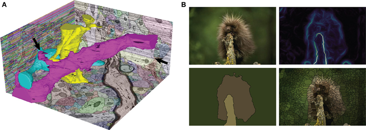
Hi Pierre, Could you please elaborate a bit on this > usecase. I was thinking, naively, that when plotting a grayscale image, > one would simply used a gray colormap. > Using a colormap with hue and saturation gives you better contrast than pure grayscale. For natural images, that is, photographs of human-scale objects, indeed grayscale is a good choice, because that is how we are used to looking at those images. But for looking at physical quantities, for example, using a colormap with hue and saturation as well as lightness is useful. Here are some examples: http://www.gnuplotting.org/color-maps-from-colorbrewer/ https://www.mrao.cam.ac.uk/~dag/CUBEHELIX/ See also a "boundary probability map" for a natural image here (panel B, top right): http://www.frontiersin.org/files/Articles/74212/fninf-08-00034-r2/image_m/fninf-08-00034-g001.jpg Having the colormap makes it easier to place the intermediate levels of the probability map. Again, restricting the lightness range for these maps would be problematic, to say the least. Juan. -- View this message in context: http://matplotlib.1069221.n5.nabble.com/release-strategy-and-the-color-revolution-tp44929p45030.html Sent from the matplotlib - devel mailing list archive at Nabble.com. |
|
From: Pierre H. <pie...@cr...> - 2015-03-02 10:03:40
|
Hi, Le 01/03/2015 23:27, jni a écrit : > As someone working with images, I think for displaying images you want a > colormap that spans as much as possible of the luminance range. The colormap > suggested by Michael Waskom would be quite perfect as-is. (recap: middle > colormap here: > http://earthobservatory.nasa.gov/blogs/elegantfigures/files/2013/08/three_perceptual_palettes_618.png) > Thanks for this feedback. Could you please elaborate a bit on this usecase. I was thinking, naively, that when plotting a grayscale image, one would simply used a gray colormap. Do you have some examples to illustrate what kind of results you are expecting ? best, Pierre |
)
|
From: jni <jni...@gm...> - 2015-03-01 22:28:03
|
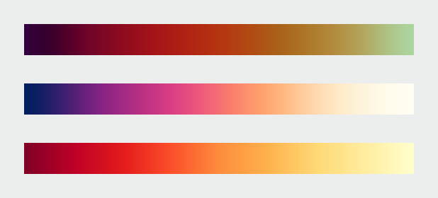
Hi everyone, As someone working with images, I think for displaying images you want a colormap that spans as much as possible of the luminance range. The colormap suggested by Michael Waskom would be quite perfect as-is. (recap: middle colormap here: http://earthobservatory.nasa.gov/blogs/elegantfigures/files/2013/08/three_perceptual_palettes_618.png) I understand the concern that a colormap should be able to display things on dark and light backgrounds, but this applies only to plots, not to images. Tom Caswell emphasised the distinction between colormaps for continuous variables and color cycles for categorical variables. There should also be a distinction between image display and plotting. For image display, please consider using a colormap with a wide luminance range. Thanks! -- View this message in context: http://matplotlib.1069221.n5.nabble.com/release-strategy-and-the-color-revolution-tp44929p45027.html Sent from the matplotlib - devel mailing list archive at Nabble.com. |
|
From: Benjamin R. <ben...@ou...> - 2015-03-01 03:38:57
|
Well, since we are thinking of it... What about prettyplotlib's style? I am not sure I want to completely steal either project's style as it is their own look-n-feel (and there are some aspects of their styles I don't quite like, but I am something of a luddite...). But I would certainly be receptive to addressing whatever egregious appearance faux pas we may have. Perhaps the owners of those projects could provide use feedback on what they might consider their "short-list" for things they would fix in matplotlib? On Sat, Feb 28, 2015 at 5:50 PM, Todd <tod...@gm...> wrote: > On Feb 19, 2015 1:39 AM, "Nathaniel Smith" <nj...@po...> wrote: > > > > On Feb 16, 2015 3:39 PM, "Eric Firing" <ef...@ha...> wrote: > > > > > > On 2015/02/16 1:29 PM, Michael Waskom wrote: > > > > > > > Nathaniel's January 9 message in that thread (can't figure out how to > > > > link to it in the archives) had a suggestion that I thought was very > > > > promising, to do something similar to Parula but rotate around the > hue > > > > circle the other direction so that the hues would go blue - purple - > red > > > > - yellow. I don't think we've seen an example of exactly what it > would > > > > look like, but I reckon it would be similar to the middle colormap > here > > > > > http://earthobservatory.nasa.gov/blogs/elegantfigures/files/2013/08/three_perceptual_palettes_618.png > > > > (from the elegant figures block series linked above), which I've > always > > > > found quite attractive. > > > > > > Certainly it can be considered--but we have to have a real > implementation. > > > > While I hate to promise vaporware, I actually was planning to have a > > go at implementing such a colormap in the next few weeks, based on > > optimizing the same set of parameters that viscm visualizes... FWIW. > > > > Are we planning to make other default appearance changes at the same > > time? The idea of changing the color cycle and/or dot-dash cycle has > > already come up in this thread, and this earlier thread proposed > > several more good ideas [1]: > > > http://thread.gmane.org/gmane.comp.python.matplotlib.devel/13128/focus=13166 > > > > > If the goal is still to put all the appearance-related changes in a single > release (to simplify changes to downstream unit tests), but nobody has > stepped up to make changes except to the colors, might it be possible to > just adopt the default seaborn style (except for colors, of course)? If > anybody is strongly motivated to make changes they can, but if nobody does > there would still be a good, modern, pleasant-looking style used by default. > > > ------------------------------------------------------------------------------ > Dive into the World of Parallel Programming The Go Parallel Website, > sponsored > by Intel and developed in partnership with Slashdot Media, is your hub for > all > things parallel software development, from weekly thought leadership blogs > to > news, videos, case studies, tutorials and more. Take a look and join the > conversation now. http://goparallel.sourceforge.net/ > _______________________________________________ > Matplotlib-devel mailing list > Mat...@li... > https://lists.sourceforge.net/lists/listinfo/matplotlib-devel > > |
127 messages has been excluded from this view by a project administrator.
