Menu
▾
▴
gnuplot-info — For questions and discussion about gnuplot
You can subscribe to this list here.
| 2003 |
Jan
|
Feb
|
Mar
|
Apr
|
May
|
Jun
|
Jul
|
Aug
|
Sep
|
Oct
(2) |
Nov
(2) |
Dec
|
|---|---|---|---|---|---|---|---|---|---|---|---|---|
| 2004 |
Jan
(3) |
Feb
(1) |
Mar
(2) |
Apr
(22) |
May
(52) |
Jun
(43) |
Jul
(36) |
Aug
(59) |
Sep
(37) |
Oct
(55) |
Nov
(39) |
Dec
(36) |
| 2005 |
Jan
(64) |
Feb
(40) |
Mar
(62) |
Apr
(58) |
May
(256) |
Jun
(77) |
Jul
(80) |
Aug
(39) |
Sep
(56) |
Oct
(36) |
Nov
(113) |
Dec
(68) |
| 2006 |
Jan
(43) |
Feb
(64) |
Mar
(69) |
Apr
(60) |
May
(71) |
Jun
(53) |
Jul
(63) |
Aug
(63) |
Sep
(76) |
Oct
(85) |
Nov
(82) |
Dec
(73) |
| 2007 |
Jan
(75) |
Feb
(82) |
Mar
(84) |
Apr
(104) |
May
(67) |
Jun
(101) |
Jul
(107) |
Aug
(138) |
Sep
(128) |
Oct
(106) |
Nov
(112) |
Dec
(112) |
| 2008 |
Jan
(94) |
Feb
(87) |
Mar
(146) |
Apr
(169) |
May
(75) |
Jun
(26) |
Jul
(26) |
Aug
(7) |
Sep
(18) |
Oct
(53) |
Nov
(42) |
Dec
(19) |
| 2009 |
Jan
(43) |
Feb
(39) |
Mar
(18) |
Apr
(45) |
May
(66) |
Jun
(87) |
Jul
(56) |
Aug
(41) |
Sep
(56) |
Oct
(139) |
Nov
(98) |
Dec
(88) |
| 2010 |
Jan
(81) |
Feb
(79) |
Mar
(83) |
Apr
(97) |
May
(124) |
Jun
(84) |
Jul
(53) |
Aug
(85) |
Sep
(89) |
Oct
(50) |
Nov
(98) |
Dec
(78) |
| 2011 |
Jan
(97) |
Feb
(74) |
Mar
(68) |
Apr
(54) |
May
(63) |
Jun
(59) |
Jul
(65) |
Aug
(58) |
Sep
(37) |
Oct
(40) |
Nov
(59) |
Dec
(35) |
| 2012 |
Jan
(16) |
Feb
(56) |
Mar
(63) |
Apr
(25) |
May
(48) |
Jun
(58) |
Jul
(20) |
Aug
(13) |
Sep
(43) |
Oct
(35) |
Nov
(20) |
Dec
(17) |
| 2013 |
Jan
(22) |
Feb
(11) |
Mar
(51) |
Apr
(34) |
May
(57) |
Jun
(27) |
Jul
(70) |
Aug
(30) |
Sep
(38) |
Oct
(53) |
Nov
(40) |
Dec
(25) |
| 2014 |
Jan
(26) |
Feb
(35) |
Mar
(60) |
Apr
(12) |
May
(17) |
Jun
(15) |
Jul
(9) |
Aug
(18) |
Sep
(46) |
Oct
(18) |
Nov
(19) |
Dec
(15) |
| 2015 |
Jan
(17) |
Feb
(28) |
Mar
(21) |
Apr
(54) |
May
(36) |
Jun
(8) |
Jul
(30) |
Aug
(13) |
Sep
(3) |
Oct
(28) |
Nov
(3) |
Dec
(3) |
| 2016 |
Jan
(11) |
Feb
(9) |
Mar
(29) |
Apr
(10) |
May
(8) |
Jun
(5) |
Jul
(50) |
Aug
(57) |
Sep
(13) |
Oct
(5) |
Nov
(17) |
Dec
(11) |
| 2017 |
Jan
(3) |
Feb
(23) |
Mar
(16) |
Apr
(7) |
May
(15) |
Jun
(12) |
Jul
(48) |
Aug
(15) |
Sep
(3) |
Oct
(20) |
Nov
(28) |
Dec
(21) |
| 2018 |
Jan
(13) |
Feb
(21) |
Mar
(21) |
Apr
(7) |
May
(3) |
Jun
(7) |
Jul
(27) |
Aug
(38) |
Sep
(4) |
Oct
(30) |
Nov
(22) |
Dec
|
| 2019 |
Jan
(5) |
Feb
(16) |
Mar
(1) |
Apr
(9) |
May
(7) |
Jun
(20) |
Jul
(13) |
Aug
(3) |
Sep
(2) |
Oct
(2) |
Nov
(2) |
Dec
(4) |
| 2020 |
Jan
(6) |
Feb
(11) |
Mar
(1) |
Apr
(18) |
May
(4) |
Jun
(5) |
Jul
(12) |
Aug
(1) |
Sep
(3) |
Oct
(7) |
Nov
(1) |
Dec
(17) |
| 2021 |
Jan
(1) |
Feb
(11) |
Mar
(16) |
Apr
(6) |
May
(5) |
Jun
(1) |
Jul
(1) |
Aug
(2) |
Sep
(8) |
Oct
(10) |
Nov
(4) |
Dec
(4) |
| 2022 |
Jan
(9) |
Feb
(35) |
Mar
(4) |
Apr
|
May
(3) |
Jun
(49) |
Jul
(11) |
Aug
|
Sep
(5) |
Oct
(2) |
Nov
(16) |
Dec
(13) |
| 2023 |
Jan
|
Feb
(8) |
Mar
(3) |
Apr
|
May
(8) |
Jun
|
Jul
(5) |
Aug
|
Sep
|
Oct
(2) |
Nov
|
Dec
(2) |
| 2024 |
Jan
(6) |
Feb
(9) |
Mar
|
Apr
(26) |
May
(24) |
Jun
|
Jul
(4) |
Aug
(2) |
Sep
(1) |
Oct
(10) |
Nov
(9) |
Dec
|
| 2025 |
Jan
|
Feb
(22) |
Mar
|
Apr
(1) |
May
|
Jun
|
Jul
|
Aug
|
Sep
(1) |
Oct
(1) |
Nov
|
Dec
|
|
From: Emanuel B. <in...@da...> - 2022-06-28 01:00:05
|
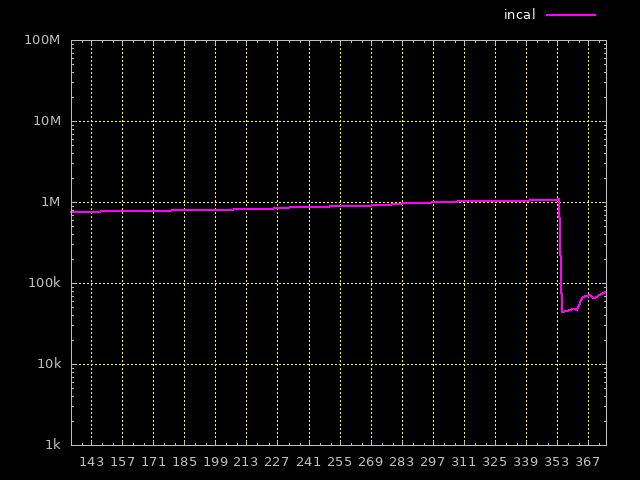
> plot \ > data u ($0+1):1 w l lc "cyan" lw 2 t "solene", \ > data u ($0+1):2 w l lc "magenta" lw 2 t "incal", \ > data u ($0+1):3 w l lc "yellow" lw 2 t "lich", \ > data u ($0+1):4 w l lc "green" lw 2 t "josk", \ > data u ($0+1):5 w l lc "white" lw 2 t "rjc", \ > data u ($0+1):6 w l lc "red" lw 2 t "katzeilla" I just read of columnhead, however that's still hard-coded (the number of lines) data="/home/incal/public_html/hits/hits.dat" plot \ data u ($0+1):1 w l lc "cyan" lw 2 t columnhead, \ data u ($0+1):2 w l lc "magenta" lw 2 t columnhead, \ data u ($0+1):3 w l lc "yellow" lw 2 t columnhead, \ data u ($0+1):4 w l lc "green" lw 2 t columnhead, \ data u ($0+1):5 w l lc "white" lw 2 t columnhead, \ data u ($0+1):6 w l lc "red" lw 2 t columnhead I realize I have sorted the data so the columnhead solution doesn't work if one dude passes the other. So right, I'll unsort that but ... I don't see how it will work, if one user is added or deleted for example? I guess tagging the individual data won't work. Maybe put it in a column of its own and refer to it explicitly? -- underground experts united https://dataswamp.org/~incal |
|
From: Emanuel B. <in...@da...> - 2022-06-28 00:42:54
|
> The only thing that isn't automated [...] are the user > names, those are known tho (from the log file names) so they > just need to be passed to gnuplot - maybe the columns in the > data files can be assigned names (a multi-column header)? So the data for day x is now at line x in the .dat file, e.g. day 147 at line 147 says 11814601 737184 610310 13198 4223 1885 Can I maybe tag these data, like this solene:11814601 incal:737184 lich:610310 josk:13198 rjc:4223 katzeilla:1885 or in some other way so that gnuplot will associate the graph with that name? So I don't have to do this hard-coding of the names? data="/home/incal/public_html/hits/hits.dat" plot \ data u ($0+1):1 w l lc "cyan" lw 2 t "solene", \ data u ($0+1):2 w l lc "magenta" lw 2 t "incal", \ data u ($0+1):3 w l lc "yellow" lw 2 t "lich", \ data u ($0+1):4 w l lc "green" lw 2 t "josk", \ data u ($0+1):5 w l lc "white" lw 2 t "rjc", \ data u ($0+1):6 w l lc "red" lw 2 t "katzeilla" ? The hard-coding isn't just bad because it is hard-coding in general, which is bad (almost always), here it is also the last step that isn't automated ... https://dataswamp.org/~incal/hits/hits.gpi https://dataswamp.org/~incal/hits/hits.png -- underground experts united https://dataswamp.org/~incal |
|
From: Emanuel B. <in...@da...> - 2022-06-27 20:26:15
|
Norwid Behrnd via gnuplot-info wrote:

>> It should start either at 2022-01-10 and then +7 days for
>> every xtick, or it can start with 148 also with +7 days
>> per step.
>
> From this I bet your interest is the automated analysis of
> time series with gnuplot [...]
>
> Ben Hoey's example is one both to easy to decipher and
> suitable as point of departure about how to interact from
> bash with gnuplot.

It is automated, the way you put it it seems more advanced
than it is tho ...

What happens is a zsh script [1] is invoked from cron once
every day, the script goes on to call Emacs which uses an
Elisp program [2] to fetch data from the logs already present
in the system - files named

  /var/www/logs/access-${user}.log

where one line equals one HTTP request or one hit for
our purposes.

All in all the zsh script including the Elisp extracts and
appends data to the data file [3] and then the gnuplot
commands [4] execute on that.

The result I've shown you many times by now ... thanks for all
the help. I think it looks cool!

The only thing that isn't automated IINM are the user names,
those are known tho (from the log file names) so they just
need to be passed to gnuplot - maybe the columns in the data
files can be assigned names (a multi-column header)?

  https://dataswamp.org/~incal/hits/hits.png

[1] https://dataswamp.org/~incal/hits/piles-all
[2] https://dataswamp.org/~incal/emacs-init/piles.el
[3] https://dataswamp.org/~incal/hits/ooa/hits.dat
[4] https://dataswamp.org/~incal/hits/hits.gpi

--
underground experts united
https://dataswamp.org/~incal
|
|
From: Emanuel B. <in...@da...> - 2022-06-27 20:02:25
|
theozh wrote: > if you give only one column for a line plot it will use the > pseudocolumn 0 as x-value (check "help pseudocolumns") which > is basically the line number (index zero-based). Understood, thanks! > So, instead use: > > data="/home/incal/public_html/hits/hits.dat" > plot \ > data u ($0+1):1 w l lc "cyan" lw 2 t "solene", ... You are right, that did it! Now everything is correct, the days, the weeks (start at Mondays). The only thing that is strange is it appears to be a week starting at day 147 if you look at the image? https://dataswamp.org/~incal/hits/hits.png Source: https://dataswamp.org/~incal/hits/hits.gpi -- underground experts united https://dataswamp.org/~incal |
|
From: theozh <th...@gm...> - 2022-06-27 06:35:46
|
if you give only one column for a line plot it will use the pseudocolumn 0 as x-value (check "help pseudocolumns") which is basically the line number (index zero-based).
So, instead use:

data="/home/incal/public_html/hits/hits.dat"
  plot \
    data u ($0+1):1 w l lc "cyan"    lw 2 t "solene",   ...
|
|
From: Emanuel B. <in...@da...> - 2022-06-27 02:24:30
|
Now it's almost good except it still counts from 0, so day 170 is actually day 171. I don't know how that can be changed, I'm tempted to add a bogus line to the data ... but no. Don't know what else to do tho? Take a look: https://dataswamp.org/~incal/hits/hits.png TIA #! /usr/local/bin/gnuplot # # this file: # https://dataswamp.org/~incal/hits/hits.gpi # # the graph: # https://dataswamp.org/~incal/hits/hits.png reset set term png background rgb "black" set out "/home/incal/public_html/hits/hits.png" set tics font "verdana,10" set format y "%.0s%c" set logscale y set yrange[1000:1e9] set format x "%s" timedate set xtics 2,7 set xrange [146:] noextend set grid lc "yellow" set border lc "gray" set key outside top right spacing 1.4 tc "white" font "verdana,10" horizontal data="/home/incal/public_html/hits/hits.dat" plot \ data u 1 w l lc "cyan" lw 2 t "solene", \ data u 2 w l lc "magenta" lw 2 t "incal", \ data u 3 w l lc "yellow" lw 2 t "lich", \ data u 4 w l lc "green" lw 2 t "josk", \ data u 5 w l lc "white" lw 2 t "rjc", \ data u 6 w l lc "red" lw 2 t "katzeilla" -- underground experts united https://dataswamp.org/~incal |
|
From: Norwid B. <nb...@ya...> - 2022-06-25 14:16:07
|
@Emanuel and future readers interested in time-series analysis with gnuplot : Two days ago, the discussion on fortran-lang about the continuous visualization of computational results[1] was amended by a link to the presentation «Realtime display with Gnuplot» by Ge Baolai (2022/06/15). As one of the online seminars hosted by the Canadian sharcnet,[2] three approaches how to address such a task are presented and compared with each other. So I think this would fit well here, too. To quote some of the abstract:[3] «In this talk we will discuss the technique for displaying output in real time with Gnuplot during number crunching and data processing. Often people might want to see the results while computing to determine if the program runs normally or to verify if the output results make sense. [...] We will show in this seminar how to use Gnuplot to achieve the goal of displaying output data in real time without calling external functions explicitly. The targeted audience would be those who use general purpose programming languages such as C/C++, Fortran, shell scripting etc.» In addition to the video,[4] the presenter's slides[5] are shared. [1] «How to use Fortran + gnuplot to plot in real time in just one window?», root entry https://fortran-lang.discourse.group/t/how-to-use-fortran-gnuplot-to-plot-in-real-time-in-just-one-window/2904 [2] https://helpwiki.sharcnet.ca/wiki/Online_Seminars [3] https://helpwiki.sharcnet.ca/wiki/Webinar_2022_Realtime_display_with_Gnuplot [4] https://youtu.be/A9YPibAEXEE [5] https://helpwiki.sharcnet.ca/wiki/images/e/ea/Dirt.pdf |
|
From: Ethan M. <eam...@gm...> - 2022-06-24 18:10:04
|
On Friday, 24 June 2022 01:30:25 PDT Emanuel Berg wrote:
>
> But how will one get infamation on the x-axis?
>
> It should start either at 2022-01-10 and then +7 days for
> every xtick, or it can start with 148 also with +7 days
> per step.
>
> In the shell (shell-mode) it works using
> 'date +"%Y-%m-%d"' or 'date +"%j"' if that helps ...
>
> It would be better to automate it than hard code it but
> actually hard-code would also be an improvement at this stage.

I draw your attention to these possibly relevant changes to gnuplot
from last year.  These are in the development code but not in the
current version 5.4 release.    Is there interest in having these changes
back-ported to 5.4?

commit a8a8a88d77a77f3af047f5b4d0444737a6837c67
Author: Ethan A Merritt <merritt@u.washington.edu>
Date:   Mon Jun 14 15:03:25 2021 -0700

   "set mxtics time <N> <units"

   Allow explicit choice of minitic placement along time axis.
   For example
       set mxtics time 1 month
   places a minitic exactly on the 1st day of Feb/Mar/Apr even
   though this does not correspond to equal intervals measured in days.
commit 529062ae873901010d138e68897d8f6d057a8e7a
Author: Ethan A Merritt <merritt@u.washington.edu>
Date:   Tue Jun 15 22:19:08 2021 -0700

   Revise auto-placement of tics for time data

   For timescales of days or longer, if a ticmark is generated for
   some date then place it at the start of that same day (0 AM).
   The spacing between "day" tics is always exactly N days.

   It used to be that the date was rounded up if time > 22:00 but
   hours/minutes/seconds were left unchanged. This meant that the
   tic positions were not exactly on a day boundary and might not
   even be on the same day. Thus the spacing between "dates" was not
   an integral number of days.

   This discrepancy was particularly obvious when using the new
   option "set minitics time N days", since the evenly spaced
   minitics did not align with the major tics.
|
|
From: Norwid B. <nb...@ya...> - 2022-06-24 17:50:44
|
> > But how will one get infamation on the x-axis? > > It should start either at 2022-01-10 and then +7 days for > every xtick, or it can start with 148 also with +7 days > per step. > From this I bet your interest is the automated analysis of time series with gnuplot. Did you visit the gallery of examples on gnuplot.info, in particular about axis transformation?[1] Ben Hoey's example[2] is one both to easy to decipher and suitable as point of departure about how to interact from bash with gnuplot. (Your mileage may vary for other OSes like Windows or Mac.) For one, he stores the log data in a space separated file named `mydata.txt`: ``` 2019-02-01 15 2019-03-01 8 2019-04-01 16 2019-05-01 20 2019-06-01 14 ``` For two, the pattern to be applied is defined in a gnuplot script called to action from the CLI including arguments. It isn't like Python's argparse where you have to define and remember the flag's keys, but their counting and sequence: ARG0 refers to the name of the gnuplot script itself. ARG1, ARG2, etc. are for subsequent adjustments to affect gnuplot's work. Already modified for demonstration, Ben's script I store as `s1.spt` in the same folder as `mydata.txt` is the following (lines' length limit is 80 chars/line): ``` set xdata time # Indicate that x-axis values are time values set timefmt "%Y-%m-%d" # Indicate the pattern the time values will be in # set format x "%m-%y" # Set how the dates will be displayed on the plot # set xrange ["2019-01-01":"2019-12-31"] # Set x-axis range of values set yrange [0:30] # Set y-axis range of values set key off # Turn off graph legend set xtics rotate by -45 # Rotate dates on x-axis 45deg for cleaner display set title 'Squirrels Spotted' # Set graph title # set terminal jpeg # Set the output format to jpeg # set output 'output.jpg' # Set output file to output.jpg # introduced modifications, start: set xrange [ARG1:ARG2] # listen to arguments by the CLI set format x "%Y-%m" # coarse-to-fine time format on abscissa set grid set terminal pngcairo set output "test.png" # introduced modifications, end. plot 'mydata.txt' using 1:2 with linespoints linetype 6 linewidth 2 ``` Three, gnuplot is called from the CLI with `-c` (like /collect/ the arguments) in a pattern like ``` gnuplot -c s1.spt 2019-01-01 2019-12-31 gnuplot -c s1.spt 2019-03-14 2019-07-14 ``` with ARG1 defining the start, and ARG2 the end of the canvas. In the present example, the two have to be provided in the pattern YYYY-MM-DD. If the data contain more than two columns, either adjust `using` (short `u`) to indicate gnuplot the independent and dependent variable(s), or reorganize the log file submitted to gnuplot (e.g., AWK). On the other hand, it looks like the major bits and bolts now are at hand to automate your report generation. [1] http://gnuplot.sourceforge.net/demo_5.4/timedat.html [2] https://bhoey.com/blog/simple-time-series-graphs-with-gnuplot/ |
|
From: Emanuel B. <in...@da...> - 2022-06-24 08:30:44
|
Norwid Behrnd via gnuplot-info wrote: > For two, the user defined additional tic only was set to > show that this possibility (still) is at your disposition. > E.g., to mark a critical threshold like in control charts > (analytical chemistry / chemical engineering), adding > lower/upper control levels before a process runs away. Thus, > it was an alternative to an one-liner like Right, I would have expected such a feature to exist and now you have showed it beyond doubt :) But how will one get infamation on the x-axis? It should start either at 2022-01-10 and then +7 days for every xtick, or it can start with 148 also with +7 days per step. In the shell (shell-mode) it works using 'date +"%Y-%m-%d"' or 'date +"%j"' if that helps ... It would be better to automate it than hard code it but actually hard-code would also be an improvement at this stage. https://dataswamp.org/~incal/hits/hits.gpi https://dataswamp.org/~incal/hits/hits.png -- underground experts united https://dataswamp.org/~incal |
|
From: Norwid B. <nb...@ya...> - 2022-06-24 08:10:11
|
Emanuel Berg wrote:

>
> > set ytics font "verdana,10" add \
> > ("25 M"   2.5e7)  # only shown for the ordinate scaling by lg
>
> Looks even better without it?
>

For one, I agree with you there are situations where indeed it does
look better without it.

For two, the user defined additional tic only was set to show that
this possibility (still) is at your disposition.  E.g., to mark a
critical threshold like in control charts (analytical chemistry /
chemical engineering), adding lower/upper control levels before a
process runs away.  Thus, it was an alternative to an one-liner like

```
set arrow from graph 0,first 2.5e7 to graph 1, first 2.5e7 nohead lt
0 lc "red"
```

as in «our infrastructure reliably processes up to 25M events/s».
|
|
From: Emanuel B. <in...@da...> - 2022-06-24 05:05:55
|
Norwid Behrnd via gnuplot-info wrote:

> set ytics font "verdana,10" add \
> ("25 M"   2.5e7)  # only shown for the ordinate scaling by lg

Looks even better without it?

  https://dataswamp.org/~incal/hits/hits.gpi
  https://dataswamp.org/~incal/hits/hits.png

--
underground experts united
https://dataswamp.org/~incal
|
|
From: Emanuel B. <in...@da...> - 2022-06-24 05:05:51
|
Norwid Behrnd via gnuplot-info wrote:

> + gnuplot actually may add SI prefixes (k, M, etc.) on the
>   scales for you and show user-defined tics. For this to
>   happen, drop "set format y "%.0f" to try instead ``` set
>   format y '%.0s %c'
>
> set ytics font "verdana,10" add \
> ("25 M"   2.5e7)  # only shown for the ordinate scaling by lg
>
> set logscale y  # i.e., the implicit form of "set logscale y 10"

Oh, cool!

> Perhaps altogether with an instruction like "set
> yrange[1000:1e9]"

Done.

> this may justify to move/reorganize the keys a little bit.

https://dataswamp.org/~incal/hits/hits.png B)

--
underground experts united
https://dataswamp.org/~incal
|
|
From: Emanuel B. <in...@da...> - 2022-06-24 05:05:51
|
theozh wrote: > Please read `help colorspec` carefully. > > This would be one valid option of many options: > > green = "#00009600" > set title font "verdana,12" tc rgbcolor green [...] OK, but I thought it worked with just 'tc "#00009600"' so I don't understand why rgbcolor is needed all of a sudden? Maybe it didn't work, actually. But anyway I decided to stick with the default/built-in colors so now it looks like this: https://dataswamp.org/~incal/hits/hits.png Thank anyway ... -- underground experts united https://dataswamp.org/~incal |
|
From: theozh <th...@gm...> - 2022-06-23 19:28:38
|
Please read `help colorspec` carefully. This would be one valid option of many options: green = "#00009600" set title font "verdana,12" tc rgbcolor green "hits \\@ https://dataswamp.org/\\~$USER" Am 23.06.2022 um 09:39 schrieb Emanuel Berg: > Why doesn't this work and how should you put it? > > green = "#00009600" > # ... > set title font "verdana,12" tc green "hits \\@ https://dataswamp.org/\\~$USER" > > It says the "colorspec option not recognized." at "green" on the last line. > > https://dataswamp.org/~incal/hits/hits.gpi > https://dataswamp.org/~incal/hits/hits.png > |
|
From: Norwid B. <nb...@ya...> - 2022-06-23 12:33:44
|
Emanuel Berg <in...@da...> wrote:

>
> Brilliant,
>
> set format y "%.0f"
> set ytics add (0           0, \
>                "1M"  1000000, \
>                "2M"  2000000, \
>                "4M"  4000000, \
>                "6M"  6000000, \
>                "8M"  8000000, \
>               "10M" 10000000, \
>               "12M" 12000000, \
>               "14M" 14000000)
>
> works!
>

With the data available (and because the question is interesting), two
additional comments:

+ you may ease managing user-defined tics with exponential notation
  like e.g., in Fortran:

  ```
set format y "%.0f"
set ytics font "verdana,10" add \
              (  0         0, \
               "1M"  1e06, \
               "2M"  2e06, \
               "4M"  4e06, \
               "6M"  6e06, \
               "8M"  8e06, \
              "10M"  1e07, \
              "12M" 1.2e7, \
              "14M" 1.4e7)
   ```

+ gnuplot actually may add SI prefixes (k, M, etc.) on the scales for
  you and show user-defined tics.  For this to happen, drop "set
  format y "%.0f" to try instead

  ```
set format y '%.0s %c'

set ytics font "verdana,10" add \
("25 M"   2.5e7)  # only shown for the ordinate scaling by lg

set logscale y  # i.e., the implicit form of "set logscale y 10"
  ```

  The plot then retains an obvious hint something happened to
  "katzeilla" and "rjc" during the first interval of recording while
  the relative variation of the other traces was smaller.  Credit to
  stackoverflow user Christoph for the showcase[1] about the
  alternative format.

  Perhaps altogether with an instruction like "set yrange[1000:1e9]"
  this may justify to move/reorganize the keys a little bit.

[1]
https://stackoverflow.com/questions/25123624/gnuplot-y-axis-format-convert-bytes-to-megabytes/25125788#25125788
|
|
From: Emanuel B. <in...@da...> - 2022-06-23 07:39:48
|
Why doesn't this work and how should you put it? green = "#00009600" # ... set title font "verdana,12" tc green "hits \\@ https://dataswamp.org/\\~$USER" It says the "colorspec option not recognized." at "green" on the last line. https://dataswamp.org/~incal/hits/hits.gpi https://dataswamp.org/~incal/hits/hits.png -- underground experts united https://dataswamp.org/~incal |
|
From: Emanuel B. <in...@da...> - 2022-06-23 07:22:57
|
>> You simply have to set the linecolor and textcolor of all >> the other objects, e.g. borders, labels, tics, etc. >> to "white". > > How do you set the size of the numbers for the y-axis? ytics Getting the hang of it :) -- underground experts united https://dataswamp.org/~incal |
|
From: Emanuel B. <in...@da...> - 2022-06-23 07:11:29
|
theozh wrote: > You simply have to set the linecolor and textcolor of all > the other objects, e.g. borders, labels, tics, etc. > to "white". How do you set the size of the numbers for the y-axis? This set ylabel font "verdana,11" doesn't seem to take. -- underground experts united https://dataswamp.org/~incal |
|
From: Emanuel B. <in...@da...> - 2022-06-23 07:02:29
|
Norwid Behrnd via gnuplot-info wrote:

> set ytics 10
> set mytics 10
>
> set ytics add ( "1 kb" 1000, \
> "10 kb" 10000, \
> "100 kb" 100000,\
> "1 mb" 1000000, \
> "10 mb" 10000000,\
> "100 mb" 100000000,\
> "1 gb" 1000000000, \
> "10 gb" 10000000000.0,\
> "100 gb" 100000000000.0,\
> "1 tb" 1000000000000.0, \
> "10 tb" 10000000000000.0, \
> "100 tb" 100000000000000.0, \
> "1 pb" 1000000000000000.0, \
> "10 pb" 10000000000000000.0 )

Brilliant,

set format y "%.0f"
set ytics add (0           0, \
               "1M"  1000000, \
               "2M"  2000000, \
               "4M"  4000000, \
               "6M"  6000000, \
               "8M"  8000000, \
              "10M" 10000000, \
              "12M" 12000000, \
              "14M" 14000000)

works!

https://dataswamp.org/~incal/hits/hits.gpi
https://dataswamp.org/~incal/hits/hits.png

--
underground experts united
https://dataswamp.org/~incal
|
|
From: Emanuel B. <in...@da...> - 2022-06-23 06:53:22
|
theozh wrote: >>> You can also read the docs. In gnuplot console type: help >>> borders, help xtics, etc.. One example hint: `set border >>> lc "white" >> >> Thanks but for the key and title lc is an "unknown key >> option"? > > Please read the documentation of `help key` and `help > title`. There is an option "textcolor" or "tc" Ah, now I understand where the console is. In the console! Thanks, that did it! Now just some polishing and trying-out with the colors and all set :) https://dataswamp.org/~incal/hits/hits.gpi https://dataswamp.org/~incal/hits/hits.png -- underground experts united https://dataswamp.org/~incal |
|
From: Emanuel B. <in...@da...> - 2022-06-23 06:34:11
|
Ethan Merritt wrote:

> A correction, sorry. I meant to say the standard "C" local
> does not use a special character for the thousands
> separator. That is the default for gnuplot. en_US locale
> uses a comma. fr_FR uses a space.
>
> set decimal locale 'fr_FR.UTF-8'
> FR = sprintf("%'.2f", A)
> print "FR format is ", FR
> Output:
>
> decimal_sign in locale is .
> decimal_sign in locale is ,
> US format is  1,234,567.89
> FR format is  1 234 567,89

Thanks for the explanation and example, I get it, but I'm not
getting it to work.

First, for me it says "decimal sign in locale is ." after
I set it to French; and after that it's still 14000000, i.e.
no grouping.

14M would be optimal IMO but 14 000 000 much better than
14000000 and "good enough for government work" I guess.

--
underground experts united
https://dataswamp.org/~incal
|
|
From: theozh <th...@gm...> - 2022-06-23 04:06:48
|
> You simply have to set the linecolor and textcolor of all the other objects, e.g. borders, labels, tics, etc. to "white". Please read the documentation of `help key` and `help title`. There is an option "textcolor" or "tc" Am 23.06.2022 um 03:47 schrieb Emanuel Berg: > theozh wrote: > >> You can also read the docs. >> In gnuplot console type: help borders, help xtics, etc.. >> One example hint: `set border lc "white" > > Thanks but for the key and title lc is an "unknown key > option"? > |
|
From: Ethan M. <eam...@gm...> - 2022-06-23 03:44:57
|
On Wednesday, 22 June 2022 20:25:53 PDT Ethan Merritt wrote:
> On Wednesday, 22 June 2022 18:41:52 PDT Emanuel Berg wrote:
> > >> you might want to try "%0'.f" or "%'0.f" (whichever you
> > >> find easier to read).
> > >
> > > What does that apostrophe do?
> >
> > Grouping. Don't know if that's supported or why it doesn't
> > work. But OK.
>
> The thousands separator format is sensitive to the current locale.
> I do not know of any way to set is separately; only as one component
> of a full numerical locale.  Standard US practice does not use a special
> character for this purpose, so the standard US locale ignores the aposrophe
> in a format.

A correction, sorry.
I meant to say the standard "C" local does not use a special character
for the thousands separator.  That is the default for gnuplot.
en_US locale uses a comma.  fr_FR uses a space.

	Ethan

> Other locales do provide one, however.
>
> Here is an example of how you can use this in gnuplot:
> Script:
>
> A = 1234567.89
>
> set decimal locale 'en_US.UTF-8'
> US = sprintf("%'.2f", A)
> print "US format is ", US
>
> set decimal locale 'fr_FR.UTF-8'
> FR = sprintf("%'.2f", A)
> print "FR format is ", FR
> Output:
>
> decimal_sign in locale is .
> decimal_sign in locale is ,
> US format is  1,234,567.89
> FR format is  1 234 567,89
>
> 	Ethan
>
>
|
|
From: Ethan M. <eam...@gm...> - 2022-06-23 03:26:06
|
On Wednesday, 22 June 2022 18:41:52 PDT Emanuel Berg wrote:
> >> you might want to try "%0'.f" or "%'0.f" (whichever you
> >> find easier to read).
> >
> > What does that apostrophe do?
>
> Grouping. Don't know if that's supported or why it doesn't
> work. But OK.

The thousands separator format is sensitive to the current locale.
I do not know of any way to set is separately; only as one component
of a full numerical locale.  Standard US practice does not use a special
character for this purpose, so the standard US locale ignores the aposrophe
in a format.   Other locales do provide one, however.

Here is an example of how you can use this in gnuplot:
Script:

A = 1234567.89

set decimal locale 'en_US.UTF-8'
US = sprintf("%'.2f", A)
print "US format is ", US

set decimal locale 'fr_FR.UTF-8'
FR = sprintf("%'.2f", A)
print "FR format is ", FR
Output:

decimal_sign in locale is .
decimal_sign in locale is ,
US format is  1,234,567.89
FR format is  1 234 567,89

	Ethan
|
635 messages has been excluded from this view by a project administrator.