Menu
▾
▴
Re: [Matplotlib-users] windrose
|
From: Shahar Shani-K. <ka...@po...> - 2013-03-19 20:06:09
|
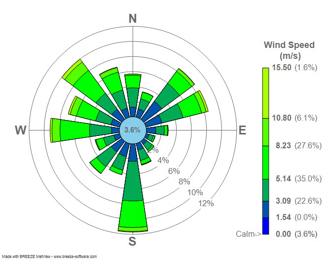
Just a thought: Shouldn't the bars terminate with a arc rather then a straight line? What value should one reading this diagram look at? The one at the center of the "bar" or the "corners" these values can be quite different. Sent from my iPhone On Mar 19, 2013, at 8:00 PM, Paul Hobson <pmh...@gm...> wrote: > On Tue, Mar 19, 2013 at 2:22 AM, Sudheer Joseph <sud...@ya...> wrote: >> Dear users, >> Attached is a windrose diagram created by using https://sourceforge.net/project/showfiles.php?group_id=239240&package_id=290902 . Can any one tell me if the numbers displayed in the attached plot is % of wind directions in each category? or are they represent some other numbers? >> >> http://3.bp.blogspot.com/_4ZlrnfU7IT8/TPxpftZGzfI/AAAAAAAAADA/uq9cF3PTpR8/s1600/Wind_rose_plot.jpg > > Sudheer, > > That's correct. The total length of the bars is the percentage of time that the wind is blowing *from* that direction. > See my implementation here: https://github.com/phobson/python-metar/blob/master/metar/graphics.py#L135 > > Side note, you're emails are consistently formatted pretty strangely and can be difficult to read. Perhaps stick with the same font that is in your email signature? > ------------------------------------------------------------------------------ > Everyone hates slow websites. So do we. > Make your web apps faster with AppDynamics > Download AppDynamics Lite for free today: > http://p.sf.net/sfu/appdyn_d2d_mar > _______________________________________________ > Matplotlib-users mailing list > Mat...@li... > https://lists.sourceforge.net/lists/listinfo/matplotlib-users |