Menu
▾
▴
Re: [Matplotlib-users] windrose
|
From: Paul H. <pmh...@gm...> - 2013-03-19 18:00:41
|
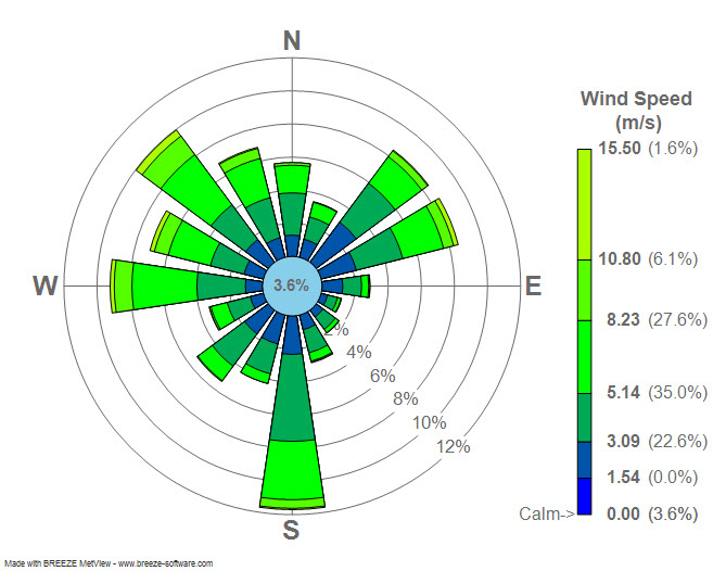
On Tue, Mar 19, 2013 at 2:22 AM, Sudheer Joseph <sud...@ya...>wrote: > Dear users, > Attached is a windrose diagram created by using > https://sourceforge.net/project/showfiles.php?group_id=239240&package_id=290902. Can any one tell me if the numbers displayed in the attached plot is % of > wind directions in each category? or are they represent some other numbers? > > > http://3.bp.blogspot.com/_4ZlrnfU7IT8/TPxpftZGzfI/AAAAAAAAADA/uq9cF3PTpR8/s1600/Wind_rose_plot.jpg > > Sudheer, That's correct. The total length of the bars is the percentage of time that the wind is blowing *from* that direction. See my implementation here: https://github.com/phobson/python-metar/blob/master/metar/graphics.py#L135 Side note, you're emails are consistently formatted pretty strangely and can be difficult to read. Perhaps stick with the same font that is in your email signature? |