
Menu
▾
▴
matplotlib-users — Discussion related to using matplotlib
You can subscribe to this list here.
| 2003 |
Jan
|
Feb
|
Mar
|
Apr
|
May
(3) |
Jun
|
Jul
|
Aug
(12) |
Sep
(12) |
Oct
(56) |
Nov
(65) |
Dec
(37) |
|---|---|---|---|---|---|---|---|---|---|---|---|---|
| 2004 |
Jan
(59) |
Feb
(78) |
Mar
(153) |
Apr
(205) |
May
(184) |
Jun
(123) |
Jul
(171) |
Aug
(156) |
Sep
(190) |
Oct
(120) |
Nov
(154) |
Dec
(223) |
| 2005 |
Jan
(184) |
Feb
(267) |
Mar
(214) |
Apr
(286) |
May
(320) |
Jun
(299) |
Jul
(348) |
Aug
(283) |
Sep
(355) |
Oct
(293) |
Nov
(232) |
Dec
(203) |
| 2006 |
Jan
(352) |
Feb
(358) |
Mar
(403) |
Apr
(313) |
May
(165) |
Jun
(281) |
Jul
(316) |
Aug
(228) |
Sep
(279) |
Oct
(243) |
Nov
(315) |
Dec
(345) |
| 2007 |
Jan
(260) |
Feb
(323) |
Mar
(340) |
Apr
(319) |
May
(290) |
Jun
(296) |
Jul
(221) |
Aug
(292) |
Sep
(242) |
Oct
(248) |
Nov
(242) |
Dec
(332) |
| 2008 |
Jan
(312) |
Feb
(359) |
Mar
(454) |
Apr
(287) |
May
(340) |
Jun
(450) |
Jul
(403) |
Aug
(324) |
Sep
(349) |
Oct
(385) |
Nov
(363) |
Dec
(437) |
| 2009 |
Jan
(500) |
Feb
(301) |
Mar
(409) |
Apr
(486) |
May
(545) |
Jun
(391) |
Jul
(518) |
Aug
(497) |
Sep
(492) |
Oct
(429) |
Nov
(357) |
Dec
(310) |
| 2010 |
Jan
(371) |
Feb
(657) |
Mar
(519) |
Apr
(432) |
May
(312) |
Jun
(416) |
Jul
(477) |
Aug
(386) |
Sep
(419) |
Oct
(435) |
Nov
(320) |
Dec
(202) |
| 2011 |
Jan
(321) |
Feb
(413) |
Mar
(299) |
Apr
(215) |
May
(284) |
Jun
(203) |
Jul
(207) |
Aug
(314) |
Sep
(321) |
Oct
(259) |
Nov
(347) |
Dec
(209) |
| 2012 |
Jan
(322) |
Feb
(414) |
Mar
(377) |
Apr
(179) |
May
(173) |
Jun
(234) |
Jul
(295) |
Aug
(239) |
Sep
(276) |
Oct
(355) |
Nov
(144) |
Dec
(108) |
| 2013 |
Jan
(170) |
Feb
(89) |
Mar
(204) |
Apr
(133) |
May
(142) |
Jun
(89) |
Jul
(160) |
Aug
(180) |
Sep
(69) |
Oct
(136) |
Nov
(83) |
Dec
(32) |
| 2014 |
Jan
(71) |
Feb
(90) |
Mar
(161) |
Apr
(117) |
May
(78) |
Jun
(94) |
Jul
(60) |
Aug
(83) |
Sep
(102) |
Oct
(132) |
Nov
(154) |
Dec
(96) |
| 2015 |
Jan
(45) |
Feb
(138) |
Mar
(176) |
Apr
(132) |
May
(119) |
Jun
(124) |
Jul
(77) |
Aug
(31) |
Sep
(34) |
Oct
(22) |
Nov
(23) |
Dec
(9) |
| 2016 |
Jan
(26) |
Feb
(17) |
Mar
(10) |
Apr
(8) |
May
(4) |
Jun
(8) |
Jul
(6) |
Aug
(5) |
Sep
(9) |
Oct
(4) |
Nov
|
Dec
|
| 2017 |
Jan
(5) |
Feb
(7) |
Mar
(1) |
Apr
(5) |
May
|
Jun
(3) |
Jul
(6) |
Aug
(1) |
Sep
|
Oct
(2) |
Nov
(1) |
Dec
|
| 2018 |
Jan
|
Feb
|
Mar
|
Apr
(1) |
May
|
Jun
|
Jul
|
Aug
|
Sep
|
Oct
|
Nov
|
Dec
|
| 2020 |
Jan
|
Feb
|
Mar
|
Apr
|
May
(1) |
Jun
|
Jul
|
Aug
|
Sep
|
Oct
|
Nov
|
Dec
|
| 2025 |
Jan
(1) |
Feb
|
Mar
|
Apr
|
May
|
Jun
|
Jul
|
Aug
|
Sep
|
Oct
|
Nov
|
Dec
|
|
From: Benjamin R. <ben...@ou...> - 2013-03-22 16:44:19
|
On Fri, Mar 22, 2013 at 12:39 PM, Sterling Smith <sm...@fu...>wrote: > Steven, > > Did you mean to switch back to AxesGrid? I thought you said that it was > fixed with Grid. > > -Sterling > > No, I am saying that your example used "AxesGrid". Use "Grid". Ben Root |
|
From: Benjamin R. <ben...@ou...> - 2013-03-22 16:40:15
|
On Fri, Mar 22, 2013 at 12:30 PM, Steven Boada <bo...@ph...>wrote: > Well... I jumped the gun. To better illustrate the problem(s) I am having, > I wrote a simple script that doesn't work... > > import pylab as pyl > from mpl_toolkits.axes_grid1 import AxesGrid > > # make some data > xdata = pyl.random(100) * 25. > ydata = pyl.random(100) * 8. > colordata = pyl.random(100) * 3. > > # make us a figure > F = pyl.figure(1,figsize=(5.5,3.5)**) > grid = AxesGrid(F, 111, > nrows_ncols=(1,2), > axes_pad = 0.1, > add_all=True, > share_all = True, > cbar_mode = 'each', > cbar_location = 'top') > > # Plot! > sc1 = grid[0].scatter(xdata, ydata, c=colordata, s=50, cmap='spectral') > sc2 = grid[1].scatter(xdata, ydata, c=colordata, s=50, cmap='spectral') > > # Add colorbars > grid.cbar_axes[0].colorbar(**sc1) > grid.cbar_axes[1].colorbar(**sc2) > > grid[0].set_xlim(0,25) > grid[0].set_ylim(0,8) > > pyl.show() > > > And you get some squashed figures... I'll attach a png. > > Thanks again. > > Steven > > You used AxesGrid again, not Grid. AxesGrid implicitly applies an aspect='equal' to the subplots. This means that a unit of distance on the x-axis takes the same amount of space as the same unit of distance on the y-axis. In your example, the x axis goes from 0 to 25, while the y-axis goes from 0 to 8. When aspect='equal', the y-axis will then be about a third the size of the x-axis, because the y-limits are about a third the size of the x-limits. Ben Root |
|
From: Michael D. <md...@st...> - 2013-03-22 16:40:14
|
See https://github.com/matplotlib/matplotlib/pull/1846 On 03/22/2013 11:17 AM, Michael Droettboom wrote: > It's puzzler. I'm looking at it now. > > Mike > > On 03/22/2013 06:33 AM, Andrew Dawson wrote: >> Thanks, the clipping is working now. But as you say the weird line >> width issue still remains for Agg (and png, perhaps that uses Agg, I >> don't know...). PDF output looks correct. >> >> >> On 20 March 2013 05:48, Jae-Joon Lee <lee...@gm... >> <mailto:lee...@gm...>> wrote: >> >> >> On Wed, Mar 13, 2013 at 2:17 AM, Andrew Dawson >> <da...@at... <mailto:da...@at...>> wrote: >> >> You should see that the circle is no longer circular, and >> also there are weird line width issues. What I want it >> basically exactly like the attached without_clipping.png but >> with paths inside the circle removed. >> >> >> The reason that circle is no more circle is that simply inverting >> the vertices does not always results in a correctly inverted path. >> Instead of following line. >> >> interior.vertices = interior.vertices[::-1] >> >> You should use something like below. >> >> interior = mpath.Path(np.concatenate([interior.vertices[-2::-1], >> interior.vertices[-1:]]), >> interior.codes) >> >> It would be good if we have a method to invert a path. >> >> This will give you a circle. But the weird line width issue >> remains. This seems to be an Agg issue, and the line width seems >> to depend on the dpi. >> I guess @mdboom nay have some insight on this. >> >> Regards, >> >> -JJ >> >> >> >> >> -- >> Dr Andrew Dawson >> Atmospheric, Oceanic & Planetary Physics >> Clarendon Laboratory >> Parks Road >> Oxford OX1 3PU, UK >> Tel: +44 (0)1865 282438 >> Email: da...@at... <mailto:da...@at...> >> Web Site: http://www2.physics.ox.ac.uk/contacts/people/dawson >> >> >> ------------------------------------------------------------------------------ >> Everyone hates slow websites. So do we. >> Make your web apps faster with AppDynamics >> Download AppDynamics Lite for free today: >> http://p.sf.net/sfu/appdyn_d2d_mar >> >> >> _______________________________________________ >> Matplotlib-users mailing list >> Mat...@li... >> https://lists.sourceforge.net/lists/listinfo/matplotlib-users > > > > ------------------------------------------------------------------------------ > Everyone hates slow websites. So do we. > Make your web apps faster with AppDynamics > Download AppDynamics Lite for free today: > http://p.sf.net/sfu/appdyn_d2d_mar > > > _______________________________________________ > Matplotlib-users mailing list > Mat...@li... > https://lists.sourceforge.net/lists/listinfo/matplotlib-users |
|
From: Sterling S. <sm...@fu...> - 2013-03-22 16:40:05
|
Steven, Did you mean to switch back to AxesGrid? I thought you said that it was fixed with Grid. -Sterling On Mar 22, 2013, at 9:30AM, Steven Boada wrote: > Well... I jumped the gun. To better illustrate the problem(s) I am having, I wrote a simple script that doesn't work... > > import pylab as pyl > from mpl_toolkits.axes_grid1 import AxesGrid > > # make some data > xdata = pyl.random(100) * 25. > ydata = pyl.random(100) * 8. > colordata = pyl.random(100) * 3. > > # make us a figure > F = pyl.figure(1,figsize=(5.5,3.5)) > grid = AxesGrid(F, 111, > nrows_ncols=(1,2), > axes_pad = 0.1, > add_all=True, > share_all = True, > cbar_mode = 'each', > cbar_location = 'top') > > # Plot! > sc1 = grid[0].scatter(xdata, ydata, c=colordata, s=50, cmap='spectral') > sc2 = grid[1].scatter(xdata, ydata, c=colordata, s=50, cmap='spectral') > > # Add colorbars > grid.cbar_axes[0].colorbar(sc1) > grid.cbar_axes[1].colorbar(sc2) > > grid[0].set_xlim(0,25) > grid[0].set_ylim(0,8) > > pyl.show() > > > And you get some squashed figures... I'll attach a png. > > Thanks again. > > Steven > > On Fri Mar 22 10:49:44 2013, Steven Boada wrote: >> >> Thanks JJ! >> >> That did fix my problem, but I can't say I understand what the >> difference is. Why does Axesgrid make them squashed while just Grid >> works? >> >> >> On Thu Mar 21 22:28:34 2013, Jae-Joon Lee wrote: >>> >>> It is not clear what your problem is. >>> AxesGrid implicitly assumes aspect=1 for each axes. So, I guess your >>> y-limits are smaller (in its span) than x-limits. >>> If you don't want this behavior, there is no need of using the >>> AxesGrid. Rather use Grid, or simply subplots. >>> >>> import matplotlib.pyplot as plt >>> from mpl_toolkits.axes_grid1 import Grid >>> >>> F = plt.figure(1,(5.5,3.5)) >>> grid = Grid(F, 111, >>> nrows_ncols=(1,3), >>> axes_pad = 0.1, >>> add_all=True, >>> label_mode = 'L', >>> ) >>> >>> If this is not the answer you're looking for, I recommend you to post >>> a complete but simple script that reproduces your problem and describe >>> the problem more explicitly. >>> >>> Regards, >>> >>> -JJ >>> >>> >>> On Fri, Mar 22, 2013 at 6:03 AM, Steven Boada <bo...@ph... >>> <mailto:bo...@ph...>> wrote: >>> >>> Heya List, >>> >>> See attached image for what I mean. >>> >>> Here is the grid creation bit. I can't seem to figure out what >>> might be causing such a problem. >>> >>> F = pyl.figure(1,(5.5,3.5)) >>> grid = AxesGrid(F, 111, >>> nrows_ncols=(1,3), >>> axes_pad = 0.1, >>> add_all=True, >>> label_mode = 'L', >>> aspect=True) >>> >>> Should be simple enough right? >>> >>> -- >>> >>> Steven Boada >>> >>> Doctoral Student >>> Dept of Physics and Astronomy >>> Texas A&M University >>> bo...@ph... <mailto:bo...@ph...> >>> >>> >>> ------------------------------------------------------------------------------ >>> Everyone hates slow websites. So do we. >>> Make your web apps faster with AppDynamics >>> Download AppDynamics Lite for free today: >>> http://p.sf.net/sfu/appdyn_d2d_mar >>> _______________________________________________ >>> Matplotlib-users mailing list >>> Mat...@li... >>> <mailto:Mat...@li...> >>> https://lists.sourceforge.net/lists/listinfo/matplotlib-users >>> >>> >> >> >> -- >> >> Steven Boada >> >> Doctoral Student >> Dept of Physics and Astronomy >> Texas A&M University >> bo...@ph... >> >> ------------------------------------------------------------------------------ >> Everyone hates slow websites. So do we. >> Make your web apps faster with AppDynamics >> Download AppDynamics Lite for free today: >> http://p.sf.net/sfu/appdyn_d2d_mar >> _______________________________________________ >> Matplotlib-users mailing list >> Mat...@li... >> https://lists.sourceforge.net/lists/listinfo/matplotlib-users >> >> -- >> >> Steven Boada >> >> Doctoral Student >> Dept of Physics and Astronomy >> Texas A&M University >> bo...@ph... > <Screen Shot 2013-03-22 at 11.27.19 AM.png>------------------------------------------------------------------------------ > Everyone hates slow websites. So do we. > Make your web apps faster with AppDynamics > Download AppDynamics Lite for free today: > http://p.sf.net/sfu/appdyn_d2d_mar_______________________________________________ > Matplotlib-users mailing list > Mat...@li... > https://lists.sourceforge.net/lists/listinfo/matplotlib-users |
|
From: Steven B. <bo...@ph...> - 2013-03-22 16:30:12
|
Well... I jumped the gun. To better illustrate the problem(s) I am
having, I wrote a simple script that doesn't work...

import pylab as pyl
from mpl_toolkits.axes_grid1 import AxesGrid

# make some data
xdata = pyl.random(100) * 25.
ydata = pyl.random(100) * 8.
colordata = pyl.random(100) * 3.

# make us a figure
F = pyl.figure(1,figsize=(5.5,3.5))
grid = AxesGrid(F, 111,
         nrows_ncols=(1,2),
         axes_pad = 0.1,
         add_all=True,
         share_all = True,
         cbar_mode = 'each',
         cbar_location = 'top')

# Plot!
sc1 = grid[0].scatter(xdata, ydata, c=colordata, s=50, cmap='spectral')
sc2 = grid[1].scatter(xdata, ydata, c=colordata, s=50, cmap='spectral')

# Add colorbars
grid.cbar_axes[0].colorbar(sc1)
grid.cbar_axes[1].colorbar(sc2)

grid[0].set_xlim(0,25)
grid[0].set_ylim(0,8)

pyl.show()


And you get some squashed figures... I'll attach a png.

Thanks again.

Steven

On Fri Mar 22 10:49:44 2013, Steven Boada wrote:
>
> Thanks JJ!
>
> That did fix my problem, but I can't say I understand what the
> difference is. Why does Axesgrid make them squashed while just Grid
> works?
>
>
> On Thu Mar 21 22:28:34 2013, Jae-Joon Lee wrote:
>>
>> It is not clear what your problem is.
>> AxesGrid implicitly assumes aspect=1 for each axes. So, I guess your
>> y-limits are smaller (in its span) than x-limits.
>> If you don't want this behavior, there is no need of using the
>> AxesGrid. Rather use Grid, or simply subplots.
>>
>> import matplotlib.pyplot as plt
>> from mpl_toolkits.axes_grid1 import Grid
>>
>> F = plt.figure(1,(5.5,3.5))
>> grid = Grid(F, 111,
>> nrows_ncols=(1,3),
>> axes_pad = 0.1,
>> add_all=True,
>> label_mode = 'L',
>> )
>>
>> If this is not the answer you're looking for, I recommend you to post
>> a complete but simple script that reproduces your problem and describe
>> the problem more explicitly.
>>
>> Regards,
>>
>> -JJ
>>
>>
>> On Fri, Mar 22, 2013 at 6:03 AM, Steven Boada <bo...@ph...
>> <mailto:bo...@ph...>> wrote:
>>
>> Heya List,
>>
>> See attached image for what I mean.
>>
>> Here is the grid creation bit. I can't seem to figure out what
>> might be causing such a problem.
>>
>> F = pyl.figure(1,(5.5,3.5))
>> grid = AxesGrid(F, 111,
>> nrows_ncols=(1,3),
>> axes_pad = 0.1,
>> add_all=True,
>> label_mode = 'L',
>> aspect=True)
>>
>> Should be simple enough right?
>>
>> --
>>
>> Steven Boada
>>
>> Doctoral Student
>> Dept of Physics and Astronomy
>> Texas A&M University
>> bo...@ph... <mailto:bo...@ph...>
>>
>>
>> ------------------------------------------------------------------------------
>> Everyone hates slow websites. So do we.
>> Make your web apps faster with AppDynamics
>> Download AppDynamics Lite for free today:
>> http://p.sf.net/sfu/appdyn_d2d_mar
>> _______________________________________________
>> Matplotlib-users mailing list
>> Mat...@li...
>> <mailto:Mat...@li...>
>> https://lists.sourceforge.net/lists/listinfo/matplotlib-users
>>
>>
>
>
> --
>
> Steven Boada
>
> Doctoral Student
> Dept of Physics and Astronomy
> Texas A&M University
> bo...@ph...
>
> ------------------------------------------------------------------------------
> Everyone hates slow websites. So do we.
> Make your web apps faster with AppDynamics
> Download AppDynamics Lite for free today:
> http://p.sf.net/sfu/appdyn_d2d_mar
> _______________________________________________
> Matplotlib-users mailing list
> Mat...@li...
> https://lists.sourceforge.net/lists/listinfo/matplotlib-users
>
> --
>
> Steven Boada
>
> Doctoral Student
> Dept of Physics and Astronomy
> Texas A&M University
> bo...@ph...
|
|
From: Steven B. <bo...@ph...> - 2013-03-22 15:49:52
|
Thanks JJ! That did fix my problem, but I can't say I understand what the difference is. Why does Axesgrid make them squashed while just Grid works? On Thu Mar 21 22:28:34 2013, Jae-Joon Lee wrote: > It is not clear what your problem is. > AxesGrid implicitly assumes aspect=1 for each axes. So, I guess your > y-limits are smaller (in its span) than x-limits. > If you don't want this behavior, there is no need of using the > AxesGrid. Rather use Grid, or simply subplots. > > import matplotlib.pyplot as plt > from mpl_toolkits.axes_grid1 import Grid > > F = plt.figure(1,(5.5,3.5)) > grid = Grid(F, 111, > nrows_ncols=(1,3), > axes_pad = 0.1, > add_all=True, > label_mode = 'L', > ) > > If this is not the answer you're looking for, I recommend you to post > a complete but simple script that reproduces your problem and describe > the problem more explicitly. > > Regards, > > -JJ > > > On Fri, Mar 22, 2013 at 6:03 AM, Steven Boada <bo...@ph... > <mailto:bo...@ph...>> wrote: > > Heya List, > > See attached image for what I mean. > > Here is the grid creation bit. I can't seem to figure out what > might be causing such a problem. > > F = pyl.figure(1,(5.5,3.5)) > grid = AxesGrid(F, 111, > nrows_ncols=(1,3), > axes_pad = 0.1, > add_all=True, > label_mode = 'L', > aspect=True) > > Should be simple enough right? > > -- > > Steven Boada > > Doctoral Student > Dept of Physics and Astronomy > Texas A&M University > bo...@ph... <mailto:bo...@ph...> > > > ------------------------------------------------------------------------------ > Everyone hates slow websites. So do we. > Make your web apps faster with AppDynamics > Download AppDynamics Lite for free today: > http://p.sf.net/sfu/appdyn_d2d_mar > _______________________________________________ > Matplotlib-users mailing list > Mat...@li... > <mailto:Mat...@li...> > https://lists.sourceforge.net/lists/listinfo/matplotlib-users > > -- Steven Boada Doctoral Student Dept of Physics and Astronomy Texas A&M University bo...@ph... |
|
From: Michael D. <md...@st...> - 2013-03-22 15:17:28
|
It's puzzler. I'm looking at it now. Mike On 03/22/2013 06:33 AM, Andrew Dawson wrote: > Thanks, the clipping is working now. But as you say the weird line > width issue still remains for Agg (and png, perhaps that uses Agg, I > don't know...). PDF output looks correct. > > > On 20 March 2013 05:48, Jae-Joon Lee <lee...@gm... > <mailto:lee...@gm...>> wrote: > > > On Wed, Mar 13, 2013 at 2:17 AM, Andrew Dawson > <da...@at... <mailto:da...@at...>> wrote: > > You should see that the circle is no longer circular, and also > there are weird line width issues. What I want it basically > exactly like the attached without_clipping.png but with paths > inside the circle removed. > > > The reason that circle is no more circle is that simply inverting > the vertices does not always results in a correctly inverted path. > Instead of following line. > > interior.vertices = interior.vertices[::-1] > > You should use something like below. > > interior = mpath.Path(np.concatenate([interior.vertices[-2::-1], > interior.vertices[-1:]]), > interior.codes) > > It would be good if we have a method to invert a path. > > This will give you a circle. But the weird line width issue > remains. This seems to be an Agg issue, and the line width seems > to depend on the dpi. > I guess @mdboom nay have some insight on this. > > Regards, > > -JJ > > > > > -- > Dr Andrew Dawson > Atmospheric, Oceanic & Planetary Physics > Clarendon Laboratory > Parks Road > Oxford OX1 3PU, UK > Tel: +44 (0)1865 282438 > Email: da...@at... <mailto:da...@at...> > Web Site: http://www2.physics.ox.ac.uk/contacts/people/dawson > > > ------------------------------------------------------------------------------ > Everyone hates slow websites. So do we. > Make your web apps faster with AppDynamics > Download AppDynamics Lite for free today: > http://p.sf.net/sfu/appdyn_d2d_mar > > > _______________________________________________ > Matplotlib-users mailing list > Mat...@li... > https://lists.sourceforge.net/lists/listinfo/matplotlib-users |
|
From: kalle <kal...@si...> - 2013-03-22 11:29:42
|
 Hi,

 following problem arises when using the pgf backend:

 For the plots in my document I would like to use a sans-serif font.
 Because I want to use the functionality of the Tex-package siunitx
 (among others) I need to use either the pdf-backend with text.usetex set
 to True or the pgf-backend. Because I like the idea of being able to use
 virtually any font with XeLatex I'd prefer using the pgf-backend.
 However, I cannot seem to be able to convince matplotlib to use a
 sans-serif font for the tick-labels of my logarithmic axis. The weird
 thing is, that there is no problem when using linear scales. My
 (minimal) matplotlibrc looks like this:

 backend       : pdf
 font.family   : sans-serif
 pgf.preamble  : \usepackage{sfmath}

 An example script to reproduce the error:
 #!usr/bin/env python

 from pylab import *

 y = logspace(-3,9,num=50,base=10.0)

 fig = figure(1)
 clf()
 myplt = fig.add_subplot(111)
 myplt.plot(y)
 myplt.set_yscale('log')
 savefig('test.pdf')

 Has anyone had similar issues or does anyone have a good idea as to
 what to look into? Any help would be greatly appreciated.

 Thanks in advance,

 Kalle
|
|
From: Andrew D. <da...@at...> - 2013-03-22 10:34:13
|
Thanks, the clipping is working now. But as you say the weird line width issue still remains for Agg (and png, perhaps that uses Agg, I don't know...). PDF output looks correct. On 20 March 2013 05:48, Jae-Joon Lee <lee...@gm...> wrote: > > On Wed, Mar 13, 2013 at 2:17 AM, Andrew Dawson <da...@at...>wrote: > >> You should see that the circle is no longer circular, and also there are >> weird line width issues. What I want it basically exactly like the attached >> without_clipping.png but with paths inside the circle removed. > > > The reason that circle is no more circle is that simply inverting the > vertices does not always results in a correctly inverted path. > Instead of following line. > > interior.vertices = interior.vertices[::-1] > > You should use something like below. > > interior = mpath.Path(np.concatenate([interior.vertices[-2::-1], > interior.vertices[-1:]]), > interior.codes) > > It would be good if we have a method to invert a path. > > This will give you a circle. But the weird line width issue remains. This > seems to be an Agg issue, and the line width seems to depend on the dpi. > I guess @mdboom nay have some insight on this. > > Regards, > > -JJ > > -- Dr Andrew Dawson Atmospheric, Oceanic & Planetary Physics Clarendon Laboratory Parks Road Oxford OX1 3PU, UK Tel: +44 (0)1865 282438 Email: da...@at... Web Site: http://www2.physics.ox.ac.uk/contacts/people/dawson |
|
From: Jae-Joon L. <lee...@gm...> - 2013-03-22 03:28:56
|
It is not clear what your problem is.
AxesGrid implicitly assumes aspect=1 for each axes. So, I guess your
y-limits are smaller (in its span) than x-limits.
If you don't want this behavior, there is no need of using the AxesGrid.
Rather use Grid, or simply subplots.

import matplotlib.pyplot as plt
from mpl_toolkits.axes_grid1 import Grid

F = plt.figure(1,(5.5,3.5))
grid = Grid(F, 111,
            nrows_ncols=(1,3),
            axes_pad = 0.1,
            add_all=True,
            label_mode = 'L',
            )

If this is not the answer you're looking for, I recommend you to post a
complete but simple script that reproduces your problem and describe the
problem more explicitly.

Regards,

-JJ


On Fri, Mar 22, 2013 at 6:03 AM, Steven Boada <bo...@ph...>wrote:

> Heya List,
>
> See attached image for what I mean.
>
> Here is the grid creation bit. I can't seem to figure out what might be
> causing such a problem.
>
>     F = pyl.figure(1,(5.5,3.5))
>     grid = AxesGrid(F, 111,
>                         nrows_ncols=(1,3),
>                         axes_pad = 0.1,
>                         add_all=True,
>                         label_mode = 'L',
>                         aspect=True)
>
> Should be simple enough right?
>
> --
>
> Steven Boada
>
> Doctoral Student
> Dept of Physics and Astronomy
> Texas A&M University
> bo...@ph...
>
>
>
> ------------------------------------------------------------------------------
> Everyone hates slow websites. So do we.
> Make your web apps faster with AppDynamics
> Download AppDynamics Lite for free today:
> http://p.sf.net/sfu/appdyn_d2d_mar
> _______________________________________________
> Matplotlib-users mailing list
> Mat...@li...
> https://lists.sourceforge.net/lists/listinfo/matplotlib-users
>
>
|
|
From: Steven B. <bo...@ph...> - 2013-03-21 21:15:29
|
Heya List,

See attached image for what I mean.

Here is the grid creation bit. I can't seem to figure out what might be
causing such a problem.

     F = pyl.figure(1,(5.5,3.5))
     grid = AxesGrid(F, 111,
                         nrows_ncols=(1,3),
                         axes_pad = 0.1,
                         add_all=True,
                         label_mode = 'L',
                         aspect=True)

Should be simple enough right?

--

Steven Boada

Doctoral Student
Dept of Physics and Astronomy
Texas A&M University
bo...@ph...
|
|
From: Mark L. <bre...@ya...> - 2013-03-21 03:45:58
|
On 19/03/2013 18:35, Paul Hobson wrote:
> On Tue, Mar 19, 2013 at 11:30 AM, Paul Hobson <pmh...@gm...
> <mailto:pmh...@gm...>> wrote:
>
>     On Mon, Mar 18, 2013 at 8:34 PM, Mark Lawrence
>     <bre...@ya...
>     <mailto:bre...@ya...>> wrote:
>
>         Matplotlib 1.2.0, Windows Vista, Python 3.3.0.  I want the first
>         major
>         xtick label aligned with the first date that's plotted.  This never
>         happens with the value of day below set in the range zero to
>         six.  The
>         first major tick label actually occurs as follows.
>
>         Day     Label date
>         0       25/03/2013
>         1       02/04/2013
>         2       10/04/2013
>         3       21/03/2013
>         4       29/03/2013
>         5       06/04/2013
>         6       17/03/2013
>
>         What am I doing wrong?
>
>         If day is set to seven then no xticks are displayed but labels for
>         14/03/2013 and 13/03/2014 are displayed.  I expected a ValueError or
>         similar using this number.  Could you explain this behaviour please?
>
>         import matplotlib.pyplot as plt
>         from matplotlib.ticker import FormatStrFormatter, MultipleLocator
>         from matplotlib.dates import DateFormatter, WeekdayLocator
>         import datetime
>
>         dates = [datetime.date(2013, 3, 14), datetime.date(2014, 3, 13)]
>         values = [0, 1]
>         plt.ylabel('Balance')
>         plt.grid()
>         ax = plt.subplot(111)
>         plt.plot_date(dates, values, fmt = 'rx-')
>         plt.axis(xmin=dates[0], xmax=dates[-1])
>         day = ?
>         ax.xaxis.set_major_locator(WeekdayLocator(byweekday=day,
>         interval=4))
>         ax.xaxis.set_minor_locator(WeekdayLocator(byweekday=day))
>         ax.xaxis.set_major_formatter(DateFormatter('%d/%m/%y'))
>         ax.yaxis.set_major_formatter(FormatStrFormatter('£%0.2f'))
>         ax.yaxis.set_minor_locator(MultipleLocator(5))
>         plt.setp(plt.gca().get_xticklabels(), rotation = 45, fontsize = 10)
>         plt.setp(plt.gca().get_yticklabels(), fontsize = 10)
>         plt.show()
>
>
>     Mark,
>
>     I've found that rotation_mode='anchor' works best when rotation != 0
>
>     So that makes it:
>     plt.setp(plt.gca().get_xticklabels(), rotation = 45, fontsize = 10,
>       rotation_mode='anchor' )
>
>     HTH,
>     -paul
>
>
>
> I misread your question. Try setting your x-axis limits after defining
> the locators and formatters.
> -p
>
>

Please accept my apologies for the delay in replying, plus I should also
have mentioned originally that I've only encountered this problem with
WeekdayLocator.

Setting the x-axis limits after defining the locators and formatters
makes no difference.

I've resolved my issue by reverting back to using MonthLocator, which I
originally disliked as the minor tick locations made the display look
poor around that darned month of February.  My solution has been to
ignore all rrule type computing and use the following code.

xticks = ax.get_xticks()
minorTicks = []
for i,xt in enumerate(xticks, start=1):
     try:
         diff = (xticks[i] - xt) / 4
         for i in range(1, 4):
             minorTicks.append(xt + i * diff)
     except IndexError:
         pass
ax.set_xticks(minorTicks, minor=True)

It works a treat, but if there's a simpler solution please let me know :)

--
Cheers.

Mark Lawrence
|
|
From: Jonathan S. <js...@cf...> - 2013-03-21 03:25:06
|
Hmm.  It seems that the adjustable='box-forced' option to set_aspect
does work.  I don't know what went wrong the first time I tried it
(probably a typo).  So that solves my problem.  Thanks Eric.

It does seem to me that this should be the default behavior, though I
can appreciate the difficulty with panning and zooming.

Jon

On Wed, 2013-03-20 at 18:16 -0700, Brendan Barnwell wrote:
>
> On 2013-03-20 14:25, Eric Firing wrote:
>  > > On 2013/03/20 8:57 AM, Jonathan Slavin wrote:
>  >> >> Hi all,
>  >> >>
>  >> >> I've run across a minor but annoying bug.  It can be
> demonstrated pretty
>  >> >> simply:
>  >> >>
>  >> >> fig, ax = plt.subplots(2,1,sharex=True,figsize=(7.,7.))
>  >> >> fig.subplots_adjust(hspace=0.0)
>  >> >> x = 4.25*(np.arange(6.) - 2.5)/10.
>  >> >> y =  0.6*x/max(x)
>  >> >> ax[0].plot(x,y)
>  >> >> ax[0].set_xlim(-1.2,1.2)
>  >> >> ax[0].set_aspect('equal')
>  >> >> ax[1].plot(x,y)
>  >> >> ax[0].set_ylim(-0.6,0.6)
>  >> >> ax[1].set_ylim(-0.6,0.6)
>  >> >> ax[1].set_aspect('equal')
>  >> >> plt.show()
>  >> >>
>  >> >> The problem is that the y limits on the two plots are slightly
> different
>  >> >> from those set:
>  > >
>  > > I think the problem is that you are trying to specify too many
> things:
>  > > you are specifying the box dimensions when you make the axes,
> then you
>  > > are specifying xlim, and then you are specifying ylim, but then
> you are
>  > > asking for a 1:1 aspect ratio.  Something has to give!  The
> aspect ratio
>  > > handling is designed to provide the specified aspect ratio under
> a wide
>  > > range of circumstances, including zooming and panning, and to do
> that,
>  > > it has to be able to change something.  You can choose to let the box
>  > > dimensions be changeable, or the data limits.
>
> 	If I understand right, though, in this case what should give is the
> spacing around the axes but inside the figure (as suggested in the
> original post).  You should be able to fix the aspect ratio of the
> *axes* and also the dimensions of the *figure*, and let the slack be
> taken up by blank space around the axes.  It would still be possible
> for the dimensions of the axes box to change, just not their aspect
> ratio (i.e., zooming in on an oblong region would just result in a lot
> of blank space).
>
> -- Brendan Barnwell "Do not follow where the path may lead. Go,
> instead, where there is no path, and leave a trail." --author unknown
>
>
>

--
______________________________________________________________
Jonathan D. Slavin              Harvard-Smithsonian CfA
js...@cf...         60 Garden Street, MS 83
phone: (617) 496-7981           Cambridge, MA 02138-1516
 cell: (781) 363-0035           USA
______________________________________________________________
|
|
From: Jonathan S. <js...@cf...> - 2013-03-21 03:06:05
|
Eric,

I don't see it that way.  Specifying an equal aspect ratio just means
that I want the scaling of the axes to the same.  Then specifying the
data limits gives the overall scaling of the figure effectively.  This
works perfectly well for a single set of axes.  The bounding space is
allotted so that it all works.  The problem only arises when I have the
figures stacked.  Then it seems that the bounding space becomes fixed
for some reason and instead the axis limits are "what gives" instead of
the space around the axes.

By the way, the adjustable='box-forced' option to set_aspect generates
an exception,
ValueError: adjustable must be "datalim" for shared axes

Jon

On Wed, 2013-03-20 at 11:25 -1000, Eric Firing wrote:
> On 2013/03/20 8:57 AM, Jonathan Slavin wrote:
> > Hi all,
> >
> > I've run across a minor but annoying bug.  It can be demonstrated pretty
> > simply:
> >
> > fig, ax = plt.subplots(2,1,sharex=True,figsize=(7.,7.))
> > fig.subplots_adjust(hspace=0.0)
> > x = 4.25*(np.arange(6.) - 2.5)/10.
> > y =  0.6*x/max(x)
> > ax[0].plot(x,y)
> > ax[0].set_xlim(-1.2,1.2)
> > ax[0].set_aspect('equal')
> > ax[1].plot(x,y)
> > ax[0].set_ylim(-0.6,0.6)
> > ax[1].set_ylim(-0.6,0.6)
> > ax[1].set_aspect('equal')
> > plt.show()
> >
> > The problem is that the y limits on the two plots are slightly different
> > from those set:
>
> I think the problem is that you are trying to specify too many things:
> you are specifying the box dimensions when you make the axes, then you
> are specifying xlim, and then you are specifying ylim, but then you are
> asking for a 1:1 aspect ratio.  Something has to give!  The aspect ratio
> handling is designed to provide the specified aspect ratio under a wide
> range of circumstances, including zooming and panning, and to do that,
> it has to be able to change something.  You can choose to let the box
> dimensions be changeable, or the data limits.
>
> If you want to fix the data limits, then you have to make the box
> adjustable.  This can cause problems with shared axes, but you can try
> it with ax[0].set_aspect('equal', adjustable='box-forced').
>
> Eric
>
> > ax[1].get_ylim()
> > (-0.61935483870967734, 0.61935483870967734)
> > and doing a set_ylim doesn't have any effect.  This seems to be caused
> > by the set_aspect('equal'), since removing it results in plots with the
> > correct limits -- but aspect that is not quite equal.  It is affected by
> > the figsize parameter in the call to subplots.  It seems I can get the
> > correct y limits and aspect if I keep the set_aspect('equal') and fiddle
> > with the figsize.  But that certainly doesn't seem to be a desirable
> > behavior.  Ideally, the set_ylim (or set_xlim) would be respected as
> > well as the apect ratio and extra blank space around the figure would be
> > added as needed to fit the figsize.
> >
> > By the way, using no figsize argument to subplots results in y limits
> > even smaller than the data limits.  Also, this problem does not occur
> > for single (non-stacked) plots and the use of subplots_adjust also does
> > not seem to affect the problem.  I'm using matplotlib 1.2.0
> >
> > I did notice that this issue is similar to that discussed in this
> > thread:
> > http://www.mail-archive.com/mat...@li.../msg05783.html
> >
> > Regards,
> > Jon
> >
>
>
>

--
______________________________________________________________
Jonathan D. Slavin              Harvard-Smithsonian CfA
js...@cf...         60 Garden Street, MS 83
phone: (617) 496-7981           Cambridge, MA 02138-1516
 cell: (781) 363-0035           USA
______________________________________________________________
|
|
From: Eric F. <ef...@ha...> - 2013-03-21 03:01:55
|
On 2013/03/20 3:16 PM, Brendan Barnwell wrote:
> On 2013-03-20 14:25, Eric Firing wrote:
>> On 2013/03/20 8:57 AM, Jonathan Slavin wrote:
>>> Hi all,
>>>
>>> I've run across a minor but annoying bug.  It can be demonstrated pretty
>>> simply:
>>>
>>> fig, ax = plt.subplots(2,1,sharex=True,figsize=(7.,7.))
>>> fig.subplots_adjust(hspace=0.0)
>>> x = 4.25*(np.arange(6.) - 2.5)/10.
>>> y =  0.6*x/max(x)
>>> ax[0].plot(x,y)
>>> ax[0].set_xlim(-1.2,1.2)
>>> ax[0].set_aspect('equal')
>>> ax[1].plot(x,y)
>>> ax[0].set_ylim(-0.6,0.6)
>>> ax[1].set_ylim(-0.6,0.6)
>>> ax[1].set_aspect('equal')
>>> plt.show()
>>>
>>> The problem is that the y limits on the two plots are slightly different
>>> from those set:
>>
>> I think the problem is that you are trying to specify too many things:
>> you are specifying the box dimensions when you make the axes, then you
>> are specifying xlim, and then you are specifying ylim, but then you are
>> asking for a 1:1 aspect ratio.  Something has to give!  The aspect ratio
>> handling is designed to provide the specified aspect ratio under a wide
>> range of circumstances, including zooming and panning, and to do that,
>> it has to be able to change something.  You can choose to let the box
>> dimensions be changeable, or the data limits.
>
>      If I understand right, though, in this case what should give is the
> spacing around the axes but inside the figure (as suggested in the
> original post).  You should be able to fix the aspect ratio of the
> *axes* and also the dimensions of the *figure*, and let the slack be
> taken up by blank space around the axes.  It would still be possible for
> the dimensions of the axes box to change, just not their aspect ratio
> (i.e., zooming in on an oblong region would just result in a lot of
> blank space).
>

That is exactly what I suggested--use the kwarg adjustable='box-forced'
when axes are shared.  I think this will not work quite right for
zooming and panning, which is the reason the normal adjustable='box' is
rejected when axes are shared.

Eric
|
|
From: Brendan B. <bre...@br...> - 2013-03-21 01:16:49
|
On 2013-03-20 14:25, Eric Firing wrote:
 > > On 2013/03/20 8:57 AM, Jonathan Slavin wrote:
 >> >> Hi all,
 >> >>
 >> >> I've run across a minor but annoying bug.  It can be
demonstrated pretty
 >> >> simply:
 >> >>
 >> >> fig, ax = plt.subplots(2,1,sharex=True,figsize=(7.,7.))
 >> >> fig.subplots_adjust(hspace=0.0)
 >> >> x = 4.25*(np.arange(6.) - 2.5)/10.
 >> >> y =  0.6*x/max(x)
 >> >> ax[0].plot(x,y)
 >> >> ax[0].set_xlim(-1.2,1.2)
 >> >> ax[0].set_aspect('equal')
 >> >> ax[1].plot(x,y)
 >> >> ax[0].set_ylim(-0.6,0.6)
 >> >> ax[1].set_ylim(-0.6,0.6)
 >> >> ax[1].set_aspect('equal')
 >> >> plt.show()
 >> >>
 >> >> The problem is that the y limits on the two plots are slightly
different
 >> >> from those set:
 > >
 > > I think the problem is that you are trying to specify too many
things:
 > > you are specifying the box dimensions when you make the axes,
then you
 > > are specifying xlim, and then you are specifying ylim, but then
you are
 > > asking for a 1:1 aspect ratio.  Something has to give!  The
aspect ratio
 > > handling is designed to provide the specified aspect ratio under
a wide
 > > range of circumstances, including zooming and panning, and to do
that,
 > > it has to be able to change something.  You can choose to let the box
 > > dimensions be changeable, or the data limits.

	If I understand right, though, in this case what should give is the
spacing around the axes but inside the figure (as suggested in the
original post).  You should be able to fix the aspect ratio of the
*axes* and also the dimensions of the *figure*, and let the slack be
taken up by blank space around the axes.  It would still be possible
for the dimensions of the axes box to change, just not their aspect
ratio (i.e., zooming in on an oblong region would just result in a lot
of blank space).

-- Brendan Barnwell "Do not follow where the path may lead. Go,
instead, where there is no path, and leave a trail." --author unknown
|
|
From: Brendan B. <bre...@br...> - 2013-03-21 01:16:27
|
On 2013-03-20 14:25, Eric Firing wrote:
> On 2013/03/20 8:57 AM, Jonathan Slavin wrote:
>> Hi all,
>>
>> I've run across a minor but annoying bug.  It can be demonstrated pretty
>> simply:
>>
>> fig, ax = plt.subplots(2,1,sharex=True,figsize=(7.,7.))
>> fig.subplots_adjust(hspace=0.0)
>> x = 4.25*(np.arange(6.) - 2.5)/10.
>> y =  0.6*x/max(x)
>> ax[0].plot(x,y)
>> ax[0].set_xlim(-1.2,1.2)
>> ax[0].set_aspect('equal')
>> ax[1].plot(x,y)
>> ax[0].set_ylim(-0.6,0.6)
>> ax[1].set_ylim(-0.6,0.6)
>> ax[1].set_aspect('equal')
>> plt.show()
>>
>> The problem is that the y limits on the two plots are slightly different
>> from those set:
>
> I think the problem is that you are trying to specify too many things:
> you are specifying the box dimensions when you make the axes, then you
> are specifying xlim, and then you are specifying ylim, but then you are
> asking for a 1:1 aspect ratio.  Something has to give!  The aspect ratio
> handling is designed to provide the specified aspect ratio under a wide
> range of circumstances, including zooming and panning, and to do that,
> it has to be able to change something.  You can choose to let the box
> dimensions be changeable, or the data limits.

	If I understand right, though, in this case what should give is the
spacing around the axes but inside the figure (as suggested in the
original post).  You should be able to fix the aspect ratio of the
*axes* and also the dimensions of the *figure*, and let the slack be
taken up by blank space around the axes.  It would still be possible
for the dimensions of the axes box to change, just not their aspect
ratio (i.e., zooming in on an oblong region would just result in a lot
of blank space).

--
Brendan Barnwell
"Do not follow where the path may lead.  Go, instead, where there is
no path, and leave a trail."
    --author unknown
|
|
From: ChaoYue <cha...@gm...> - 2013-03-20 21:37:55
|
Agree with Eric. I guess if you remove sharex=True, it will work.

Chao

On Wed, Mar 20, 2013 at 10:27 PM, Eric Firing [via matplotlib] <
ml-...@n5...> wrote:

> On 2013/03/20 8:57 AM, Jonathan Slavin wrote:
>
> > Hi all,
> >
> > I've run across a minor but annoying bug.  It can be demonstrated pretty
> > simply:
> >
> > fig, ax = plt.subplots(2,1,sharex=True,figsize=(7.,7.))
> > fig.subplots_adjust(hspace=0.0)
> > x = 4.25*(np.arange(6.) - 2.5)/10.
> > y =  0.6*x/max(x)
> > ax[0].plot(x,y)
> > ax[0].set_xlim(-1.2,1.2)
> > ax[0].set_aspect('equal')
> > ax[1].plot(x,y)
> > ax[0].set_ylim(-0.6,0.6)
> > ax[1].set_ylim(-0.6,0.6)
> > ax[1].set_aspect('equal')
> > plt.show()
> >
> > The problem is that the y limits on the two plots are slightly different
> > from those set:
>
> I think the problem is that you are trying to specify too many things:
> you are specifying the box dimensions when you make the axes, then you
> are specifying xlim, and then you are specifying ylim, but then you are
> asking for a 1:1 aspect ratio.  Something has to give!  The aspect ratio
> handling is designed to provide the specified aspect ratio under a wide
> range of circumstances, including zooming and panning, and to do that,
> it has to be able to change something.  You can choose to let the box
> dimensions be changeable, or the data limits.
>
> If you want to fix the data limits, then you have to make the box
> adjustable.  This can cause problems with shared axes, but you can try
> it with ax[0].set_aspect('equal', adjustable='box-forced').
>
> Eric
>
> > ax[1].get_ylim()
> > (-0.61935483870967734, 0.61935483870967734)
> > and doing a set_ylim doesn't have any effect.  This seems to be caused
> > by the set_aspect('equal'), since removing it results in plots with the
> > correct limits -- but aspect that is not quite equal.  It is affected by
> > the figsize parameter in the call to subplots.  It seems I can get the
> > correct y limits and aspect if I keep the set_aspect('equal') and fiddle
> > with the figsize.  But that certainly doesn't seem to be a desirable
> > behavior.  Ideally, the set_ylim (or set_xlim) would be respected as
> > well as the apect ratio and extra blank space around the figure would be
> > added as needed to fit the figsize.
> >
> > By the way, using no figsize argument to subplots results in y limits
> > even smaller than the data limits.  Also, this problem does not occur
> > for single (non-stacked) plots and the use of subplots_adjust also does
> > not seem to affect the problem.  I'm using matplotlib 1.2.0
> >
> > I did notice that this issue is similar to that discussed in this
> > thread:
> > http://www.mail-archive.com/matplotlib-users@.../msg05783.html<http://www.mail-archive.com/mat...@li.../msg05783.html>
> >
> > Regards,
> > Jon
> >
>
>
> ------------------------------------------------------------------------------
>
> Everyone hates slow websites. So do we.
> Make your web apps faster with AppDynamics
> Download AppDynamics Lite for free today:
> http://p.sf.net/sfu/appdyn_d2d_mar
> _______________________________________________
> Matplotlib-users mailing list
> [hidden email] <http://user/SendEmail.jtp?type=node&node=40690&i=0>
> https://lists.sourceforge.net/lists/listinfo/matplotlib-users
>
>
> ------------------------------
>  If you reply to this email, your message will be added to the discussion
> below:
>
> http://matplotlib.1069221.n5.nabble.com/set-limits-not-obeyed-for-stacked-plots-when-set-aspect-equal-used-tp40689p40690.html
>  To start a new topic under matplotlib - users, email
> ml-...@n5...
> To unsubscribe from matplotlib, click here<http://matplotlib.1069221.n5.nabble.com/template/NamlServlet.jtp?macro=unsubscribe_by_code&node=2&code=Y2hhb3l1ZWpveUBnbWFpbC5jb218MnwxMzg1NzAzMzQx>
> .
> NAML<http://matplotlib.1069221.n5.nabble.com/template/NamlServlet.jtp?macro=macro_viewer&id=instant_html%21nabble%3Aemail.naml&base=nabble.naml.namespaces.BasicNamespace-nabble.view.web.template.NabbleNamespace-nabble.view.web.template.NodeNamespace&breadcrumbs=notify_subscribers%21nabble%3Aemail.naml-instant_emails%21nabble%3Aemail.naml-send_instant_email%21nabble%3Aemail.naml>
>


--
***********************************************************************************
Chao YUE
Laboratoire des Sciences du Climat et de l'Environnement (LSCE-IPSL)
UMR 1572 CEA-CNRS-UVSQ
Batiment 712 - Pe 119
91191 GIF Sur YVETTE Cedex
Tel: (33) 01 69 08 29 02; Fax:01.69.08.77.16
************************************************************************************


--
View this message in context: http://matplotlib.1069221.n5.nabble.com/set-limits-not-obeyed-for-stacked-plots-when-set-aspect-equal-used-tp40689p40691.html
Sent from the matplotlib - users mailing list archive at Nabble.com. |
|
From: Eric F. <ef...@ha...> - 2013-03-20 21:25:46
|
On 2013/03/20 8:57 AM, Jonathan Slavin wrote:
> Hi all,
>
> I've run across a minor but annoying bug.  It can be demonstrated pretty
> simply:
>
> fig, ax = plt.subplots(2,1,sharex=True,figsize=(7.,7.))
> fig.subplots_adjust(hspace=0.0)
> x = 4.25*(np.arange(6.) - 2.5)/10.
> y =  0.6*x/max(x)
> ax[0].plot(x,y)
> ax[0].set_xlim(-1.2,1.2)
> ax[0].set_aspect('equal')
> ax[1].plot(x,y)
> ax[0].set_ylim(-0.6,0.6)
> ax[1].set_ylim(-0.6,0.6)
> ax[1].set_aspect('equal')
> plt.show()
>
> The problem is that the y limits on the two plots are slightly different
> from those set:

I think the problem is that you are trying to specify too many things:
you are specifying the box dimensions when you make the axes, then you
are specifying xlim, and then you are specifying ylim, but then you are
asking for a 1:1 aspect ratio.  Something has to give!  The aspect ratio
handling is designed to provide the specified aspect ratio under a wide
range of circumstances, including zooming and panning, and to do that,
it has to be able to change something.  You can choose to let the box
dimensions be changeable, or the data limits.

If you want to fix the data limits, then you have to make the box
adjustable.  This can cause problems with shared axes, but you can try
it with ax[0].set_aspect('equal', adjustable='box-forced').

Eric

> ax[1].get_ylim()
> (-0.61935483870967734, 0.61935483870967734)
> and doing a set_ylim doesn't have any effect.  This seems to be caused
> by the set_aspect('equal'), since removing it results in plots with the
> correct limits -- but aspect that is not quite equal.  It is affected by
> the figsize parameter in the call to subplots.  It seems I can get the
> correct y limits and aspect if I keep the set_aspect('equal') and fiddle
> with the figsize.  But that certainly doesn't seem to be a desirable
> behavior.  Ideally, the set_ylim (or set_xlim) would be respected as
> well as the apect ratio and extra blank space around the figure would be
> added as needed to fit the figsize.
>
> By the way, using no figsize argument to subplots results in y limits
> even smaller than the data limits.  Also, this problem does not occur
> for single (non-stacked) plots and the use of subplots_adjust also does
> not seem to affect the problem.  I'm using matplotlib 1.2.0
>
> I did notice that this issue is similar to that discussed in this
> thread:
> http://www.mail-archive.com/mat...@li.../msg05783.html
>
> Regards,
> Jon
>
|
|
From: Jonathan S. <js...@cf...> - 2013-03-20 18:57:46
|
Hi all,

I've run across a minor but annoying bug.  It can be demonstrated pretty
simply:

fig, ax = plt.subplots(2,1,sharex=True,figsize=(7.,7.))
fig.subplots_adjust(hspace=0.0)
x = 4.25*(np.arange(6.) - 2.5)/10.
y =  0.6*x/max(x)
ax[0].plot(x,y)
ax[0].set_xlim(-1.2,1.2)
ax[0].set_aspect('equal')
ax[1].plot(x,y)
ax[0].set_ylim(-0.6,0.6)
ax[1].set_ylim(-0.6,0.6)
ax[1].set_aspect('equal')
plt.show()

The problem is that the y limits on the two plots are slightly different
from those set:
ax[1].get_ylim()
(-0.61935483870967734, 0.61935483870967734)
and doing a set_ylim doesn't have any effect.  This seems to be caused
by the set_aspect('equal'), since removing it results in plots with the
correct limits -- but aspect that is not quite equal.  It is affected by
the figsize parameter in the call to subplots.  It seems I can get the
correct y limits and aspect if I keep the set_aspect('equal') and fiddle
with the figsize.  But that certainly doesn't seem to be a desirable
behavior.  Ideally, the set_ylim (or set_xlim) would be respected as
well as the apect ratio and extra blank space around the figure would be
added as needed to fit the figsize.

By the way, using no figsize argument to subplots results in y limits
even smaller than the data limits.  Also, this problem does not occur
for single (non-stacked) plots and the use of subplots_adjust also does
not seem to affect the problem.  I'm using matplotlib 1.2.0

I did notice that this issue is similar to that discussed in this
thread:
http://www.mail-archive.com/mat...@li.../msg05783.html

Regards,
Jon
--
______________________________________________________________
Jonathan D. Slavin              Harvard-Smithsonian CfA
js...@cf...         60 Garden Street, MS 83
phone: (617) 496-7981           Cambridge, MA 02138-1516
 cell: (781) 363-0035           USA
______________________________________________________________
|
|
From: Jae-Joon L. <lee...@gm...> - 2013-03-20 05:49:15
|
On Wed, Mar 13, 2013 at 2:17 AM, Andrew Dawson <da...@at...> wrote:

> You should see that the circle is no longer circular, and also there are
> weird line width issues. What I want it basically exactly like the attached
> without_clipping.png but with paths inside the circle removed.


The reason that circle is no more circle is that simply inverting the
vertices does not always results in a correctly inverted path.
Instead of following line.

interior.vertices = interior.vertices[::-1]

You should use something like below.

interior = mpath.Path(np.concatenate([interior.vertices[-2::-1],
                                      interior.vertices[-1:]]),
                      interior.codes)

It would be good if we have a method to invert a path.

This will give you a circle. But the weird line width issue remains. This
seems to be an Agg issue, and the line width seems to depend on the dpi.
I guess @mdboom nay have some insight on this.

Regards,

-JJ
|
|
From: Sudheer J. <sud...@ya...> - 2013-03-20 00:45:53
|
Thank you Paul, I think the font issue is the mischief of Yahoo. I think I should send mail in text mode rather than html then the issue will not be there I hope. The signature is in normal text mode I saved. Please revert back if my mail shows font issues again so that I can try some thing different. However when I see it in Yahoo there is no issues though.. with best regards, Sudheer *************************************************************** Sudheer Joseph Indian National Centre for Ocean Information Services Ministry of Earth Sciences, Govt. of India POST BOX NO: 21, IDA Jeedeemetla P.O. Via Pragathi Nagar,Kukatpally, Hyderabad; Pin:5000 55 Tel:+91-40-23886047(O),Fax:+91-40-23895011(O), Tel:+91-40-23044600(R),Tel:+91-40-9440832534(Mobile) E-mail:sjo...@gm...;sud...@ya... Web- http://oppamthadathil.tripod.com *************************************************************** >________________________________ > From: Paul Hobson <pmh...@gm...> >To: Sudheer Joseph <sud...@ya...> >Cc: "mat...@li..." <mat...@li...> >Sent: Tuesday, 19 March 2013 11:30 PM >Subject: Re: [Matplotlib-users] windrose > > >On Tue, Mar 19, 2013 at 2:22 AM, Sudheer Joseph <sud...@ya...> wrote: > >Dear users, >> Attached is a windrose diagram created by using https://sourceforge.net/project/showfiles.php?group_id=239240&package_id=290902 . Can any one tell me if the numbers displayed in the attached plot is % of wind directions in each category? or are they represent some other numbers? >> >> >>http://3.bp.blogspot.com/_4ZlrnfU7IT8/TPxpftZGzfI/AAAAAAAAADA/uq9cF3PTpR8/s1600/Wind_rose_plot.jpg >> > > >Sudheer, > > >That's correct. The total length of the bars is the percentage of time that the wind is blowing *from* that direction. >See my implementation here: https://github.com/phobson/python-metar/blob/master/metar/graphics.py#L135 > > >Side note, you're emails are consistently formatted pretty strangely and can be difficult to read. Perhaps stick with the same font that is in your email signature? > > |
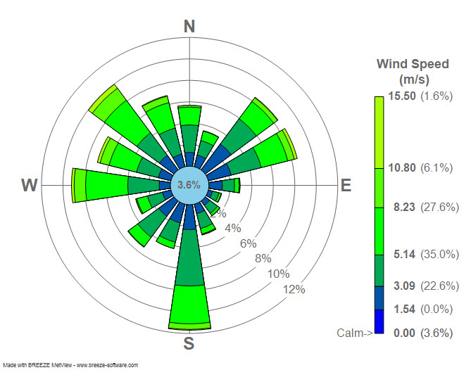
|
From: Shahar Shani-K. <ka...@po...> - 2013-03-19 20:06:09
|
Just a thought: Shouldn't the bars terminate with a arc rather then a straight line? What value should one reading this diagram look at? The one at the center of the "bar" or the "corners" these values can be quite different. Sent from my iPhone On Mar 19, 2013, at 8:00 PM, Paul Hobson <pmh...@gm...> wrote: > On Tue, Mar 19, 2013 at 2:22 AM, Sudheer Joseph <sud...@ya...> wrote: >> Dear users, >> Attached is a windrose diagram created by using https://sourceforge.net/project/showfiles.php?group_id=239240&package_id=290902 . Can any one tell me if the numbers displayed in the attached plot is % of wind directions in each category? or are they represent some other numbers? >> >> http://3.bp.blogspot.com/_4ZlrnfU7IT8/TPxpftZGzfI/AAAAAAAAADA/uq9cF3PTpR8/s1600/Wind_rose_plot.jpg > > Sudheer, > > That's correct. The total length of the bars is the percentage of time that the wind is blowing *from* that direction. > See my implementation here: https://github.com/phobson/python-metar/blob/master/metar/graphics.py#L135 > > Side note, you're emails are consistently formatted pretty strangely and can be difficult to read. Perhaps stick with the same font that is in your email signature? > ------------------------------------------------------------------------------ > Everyone hates slow websites. So do we. > Make your web apps faster with AppDynamics > Download AppDynamics Lite for free today: > http://p.sf.net/sfu/appdyn_d2d_mar > _______________________________________________ > Matplotlib-users mailing list > Mat...@li... > https://lists.sourceforge.net/lists/listinfo/matplotlib-users |
|
From: Paul H. <pmh...@gm...> - 2013-03-19 18:35:21
|
On Tue, Mar 19, 2013 at 11:30 AM, Paul Hobson <pmh...@gm...> wrote:

> On Mon, Mar 18, 2013 at 8:34 PM, Mark Lawrence <bre...@ya...>wrote:
>
>> Matplotlib 1.2.0, Windows Vista, Python 3.3.0.  I want the first major
>> xtick label aligned with the first date that's plotted.  This never
>> happens with the value of day below set in the range zero to six.  The
>> first major tick label actually occurs as follows.
>>
>> Day     Label date
>> 0       25/03/2013
>> 1       02/04/2013
>> 2       10/04/2013
>> 3       21/03/2013
>> 4       29/03/2013
>> 5       06/04/2013
>> 6       17/03/2013
>>
>> What am I doing wrong?
>>
>> If day is set to seven then no xticks are displayed but labels for
>> 14/03/2013 and 13/03/2014 are displayed.  I expected a ValueError or
>> similar using this number.  Could you explain this behaviour please?
>>
>> import matplotlib.pyplot as plt
>> from matplotlib.ticker import FormatStrFormatter, MultipleLocator
>> from matplotlib.dates import DateFormatter, WeekdayLocator
>> import datetime
>>
>> dates = [datetime.date(2013, 3, 14), datetime.date(2014, 3, 13)]
>> values = [0, 1]
>> plt.ylabel('Balance')
>> plt.grid()
>> ax = plt.subplot(111)
>> plt.plot_date(dates, values, fmt = 'rx-')
>> plt.axis(xmin=dates[0], xmax=dates[-1])
>> day = ?
>> ax.xaxis.set_major_locator(WeekdayLocator(byweekday=day, interval=4))
>> ax.xaxis.set_minor_locator(WeekdayLocator(byweekday=day))
>> ax.xaxis.set_major_formatter(DateFormatter('%d/%m/%y'))
>> ax.yaxis.set_major_formatter(FormatStrFormatter('£%0.2f'))
>> ax.yaxis.set_minor_locator(MultipleLocator(5))
>> plt.setp(plt.gca().get_xticklabels(), rotation = 45, fontsize = 10)
>> plt.setp(plt.gca().get_yticklabels(), fontsize = 10)
>> plt.show()
>>
>>
> Mark,
>
> I've found that rotation_mode='anchor' works best when rotation != 0
>
> So that makes it:
> plt.setp(plt.gca().get_xticklabels(), rotation = 45, fontsize = 10,
>  rotation_mode='anchor' )
>
> HTH,
> -paul
>


I misread your question. Try setting your x-axis limits after defining the
locators and formatters.
-p
|
|
From: Paul H. <pmh...@gm...> - 2013-03-19 18:30:53
|
On Mon, Mar 18, 2013 at 8:34 PM, Mark Lawrence <bre...@ya...>wrote:

> Matplotlib 1.2.0, Windows Vista, Python 3.3.0.  I want the first major
> xtick label aligned with the first date that's plotted.  This never
> happens with the value of day below set in the range zero to six.  The
> first major tick label actually occurs as follows.
>
> Day     Label date
> 0       25/03/2013
> 1       02/04/2013
> 2       10/04/2013
> 3       21/03/2013
> 4       29/03/2013
> 5       06/04/2013
> 6       17/03/2013
>
> What am I doing wrong?
>
> If day is set to seven then no xticks are displayed but labels for
> 14/03/2013 and 13/03/2014 are displayed.  I expected a ValueError or
> similar using this number.  Could you explain this behaviour please?
>
> import matplotlib.pyplot as plt
> from matplotlib.ticker import FormatStrFormatter, MultipleLocator
> from matplotlib.dates import DateFormatter, WeekdayLocator
> import datetime
>
> dates = [datetime.date(2013, 3, 14), datetime.date(2014, 3, 13)]
> values = [0, 1]
> plt.ylabel('Balance')
> plt.grid()
> ax = plt.subplot(111)
> plt.plot_date(dates, values, fmt = 'rx-')
> plt.axis(xmin=dates[0], xmax=dates[-1])
> day = ?
> ax.xaxis.set_major_locator(WeekdayLocator(byweekday=day, interval=4))
> ax.xaxis.set_minor_locator(WeekdayLocator(byweekday=day))
> ax.xaxis.set_major_formatter(DateFormatter('%d/%m/%y'))
> ax.yaxis.set_major_formatter(FormatStrFormatter('£%0.2f'))
> ax.yaxis.set_minor_locator(MultipleLocator(5))
> plt.setp(plt.gca().get_xticklabels(), rotation = 45, fontsize = 10)
> plt.setp(plt.gca().get_yticklabels(), fontsize = 10)
> plt.show()
>
>
Mark,

I've found that rotation_mode='anchor' works best when rotation != 0

So that makes it:
plt.setp(plt.gca().get_xticklabels(), rotation = 45, fontsize = 10,
 rotation_mode='anchor' )

HTH,
-paul
|
657 messages has been excluded from this view by a project administrator.

