Menu
▾
▴
Re: [matplotlib-devel] release strategy and the color revolution
|
From: jni <jni...@gm...> - 2015-03-02 11:31:26
|
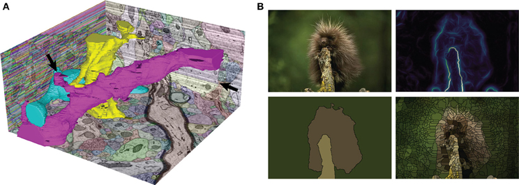
Hi Pierre, Could you please elaborate a bit on this > usecase. I was thinking, naively, that when plotting a grayscale image, > one would simply used a gray colormap. > Using a colormap with hue and saturation gives you better contrast than pure grayscale. For natural images, that is, photographs of human-scale objects, indeed grayscale is a good choice, because that is how we are used to looking at those images. But for looking at physical quantities, for example, using a colormap with hue and saturation as well as lightness is useful. Here are some examples: http://www.gnuplotting.org/color-maps-from-colorbrewer/ https://www.mrao.cam.ac.uk/~dag/CUBEHELIX/ See also a "boundary probability map" for a natural image here (panel B, top right): http://www.frontiersin.org/files/Articles/74212/fninf-08-00034-r2/image_m/fninf-08-00034-g001.jpg Having the colormap makes it easier to place the intermediate levels of the probability map. Again, restricting the lightness range for these maps would be problematic, to say the least. Juan. -- View this message in context: http://matplotlib.1069221.n5.nabble.com/release-strategy-and-the-color-revolution-tp44929p45030.html Sent from the matplotlib - devel mailing list archive at Nabble.com. |