pgfplots-features Mailing List for pgfplots (Page 3)
Brought to you by:
cfeuersaenger,
ludewich
This list is closed, nobody may subscribe to it.
| 2009 |
Jan
|
Feb
|
Mar
(20) |
Apr
(5) |
May
(7) |
Jun
(15) |
Jul
(15) |
Aug
(17) |
Sep
(22) |
Oct
(3) |
Nov
(8) |
Dec
(6) |
|---|---|---|---|---|---|---|---|---|---|---|---|---|
| 2010 |
Jan
(22) |
Feb
(19) |
Mar
(14) |
Apr
(24) |
May
(18) |
Jun
(23) |
Jul
(18) |
Aug
(10) |
Sep
(33) |
Oct
(11) |
Nov
(12) |
Dec
|
| 2011 |
Jan
(16) |
Feb
(9) |
Mar
(10) |
Apr
(17) |
May
(2) |
Jun
(11) |
Jul
(29) |
Aug
(12) |
Sep
(20) |
Oct
(9) |
Nov
(8) |
Dec
(17) |
| 2012 |
Jan
(17) |
Feb
(6) |
Mar
(9) |
Apr
(8) |
May
(1) |
Jun
(3) |
Jul
(4) |
Aug
(15) |
Sep
(7) |
Oct
(9) |
Nov
(25) |
Dec
(2) |
| 2013 |
Jan
(7) |
Feb
|
Mar
(4) |
Apr
(1) |
May
(3) |
Jun
(15) |
Jul
(2) |
Aug
(2) |
Sep
(1) |
Oct
(4) |
Nov
|
Dec
(2) |
| 2014 |
Jan
(4) |
Feb
(1) |
Mar
(17) |
Apr
(6) |
May
|
Jun
(2) |
Jul
(6) |
Aug
(3) |
Sep
(3) |
Oct
(4) |
Nov
(4) |
Dec
(4) |
| 2015 |
Jan
|
Feb
(3) |
Mar
|
Apr
|
May
(2) |
Jun
|
Jul
|
Aug
(2) |
Sep
(4) |
Oct
(1) |
Nov
|
Dec
|
| 2016 |
Jan
(3) |
Feb
|
Mar
|
Apr
|
May
|
Jun
|
Jul
|
Aug
(2) |
Sep
|
Oct
(3) |
Nov
|
Dec
(1) |
| 2017 |
Jan
|
Feb
|
Mar
|
Apr
|
May
|
Jun
(1) |
Jul
|
Aug
|
Sep
|
Oct
|
Nov
|
Dec
|
| 2018 |
Jan
|
Feb
|
Mar
|
Apr
(1) |
May
|
Jun
|
Jul
|
Aug
|
Sep
|
Oct
(9) |
Nov
(1) |
Dec
|
| 2019 |
Jan
(4) |
Feb
(1) |
Mar
(1) |
Apr
|
May
|
Jun
|
Jul
|
Aug
|
Sep
|
Oct
|
Nov
|
Dec
|
|
From: Christian F. <cfe...@go...> - 2014-10-03 09:57:15
|
Hi Wenbo,

The problem is known and has already been fixed in PGF: it is an
incompatibility between PGF's driver code and the standalone package.

According to the PGF changelog, it has been fixed with

2014-01-08 Christian Feuersaenger <cfe...@us...>

     - fixed bug in latex/plain tex shipout routines for xdvipdfmx and
xelatex:
     combination of shadings    and standalone package failed to work.

Workarounds are:

1. embed the shading into another document class and check if that works
(article works)

2. use another driver (like pdftex) for the picture in question

3. download an unstable build of PGF. The unstable build provided on
http://pgf.sourceforge.net/ appears to contain the bugfix. This needs
quite some manual work until it works.

Kind regards

Christian

Am 28.09.2014 08:45, schrieb shengwenbo:
> Hello all,
>
> I meet a problem about the colorbar in pgfplots. The test codes are
> just from the first example in section 4.9.12 of the manual (page 226):
>
> \documentclass[tikz]{standalone}
> \usepackage{pgfplots}
> \pgfplotsset{width=7cm,compat=1.11}
>
> \begin{document}
>
> \begin{tikzpicture}
> \begin{axis}[colorbar]
> \addplot[mesh,ultra thick] {x};
> \end{axis}
> \end{tikzpicture}
>
> \end{document}
>
> The problem is that the colorbar is not completed and there's some
> blank inside, as shown in the attached file (.tex, .log and .pdf files).
>
> Enviroment: Ubuntu14.04+texlive2014(updated on 2014/09/27)+pgfplots
> version 1.11
>
> Many thanks for any help!
>
> Best Regards
>
> Wenbo
>
>
>
>
> ------------------------------------------------------------------------------
> Meet PCI DSS 3.0 Compliance Requirements with EventLog Analyzer
> Achieve PCI DSS 3.0 Compliant Status with Out-of-the-box PCI DSS Reports
> Are you Audit-Ready for PCI DSS 3.0 Compliance? Download White paper
> Comply to PCI DSS 3.0 Requirement 10 and 11.5 with EventLog Analyzer
> http://pubads.g.doubleclick.net/gampad/clk?id=154622311&iu=/4140/ostg.clktrk
>
>
> _______________________________________________
> Pgfplots-features mailing list
> Pgf...@li...
> https://lists.sourceforge.net/lists/listinfo/pgfplots-features
|
|
From: Christian F. <cfe...@go...> - 2014-09-07 18:11:08
|
I Paulo,

thanks for the report!

The option axis y line=left also activates enlarge y limits=false -- in
your case, "y=0" is outside of the plotted range and the bar disappears.

You should add "ymin=0" and all is well.

Kind regards

Christian

Am 04.09.2014 09:14, schrieb paulo lesgaz:
> Hello,
> In the following code, the line corresponding to the point,() is not
> drawn.
>
> \documentclass[9pt]{article}
> \usepackage{pgfplots}
> \usetikzlibrary{pgfplots.statistics}
> \begin{document}
> \begin{tikzpicture}[scale=0.8]
> \begin{axis}[axis y line=left,
> axis x line=bottom,
> xmin=0,xmax=4.5]
> \addplot[ycomb,line width=2pt] plot coordinates {(1,350) (2,110)
> (3,30) (4,10)};
> \end{axis}
> \end{tikzpicture}
> \end{document}
>
> If I remove axis y line=left, everything is OK!
>
> Hope you can help me.
>
> Thanks in advance
>
> Joao
>
>
> ------------------------------------------------------------------------------
> Slashdot TV.
> Video for Nerds.  Stuff that matters.
> http://tv.slashdot.org/
>
>
> _______________________________________________
> Pgfplots-features mailing list
> Pgf...@li...
> https://lists.sourceforge.net/lists/listinfo/pgfplots-features
|
|
From: paulo l. <jer...@ya...> - 2014-09-04 07:17:26
|
Hello,

In the following code, the line corresponding to the point,() is not drawn.

\documentclass[9pt]{article}
\usepackage{pgfplots}
\usetikzlibrary{pgfplots.statistics}
\begin{document}
\begin{tikzpicture}[scale=0.8]
\begin{axis}[axis y line=left,
axis x line=bottom,
xmin=0,xmax=4.5]
\addplot[ycomb,line width=2pt] plot coordinates {(1,350) (2,110) (3,30) (4,10)};
\end{axis}
\end{tikzpicture}
\end{document}

If I remove axis y line=left, everything is OK!

Hope you can help me.

Thanks in advance

Joao
|
|
From: Christian M. <c.m...@gm...> - 2014-08-29 12:31:03
|
Hi!

I'm using pgfplots 1.10 and observe the following problem. The x label
shifts down a bit if I introduce extra x ticks, even if their labels are
empty. The following example produces the observed behavior:

\documentclass{standalone}
\usepackage{pgfplots}
\pgfplotsset{compat=newest}

\begin{document}

\begin{tikzpicture}
\begin{axis}[
  width=4cm,
  xlabel=Test,
  axis x line=bottom,
  axis y line=left,
]
\addplot [black] {x^2};
\end{axis}
\end{tikzpicture}

\begin{tikzpicture}
\begin{axis}[
  width=4cm,
  xlabel=Test,
  axis x line=bottom,
  axis y line=left,
  extra x ticks={0},
  extra x tick labels={},
]
\addplot [black] {x^2};
\end{axis}
\end{tikzpicture}

\end{document}

It does not happen with the old, static, label placement (e. g. if I
remove the compat setting). I was not able to test with 1.11, but
there's nothing related mentioned in the release notes, if I did not
overlook it. Any ideas what I'm missing or if it is a bug and how to
work around it? I need two adjacent graphs in subfloats but only one of
them has extra ticks, so the spacing should be equal to look reasonable.
Adding an extra tick on the other plot helps, but the spacing looks
better without, so that's not an option. And switching back to the old
behavior means manually tweaking the distance, what makes no sense to me
either.

Thanks & best regards

Chris
|
|
From: Christian F. <cfe...@go...> - 2014-08-06 21:07:33
|
I am proud to announce the release of PGFPlots 1.11 . It is available on https://sourceforge.net/projects/pgfplots/ and has been submitted to CTAN where it will become available within the next 24 hours. Miktex will follow eventually (it acquires its packages from CTAN). The release notes are attached below. Kind regards Christian 1.11: usability + bug fixes. - new feature: "hide obscured x ticks=false" to disable the feature which hides ticks - simplified UI for symbolic coords: now, it accepts unexpandable dictionary entries including umlauts, undefined macros, math mode, ... - simplified UI for symbolic coords: added magic prefix [normalized]<number> to allow something like xmin={[normalized]0.7} - simplified UI for custom annotations: one does not need to say "axis cs" any longer; coordinates like (1,2) are now automatically interpreted as (axis cs:1,2) - new feature: 'type ticklabels with struts' improves baseline alignment of tick labels - new feature: 'trig format plots=rad' allows to use radians in trigonometric evaluations - simplified 'external lib': added driver auto-detection for pdflatex, lualatex, xelatex, dvips (\usepgfplotslibrary{external}, or, with the next PGF release, \usetikzlibrary{external}) - simplified UI for \addplot coordinates: now, it expands macros as it goes. - new feature: 'intersection segments' now accepts negative indices to count from the last backwards - simplified UI: 'intersection segments' now accepts new syntax with 1-based indices (old 0-based are still supported) - fixed bug: fillbetween has had a problem with pins on input paths - fixed bug: now, 'stacked ignores zero' is no longer applied to error bars. - fixed bug: tick lines were drawn incorrectly for centered axis lines in 3d - fixed bug: variable=u failed to work in some contexts - fixed bug: fill between implicitly activated layers, but did not install the correct layers for grid lines etc. - fixed bug: z grid style was applied to y grid style - fixed bug: using 'x=1cm' failed to work in axis descriptions (legends) - fixed bug: mesh legend failed to work with 'shader=interp' - fixed bug: bounding box of shader=interp was wrong if there were transformations. - fixed bug: added support for \addplot graphics in ConTeXt - fixed bug: external lib failed to work with dvips (since PGF 3.0.0 I suppose); now it produces correct bounding boxes - fixed bug: \pgfplotstablenew can now overwrite existing tables. - fixed bug: extra ticks near intersections of axis lines were hidden - fixed bug: 'intersection segments' did not work with '--cycle' - fixed bug: 'intersection segments' did not update the last tikz point - fixed bug: tick lines/grid lines have been clipped when they were near the boundary - fixed bug: soft clip decoration failed to apply the transformation matrix - fixed bug: polar axes and units library resulted in broken bounding box - fixed bug: \addplot[stack plots=false] used to work up to 1.8, but failed until now. Fixed. - fixed bug: hist/density was broken since some time 1.10: - new feature: fill between plots (library fillbetween) - new feature: concatenate intersection segments (library fillbetween) - fixed bug: xelatex failed to run contour external - fixed incompatibility with \label and \usepackage{mcaption} - fixed bug: histograms produced wrong point meta - fixed bug: histograms reported the wrong 'plot name' and confused shifts of bar plots 1.9: - new feature: asymmetric error bars - new feature: activated math parser for axis limit arguments, arguments in axis cs, and domain argument in log plots - new feature: stacked bar plots place their 'nodes near coords' correctly in the middle and print the increment (compat=1.9) - new feature: stacked bar plots suppress empty increments (compat=1.9). - new feature: 'scatter/position=relative|absolute' allow to position 'nodes near coords' absolutely. use-case: bar plots + nodes near coords which are at, say, y=0 rather than their y value - new feature: integration of smooth shadings & auto-CMYK conversion \usepackage[cmyk]{xcolor} or \selectcolormodel{cmyk} will reconfigure pgfplots to use CMYK (document-wide) - new feature (advanced audience only): programmatic access to data coordinates during the visualization phase -> allows much more customization for error bars, stacked plots, nodes near coords. - wrote beginner tutorials - fixed bug: error bars and point meta did not work together - fixed bug: stacked plots did not respect 'visualization depends on' - fixed bug: luatex 0.76 is not backwards compatible; added version switch - fixed bug: ternary library precision has been improved - fixed bug: problem with axis limits very close to 0 - fixed bug: colormap specification limit case produced out of bounds exception |
|
From: Christian F. <cfe...@go...> - 2014-08-02 18:20:00
|
Hi Xavier,

thanks for the report! I can reproduce the issue and confirm that it
used to work up to at least 1.8 .

In fact, stack plots have received a major rework in version 1.9..
apparently, your use-case got lost. Sadly, I have had no tests for this
case (I never anticipated the possibility to disable stacking for
separate plots, to be honest).

I will take care of it with high priority.

I am sorry for the trouble.

Kind regards

Christian

Am 01.08.2014 14:48, schrieb Xavier Lacoste:
> Hello,
>
> I'm sorry I didn't find the way to post a bug on sourceforge project page.
>
> I think there was a regression in pgfplots (on Mac with the latest update of texlive (MacTex)):
>
> This minimal example will fail :
>
> \documentclass{standalone}
>
> \usepackage{tikz}
> \usepackage{pgfplots}
> \pgfplotsset{compat=1.10}
>
> \pgfplotstableread{
> 1   19.178  26.027  8.219   6.849   39.726 1
> 2   54.795  21.918  4.110   6.849   12.329 1
> 3   28.767  16.438  6.849   8.219   39.726 1
> 4   63.014  2.740   2.740   2.740   28.767 2
> 5   90.411  1.370   6.849   0.000   1.370  2
> 6   15.068  2.740   16.438  8.219   57.534 2
> 7   67.123  0.000   0.000   0.000   32.877 3
> 8   72.603  6.849   5.479   0.000   15.068 3
> 9   56.164  12.329  6.849   4.110   20.548 3
> 10  50.685  4.110   8.219   1.370   35.616 3
> }\datatable
>
> \begin{document}
> \makeatletter
> \begin{tikzpicture}
> \begin{axis}[
>      ybar stacked
> ]
>
> \addplot table[x index=0,y index=1] \datatable;
> \addplot table[x index=0,y index=2] \datatable;
> \addplot table[x index=0,y index=3] \datatable;
> \addplot table[x index=0,y index=4] \datatable;
> \addplot [stack plots=false] table[x index=0,y index=5] \datatable;
> \legend{Far,Near,Here,There,NotThere}
> \end{axis}
> \end{tikzpicture}
> \end{document}
>
> If one remove the "stack plots=false", it will generate the plot.
>
> I was using this feature before and it worked. I just recently recompiled my tex file and it failed.
>
> I have a workaround for this, manually compute the difference between the plots, but I just wanted to report this.
>
> Regards,
>
> XL.
|
|
From: Christian F. <cfe...@go...> - 2014-07-09 18:33:28
|
Hi Matthias,

thanks for this bug report.

I will take care of it.

Kind regards

Christian

Am 09.07.2014 20:21, schrieb Matthias Pospiech:
> Hello,
> I tried to report a bug using sourceforge, but although I logged into
> sf, I got no
> button or link to report a bug?
>
> This is my problem:
> In my template I use an example of pgfplots which uses gnuplot.
> Lately I installed the latest gunplot windows version which is 5.0rc1
> Now the code of pgfplot fails.
>
> This is the code
>
> \pgfplotsset{width=0.8\textwidth, height=0.6\textwidth}
> \pgfplotsset{samples=2000}
> \centering
> \begin{tikzpicture}
> \begin{axis}[
>     xlabel=$x$,
>     ylabel={$\sin(x) (x+1) + 3x$},
>     grid=major,
>     /pgfplots/enlargelimits=false,
>     ymax=500,
>     /pgfplots/xtick={0,20,...,100},
>     /pgfplots/ytick={0,100,...,600},
> ]
> %
> \addplot[domain=0:100, blue,style={line width=0.7pt}]
>     gnuplot{sin(x)*(x+1) + 3*x};
> %
> \legend{$\sin(x) (x+1) + 3x$}
> \end{axis}
> \end{tikzpicture}
>
> And this the error message of gnuplot:
> set format "%.7e";; set samples 2000; set dummy x,y; plot [x=0:100]
> sin(x)*(x+1) + 3*x; ^ "TemplateDocumentation.pgf-plot.gnuplot", line 2: too
>
>
> many dummy variables
>
>
> My gnuplot knowledge and especially the changes from 4 to 5 are too
> little to know what causes this error.
>
> Matthias
>
> ------------------------------------------------------------------------------
> Open source business process management suite built on Java and Eclipse
> Turn processes into business applications with Bonita BPM Community Edition
> Quickly connect people, data, and systems into organized workflows
> Winner of BOSSIE, CODIE, OW2 and Gartner awards
> http://p.sf.net/sfu/Bonitasoft
> _______________________________________________
> Pgfplots-features mailing list
> Pgf...@li...
> https://lists.sourceforge.net/lists/listinfo/pgfplots-features
|
|
From: Matthias P. <mat...@gm...> - 2014-07-09 18:21:55
|
Hello,
I tried to report a bug using sourceforge, but although I logged into
sf, I got no
button or link to report a bug?

This is my problem:
In my template I use an example of pgfplots which uses gnuplot.
Lately I installed the latest gunplot windows version which is 5.0rc1
Now the code of pgfplot fails.

This is the code

\pgfplotsset{width=0.8\textwidth, height=0.6\textwidth}
\pgfplotsset{samples=2000}
\centering
\begin{tikzpicture}
\begin{axis}[
   xlabel=$x$,
   ylabel={$\sin(x) (x+1) + 3x$},
   grid=major,
   /pgfplots/enlargelimits=false,
   ymax=500,
   /pgfplots/xtick={0,20,...,100},
   /pgfplots/ytick={0,100,...,600},
]
%
\addplot[domain=0:100, blue,style={line width=0.7pt}]
   gnuplot{sin(x)*(x+1) + 3*x};
%
\legend{$\sin(x) (x+1) + 3x$}
\end{axis}
\end{tikzpicture}

And this the error message of gnuplot:
set format "%.7e";; set samples 2000; set dummy x,y; plot [x=0:100]
sin(x)*(x+1) + 3*x; ^ "TemplateDocumentation.pgf-plot.gnuplot", line 2: too


many dummy variables


My gnuplot knowledge and especially the changes from 4 to 5 are too
little to know what causes this error.

Matthias
|
|
From: Christian M. <c.m...@gm...> - 2014-07-08 07:42:51
|
Am 07.07.2014 20:25, schrieb Christian Feuersaenger: > I have identified and repaired the root cause for the bug. > > Apparently, the units library always generates xlabel and ylabel -- and > these, in turn, are undefined for polar axes. In fact, I believe that > both are meaningless and useless. I modified their styles such that they > will be displayed inside of the circle, and I added "use units=false" > for every polar axis (which appears to be as useless as labels). This > should repair the problem; at least until it becomes clear how these two > features are supposed to interact. > > Thanks for the report. Thanks for repairing (and for the explanation, of course) :-) Best regards, Chris |
|
From: Christian F. <cfe...@go...> - 2014-07-07 18:25:26
|
I have identified and repaired the root cause for the bug. Apparently, the units library always generates xlabel and ylabel -- and these, in turn, are undefined for polar axes. In fact, I believe that both are meaningless and useless. I modified their styles such that they will be displayed inside of the circle, and I added "use units=false" for every polar axis (which appears to be as useless as labels). This should repair the problem; at least until it becomes clear how these two features are supposed to interact. Thanks for the report. Kind regards Christian Am 07.07.2014 13:09, schrieb Christian Mandel: > Hi, > > since I was not able to file a bug report on SF I report this issue here. > > When using polar plots together with the units library, even if the > latter is not actively used in the plot but just loaded, there is > additional white space around the plot due to unused nodes. An example > can be seen at > > > http://tex.stackexchange.com/questions/187421/polar-pgfplots-diagram-adds-additional-whitespace-with-units-library-loaded/188123?noredirect=1#comment435888_188123 > > For me, the workaround given there to temporary disable the units > library works, but a more general solution would be handy, especially > for people using the two libraries together. > > Best regards, Chris > > > ------------------------------------------------------------------------------ > Open source business process management suite built on Java and Eclipse > Turn processes into business applications with Bonita BPM Community Edition > Quickly connect people, data, and systems into organized workflows > Winner of BOSSIE, CODIE, OW2 and Gartner awards > http://p.sf.net/sfu/Bonitasoft > _______________________________________________ > Pgfplots-features mailing list > Pgf...@li... > https://lists.sourceforge.net/lists/listinfo/pgfplots-features |
|
From: Christian F. <cfe...@go...> - 2014-07-07 11:51:11
|
Hi Christian, thanks for the report. I will look into it. Kind regards Christian Am 07.07.2014 13:09, schrieb Christian Mandel: > Hi, > > since I was not able to file a bug report on SF I report this issue here. > > When using polar plots together with the units library, even if the > latter is not actively used in the plot but just loaded, there is > additional white space around the plot due to unused nodes. An example > can be seen at > > > http://tex.stackexchange.com/questions/187421/polar-pgfplots-diagram-adds-additional-whitespace-with-units-library-loaded/188123?noredirect=1#comment435888_188123 > > For me, the workaround given there to temporary disable the units > library works, but a more general solution would be handy, especially > for people using the two libraries together. > > Best regards, Chris > > > ------------------------------------------------------------------------------ > Open source business process management suite built on Java and Eclipse > Turn processes into business applications with Bonita BPM Community Edition > Quickly connect people, data, and systems into organized workflows > Winner of BOSSIE, CODIE, OW2 and Gartner awards > http://p.sf.net/sfu/Bonitasoft > _______________________________________________ > Pgfplots-features mailing list > Pgf...@li... > https://lists.sourceforge.net/lists/listinfo/pgfplots-features |
|
From: Christian M. <c.m...@gm...> - 2014-07-07 11:08:24
|
Hi, since I was not able to file a bug report on SF I report this issue here. When using polar plots together with the units library, even if the latter is not actively used in the plot but just loaded, there is additional white space around the plot due to unused nodes. An example can be seen at http://tex.stackexchange.com/questions/187421/polar-pgfplots-diagram-adds-additional-whitespace-with-units-library-loaded/188123?noredirect=1#comment435888_188123 For me, the workaround given there to temporary disable the units library works, but a more general solution would be handy, especially for people using the two libraries together. Best regards, Chris |
|
From: Christian F. <cfe...@go...> - 2014-06-09 08:35:04
|
Hi Joshua, thanks for the update. The request to have significance stars is already on my todo list; with your older emails to fill it with details. I plan to work through the numerous feature requests around bar plots eventually, and your request will be considered. Kind regards Christian Am 08.06.2014 23:13, schrieb Joshua Krämer: > On 2014-04-05, 21:40, Christian Feuersaenger wrote: > >> as already mentioned, your old mails from January have slipped my >> discipline... I am sorry for not answering right away. > No problem! Thanks for your answers. I'm also sorry for answering so > late, I just didn't check the newsgroup for a long time ... > > Actually, in the mean time, I regarded the fact that what I wanted to > achieve is not possible without hassle as an indicator that what I want > might be not advisable. I decided to split the complicated charts into > several simpler charts, and I think the data are now represented more > clearly. > > With the simpler charts it was also no longer necessary to have a line > above the bars to indicate to which bars the significance stars > belong. The simpler charts have only two bars (disease and control), > and I could thus simply put the stars over the disease bar. > > What I still think to be desirable would be a method to put a label over > a bar (e.g. a significance star) with automatic calculation of the > necessary y limits enlargement to make space for it. > > Again, thanks for your support! > > Kind regards, > Joshua > > > > ------------------------------------------------------------------------------ > Learn Graph Databases - Download FREE O'Reilly Book > "Graph Databases" is the definitive new guide to graph databases and their > applications. Written by three acclaimed leaders in the field, > this first edition is now available. Download your free book today! > http://p.sf.net/sfu/NeoTech > _______________________________________________ > Pgfplots-features mailing list > Pgf...@li... > https://lists.sourceforge.net/lists/listinfo/pgfplots-features |
|
From: Joshua K. <jos...@gm...> - 2014-06-08 20:52:06
|
On 2014-04-05, 21:40, Christian Feuersaenger wrote: > as already mentioned, your old mails from January have slipped my > discipline... I am sorry for not answering right away. No problem! Thanks for your answers. I'm also sorry for answering so late, I just didn't check the newsgroup for a long time ... Actually, in the mean time, I regarded the fact that what I wanted to achieve is not possible without hassle as an indicator that what I want might be not advisable. I decided to split the complicated charts into several simpler charts, and I think the data are now represented more clearly. With the simpler charts it was also no longer necessary to have a line above the bars to indicate to which bars the significance stars belong. The simpler charts have only two bars (disease and control), and I could thus simply put the stars over the disease bar. What I still think to be desirable would be a method to put a label over a bar (e.g. a significance star) with automatic calculation of the necessary y limits enlargement to make space for it. Again, thanks for your support! Kind regards, Joshua |
|
From: Christian F. <cfe...@go...> - 2014-04-21 08:51:11
|
Am 20.04.2014 21:14, schrieb Joseph Wright: > On 20/04/2014 20:13, Christian Feuersaenger wrote: >> Hi Jerome, >> >> I am glad you find pgfplots useful, thanks for the praise! >> >> you are right, \uncover does not work as expected. >> >> I fear this is somewhat inherent to how both \uncover and pgfplots work >> and will require quite some implementational work to get this done. >> >> I will take a list on my todo item, although I tend to keep it this way >> for now since the work-around with \only appears to work reasonably. >> >> I believe \uncover will work within any text descriptions of the axis. >> >> Kind regards >> >> Christian > Sounds about right: 'extremely tricky' at best. > -- > Joseph Wright > Hi Joseph, thanks for the helpful comment! In this case, one could think about a suitable error message of sorts "\uncover is unsupported in this context, please prefer \only" or something like that.... I wish blessed easter holidays! Kind regards Christian |
|
From: Joseph W. <jos...@mo...> - 2014-04-20 20:29:31
|
On 20/04/2014 20:13, Christian Feuersaenger wrote: > Hi Jerome, > > I am glad you find pgfplots useful, thanks for the praise! > > you are right, \uncover does not work as expected. > > I fear this is somewhat inherent to how both \uncover and pgfplots work > and will require quite some implementational work to get this done. > > I will take a list on my todo item, although I tend to keep it this way > for now since the work-around with \only appears to work reasonably. > > I believe \uncover will work within any text descriptions of the axis. > > Kind regards > > Christian Sounds about right: 'extremely tricky' at best. -- Joseph Wright |
|
From: Christian F. <cfe...@go...> - 2014-04-20 19:13:23
|
Hi Jerome, I am glad you find pgfplots useful, thanks for the praise! you are right, \uncover does not work as expected. I fear this is somewhat inherent to how both \uncover and pgfplots work and will require quite some implementational work to get this done. I will take a list on my todo item, although I tend to keep it this way for now since the work-around with \only appears to work reasonably. I believe \uncover will work within any text descriptions of the axis. Kind regards Christian Am 20.04.2014 18:05, schrieb Jerome Euzenat: > Dear all, > > Trying to use pgfplot + beamer. > > As presented in http://sourceforge.net/p/pgfplots/feature-requests/7/ , this works > well with \only<> > but, this does not work with \uncover<> > > To be more precise: \uncover around a \addplot results in all the plots on the same > frame... > > Thanks for pdfplots: this is a great package. > |
|
From: Jerome E. <Jer...@in...> - 2014-04-20 16:06:09
|
Dear all, Trying to use pgfplot + beamer. As presented in http://sourceforge.net/p/pgfplots/feature-requests/7/ , this works well with \only<> but, this does not work with \uncover<> To be more precise: \uncover around a \addplot results in all the plots on the same frame... Thanks for pdfplots: this is a great package. -- | Jérôme Euzenat INRIA & Univ. Grenoble Alpes, LIG, Grenoble, France | | Jerome : Euzenat # inria : fr http://exmo.inria.fr | |
|
From: Christian F. <cfe...@go...> - 2014-04-05 18:58:55
|
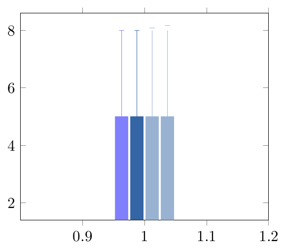
Hi Joshua,

I realized that this post is still open, sorry for the late response.

I fear the problem is due to the lacking color support regarding context
- I believe pgf as such is quite restricted in this context.

This is clearly a bug in pgf and/or pgfplots and I can reproduce the
shifts (although my context does not produce any mix colors at all for
some reason).

My first guess was to define the mix colors manually outside of the
path/plot statement. Since I am entirely unaware of the ConTeXt commands
to mix colors, I tried to invoke the PGF low level routine which mixes
colors by means of

\csname pgfutil@colorlet\endcsname{BlueMixedWhite}{Blue!50!White}

and used

\addplot+[BlueMixedWhite] coordinates {(1,5) +- (0,3)};

On my machine, the outcome has no spurious shift. I cannot verify the
color as my context produces no mix colors at all (an installation
issues for sure).

Aside from that potential workaround, I will file a bug report for
pgfplots in my to do list.

Kind regards

Christian

Am 23.01.2014 21:53, schrieb Joshua Krämer:
> Dear list,
>
> I'm using pgfplots to create some bar charts with error bars in ConTeXt,
> and I want to use custom colours for them.  This works, but if I mix a
> custom colour with another colour, it results in a gap between the
> error bar line and the error bar mark.  If two custom colours are
> mixed, the gap seems to be doubled.  Mixing with predefined colours
> works normally.  MWE:
>
> \usemodule[tikz]
> \usemodule[pgfplots]
>
> \definecolor	[Blue]	[h=3465a4]
> \definecolor	[White]	[h=ffffff]
>
> \pgfplotsset{compat=newest}
>
> \starttext
> \starttikzpicture
> 	\startaxis[ybar, error bars/y dir=both, error bars/y explicit]
> 		\addplot+[blue!50!white] coordinates {(1,5) +- (0,3)};
> 		\addplot+[Blue] coordinates {(1,5) +- (0,3)};
> 		\addplot+[Blue!50!white] coordinates {(1,5) +- (0,3)};
> 		\addplot+[Blue!50!White] coordinates {(1,5) +- (0,3)};
> 	\stopaxis
> \stoptikzpicture
> \stoptext
>
> Here you can see the result:
> http://666kb.com/i/cl86t0mfpin35tht7.png
>
> Kind regards,
> Joshua Krämer
>
>
>
> ------------------------------------------------------------------------------
> CenturyLink Cloud: The Leader in Enterprise Cloud Services.
> Learn Why More Businesses Are Choosing CenturyLink Cloud For
> Critical Workloads, Development Environments & Everything In Between.
> Get a Quote or Start a Free Trial Today.
> http://pubads.g.doubleclick.net/gampad/clk?id=119420431&iu=/4140/ostg.clktrk
> _______________________________________________
> Pgfplots-features mailing list
> Pgf...@li...
> https://lists.sourceforge.net/lists/listinfo/pgfplots-features
|
|
From: Christian F. <cfe...@go...> - 2014-03-22 09:08:09
|
Hi Philipp,

I checked your example map with and without my nonlinear scale. In both
cases, I receive a reddish color map, there appears to be no variation
at all. However, the nonlinear scale changes the tick labels as it ought
to be.

As soon as I modify your colors in a random way, I see the difference.

I conclude that
a) it is unrelated to my suggested nonlinearly scaled colormap style and
b) your colormap simply consists of colors which are so similar that you
cannot distinguish one from the other.

Note that my style which changes the way how point meta is computed and
the tick labels are displayed is entirely unrelated to the actual colormap.

I suggest to modify the map.

Kind regards

Christian

Am 21.03.2014 10:01, schrieb Philipp A.:
> hmm, it doesn’t seem to work with my custom colormap.
>
> speaking of which, it only shows something at all when using the most
> explicit syntax and rgb. doing something like the following breaks:
>
> \pgfplotsset{colormap={spectral}{rgb255=(158,1,66) rgb255=(160,3,66)
> rgb255=(162,5,67) rgb255=(164,8,67) rgb255=(166,10,68)
> rgb255=(168,12,68) rgb255=(170,15,69) rgb255=(173,17,69)
> rgb255=(175,20,70) rgb255=(177,22,70) rgb255=(179,24,71)}}
|
|
From: Philipp A. <fly...@we...> - 2014-03-21 09:01:47
|
hmm, it doesn’t seem to work with my custom colormap.

speaking of which, it only shows something at all when using the most
explicit syntax and rgb. doing something like the following breaks:

\pgfplotsset{colormap={spectral}{rgb255=(158,1,66) rgb255=(160,3,66)
rgb255=(162,5,67) rgb255=(164,8,67) rgb255=(166,10,68) rgb255=(168,12,68)
rgb255=(170,15,69) rgb255=(173,17,69) rgb255=(175,20,70) rgb255=(177,22,70)
rgb255=(179,24,71)}}
|
|
From: Philipp A. <fly...@we...> - 2014-03-21 08:00:48
|
wow, nice! you switched the pics around, however (the skewed bar is in the qestion, the normal one in the answer) 2014-03-21 0:30 GMT+01:00 Christian Feuersaenger < cfe...@go...>: > Hi Philipp, > > Hi Philipp, > > this is possible by rescaling point meta and by scaling it back in the > colorbar. > > Since this is tedious to add to a mail, I posted your question along > with my answer on > > > http://tex.stackexchange.com/questions/166776/pgfplots-with-nonlinearly-scaled-color-maps/166777#166777 > > I hope this is what you had in mind. Please post a new question on > tex.stackexchange with an updated minimal example if that turned out to > be a correct answer to a misunderstood question. > > Kind regards > > Christian > > Am 20.03.2014 11:59, schrieb Philipp A.: > > > > hi, > > > > i have a picture that uses a diverging color map. > > > > but minimum and maximum don’t have the same absolute value (but -0.2 > > and +0.5 instead) > > > > i want to be able to do a centered color map, where “0” is the middle > > color, all points >0 use the upper half of the map, and all <0 the > > lower half. > > > > the color bar should be skewed according to the real values (i.e. the > > lower half of the map should take up 2/7 of the bar,a nd the upper > > half the remaining 5/7) > > > > maybe a |point meta center=[auto,<scalar>]| key, with |auto| meaning a > > calculated value of (point meta max + point meta min) ÷ 2 > > > > best, > > > > philipp > > > > > > > > > ------------------------------------------------------------------------------ > > Learn Graph Databases - Download FREE O'Reilly Book > > "Graph Databases" is the definitive new guide to graph databases and > their > > applications. Written by three acclaimed leaders in the field, > > this first edition is now available. Download your free book today! > > http://p.sf.net/sfu/13534_NeoTech > > > > > > _______________________________________________ > > Pgfplots-features mailing list > > Pgf...@li... > > https://lists.sourceforge.net/lists/listinfo/pgfplots-features > > > > ------------------------------------------------------------------------------ > Learn Graph Databases - Download FREE O'Reilly Book > "Graph Databases" is the definitive new guide to graph databases and their > applications. Written by three acclaimed leaders in the field, > this first edition is now available. Download your free book today! > http://p.sf.net/sfu/13534_NeoTech > _______________________________________________ > Pgfplots-features mailing list > Pgf...@li... > https://lists.sourceforge.net/lists/listinfo/pgfplots-features > |
|
From: Philipp A. <fly...@we...> - 2014-03-21 07:57:44
|
nice, thanks.


2014-03-20 23:49 GMT+01:00 Christian Feuersaenger <
cfe...@go...>:

> Hi Philipp,
>
> thanks for the bug report! I have copied your example to the todo list,
> will become part of one of the next stable releases.
>
> Kind regards
>
> Christian
>
> Am 20.03.2014 11:51, schrieb Philipp A.:
> >
> > Hi,
> >
> > |\addplot graphics| internally tries to use |\includegraphics| even on
> > ConTeXt
> >
> > this can be fixed by defining
> >
> > |\def\includegraphicscompat[#1]#2{\externalfigure[#2][#1]}
> > |
> >
> > and setting
> >
> > |includegraphics cmd=\includegraphicscompat
> > |
> >
> > on ConTeXt. It should be done by PGF Plots automatically
> >
> > best, philipp
> >
> >
> >
> >
> ------------------------------------------------------------------------------
> > Learn Graph Databases - Download FREE O'Reilly Book
> > "Graph Databases" is the definitive new guide to graph databases and
> their
> > applications. Written by three acclaimed leaders in the field,
> > this first edition is now available. Download your free book today!
> > http://p.sf.net/sfu/13534_NeoTech
> >
> >
> > _______________________________________________
> > Pgfplots-features mailing list
> > Pgf...@li...
> > https://lists.sourceforge.net/lists/listinfo/pgfplots-features
>
>
>
> ------------------------------------------------------------------------------
> Learn Graph Databases - Download FREE O'Reilly Book
> "Graph Databases" is the definitive new guide to graph databases and their
> applications. Written by three acclaimed leaders in the field,
> this first edition is now available. Download your free book today!
> http://p.sf.net/sfu/13534_NeoTech
> _______________________________________________
> Pgfplots-features mailing list
> Pgf...@li...
> https://lists.sourceforge.net/lists/listinfo/pgfplots-features
>
|
|
From: Christian F. <cfe...@go...> - 2014-03-20 23:30:56
|
Hi Philipp, Hi Philipp, this is possible by rescaling point meta and by scaling it back in the colorbar. Since this is tedious to add to a mail, I posted your question along with my answer on http://tex.stackexchange.com/questions/166776/pgfplots-with-nonlinearly-scaled-color-maps/166777#166777 I hope this is what you had in mind. Please post a new question on tex.stackexchange with an updated minimal example if that turned out to be a correct answer to a misunderstood question. Kind regards Christian Am 20.03.2014 11:59, schrieb Philipp A.: > > hi, > > i have a picture that uses a diverging color map. > > but minimum and maximum don’t have the same absolute value (but -0.2 > and +0.5 instead) > > i want to be able to do a centered color map, where “0” is the middle > color, all points >0 use the upper half of the map, and all <0 the > lower half. > > the color bar should be skewed according to the real values (i.e. the > lower half of the map should take up 2/7 of the bar,a nd the upper > half the remaining 5/7) > > maybe a |point meta center=[auto,<scalar>]| key, with |auto| meaning a > calculated value of (point meta max + point meta min) ÷ 2 > > best, > > philipp > > > > ------------------------------------------------------------------------------ > Learn Graph Databases - Download FREE O'Reilly Book > "Graph Databases" is the definitive new guide to graph databases and their > applications. Written by three acclaimed leaders in the field, > this first edition is now available. Download your free book today! > http://p.sf.net/sfu/13534_NeoTech > > > _______________________________________________ > Pgfplots-features mailing list > Pgf...@li... > https://lists.sourceforge.net/lists/listinfo/pgfplots-features |
|
From: Christian F. <cfe...@go...> - 2014-03-20 22:49:30
|
Hi Philipp,

thanks for the bug report! I have copied your example to the todo list,
will become part of one of the next stable releases.

Kind regards

Christian

Am 20.03.2014 11:51, schrieb Philipp A.:
>
> Hi,
>
> |\addplot graphics| internally tries to use |\includegraphics| even on
> ConTeXt
>
> this can be fixed by defining
>
> |\def\includegraphicscompat[#1]#2{\externalfigure[#2][#1]}
> |
>
> and setting
>
> |includegraphics cmd=\includegraphicscompat
> |
>
> on ConTeXt. It should be done by PGF Plots automatically
>
> best, philipp
>
>
>
> ------------------------------------------------------------------------------
> Learn Graph Databases - Download FREE O'Reilly Book
> "Graph Databases" is the definitive new guide to graph databases and their
> applications. Written by three acclaimed leaders in the field,
> this first edition is now available. Download your free book today!
> http://p.sf.net/sfu/13534_NeoTech
>
>
> _______________________________________________
> Pgfplots-features mailing list
> Pgf...@li...
> https://lists.sourceforge.net/lists/listinfo/pgfplots-features
|
