Menu
▾
▴
Re: [Matplotlib-users] Feature request: additional arguments of hist()
|
From: K.KISHIMOTO <ko...@us...> - 2003-12-16 12:48:07
|
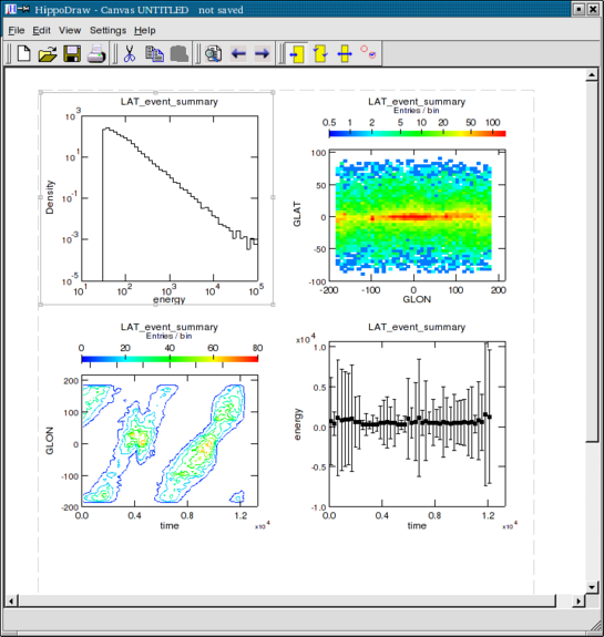
Thanks for your quick reply. On 2003.12.16, at 20:47 Japan, John Hunter wrote: > Is this what you mean? More precisely, what I mean is like the top-left plot in http://www.slac.stanford.edu/grp/ek/hippodraw/canvaswindow.png If I understand bar() (then hist()) functionalities correctly, it may be unable to create such a plot currently without using plot(). from matplotlib.matlab import * bins = [0, 1, 2, 3] vals = [3, 4, 5] x = [bins[0]] y = [0] vals.append(0) for i in range(len(bins) - 1): x.append(bins[i]) y.append(vals[i]) x.append(bins[i + 1]) y.append(vals[i]) x.append(bins[i + 1]) y.append(vals[i + 1]) plot(x, y) show() |