Menu
▾
▴
Re: [Matplotlib-users] how to draw concentric donuts chart ?
|
From: Joe K. <jof...@gm...> - 2014-05-16 14:25:35
|
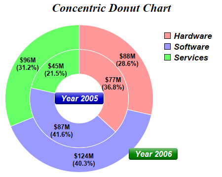
On Fri, May 16, 2014 at 7:36 AM, Alan G Isaac <ala...@gm...> wrote: > On 5/16/2014 7:51 AM, 不坏阿峰 wrote: > > how to use matplotlib to drew chart like this ? > > http://www.advsofteng.com/doc/cdpydoc/images/concentric.png > > > Not an answer to your question: > http://www.businessinsider.com/pie-charts-are-the-worst-2013-6 > > fwiw, > Alan Isaac > Alan is quite right. However, that aside, here's how you'd do it in matplotlib: import matplotlib.pyplot as plt fig, ax = plt.subplots() ax.axis('equal') # Width of the "rings" (percentages if the largest "radius"==1) width = 0.35 # Note the different "radius" values: largest --> outside "donut". kwargs = dict(colors=['#66FF66', '#9999FF', '#FF9999'], startangle=90) inside, _ = ax.pie([45, 87, 77], radius=1-width, **kwargs) outside, _ = ax.pie([96, 124, 88], radius=1, **kwargs) # This is the key. We'll set the "width" for all wedges generated by ax.pie. # (The inside radius for each donut will be "radius" - "width") plt.setp(inside + outside, width=width, edgecolor='white') ax.legend(inside[::-1], ['Hardware', 'Software', 'Services'], frameon=False) plt.show() If you wanted to replicate the example figure more closely, you'll need to get a touch fancier: import matplotlib.pyplot as plt import numpy as np def pie(ax, values, **kwargs): total = sum(values) def formatter(pct): return '${:0.0f}M\n({:0.1f}%)'.format(pct*total/100, pct) wedges, _, labels = ax.pie(values, autopct=formatter, **kwargs) return wedges fig, ax = plt.subplots() ax.axis('equal') width = 0.35 kwargs = dict(colors=['#66FF66', '#9999FF', '#FF9999'], startangle=90) outside = pie(ax, [96, 124, 88], radius=1, pctdistance=1-width/2, **kwargs) inside = pie(ax, [45, 87, 77], radius=1-width, pctdistance=1 - (width/2) / (1-width), **kwargs) plt.setp(inside + outside, width=width, edgecolor='white') ax.legend(inside[::-1], ['Hardware', 'Software', 'Services'], frameon=False) kwargs = dict(size=13, color='white', va='center', fontweight='bold') ax.text(0, 0, 'Year 2005', ha='center', bbox=dict(boxstyle='round', facecolor='blue', edgecolor='none'), **kwargs) ax.annotate('Year 2006', (0, 0), xytext=(np.radians(-45), 1.1), bbox=dict(boxstyle='round', facecolor='green', edgecolor='none'), textcoords='polar', ha='left', **kwargs) plt.show() Hope those examples give you some ideas! Cheers, -Joe |
