Menu
▾
▴
Re: [matplotlib-devel] RFC: candidates for a new default colormap
|
From: Eric F. <ef...@ha...> - 2015-06-03 23:27:50
|
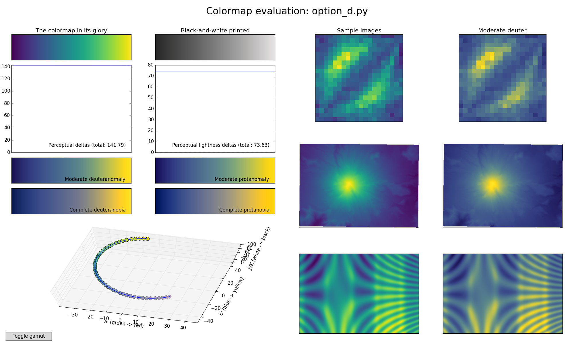
On 2015/06/03 12:27 PM, Nathaniel Smith wrote: > We also tried tweaking it a bit to end on a more saturated yellow, > which I think helps increase contrast in the deuteranomalous version > in particular, and put this on the website as an "option D": > https://bids.github.io/colormap/images/screenshots/option_d.png Thank you. To me, this is more comfortable to look at than A, B, and especially C. > > We also previously designed a colormap that follows parula's ideas > pretty closely, in terms of starting/ending points, overall > brightness, and the trick of kinking over through orange at the top > end. It ends up being much much more green than parula though: > https://bids.github.io/colormap/images/screenshots/fake_parula.png Interesting. That kink comes through as a visible over-emphasis of the orange range in the images. Attached are two more variations on the clockwise dark-to-light theme. They achieve more dynamic range, and perhaps "colorfulness", but at the cost of more relative loss of contrast in the colorblind cases. Is the tradeoff worthwhile? Eric |
