Menu
▾
▴
Re: [matplotlib-devel] release strategy and the color revolution
|
From: Olga B. <obo...@uc...> - 2015-04-05 21:18:10
|
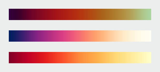
How about "pythonic sunset" ? On Sun, Apr 5, 2015 at 2:01 PM Benjamin Root <ben...@ou...> wrote: > That is nice. The blue is a bit heavy, but that might be my display. Now, > how should we order it by default? I am used to thinking of blues as lower > values, and reds as higher. The yellow at the end throws me off a bit, > because I would think of it as a "weaker" color. Maybe if it was more > gold-like? > > We should also start thinking of a snazzy name. BlRdYe probably won't cut > it. > > Ben Root > On Apr 5, 2015 3:21 AM, "Nathaniel Smith" <nj...@po...> wrote: > >> On Mon, Feb 23, 2015 at 10:46 AM, Eric Firing <ef...@ha...> wrote: >> > On 2015/02/18 2:39 PM, Nathaniel Smith wrote: >> >> >> >> On Feb 16, 2015 3:39 PM, "Eric Firing" <ef...@ha...> wrote: >> >>> >> >>> >> >>> On 2015/02/16 1:29 PM, Michael Waskom wrote: >> >>> >> >>>> Nathaniel's January 9 message in that thread (can't figure out how to >> >>>> link to it in the archives) had a suggestion that I thought was very >> >>>> promising, to do something similar to Parula but rotate around the >> hue >> >>>> circle the other direction so that the hues would go blue - purple - >> red >> >>>> - yellow. I don't think we've seen an example of exactly what it >> would >> >>>> look like, but I reckon it would be similar to the middle colormap >> here >> >>>> >> >>>> >> http://earthobservatory.nasa.gov/blogs/elegantfigures/files/2013/08/three_perceptual_palettes_618.png >> >>>> (from the elegant figures block series linked above), which I've >> always >> >>>> found quite attractive. >> >>> >> >>> >> >>> Certainly it can be considered--but we have to have a real >> >>> implementation. >> >> >> >> >> >> While I hate to promise vaporware, I actually was planning to have a >> >> go at implementing such a colormap in the next few weeks, based on >> >> optimizing the same set of parameters that viscm visualizes... FWIW. >> > >> > >> > It might be worth quite a bit--and the sooner, the better. >> >> While it's taking longer than hoped, just to reassure you that this >> isn't total vaporware, here's a screenshot from the colormap designer >> that Stéfan van der Walt and I have been working on... still needs >> fine-tuning (which at this point probably won't happen until after I >> get back from PyCon), but we like what we're seeing so far :-) >> >> The colormap shown has, by construction, perfect lightness linearity >> and perfect perceptual uniformity, according to the better-than-CIELAB >> model used by the viscm tool I linked upthread. >> >> -- >> Nathaniel J. Smith -- http://vorpus.org >> >> >> ------------------------------------------------------------------------------ >> Dive into the World of Parallel Programming The Go Parallel Website, >> sponsored >> by Intel and developed in partnership with Slashdot Media, is your hub >> for all >> things parallel software development, from weekly thought leadership >> blogs to >> news, videos, case studies, tutorials and more. Take a look and join the >> conversation now. http://goparallel.sourceforge.net/ >> _______________________________________________ >> Matplotlib-devel mailing list >> Mat...@li... >> https://lists.sourceforge.net/lists/listinfo/matplotlib-devel >> >> ------------------------------------------------------------ > ------------------ > Dive into the World of Parallel Programming The Go Parallel Website, > sponsored > by Intel and developed in partnership with Slashdot Media, is your hub for > all > things parallel software development, from weekly thought leadership blogs > to > news, videos, case studies, tutorials and more. Take a look and join the > conversation now. http://goparallel.sourceforge.net/ > _______________________________________________ > Matplotlib-devel mailing list > Mat...@li... > https://lists.sourceforge.net/lists/listinfo/matplotlib-devel > |
