Menu
▾
▴
matplotlib-devel
|
From: Michael W. <mw...@st...> - 2015-02-18 17:03:16
|
Cool! I knew there had been some useful tools posted on the earlier thread but didn't have time to dig them out. Interesting observation about the colorfulness. I don't know enough about all the transformations involved to full account for that, but I added some stuff to the notebook to figure out how much of that might be caused by straying out of gamut. It looks like the map I created does a pretty good job and is only getting clamped at the very low end and near the high end, so I don't think it's a complete explanation for the undulating "colorfulness": http://nbviewer.ipython.org/gist/mwaskom/6a43a3b94eca4a9e2e8b By means of disclosure, I did this before having coffee, so it might be wrong... |
|
From: Benjamin R. <ben...@ou...> - 2015-02-18 16:31:49
|
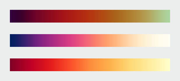
The problem I have with hcl is that while it is technically "colorful" (or whatever the term may be), only the reds really come out because the other colors are only used when either really light or really dark. Perhaps squashing the brightness range a bit and let the natural lightness of yellow and the natural darkness of blue come through on their own. (does that even make any sense to anybody else? it makes sense in my head, but I am certainly am not an expert in color perception) Ben Root P.S. - Of course, my own color perception weirdness might be at play here and the colormap looks perfectly fine to everybody else... On Wed, Feb 18, 2015 at 11:17 AM, Maximilian Albert < max...@gm...> wrote: > 2015-02-17 1:23 GMT+01:00 Michael Waskom <mw...@st...>: > >> See [here](http://nbviewer.ipython.org/gist/mwaskom/6a43a3b94eca4a9e2e8b) >> for a quick and dirty implementation that should get a general idea. This >> probably ins't the best way to do it -- anyone should feel free to build on >> this. >> > > This is very neat! Great job. Incidentally, when I stumbled upon the > earthobservatory blog a while ago this particular colormap also caught my > eye as a potential candidate, so I'm glad you suggested it as a starting > point for a new matplotlib default. > > Out of curiosity, I applied Nathaniel's "viscm" function (from the > previous thread) to the colormap from your notebook (screenshot attached). > Interestingly, while it confirms that the lightness and hue angle increase > more or less linearly, the "colourfulness" goes up and down in waves, even > though you designed the chroma to increase linearly, too. I'm not sure > whether this is because "colourfulness" and "chroma" are actually two > different concepts, or whether it has to do with inaccuracies and/or > clamping during the conversion between various colour spaces. It could also > be the case that the colormath and pycam02ucs modules use different > conversion formulas (in which case it would be good to know which is "more > accurate"; not sure there is even an objective measure for "accuracy" in > this case). Also, there seems to be something strange going on at the dark > (blue) end of the colormap, but this could again be due to clamping. > > I'd love to play a bit more with your example notebook but not sure I'll > be able to do so before the weekend (or early next week). > > Cheers, > Max > > > ------------------------------------------------------------------------------ > Download BIRT iHub F-Type - The Free Enterprise-Grade BIRT Server > from Actuate! Instantly Supercharge Your Business Reports and Dashboards > with Interactivity, Sharing, Native Excel Exports, App Integration & more > Get technology previously reserved for billion-dollar corporations, FREE > > http://pubads.g.doubleclick.net/gampad/clk?id=190641631&iu=/4140/ostg.clktrk > _______________________________________________ > Matplotlib-devel mailing list > Mat...@li... > https://lists.sourceforge.net/lists/listinfo/matplotlib-devel > > |
|
From: Eric F. <ef...@ha...> - 2015-02-18 16:48:10
|
On 2015/02/18 6:31 AM, Benjamin Root wrote: > The problem I have with hcl is that while it is technically "colorful" > (or whatever the term may be), only the reds really come out because the > other colors are only used when either really light or really dark. > Perhaps squashing the brightness range a bit and let the natural > lightness of yellow and the natural darkness of blue come through on > their own. (does that even make any sense to anybody else? it makes > sense in my head, but I am certainly am not an expert in color perception) > > Ben Root > > P.S. - Of course, my own color perception weirdness might be at play > here and the colormap looks perfectly fine to everybody else... My own reaction to it is that it seems like a nicely *functional* colormap, one I would want to have available and probably would sometimes use, but it is not particularly aesthetically *pleasing*. I think this is consistent with Olga's earlier post as well. Eric |
|
From: Michael W. <mw...@st...> - 2015-02-18 17:38:53
|
I've made a second notebook that uses the IPython interactive machinery to let anyone play with the parameters and explore different ways of setting them. you can download the notebook with that here: http://nbviewer.ipython.org/gist/mwaskom/842d1497b6892d081bfb (I made it using IPython 3.0rc1; I'm not certain if it will work on the 2.x series; sorry if that is the case). This stays with the general approach in the original notebook of using a linear ramp for chroma, which again maybe is not what we want. But it should let you get a better sense for the parameter space. As I said in the email to Olga, I think (a) I would advocate fairly strongly that matplotlib should design a custom colormap as its default, and (b) I think this approach (a cubehelix-like map in Hcl space) is a principled way of doing so (though maybe not optimal). But both of those points are independent of whether you end up going with the particular parameters that I used to generate the original proposal -- I have my own domain on which to impose my personal aesthetic preferences, and I don't need to take over matplotlib too :) (But I do think it's worth distinguishing the matplotlib default from the matlab default.) Michael |
|
From: Eric F. <ef...@ha...> - 2015-02-19 01:23:15
|
On 2015/02/18 2:39 PM, Nathaniel Smith wrote: > On Feb 16, 2015 3:39 PM, "Eric Firing" <ef...@ha...> wrote: >> >> On 2015/02/16 1:29 PM, Michael Waskom wrote: >> >>> Nathaniel's January 9 message in that thread (can't figure out how to >>> link to it in the archives) had a suggestion that I thought was very >>> promising, to do something similar to Parula but rotate around the hue >>> circle the other direction so that the hues would go blue - purple - red >>> - yellow. I don't think we've seen an example of exactly what it would >>> look like, but I reckon it would be similar to the middle colormap here >>> http://earthobservatory.nasa.gov/blogs/elegantfigures/files/2013/08/three_perceptual_palettes_618.png >>> (from the elegant figures block series linked above), which I've always >>> found quite attractive. >> >> Certainly it can be considered--but we have to have a real implementation. > > While I hate to promise vaporware, I actually was planning to have a > go at implementing such a colormap in the next few weeks, based on > optimizing the same set of parameters that viscm visualizes... FWIW. Do you think there is a way to make a sequential map that is more pleasing to those of us who are more comfortable with blues and greens than with the slightly muddy purples and browns in the initial attempt at HCL? > > Are we planning to make other default appearance changes at the same > time? The idea of changing the color cycle and/or dot-dash cycle has > already come up in this thread, and this earlier thread proposed > several more good ideas [1]: > http://thread.gmane.org/gmane.comp.python.matplotlib.devel/13128/focus=13166 My thought was to just change the color cycle, but other style aspects are by no means out of the question. Thank you for pointing out that thread. > > I agree that now is definitely the time to get serious about making > these changes, but it seems like there's enough to be worked out that > sticking to the original plan and keeping mainline quasi-frozen until > 2.0 is ready might create frustration and hasty decisions. Maybe it > would be less stressful all around if we let mainline development > proceed at whatever pace makes sense while these things get sorted > out, and then once the appearance changes are ready make the call > about whether to cut a quick 1.5 first or not? Presumably these > defaults will stick around for many years so it's worth taking a few > months to get a complete proposal together, get feedback, etc., IMO. The problem is that we have years of experience of no change, no decisions, no convergence of opinion. More recently we have had general agreement that a change is in order, but we are sadly lacking in concrete proposals. I certainly don't want to see a bad decision made, but without considerable prodding, it seems most likely that this will drag on for years. We need to make a change that is good; "perfect" is unattainable. > > In an ideal world version 1.last might even provide a > style.use("matplotlib2") command to preview what 2.0 will do, just > like 2.0 will presumably have a style.use("matplotlib1") command for > those who want to (temporarily) revert. This is a good idea--but even for this, we need actual style files. Eric > > -n > > [1] well I would think that wouldn't I ;-) > |
|
From: Michael W. <mw...@st...> - 2015-02-19 01:47:20
Attachments:
Screenshot 2015-02-18 17.25.40.png
|
On Wed, Feb 18, 2015 at 5:23 PM, Eric Firing <ef...@ha...> wrote: > > Do you think there is a way to make a sequential map that is more pleasing > to those of us who are more comfortable with blues and greens than with the > slightly muddy purples and browns in the initial attempt at HCL? Just to be clear, Hcl is just a color space; you could in principle make any number of colormaps using it. My particular proposal is to do something cubehelix-like in Hcl space while aiming for around .5-.75 of a rotation around the color wheel. What motivated the particular parameters in the original proposal was two things: a) Starting with blue and ending with yellow makes sense, because you can get good saturation out of dark blues and light yellows b) Once you have those endpoints, you can either go through green (this is what matlab does with parula) or through purple and red. the latter has the functional advantage of getting a bit more hue variation, and it also distinguishes the colormap from parula. I think this was the argument Nathaniel originally made. Tastes differ, but I find the blue-purple-red-yellow colormap quite attractive, (perhaps because it reminds me of the sunset. Actually, as an aside, your speculation that your aesthetic preferences are driven by positive associations by things that have those colors has some support in the psych literature: http://www.pnas.org/content/107/19/8877.full) Anyway, within the constraints of the "increase lightness and chroma linearly while circling around the hue wheel", it's easy to create a blue-green-yellow colormap: And also more generally, once you have a way of making a colormap from a few parameters, and some objective function for what makes a colormap "good", you can optimize in more principled ways than just playing around with the knobs of a widget. I believe this is what Nathaniel was proposing, and it sounds like a good idea. I would suggest that you folks (i.e. the matplotlib core developers) figure out earlier, rather than later, how the actual decision is going to be made. I think you can get pretty far with principled arguments, but ultimately there's going to be an aesthetic aspect and the decision will easily devolve some people thinking option A is "ugly" and other people thinking option B is "ugly". And that will be annoying for everyone involved, but particularly for the people who put time into developing candidates. |
|
From: Pierre H. <pie...@cr...> - 2015-02-23 17:54:37
Attachments:
signature.asc
|
Hi, Le 16/02/2015 23:01, Eric Firing a écrit : > For a long time there has been discussion of replacing the matplotlib > default color map [...] I've started building a small interactive Lab point editor to build a sequential colormap. https://github.com/pierre-haessig/lab-colormap-creator The main interest of it is the ability to quickly check that the points stay in the sRGB gamut. There are some colormap results I just got this afternoon with it in the companion notebook (http://nbviewer.ipython.org/github/pierre-haessig/lab-colormap-creator/blob/master/test_plots.ipynb) It feels there are indeed only two routes: the Blue-Green-Yellow and the Blue-Red-Yellow one. Maybe it is possible to squeeze in a more "snaky" path, but it might look weird. best, Pierre |
|
From: Benjamin R. <ben...@ou...> - 2015-02-23 18:16:57
|
Interesting choices, and I think we are on the right paths (no pun intended) through the two possible colors. However, I think the same problem arises that I noted before. Both ends of the colormap are nearly black to nearly white. IIRC, our perception of luminosity has a much greater range than it does for chroma. While it is nice to take advantage of that, I wonder if we are going too far in the luminosity range? Perhaps these colormaps would be better if the luminosity range wasn't as full as it is here? Ben Root On Mon, Feb 23, 2015 at 12:36 PM, Pierre Haessig <pie...@cr...> wrote: > Hi, > > Le 16/02/2015 23:01, Eric Firing a écrit : > > For a long time there has been discussion of replacing the matplotlib > > default color map [...] > I've started building a small interactive Lab point editor to build a > sequential colormap. > https://github.com/pierre-haessig/lab-colormap-creator > > The main interest of it is the ability to quickly check that the points > stay in the sRGB gamut. > > There are some colormap results I just got this afternoon with it in the > companion notebook > ( > http://nbviewer.ipython.org/github/pierre-haessig/lab-colormap-creator/blob/master/test_plots.ipynb > ) > > It feels there are indeed only two routes: the Blue-Green-Yellow and the > Blue-Red-Yellow one. Maybe it is possible to squeeze in a more "snaky" > path, but it might look weird. > > best, > Pierre > > > > ------------------------------------------------------------------------------ > Download BIRT iHub F-Type - The Free Enterprise-Grade BIRT Server > from Actuate! Instantly Supercharge Your Business Reports and Dashboards > with Interactivity, Sharing, Native Excel Exports, App Integration & more > Get technology previously reserved for billion-dollar corporations, FREE > > http://pubads.g.doubleclick.net/gampad/clk?id=190641631&iu=/4140/ostg.clktrk > _______________________________________________ > Matplotlib-devel mailing list > Mat...@li... > https://lists.sourceforge.net/lists/listinfo/matplotlib-devel > > |
|
From: Eric F. <ef...@ha...> - 2015-02-23 18:30:40
|
On 2015/02/23 8:16 AM, Benjamin Root wrote: > Interesting choices, and I think we are on the right paths (no pun > intended) through the two possible colors. However, I think the same > problem arises that I noted before. Both ends of the colormap are nearly > black to nearly white. IIRC, our perception of luminosity has a much > greater range than it does for chroma. While it is nice to take > advantage of that, I wonder if we are going too far in the luminosity > range? Perhaps these colormaps would be better if the luminosity range > wasn't as full as it is here? > > Ben Root Ben, I was noticing the same thing, except that at least on my screen, the problem is mainly at the dark end, and it varies with the actual set of control points. The very last one, for example (Purple Red Yellow L5-95) has what looks like a fairly linear ramp from end to end on my screen, while "Blue Green Yellow L10-90" lacks contrast on the dark end. I suspect all this will be quite dependent on the particular screen (or printer--including the whole chain of color conversions ending up in ink or toner dots) being used. It doesn't look to me like a problem with the luminosity range as such. We have a highly nonlinear problem here. In any case, this looks like a nice tool. Maybe it can be combined with Nathaniel's code, which shows other aspects of the colormap? Eric |
|
From: Benjamin R. <ben...@ou...> - 2015-02-23 18:39:14
|
My eyes are definitely favoring the L20-80 over the L5-95 colormaps. Does Luminosity take into account human's non-linearity in perceiving brightness? I remember a few years ago many of the open-source graphics tools (such as GIMP) had to be fixed because it assumed a linear brightness perception. IIRC, humans are better at perceiving brightness gradients on one end of the range than on the other end. On Mon, Feb 23, 2015 at 1:30 PM, Eric Firing <ef...@ha...> wrote: > On 2015/02/23 8:16 AM, Benjamin Root wrote: > > Interesting choices, and I think we are on the right paths (no pun > > intended) through the two possible colors. However, I think the same > > problem arises that I noted before. Both ends of the colormap are nearly > > black to nearly white. IIRC, our perception of luminosity has a much > > greater range than it does for chroma. While it is nice to take > > advantage of that, I wonder if we are going too far in the luminosity > > range? Perhaps these colormaps would be better if the luminosity range > > wasn't as full as it is here? > > > > Ben Root > > Ben, > > I was noticing the same thing, except that at least on my screen, the > problem is mainly at the dark end, and it varies with the actual set of > control points. The very last one, for example (Purple Red Yellow > L5-95) has what looks like a fairly linear ramp from end to end on my > screen, while "Blue Green Yellow L10-90" lacks contrast on the dark end. > I suspect all this will be quite dependent on the particular screen > (or printer--including the whole chain of color conversions ending up in > ink or toner dots) being used. It doesn't look to me like a problem > with the luminosity range as such. We have a highly nonlinear problem > here. > > In any case, this looks like a nice tool. Maybe it can be combined with > Nathaniel's code, which shows other aspects of the colormap? > > Eric > > > ------------------------------------------------------------------------------ > Download BIRT iHub F-Type - The Free Enterprise-Grade BIRT Server > from Actuate! Instantly Supercharge Your Business Reports and Dashboards > with Interactivity, Sharing, Native Excel Exports, App Integration & more > Get technology previously reserved for billion-dollar corporations, FREE > > http://pubads.g.doubleclick.net/gampad/clk?id=190641631&iu=/4140/ostg.clktrk > _______________________________________________ > Matplotlib-devel mailing list > Mat...@li... > https://lists.sourceforge.net/lists/listinfo/matplotlib-devel > |
|
From: Pierre H. <pie...@cr...> - 2015-03-02 10:03:40
|
Hi, Le 01/03/2015 23:27, jni a écrit : > As someone working with images, I think for displaying images you want a > colormap that spans as much as possible of the luminance range. The colormap > suggested by Michael Waskom would be quite perfect as-is. (recap: middle > colormap here: > http://earthobservatory.nasa.gov/blogs/elegantfigures/files/2013/08/three_perceptual_palettes_618.png) > Thanks for this feedback. Could you please elaborate a bit on this usecase. I was thinking, naively, that when plotting a grayscale image, one would simply used a gray colormap. Do you have some examples to illustrate what kind of results you are expecting ? best, Pierre |
)
|
From: jni <jni...@gm...> - 2015-03-02 11:31:26
|
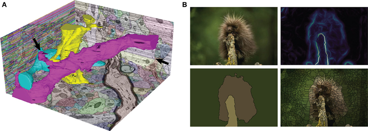
Hi Pierre, Could you please elaborate a bit on this > usecase. I was thinking, naively, that when plotting a grayscale image, > one would simply used a gray colormap. > Using a colormap with hue and saturation gives you better contrast than pure grayscale. For natural images, that is, photographs of human-scale objects, indeed grayscale is a good choice, because that is how we are used to looking at those images. But for looking at physical quantities, for example, using a colormap with hue and saturation as well as lightness is useful. Here are some examples: http://www.gnuplotting.org/color-maps-from-colorbrewer/ https://www.mrao.cam.ac.uk/~dag/CUBEHELIX/ See also a "boundary probability map" for a natural image here (panel B, top right): http://www.frontiersin.org/files/Articles/74212/fninf-08-00034-r2/image_m/fninf-08-00034-g001.jpg Having the colormap makes it easier to place the intermediate levels of the probability map. Again, restricting the lightness range for these maps would be problematic, to say the least. Juan. -- View this message in context: http://matplotlib.1069221.n5.nabble.com/release-strategy-and-the-color-revolution-tp44929p45030.html Sent from the matplotlib - devel mailing list archive at Nabble.com. |
|
From: Thomas C. <tca...@gm...> - 2015-03-18 03:42:47
|
I have opened a PR to document this discussion. It is meant to provide a permanent record of the thought process leading up to color map and to serve as a tool in making the finial decision. https://github.com/matplotlib/matplotlib/pull/4238 On Mon, Mar 2, 2015 at 6:32 AM jni <jni...@gm...> wrote: > Hi Pierre, > > Could you please elaborate a bit on this >> usecase. I was thinking, naively, that when plotting a grayscale image, >> one would simply used a gray colormap. >> > > Using a colormap with hue and saturation gives you better contrast than > pure grayscale. For natural images, that is, photographs of human-scale > objects, indeed grayscale is a good choice, because that is how we are used > to looking at those images. But for looking at physical quantities, for > example, using a colormap with hue and saturation as well as lightness is > useful. Here are some examples: > http://www.gnuplotting.org/color-maps-from-colorbrewer/ > https://www.mrao.cam.ac.uk/~dag/CUBEHELIX/ > > See also a "boundary probability map" for a natural image here (panel B, > top right): > > http://www.frontiersin.org/files/Articles/74212/fninf-08-00034-r2/image_m/fninf-08-00034-g001.jpg > Having the colormap makes it easier to place the intermediate levels of > the probability map. > > Again, restricting the lightness range for these maps would be > problematic, to say the least. > > Juan. > > ------------------------------ > View this message in context: Re: release strategy and the color > revolution > <http://matplotlib.1069221.n5.nabble.com/release-strategy-and-the-color-revolution-tp44929p45030.html> > Sent from the matplotlib - devel mailing list archive > <http://matplotlib.1069221.n5.nabble.com/matplotlib-devel-f28077.html> at > Nabble.com. > ------------------------------------------------------------ > ------------------ > Dive into the World of Parallel Programming The Go Parallel Website, > sponsored > by Intel and developed in partnership with Slashdot Media, is your hub for > all > things parallel software development, from weekly thought leadership blogs > to > news, videos, case studies, tutorials and more. Take a look and join the > conversation now. http://goparallel.sourceforge.net/ > _______________________________________________ > Matplotlib-devel mailing list > Mat...@li... > https://lists.sourceforge.net/lists/listinfo/matplotlib-devel > |
|
From: Olga B. <obo...@uc...> - 2015-04-05 21:18:10
|
How about "pythonic sunset" ? On Sun, Apr 5, 2015 at 2:01 PM Benjamin Root <ben...@ou...> wrote: > That is nice. The blue is a bit heavy, but that might be my display. Now, > how should we order it by default? I am used to thinking of blues as lower > values, and reds as higher. The yellow at the end throws me off a bit, > because I would think of it as a "weaker" color. Maybe if it was more > gold-like? > > We should also start thinking of a snazzy name. BlRdYe probably won't cut > it. > > Ben Root > On Apr 5, 2015 3:21 AM, "Nathaniel Smith" <nj...@po...> wrote: > >> On Mon, Feb 23, 2015 at 10:46 AM, Eric Firing <ef...@ha...> wrote: >> > On 2015/02/18 2:39 PM, Nathaniel Smith wrote: >> >> >> >> On Feb 16, 2015 3:39 PM, "Eric Firing" <ef...@ha...> wrote: >> >>> >> >>> >> >>> On 2015/02/16 1:29 PM, Michael Waskom wrote: >> >>> >> >>>> Nathaniel's January 9 message in that thread (can't figure out how to >> >>>> link to it in the archives) had a suggestion that I thought was very >> >>>> promising, to do something similar to Parula but rotate around the >> hue >> >>>> circle the other direction so that the hues would go blue - purple - >> red >> >>>> - yellow. I don't think we've seen an example of exactly what it >> would >> >>>> look like, but I reckon it would be similar to the middle colormap >> here >> >>>> >> >>>> >> http://earthobservatory.nasa.gov/blogs/elegantfigures/files/2013/08/three_perceptual_palettes_618.png >> >>>> (from the elegant figures block series linked above), which I've >> always >> >>>> found quite attractive. >> >>> >> >>> >> >>> Certainly it can be considered--but we have to have a real >> >>> implementation. >> >> >> >> >> >> While I hate to promise vaporware, I actually was planning to have a >> >> go at implementing such a colormap in the next few weeks, based on >> >> optimizing the same set of parameters that viscm visualizes... FWIW. >> > >> > >> > It might be worth quite a bit--and the sooner, the better. >> >> While it's taking longer than hoped, just to reassure you that this >> isn't total vaporware, here's a screenshot from the colormap designer >> that Stéfan van der Walt and I have been working on... still needs >> fine-tuning (which at this point probably won't happen until after I >> get back from PyCon), but we like what we're seeing so far :-) >> >> The colormap shown has, by construction, perfect lightness linearity >> and perfect perceptual uniformity, according to the better-than-CIELAB >> model used by the viscm tool I linked upthread. >> >> -- >> Nathaniel J. Smith -- http://vorpus.org >> >> >> ------------------------------------------------------------------------------ >> Dive into the World of Parallel Programming The Go Parallel Website, >> sponsored >> by Intel and developed in partnership with Slashdot Media, is your hub >> for all >> things parallel software development, from weekly thought leadership >> blogs to >> news, videos, case studies, tutorials and more. Take a look and join the >> conversation now. http://goparallel.sourceforge.net/ >> _______________________________________________ >> Matplotlib-devel mailing list >> Mat...@li... >> https://lists.sourceforge.net/lists/listinfo/matplotlib-devel >> >> ------------------------------------------------------------ > ------------------ > Dive into the World of Parallel Programming The Go Parallel Website, > sponsored > by Intel and developed in partnership with Slashdot Media, is your hub for > all > things parallel software development, from weekly thought leadership blogs > to > news, videos, case studies, tutorials and more. Take a look and join the > conversation now. http://goparallel.sourceforge.net/ > _______________________________________________ > Matplotlib-devel mailing list > Mat...@li... > https://lists.sourceforge.net/lists/listinfo/matplotlib-devel > |
|
From: OceanWolf <jui...@ya...> - 2015-04-06 02:13:26
|
I like it, but perhaps we should condense it to one word for ease of typing, how about "Redgauntlet"? It kind of feels appropriate (for those who need an explanation of why, see https://www.youtube.com/watch?v=_guKhYVr5vA). On the colormap itself, it looks good apart from the fade into blue, my eyes on this laptop monitor see a sharp gradient around 0.2 compared with the more gradual gradient at the other end. Also I see constant colour between 0 and 0.1, and between 0.9 and 1, with less change between 0.8 to 0.9 then 0.1 and 0.2. Not sure if one causes an optical illusion in the other or not. Finally a bit confused as to what all the lines mean, any chance of some annotation? Also I would find it helpful to see a version without the big red line and what it looks like in practice (see the doc for the test script). Best, OceanWolf On 05/04/15 23:18, Olga Botvinnik wrote: > How about "pythonic sunset" ? > > On Sun, Apr 5, 2015 at 2:01 PM Benjamin Root <ben...@ou... > <mailto:ben...@ou...>> wrote: > > That is nice. The blue is a bit heavy, but that might be my > display. Now, how should we order it by default? I am used to > thinking of blues as lower values, and reds as higher. The yellow > at the end throws me off a bit, because I would think of it as a > "weaker" color. Maybe if it was more gold-like? > > We should also start thinking of a snazzy name. BlRdYe probably > won't cut it. > > Ben Root > > On Apr 5, 2015 3:21 AM, "Nathaniel Smith" <nj...@po... > <mailto:nj...@po...>> wrote: > > On Mon, Feb 23, 2015 at 10:46 AM, Eric Firing > <ef...@ha... <mailto:ef...@ha...>> wrote: > > On 2015/02/18 2:39 PM, Nathaniel Smith wrote: > >> > >> On Feb 16, 2015 3:39 PM, "Eric Firing" <ef...@ha... > <mailto:ef...@ha...>> wrote: > >>> > >>> > >>> On 2015/02/16 1:29 PM, Michael Waskom wrote: > >>> > >>>> Nathaniel's January 9 message in that thread (can't > figure out how to > >>>> link to it in the archives) had a suggestion that I > thought was very > >>>> promising, to do something similar to Parula but rotate > around the hue > >>>> circle the other direction so that the hues would go blue > - purple - red > >>>> - yellow. I don't think we've seen an example of exactly > what it would > >>>> look like, but I reckon it would be similar to the middle > colormap here > >>>> > >>>> > http://earthobservatory.nasa.gov/blogs/elegantfigures/files/2013/08/three_perceptual_palettes_618.png > >>>> (from the elegant figures block series linked above), > which I've always > >>>> found quite attractive. > >>> > >>> > >>> Certainly it can be considered--but we have to have a real > >>> implementation. > >> > >> > >> While I hate to promise vaporware, I actually was planning > to have a > >> go at implementing such a colormap in the next few weeks, > based on > >> optimizing the same set of parameters that viscm > visualizes... FWIW. > > > > > > It might be worth quite a bit--and the sooner, the better. > > While it's taking longer than hoped, just to reassure you that > this > isn't total vaporware, here's a screenshot from the colormap > designer > that Stéfan van der Walt and I have been working on... still needs > fine-tuning (which at this point probably won't happen until > after I > get back from PyCon), but we like what we're seeing so far :-) > > The colormap shown has, by construction, perfect lightness > linearity > and perfect perceptual uniformity, according to the > better-than-CIELAB > model used by the viscm tool I linked upthread. > > -- > Nathaniel J. Smith -- http://vorpus.org > > ------------------------------------------------------------------------------ > Dive into the World of Parallel Programming The Go Parallel > Website, sponsored > by Intel and developed in partnership with Slashdot Media, is > your hub for all > things parallel software development, from weekly thought > leadership blogs to > news, videos, case studies, tutorials and more. Take a look > and join the > conversation now. http://goparallel.sourceforge.net/ > _______________________________________________ > Matplotlib-devel mailing list > Mat...@li... > <mailto:Mat...@li...> > https://lists.sourceforge.net/lists/listinfo/matplotlib-devel > > ------------------------------------------------------------------------------ > Dive into the World of Parallel Programming The Go Parallel > Website, sponsored > by Intel and developed in partnership with Slashdot Media, is your > hub for all > things parallel software development, from weekly thought > leadership blogs to > news, videos, case studies, tutorials and more. Take a look and > join the > conversation now. > http://goparallel.sourceforge.net/_______________________________________________ > Matplotlib-devel mailing list > Mat...@li... > <mailto:Mat...@li...> > https://lists.sourceforge.net/lists/listinfo/matplotlib-devel > > > > ------------------------------------------------------------------------------ > Dive into the World of Parallel Programming The Go Parallel Website, sponsored > by Intel and developed in partnership with Slashdot Media, is your hub for all > things parallel software development, from weekly thought leadership blogs to > news, videos, case studies, tutorials and more. Take a look and join the > conversation now. http://goparallel.sourceforge.net/ > > > _______________________________________________ > Matplotlib-devel mailing list > Mat...@li... > https://lists.sourceforge.net/lists/listinfo/matplotlib-devel |
|
From: Benjamin R. <ben...@ou...> - 2015-04-06 13:51:34
|
"sunset" has a connotation of things ending. Howabout "sunrise"? On Sun, Apr 5, 2015 at 5:18 PM, Olga Botvinnik <obo...@uc...> wrote: > How about "pythonic sunset" ? > > On Sun, Apr 5, 2015 at 2:01 PM Benjamin Root <ben...@ou...> wrote: > >> That is nice. The blue is a bit heavy, but that might be my display. Now, >> how should we order it by default? I am used to thinking of blues as lower >> values, and reds as higher. The yellow at the end throws me off a bit, >> because I would think of it as a "weaker" color. Maybe if it was more >> gold-like? >> >> We should also start thinking of a snazzy name. BlRdYe probably won't cut >> it. >> >> Ben Root >> On Apr 5, 2015 3:21 AM, "Nathaniel Smith" <nj...@po...> wrote: >> >>> On Mon, Feb 23, 2015 at 10:46 AM, Eric Firing <ef...@ha...> >>> wrote: >>> > On 2015/02/18 2:39 PM, Nathaniel Smith wrote: >>> >> >>> >> On Feb 16, 2015 3:39 PM, "Eric Firing" <ef...@ha...> wrote: >>> >>> >>> >>> >>> >>> On 2015/02/16 1:29 PM, Michael Waskom wrote: >>> >>> >>> >>>> Nathaniel's January 9 message in that thread (can't figure out how >>> to >>> >>>> link to it in the archives) had a suggestion that I thought was very >>> >>>> promising, to do something similar to Parula but rotate around the >>> hue >>> >>>> circle the other direction so that the hues would go blue - purple >>> - red >>> >>>> - yellow. I don't think we've seen an example of exactly what it >>> would >>> >>>> look like, but I reckon it would be similar to the middle colormap >>> here >>> >>>> >>> >>>> >>> http://earthobservatory.nasa.gov/blogs/elegantfigures/files/2013/08/three_perceptual_palettes_618.png >>> >>>> (from the elegant figures block series linked above), which I've >>> always >>> >>>> found quite attractive. >>> >>> >>> >>> >>> >>> Certainly it can be considered--but we have to have a real >>> >>> implementation. >>> >> >>> >> >>> >> While I hate to promise vaporware, I actually was planning to have a >>> >> go at implementing such a colormap in the next few weeks, based on >>> >> optimizing the same set of parameters that viscm visualizes... FWIW. >>> > >>> > >>> > It might be worth quite a bit--and the sooner, the better. >>> >>> While it's taking longer than hoped, just to reassure you that this >>> isn't total vaporware, here's a screenshot from the colormap designer >>> that Stéfan van der Walt and I have been working on... still needs >>> fine-tuning (which at this point probably won't happen until after I >>> get back from PyCon), but we like what we're seeing so far :-) >>> >>> The colormap shown has, by construction, perfect lightness linearity >>> and perfect perceptual uniformity, according to the better-than-CIELAB >>> model used by the viscm tool I linked upthread. >>> >>> -- >>> Nathaniel J. Smith -- http://vorpus.org >>> >>> >>> ------------------------------------------------------------------------------ >>> Dive into the World of Parallel Programming The Go Parallel Website, >>> sponsored >>> by Intel and developed in partnership with Slashdot Media, is your hub >>> for all >>> things parallel software development, from weekly thought leadership >>> blogs to >>> news, videos, case studies, tutorials and more. Take a look and join the >>> conversation now. http://goparallel.sourceforge.net/ >>> _______________________________________________ >>> Matplotlib-devel mailing list >>> Mat...@li... >>> https://lists.sourceforge.net/lists/listinfo/matplotlib-devel >>> >>> ------------------------------------------------------------ >> ------------------ >> Dive into the World of Parallel Programming The Go Parallel Website, >> sponsored >> by Intel and developed in partnership with Slashdot Media, is your hub >> for all >> things parallel software development, from weekly thought leadership >> blogs to >> news, videos, case studies, tutorials and more. Take a look and join the >> conversation now. http://goparallel.sourceforge.net/ >> _______________________________________________ >> Matplotlib-devel mailing list >> Mat...@li... >> https://lists.sourceforge.net/lists/listinfo/matplotlib-devel >> > > > ------------------------------------------------------------------------------ > Dive into the World of Parallel Programming The Go Parallel Website, > sponsored > by Intel and developed in partnership with Slashdot Media, is your hub for > all > things parallel software development, from weekly thought leadership blogs > to > news, videos, case studies, tutorials and more. Take a look and join the > conversation now. http://goparallel.sourceforge.net/ > _______________________________________________ > Matplotlib-devel mailing list > Mat...@li... > https://lists.sourceforge.net/lists/listinfo/matplotlib-devel > > |
|
From: Eric F. <ef...@ha...> - 2015-04-06 03:10:34
Attachments:
Attached Message
|
On 2015/04/04 10:10 PM, Nathaniel Smith wrote: > We'd welcome any feedback from readers with non-simulated color deficiency! I checked with my red-green color-blind colleague, Niklas Schneider, and his evaluation is attached. Eric |
|
From: gary r. <gar...@gm...> - 2015-04-06 03:29:16
|
Just wondering whether anyone has suggested checking candidate colormaps against typical printer color gamuts? On 6 Apr 2015 1:11 pm, "Eric Firing" <ef...@ha...> wrote: > On 2015/04/04 10:10 PM, Nathaniel Smith wrote: > >> We'd welcome any feedback from readers with non-simulated color >> deficiency! >> > > I checked with my red-green color-blind colleague, Niklas Schneider, and > his evaluation is attached. > > Eric > > > > ------------------------------------------------------------------------------ > BPM Camp - Free Virtual Workshop May 6th at 10am PDT/1PM EDT > Develop your own process in accordance with the BPMN 2 standard > Learn Process modeling best practices with Bonita BPM through live > exercises > http://www.bonitasoft.com/be-part-of-it/events/bpm-camp-virtual- > event?utm_ > source=Sourceforge_BPM_Camp_5_6_15&utm_medium=email&utm_campaign=VA_SF > _______________________________________________ > Matplotlib-devel mailing list > Mat...@li... > https://lists.sourceforge.net/lists/listinfo/matplotlib-devel > > |
|
From: Nathaniel S. <nj...@po...> - 2015-04-06 05:57:48
|
On Apr 5, 2015 8:29 PM, "gary ruben" <gar...@gm...> wrote: > > Just wondering whether anyone has suggested checking candidate colormaps against typical printer color gamuts? How would you go about doing this in practice? Is it even possible to choose a subset of sRGB space and have printers take advantage of that when doing gamut mapping? (I guess I always assumed that printer gamut mapping applied to an RGB image would map all of RGB into their gamut, so there would be no advantage to restricting oneself go a subspace. But maybe I'm wrong -- color management is pretty fancy these days.) -n |
|
From: gary r. <gar...@gm...> - 2015-04-07 00:20:42
|
I guess you could just load some test patterns into any commercial software graphics or design package that supports color gamut alarms, and try some typical printer settings to make sure that the candidate color maps aren't excessively blowing the boundaries. I'm not advocating that the default color map needs to be perfectly reproducible in print, but it might be worth sanity checking this; it might mean avoiding bright greens and yellows for example. I see that PIL/pillow contains littlecms support and I see its ImageCms.py file contains a GAMUTCHECK flag, so it might be possible to use that, along with some common icc profiles to automate the checking, or build it into an optimiser as a constraint. On 6 April 2015 at 15:57, Nathaniel Smith <nj...@po...> wrote: > On Apr 5, 2015 8:29 PM, "gary ruben" <gar...@gm...> wrote: > > > > Just wondering whether anyone has suggested checking candidate colormaps > against typical printer color gamuts? > > How would you go about doing this in practice? Is it even possible to > choose a subset of sRGB space and have printers take advantage of that when > doing gamut mapping? (I guess I always assumed that printer gamut mapping > applied to an RGB image would map all of RGB into their gamut, so there > would be no advantage to restricting oneself go a subspace. But maybe I'm > wrong -- color management is pretty fancy these days.) > > -n > |
×

Want the latest updates on software, tech news, and AI?
Get latest updates about software, tech news, and AI from SourceForge directly in your inbox once a month.
Thanks for helping keep SourceForge clean.
X