Menu
▾
▴

Popup
Popup
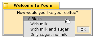
The Popup type is used for a radio selection group. Only one of the options can be selected. This is similar to the radiobutton, but takes less screenspace, and can have more options to select from.
popup
popup.type = popup
popup.label = How would you like your coffee?
popup.option1 = Black
popup.option2 = With milk
popup.option3 = With milk and sugar
popup.option4 = Only sugar, no milk
popup.default = option1
popup.tooltip = Please make your selection.
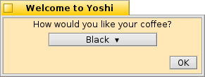
A popup entry group
popup will return "name=option#" , where # indicates a number 1 to 10. In this case "popup=option1".
.label The prompt for the user that identfies what information is being requested. If the label is longer than the width of the window, the window will be resized.
.default Sets the default selected option for the group. If there is no .default, the button label is set to "Select ▾," otherwise, the selected option is displayed. If no option is selected, popup returns "name=" in this case "popup="
.option1 through .option10 The popup button options. Start with option 1 and add options until the group is complete. This element will allow up to ten options.
The option is set to the label displayed for this selection.
.tooltip Set a tooltip for the popup group.
