Menu
▾
▴

Multiselect
Multiselect
The multiselect type is used for a multiple selection group. Any or all of the options can be selected. This is similar to the popup button, but acts like a group of checkboxes.
multiselect
coffee.type = multiselect
coffee.label = Would you like coffee?
coffee.title = Chose your Coffee
coffee.width = 40
coffee.option1 = add espresso shot
coffee.option2 = With milk
coffee.option3 = With sugar
coffee.option4 = Add Chocolate
coffee.tooltip = Please make your selection.
coffee.default = option1
#coffee.default = option3
#coffee.default = option4
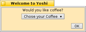
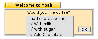
A multiselect entry group
multiselect will return "name=option#" , where # indicates a number 1 to 10. If the user has not pressed the button, it returns "name=" In this case "coffee=". If more than one option is selected, it will return all of the selected options separated by the pipe "|" character. The return string looks like this if three options are selected:
name=option#|option#|option#
or in this case:
coffee=option2|option3|option4
.label The prompt for the user that identfies what information is being requested. If the label is longer than the width of the window, the window will be resized.
.title sets the button label. unlike a popup, this is not changes with each selection. If no .title tag is specified, the button title is set to "Select ▾".
.width set the minimum width for the button. The default is 20 pixels. This will grow if the title is longer than the specified width.
.default Sets the default selected option for the group. If there is no .default, none of the options are selected. There may be more than one .default tag to set more than one option selected.
.option1 through .option10 The multiselect button options. Start with option 1 and add options until the group is complete. This element will allow up to ten options.
.tooltip Set a tooltip for the multiselect group.
