Menu
▾
▴

Buttons
Buttons
There are three types of buttons supported by Yoshi:
- defaultbutton
- cancelbutton
- button
defaultbutton
db.type = defaultbutton
db.label = >> NEXT > >
db.tooltip = Click here to submit your entry
The defaultbutton type overrides the label, normally "OK", and can add a tooltip to the default button. In the example above, it changes the default button label to ">> NEXT > >" and adds a tooltip. Manditory fields are always checked for content when the default button is pressed, and the return value is "default=1"
The default button is always located in the lower right corner of the window.
cancelbutton
cb.type = cancelbutton
cb.label = CANCEL
cb.tooltip = Closes this window without returning the values entered
The cancelbutton type overrides the cancel button label, normally "CANCEL", and can add a tooltip. If there is a cancelbutton type, the cancel button is always shown, even on windows with tabs. if pressed, yoshi will only return the status of the cancel button and no other information, IE "cancel=1"
the cancelbutton is always placed to the left of the default button.
button
b.type = button
b.label = < < BACK <<
b.tooltip = Go back to the previous Window.
The button type adds a third button to the window. Only one extra button is added. The button is placed to the left of the default button ( or cancel button if one is shown. ) The button will return button and status. IE "b=1" or "b=0" in this case. The button type does not check manditory fields for data, and will return all of the information entered.
It is best to use short labels as the window will not resize to accommodate labels longer than the window width. Other elements can resize the width, but not buttons.
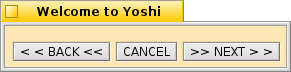
A window showing the examples above
