Menu
▾
▴
rails-devel
|
From: Frederick W. <fre...@go...> - 2011-12-16 12:34:52
|
Hi, in several domains, the rails project has gone far beyond SimTex's 1830. But there are some other domains in which the situation is the opposite. One is the availability of computer opponents which is only of minor importance for rails for obvious reasons (the most important being the lack of complete rule enforcements as a prerequisite). The other domain where SimTex's 1830 shines is the user experience (UI and beyond), including the graphics and the music. In my opinion, these parts of the computer game have a large impact on the fun / athosphere of playing the game. Therefore, I consider this to be really important, too. Rails has already moved into this direction by providing the means of including background maps. For the future steps into this direction, I have already provided some feature requests: - 3460692: svg company tokens/logos - 3460927: player portraits - 3454269: background music What I would like to know is whether/how you (Erik/Stefan/Brett/...) plan to proceed here. Regards, Frederick |
|
From: brett l. <bre...@gm...> - 2011-12-16 13:04:08
|
There hasn't been much discussion about art assets. I don't think we've ever considered things like player portraits or background music. For us, implementing game logic has always taken a higher priority. AI players is something we've discussed, but it's been a low priority. If you're interested in working on the UI, you're welcome to do so. The code is open, and patches are always welcome. The first step is to subscribe to the mailing list, then check the code out of the git repository. ;-) ---Brett. On Fri, Dec 16, 2011 at 7:34 AM, Frederick Weld <fre...@go...> wrote: > Hi, > > in several domains, the rails project has gone far beyond SimTex's 1830. But > there are some other domains in which the situation is the opposite. One is > the availability of computer opponents which is only of minor importance for > rails for obvious reasons (the most important being the lack of complete > rule enforcements as a prerequisite). > > The other domain where SimTex's 1830 shines is the user experience (UI and > beyond), including the graphics and the music. In my opinion, these parts of > the computer game have a large impact on the fun / athosphere of playing the > game. Therefore, I consider this to be really important, too. > > Rails has already moved into this direction by providing the means of > including background maps. > > For the future steps into this direction, I have already provided some > feature requests: > - 3460692: svg company tokens/logos > - 3460927: player portraits > - 3454269: background music > > What I would like to know is whether/how you (Erik/Stefan/Brett/...) plan to > proceed here. > > Regards, > Frederick > > > ------------------------------------------------------------------------------ > Learn Windows Azure Live! Tuesday, Dec 13, 2011 > Microsoft is holding a special Learn Windows Azure training event for > developers. It will provide a great way to learn Windows Azure and what it > provides. You can attend the event by watching it streamed LIVE online. > Learn more at http://p.sf.net/sfu/ms-windowsazure > _______________________________________________ > Rails-devel mailing list > Rai...@li... > https://lists.sourceforge.net/lists/listinfo/rails-devel > |
|
From: Erik V. <eri...@xs...> - 2011-12-16 15:11:24
|
My personal focus is on functionality, not on "User Experience". I would be willing to work on implementing SVG company tokens, if someone else would care to create these. I'm not interested in adding player portraits, and I generally hate background music, so you can count me out on these aspects. Personally, I have always considered the current UI to be a provisional one. What we have now was just within my reach. In the past several people have already done suggestions to replace or supplement it with a more sophisticated UI, but so far nobody has started working on one in earnest. On your other requests: I'll try to implement your 1856 background map. Possibly also the 18GA CP map, depending on whether or not Stefan can manage to do that. Erik. From: Frederick Weld [mailto:fre...@go...] Sent: Friday, December 16, 2011 1:35 PM To: rai...@li... Subject: [Rails-devel] Roadmap for improving User Experience Hi, in several domains, the rails project has gone far beyond SimTex's 1830. But there are some other domains in which the situation is the opposite. One is the availability of computer opponents which is only of minor importance for rails for obvious reasons (the most important being the lack of complete rule enforcements as a prerequisite). The other domain where SimTex's 1830 shines is the user experience (UI and beyond), including the graphics and the music. In my opinion, these parts of the computer game have a large impact on the fun / athosphere of playing the game. Therefore, I consider this to be really important, too. Rails has already moved into this direction by providing the means of including background maps. For the future steps into this direction, I have already provided some feature requests: - 3460692: svg company tokens/logos - 3460927: player portraits - 3454269: background music What I would like to know is whether/how you (Erik/Stefan/Brett/...) plan to proceed here. Regards, Frederick |
|
From: Stefan F. <ste...@we...> - 2011-12-16 15:20:27
|
Erik: I have added all maps already, only the push is missing yet. Stefan Erik Vos <eri...@xs...> schrieb: My personal focus is on functionality, not on "User Experience". I would be willing to work on implementing SVG company tokens, if someone else would care to create these. I'm not interested in adding player portraits, and I generally hate background music, so you can count me out on these aspects. Personally, I have always considered the current UI to be a provisional one. What we have now was just within my reach. In the past several people have already done suggestions to replace or supplement it with a more sophisticated UI, but so far nobody has started working on one in earnest. On your other requests: I'll try to implement your 1856 background map. Possibly also the 18GA CP map, depending on whether or not Stefan can manage to do that. Erik. From: Frederick Weld [mailto:fre...@go...] Sent: Friday, December 16, 2011 1:35 PM To: rai...@li... Subject: [Rails-devel] Roadmap for improving User Experience Hi, in several domains, the rails project has gone far beyond SimTex's 1830. But there are some other domains in which the situation is the opposite. One is the availability of computer opponents which is only of minor importance for rails for obvious reasons (the most important being the lack of complete rule enforcements as a prerequisite). The other domain where SimTex's 1830 shines is the user experience (UI and beyond), including the graphics and the music. In my opinion, these parts of the computer game have a large impact on the fun / athosphere of playing the game. Therefore, I consider this to be really important, too. Rails has already moved into this direction by providing the means of including background maps. For the future steps into this direction, I have already provided some feature requests: - 3460692: svg company tokens/logos - 3460927: player portraits - 3454269: background music What I would like to know is whether/how you (Erik/Stefan/Brett/...) plan to proceed here. Regards, Frederick ------------------------------------------------------------------------------ Learn Windows Azure Live! Tuesday, Dec 13, 2011 Microsoft is holding a special Learn Windows Azure training event for developers. It will provide a great way to learn Windows Azure and what it provides. You can attend the event by watching it streamed LIVE online. Learn more at http://p.sf.net/sfu/ms-windowsazure_______________________________________________ Rails-devel mailing list Rai...@li... https://lists.sourceforge.net/lists/listinfo/rails-devel |
|
From: Erik V. <eri...@xs...> - 2011-12-16 15:25:59
|
Thanks Stefan, then I’ll keep my hands off. Erik. From: Stefan Frey [mailto:ste...@we...] Sent: Friday, December 16, 2011 4:20 PM To: Development list for Rails: an 18xx game Subject: Re: [Rails-devel] Roadmap for improving User Experience Erik: I have added all maps already, only the push is missing yet. Stefan Erik Vos <eri...@xs...> schrieb: My personal focus is on functionality, not on "User Experience". I would be willing to work on implementing SVG company tokens, if someone else would care to create these. I'm not interested in adding player portraits, and I generally hate background music, so you can count me out on these aspects. Personally, I have always considered the current UI to be a provisional one. What we have now was just within my reach. In the past several people have already done suggestions to replace or supplement it with a more sophisticated UI, but so far nobody has started working on one in earnest. On your other requests: I'll try to implement your 1856 background map. Possibly also the 18GA CP map, depending on whether or not Stefan can manage to do that. Erik. From: Frederick Weld [mailto:fre...@go...] Sent: Friday, December 16, 2011 1:35 PM To: rai...@li... Subject: [Rails-devel] Roadmap for improving User Experience Hi, in several domains, the rails project has gone far beyond SimTex's 1830. But there are some other domains in which the situation is the opposite. One is the availability of computer opponents which is only of minor importance for rails for obvious reasons (the most important being the lack of complete rule enforcements as a prerequisite). The other domain where SimTex's 1830 shines is the user experience (UI and beyond), including the graphics and the music. In my opinion, these parts of the computer game have a large impact on the fun / athosphere of playing the game. Therefore, I consider this to be really important, too. Rails has already moved into this direction by providing the means of including background maps. For the future steps into this direction, I have already provided some feature requests: - 3460692: svg company tokens/logos - 3460927: player portraits - 3454269: background music What I would like to know is whether/how you (Erik/Stefan/Brett/...) plan to proceed here. Regards, Frederick ------------------------------------------------------------------------------ Learn Windows Azure Live! Tuesday, Dec 13, 2011 Microsoft is holding a special Learn Windows Azure training event for developers. It will provide a great way to learn Windows Azure and what it provides. You can attend the event by watching it streamed LIVE online. Learn more at http://p.sf.net/sfu/ms-windowsazure_______________________________________________ Rails-devel mailing list Rai...@li... https://lists.sourceforge.net/lists/listinfo/rails-devel |
|
From: Frederick W. <fre...@go...> - 2011-12-16 15:45:11
|
Hi Brett/Erik/Stefan, thanks for the clarification. I now understand that your focus is on functionality. Apart from occasional svg art, I won't have the resources to contribute to the project. Hence, the priority of those 3 feature requests can be downgraded. Regarding Erik's proposal for the station tokens: Replacing them with svg art would only be viable if all references to the company acronym were to be replaced (including the main portfolio / SR window). Otherwise, users could run into issues of associating the svg with the acronym. Regards, Frederick |
|
From: brett l. <bre...@gm...> - 2011-12-16 16:01:26
|
On Fri, Dec 16, 2011 at 10:45 AM, Frederick Weld <fre...@go...> wrote: > Hi Brett/Erik/Stefan, > > thanks for the clarification. I now understand that your focus is on > functionality. Apart from occasional svg art, I won't have the > resources to contribute to the project. Hence, the priority of those 3 > feature requests can be downgraded. > Contribute whenever you can. All of us work on this project in our spare time. :-) > Regarding Erik's proposal for the station tokens: > Replacing them with svg art would only be viable if all references to > the company acronym were to be replaced (including the main portfolio > / SR window). Otherwise, users could run into issues of associating > the svg with the acronym. > > Regards, > Frederick > ---Brett. |
|
From: Erik V. <eri...@xs...> - 2011-12-16 22:45:46
|
> From: Frederick Weld [mailto:fre...@go...] > Regarding Erik's proposal for the station tokens: > Replacing them with svg art would only be viable if all references to the > company acronym were to be replaced (including the main portfolio / SR > window). Otherwise, users could run into issues of associating the svg with > the acronym. IMO, what is really important is that the SVG and the company name fields use the same colours. The SVG will probably be unreadable at standard scale, so the company names, as these are currently shown in the windows, cannot be removed. Perhaps the logo can be added. Erik. |
|
From: John A. T. <ja...@ja...> - 2011-12-16 22:57:35
|
On Fri, Dec 16, 2011 at 5:45 PM, Erik Vos <eri...@xs...> wrote: > IMO, what is really important is that the SVG and the company name fields > use the same colours. > That isn't necessarily the case even with physical games -- for example, I try and make sure the company colors are distinguishable from each other, but sometimes the logos don't have that color or are distinguished by shapes or whether the color is the foreground or background, for example. Also, multicolor logos don't map well to a color to use for the company. -- John A. Tamplin |
|
From: brett l. <bre...@gm...> - 2011-12-17 02:19:57
|
On Fri, Dec 16, 2011 at 5:51 PM, John A. Tamplin <ja...@ja...> wrote: > On Fri, Dec 16, 2011 at 5:45 PM, Erik Vos <eri...@xs...> wrote: >> >> IMO, what is really important is that the SVG and the company name fields >> use the same colours. > > > That isn't necessarily the case even with physical games -- for example, I > try and make sure the company colors are distinguishable from each other, > but sometimes the logos don't have that color or are distinguished by shapes > or whether the color is the foreground or background, for example. Also, > multicolor logos don't map well to a color to use for the company. > > -- > John A. Tamplin > I'll complicate this a bit further: Color blindness. Red-Green color blindness is relatively common in men. Other forms of color blindness also exist, and make these sorts of decisions sort of dicey. There are a few people in my old gaming group that were color blind and some games were more difficult for them to play because of this. I think all markers should have the initials of the company along with an associated color. If we can also make each token it's own shape or use distinct combinations of foreground and background colors, so much the better. However, 18xx games have a *ton* of information (comparatively) and so there's a balance to be struck lest we needlessly complicate things. At a minimum, players should be able to match up the B&O token on the stock market with the B&O tokens on the map and the B&O entry in the game status window... very much like in a physical game. The easiest way to do this is just to have the characters "B&O" everywhere the company is referenced. If there's space in the UI to include the full name *and* the abbreviation in some places, that's great. But, at a minimum, we should maintain some amount of consistency by always displaying the abbreviation and not rely on just coloring to convey this information. ---Brett. |
|
From: Erik V. <eri...@xs...> - 2011-12-17 10:48:21
|
Currently, all tokens have the company abbreviation and colours, so there is a good match. However, the abbreviations are drawn on the token circles with start positions and font sizes that are derived from the number of characters in a very simple way, and the result is not very satisfactory. So I am all for better ways to draw tokens. And I would be happy to optimize colours so that the colour-blind can better distinguish these - but I am not, so I would be dependent on advice from such players. Apart from the colours, I see two ways to improve token visibility by using SVG: 1. Design simple SVG tokens that are similar to the existing ones, having just the company colours and abbreviations, but better designed so that the abbreviations are well-centered and have the best font and size for readability. 2. Design SVG tokens that resemble the real logos in terms of colours and shape. I believe that this way the name will not be readable in most cases, so (for the colour-blind) shape becomes the only distinguishing factor. In this case I would try to include such tokens into the grid windows as well, at least at the left-hand side. But the abbreviation has to stay there. Like Brett, I think that just the name abbreviation is best (option 1). Erik. > From: brett lentz [mailto:bre...@gm...] > I'll complicate this a bit further: Color blindness. > > Red-Green color blindness is relatively common in men. Other forms of color > blindness also exist, and make these sorts of decisions sort of dicey. > > There are a few people in my old gaming group that were color blind and > some games were more difficult for them to play because of this. > > I think all markers should have the initials of the company along with an > associated color. If we can also make each token it's own shape or use > distinct combinations of foreground and background colors, so much the > better. However, 18xx games have a *ton* of information > (comparatively) and so there's a balance to be struck lest we needlessly > complicate things. > > At a minimum, players should be able to match up the B&O token on the > stock market with the B&O tokens on the map and the B&O entry in the > game status window... very much like in a physical game. The easiest way to > do this is just to have the characters "B&O" everywhere the company is > referenced. If there's space in the UI to include the full name *and* the > abbreviation in some places, that's great. But, at a minimum, we should > maintain some amount of consistency by always displaying the abbreviation > and not rely on just coloring to convey this information. > > ---Brett. |
|
From: Chris S. <chr...@gm...> - 2011-12-17 17:46:36
|
There are ways to support the color blind, and those of us with less than perfect vision: 1. Global option to replace all SVG token graphics with simple black & white text abbreviations. 2. Pop up text when mousing over a token. 3. Pop up larger image when mousing over a token. -- Chris Please consider the environment before printing this e-mail. On Sat, Dec 17, 2011 at 2:48 AM, Erik Vos <eri...@xs...> wrote: > Currently, all tokens have the company abbreviation and colours, so there is a good match. > However, the abbreviations are drawn on the token circles with start positions and font sizes that are derived from the number of characters in a very simple way, and the result is not very satisfactory. > So I am all for better ways to draw tokens. And I would be happy to optimize colours so that the colour-blind can better distinguish these - but I am not, so I would be dependent on advice from such players. > > Apart from the colours, I see two ways to improve token visibility by using SVG: > > 1. Design simple SVG tokens that are similar to the existing ones, having just the company colours and abbreviations, but better designed so that the abbreviations are well-centered and have the best font and size for readability. > > 2. Design SVG tokens that resemble the real logos in terms of colours and shape. I believe that this way the name will not be readable in most cases, so (for the colour-blind) shape becomes the only distinguishing factor. In this case I would try to include such tokens into the grid windows as well, at least at the left-hand side. But the abbreviation has to stay there. > > Like Brett, I think that just the name abbreviation is best (option 1). > > Erik. > >> From: brett lentz [mailto:bre...@gm...] >> I'll complicate this a bit further: Color blindness. >> >> Red-Green color blindness is relatively common in men. Other forms of color >> blindness also exist, and make these sorts of decisions sort of dicey. >> >> There are a few people in my old gaming group that were color blind and >> some games were more difficult for them to play because of this. >> >> I think all markers should have the initials of the company along with an >> associated color. If we can also make each token it's own shape or use >> distinct combinations of foreground and background colors, so much the >> better. However, 18xx games have a *ton* of information >> (comparatively) and so there's a balance to be struck lest we needlessly >> complicate things. >> >> At a minimum, players should be able to match up the B&O token on the >> stock market with the B&O tokens on the map and the B&O entry in the >> game status window... very much like in a physical game. The easiest way to >> do this is just to have the characters "B&O" everywhere the company is >> referenced. If there's space in the UI to include the full name *and* the >> abbreviation in some places, that's great. But, at a minimum, we should >> maintain some amount of consistency by always displaying the abbreviation >> and not rely on just coloring to convey this information. >> >> ---Brett. > > > ------------------------------------------------------------------------------ > Learn Windows Azure Live! Tuesday, Dec 13, 2011 > Microsoft is holding a special Learn Windows Azure training event for > developers. It will provide a great way to learn Windows Azure and what it > provides. You can attend the event by watching it streamed LIVE online. > Learn more at http://p.sf.net/sfu/ms-windowsazure > _______________________________________________ > Rails-devel mailing list > Rai...@li... > https://lists.sourceforge.net/lists/listinfo/rails-devel |
|
From: Chris S. <chr...@gm...> - 2011-12-17 17:51:27
|
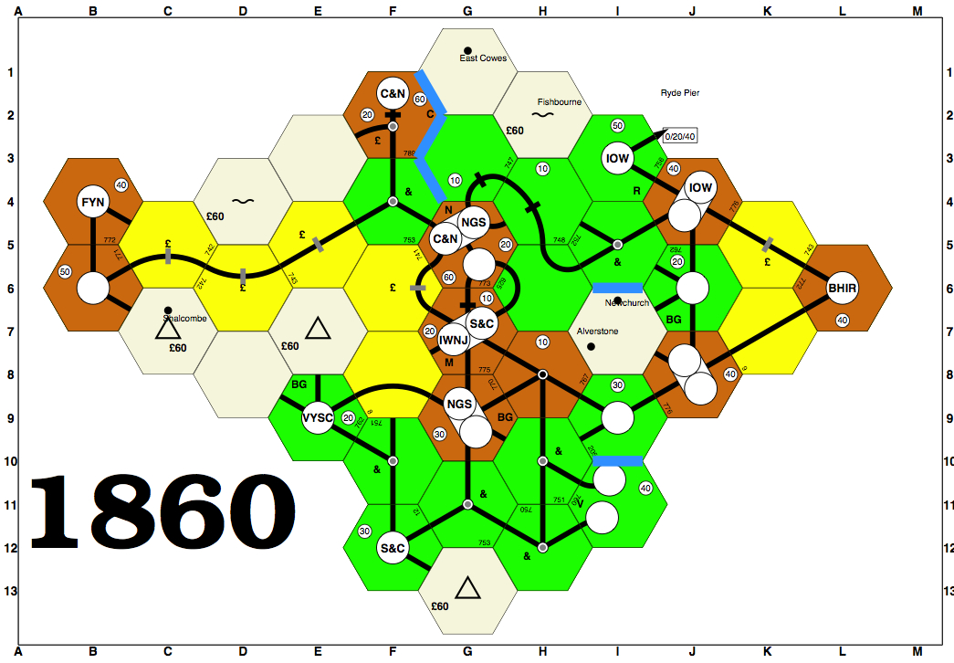
This, by the way, is what I meant by simple black & white text abbreviations. It's from a ps18xx map. http://www.mikkosgameblog.com/wp-content/uploads/2011/08/1860-mikko-ed.jpg -- Chris Please consider the environment before printing this e-mail. On Sat, Dec 17, 2011 at 9:46 AM, Chris Shaffer <chr...@gm...> wrote: > There are ways to support the color blind, and those of us with less > than perfect vision: > > 1. Global option to replace all SVG token graphics with simple black & > white text abbreviations. > 2. Pop up text when mousing over a token. > 3. Pop up larger image when mousing over a token. > > -- > Chris > > Please consider the environment before printing this e-mail. > > > > On Sat, Dec 17, 2011 at 2:48 AM, Erik Vos <eri...@xs...> wrote: >> Currently, all tokens have the company abbreviation and colours, so there is a good match. >> However, the abbreviations are drawn on the token circles with start positions and font sizes that are derived from the number of characters in a very simple way, and the result is not very satisfactory. >> So I am all for better ways to draw tokens. And I would be happy to optimize colours so that the colour-blind can better distinguish these - but I am not, so I would be dependent on advice from such players. >> >> Apart from the colours, I see two ways to improve token visibility by using SVG: >> >> 1. Design simple SVG tokens that are similar to the existing ones, having just the company colours and abbreviations, but better designed so that the abbreviations are well-centered and have the best font and size for readability. >> >> 2. Design SVG tokens that resemble the real logos in terms of colours and shape. I believe that this way the name will not be readable in most cases, so (for the colour-blind) shape becomes the only distinguishing factor. In this case I would try to include such tokens into the grid windows as well, at least at the left-hand side. But the abbreviation has to stay there. >> >> Like Brett, I think that just the name abbreviation is best (option 1). >> >> Erik. >> >>> From: brett lentz [mailto:bre...@gm...] >>> I'll complicate this a bit further: Color blindness. >>> >>> Red-Green color blindness is relatively common in men. Other forms of color >>> blindness also exist, and make these sorts of decisions sort of dicey. >>> >>> There are a few people in my old gaming group that were color blind and >>> some games were more difficult for them to play because of this. >>> >>> I think all markers should have the initials of the company along with an >>> associated color. If we can also make each token it's own shape or use >>> distinct combinations of foreground and background colors, so much the >>> better. However, 18xx games have a *ton* of information >>> (comparatively) and so there's a balance to be struck lest we needlessly >>> complicate things. >>> >>> At a minimum, players should be able to match up the B&O token on the >>> stock market with the B&O tokens on the map and the B&O entry in the >>> game status window... very much like in a physical game. The easiest way to >>> do this is just to have the characters "B&O" everywhere the company is >>> referenced. If there's space in the UI to include the full name *and* the >>> abbreviation in some places, that's great. But, at a minimum, we should >>> maintain some amount of consistency by always displaying the abbreviation >>> and not rely on just coloring to convey this information. >>> >>> ---Brett. >> >> >> ------------------------------------------------------------------------------ >> Learn Windows Azure Live! Tuesday, Dec 13, 2011 >> Microsoft is holding a special Learn Windows Azure training event for >> developers. It will provide a great way to learn Windows Azure and what it >> provides. You can attend the event by watching it streamed LIVE online. >> Learn more at http://p.sf.net/sfu/ms-windowsazure >> _______________________________________________ >> Rails-devel mailing list >> Rai...@li... >> https://lists.sourceforge.net/lists/listinfo/rails-devel |
|
From: Mark S. <mar...@gm...> - 2011-12-17 18:15:36
|
Thought on just black and white -- how to distinguish placed tokens and home bases? Sent from my iPad On Dec 17, 2011, at 12:51 PM, Chris Shaffer <chr...@gm...> wrote: > This, by the way, is what I meant by simple black & white text > abbreviations. It's from a ps18xx map. > > http://www.mikkosgameblog.com/wp-content/uploads/2011/08/1860-mikko-ed.jpg > > -- > Chris > > Please consider the environment before printing this e-mail. > > > > On Sat, Dec 17, 2011 at 9:46 AM, Chris Shaffer <chr...@gm...> wrote: >> There are ways to support the color blind, and those of us with less >> than perfect vision: >> >> 1. Global option to replace all SVG token graphics with simple black & >> white text abbreviations. >> 2. Pop up text when mousing over a token. >> 3. Pop up larger image when mousing over a token. >> >> -- >> Chris >> >> Please consider the environment before printing this e-mail. >> >> >> >> On Sat, Dec 17, 2011 at 2:48 AM, Erik Vos <eri...@xs...> wrote: >>> Currently, all tokens have the company abbreviation and colours, so there is a good match. >>> However, the abbreviations are drawn on the token circles with start positions and font sizes that are derived from the number of characters in a very simple way, and the result is not very satisfactory. >>> So I am all for better ways to draw tokens. And I would be happy to optimize colours so that the colour-blind can better distinguish these - but I am not, so I would be dependent on advice from such players. >>> >>> Apart from the colours, I see two ways to improve token visibility by using SVG: >>> >>> 1. Design simple SVG tokens that are similar to the existing ones, having just the company colours and abbreviations, but better designed so that the abbreviations are well-centered and have the best font and size for readability. >>> >>> 2. Design SVG tokens that resemble the real logos in terms of colours and shape. I believe that this way the name will not be readable in most cases, so (for the colour-blind) shape becomes the only distinguishing factor. In this case I would try to include such tokens into the grid windows as well, at least at the left-hand side. But the abbreviation has to stay there. >>> >>> Like Brett, I think that just the name abbreviation is best (option 1). >>> >>> Erik. >>> >>>> From: brett lentz [mailto:bre...@gm...] >>>> I'll complicate this a bit further: Color blindness. >>>> >>>> Red-Green color blindness is relatively common in men. Other forms of color >>>> blindness also exist, and make these sorts of decisions sort of dicey. >>>> >>>> There are a few people in my old gaming group that were color blind and >>>> some games were more difficult for them to play because of this. >>>> >>>> I think all markers should have the initials of the company along with an >>>> associated color. If we can also make each token it's own shape or use >>>> distinct combinations of foreground and background colors, so much the >>>> better. However, 18xx games have a *ton* of information >>>> (comparatively) and so there's a balance to be struck lest we needlessly >>>> complicate things. >>>> >>>> At a minimum, players should be able to match up the B&O token on the >>>> stock market with the B&O tokens on the map and the B&O entry in the >>>> game status window... very much like in a physical game. The easiest way to >>>> do this is just to have the characters "B&O" everywhere the company is >>>> referenced. If there's space in the UI to include the full name *and* the >>>> abbreviation in some places, that's great. But, at a minimum, we should >>>> maintain some amount of consistency by always displaying the abbreviation >>>> and not rely on just coloring to convey this information. >>>> >>>> ---Brett. >>> >>> >>> ------------------------------------------------------------------------------ >>> Learn Windows Azure Live! Tuesday, Dec 13, 2011 >>> Microsoft is holding a special Learn Windows Azure training event for >>> developers. It will provide a great way to learn Windows Azure and what it >>> provides. You can attend the event by watching it streamed LIVE online. >>> Learn more at http://p.sf.net/sfu/ms-windowsazure >>> _______________________________________________ >>> Rails-devel mailing list >>> Rai...@li... >>> https://lists.sourceforge.net/lists/listinfo/rails-devel > > ------------------------------------------------------------------------------ > Learn Windows Azure Live! Tuesday, Dec 13, 2011 > Microsoft is holding a special Learn Windows Azure training event for > developers. It will provide a great way to learn Windows Azure and what it > provides. You can attend the event by watching it streamed LIVE online. > Learn more at http://p.sf.net/sfu/ms-windowsazure > _______________________________________________ > Rails-devel mailing list > Rai...@li... > https://lists.sourceforge.net/lists/listinfo/rails-devel |
|
From: Chris S. <chr...@gm...> - 2011-12-17 19:12:27
|
Grey shading? -- Chris Please consider the environment before printing this e-mail. On Sat, Dec 17, 2011 at 10:15 AM, Mark Smith <mar...@gm...> wrote: > Thought on just black and white -- how to distinguish placed tokens and home bases? > > Sent from my iPad > > On Dec 17, 2011, at 12:51 PM, Chris Shaffer <chr...@gm...> wrote: > >> This, by the way, is what I meant by simple black & white text >> abbreviations. It's from a ps18xx map. >> >> http://www.mikkosgameblog.com/wp-content/uploads/2011/08/1860-mikko-ed.jpg >> >> -- >> Chris >> >> Please consider the environment before printing this e-mail. >> >> >> >> On Sat, Dec 17, 2011 at 9:46 AM, Chris Shaffer <chr...@gm...> wrote: >>> There are ways to support the color blind, and those of us with less >>> than perfect vision: >>> >>> 1. Global option to replace all SVG token graphics with simple black & >>> white text abbreviations. >>> 2. Pop up text when mousing over a token. >>> 3. Pop up larger image when mousing over a token. >>> >>> -- >>> Chris >>> >>> Please consider the environment before printing this e-mail. >>> >>> >>> >>> On Sat, Dec 17, 2011 at 2:48 AM, Erik Vos <eri...@xs...> wrote: >>>> Currently, all tokens have the company abbreviation and colours, so there is a good match. >>>> However, the abbreviations are drawn on the token circles with start positions and font sizes that are derived from the number of characters in a very simple way, and the result is not very satisfactory. >>>> So I am all for better ways to draw tokens. And I would be happy to optimize colours so that the colour-blind can better distinguish these - but I am not, so I would be dependent on advice from such players. >>>> >>>> Apart from the colours, I see two ways to improve token visibility by using SVG: >>>> >>>> 1. Design simple SVG tokens that are similar to the existing ones, having just the company colours and abbreviations, but better designed so that the abbreviations are well-centered and have the best font and size for readability. >>>> >>>> 2. Design SVG tokens that resemble the real logos in terms of colours and shape. I believe that this way the name will not be readable in most cases, so (for the colour-blind) shape becomes the only distinguishing factor. In this case I would try to include such tokens into the grid windows as well, at least at the left-hand side. But the abbreviation has to stay there. >>>> >>>> Like Brett, I think that just the name abbreviation is best (option 1). >>>> >>>> Erik. >>>> >>>>> From: brett lentz [mailto:bre...@gm...] >>>>> I'll complicate this a bit further: Color blindness. >>>>> >>>>> Red-Green color blindness is relatively common in men. Other forms of color >>>>> blindness also exist, and make these sorts of decisions sort of dicey. >>>>> >>>>> There are a few people in my old gaming group that were color blind and >>>>> some games were more difficult for them to play because of this. >>>>> >>>>> I think all markers should have the initials of the company along with an >>>>> associated color. If we can also make each token it's own shape or use >>>>> distinct combinations of foreground and background colors, so much the >>>>> better. However, 18xx games have a *ton* of information >>>>> (comparatively) and so there's a balance to be struck lest we needlessly >>>>> complicate things. >>>>> >>>>> At a minimum, players should be able to match up the B&O token on the >>>>> stock market with the B&O tokens on the map and the B&O entry in the >>>>> game status window... very much like in a physical game. The easiest way to >>>>> do this is just to have the characters "B&O" everywhere the company is >>>>> referenced. If there's space in the UI to include the full name *and* the >>>>> abbreviation in some places, that's great. But, at a minimum, we should >>>>> maintain some amount of consistency by always displaying the abbreviation >>>>> and not rely on just coloring to convey this information. >>>>> >>>>> ---Brett. >>>> >>>> >>>> ------------------------------------------------------------------------------ >>>> Learn Windows Azure Live! Tuesday, Dec 13, 2011 >>>> Microsoft is holding a special Learn Windows Azure training event for >>>> developers. It will provide a great way to learn Windows Azure and what it >>>> provides. You can attend the event by watching it streamed LIVE online. >>>> Learn more at http://p.sf.net/sfu/ms-windowsazure >>>> _______________________________________________ >>>> Rails-devel mailing list >>>> Rai...@li... >>>> https://lists.sourceforge.net/lists/listinfo/rails-devel >> >> ------------------------------------------------------------------------------ >> Learn Windows Azure Live! Tuesday, Dec 13, 2011 >> Microsoft is holding a special Learn Windows Azure training event for >> developers. It will provide a great way to learn Windows Azure and what it >> provides. You can attend the event by watching it streamed LIVE online. >> Learn more at http://p.sf.net/sfu/ms-windowsazure >> _______________________________________________ >> Rails-devel mailing list >> Rai...@li... >> https://lists.sourceforge.net/lists/listinfo/rails-devel > > ------------------------------------------------------------------------------ > Learn Windows Azure Live! Tuesday, Dec 13, 2011 > Microsoft is holding a special Learn Windows Azure training event for > developers. It will provide a great way to learn Windows Azure and what it > provides. You can attend the event by watching it streamed LIVE online. > Learn more at http://p.sf.net/sfu/ms-windowsazure > _______________________________________________ > Rails-devel mailing list > Rai...@li... > https://lists.sourceforge.net/lists/listinfo/rails-devel |
|
From: Mark S. <mar...@gm...> - 2011-12-18 00:28:01
|
OK, just to add more... in 1856 and 1870, you have the Home Base, you have the Destinations, as well as placed tokens. There should be ways to distinguish each from each other. Grey Shading doesn't seem like the right answer. If you do something "fancy" with the font, say Outline Text for Home, and Italics for a Destination, and Solid Font for Placed... it may work. Can anyone think of other ways a Company is represented on a map? Mark On Sat, Dec 17, 2011 at 2:12 PM, Chris Shaffer <chr...@gm...>wrote: > Grey shading? > > -- > Chris > > Please consider the environment before printing this e-mail. > > > > On Sat, Dec 17, 2011 at 10:15 AM, Mark Smith <mar...@gm...> > wrote: > > Thought on just black and white -- how to distinguish placed tokens and > home bases? > > > > Sent from my iPad > > > > On Dec 17, 2011, at 12:51 PM, Chris Shaffer <chr...@gm...> > wrote: > > > >> This, by the way, is what I meant by simple black & white text > >> abbreviations. It's from a ps18xx map. > >> > >> > http://www.mikkosgameblog.com/wp-content/uploads/2011/08/1860-mikko-ed.jpg > >> > >> -- > >> Chris > >> > >> Please consider the environment before printing this e-mail. > >> > >> > >> > >> On Sat, Dec 17, 2011 at 9:46 AM, Chris Shaffer <chr...@gm...> > wrote: > >>> There are ways to support the color blind, and those of us with less > >>> than perfect vision: > >>> > >>> 1. Global option to replace all SVG token graphics with simple black & > >>> white text abbreviations. > >>> 2. Pop up text when mousing over a token. > >>> 3. Pop up larger image when mousing over a token. > >>> > >>> -- > >>> Chris > >>> > >>> Please consider the environment before printing this e-mail. > >>> > >>> > >>> > >>> On Sat, Dec 17, 2011 at 2:48 AM, Erik Vos <eri...@xs...> wrote: > >>>> Currently, all tokens have the company abbreviation and colours, so > there is a good match. > >>>> However, the abbreviations are drawn on the token circles with start > positions and font sizes that are derived from the number of characters in > a very simple way, and the result is not very satisfactory. > >>>> So I am all for better ways to draw tokens. And I would be happy to > optimize colours so that the colour-blind can better distinguish these - > but I am not, so I would be dependent on advice from such players. > >>>> > >>>> Apart from the colours, I see two ways to improve token visibility by > using SVG: > >>>> > >>>> 1. Design simple SVG tokens that are similar to the existing ones, > having just the company colours and abbreviations, but better designed so > that the abbreviations are well-centered and have the best font and size > for readability. > >>>> > >>>> 2. Design SVG tokens that resemble the real logos in terms of colours > and shape. I believe that this way the name will not be readable in most > cases, so (for the colour-blind) shape becomes the only distinguishing > factor. In this case I would try to include such tokens into the grid > windows as well, at least at the left-hand side. But the abbreviation has > to stay there. > >>>> > >>>> Like Brett, I think that just the name abbreviation is best (option > 1). > >>>> > >>>> Erik. > >>>> > >>>>> From: brett lentz [mailto:bre...@gm...] > >>>>> I'll complicate this a bit further: Color blindness. > >>>>> > >>>>> Red-Green color blindness is relatively common in men. Other forms > of color > >>>>> blindness also exist, and make these sorts of decisions sort of > dicey. > >>>>> > >>>>> There are a few people in my old gaming group that were color blind > and > >>>>> some games were more difficult for them to play because of this. > >>>>> > >>>>> I think all markers should have the initials of the company along > with an > >>>>> associated color. If we can also make each token it's own shape or > use > >>>>> distinct combinations of foreground and background colors, so much > the > >>>>> better. However, 18xx games have a *ton* of information > >>>>> (comparatively) and so there's a balance to be struck lest we > needlessly > >>>>> complicate things. > >>>>> > >>>>> At a minimum, players should be able to match up the B&O token on the > >>>>> stock market with the B&O tokens on the map and the B&O entry in the > >>>>> game status window... very much like in a physical game. The easiest > way to > >>>>> do this is just to have the characters "B&O" everywhere the company > is > >>>>> referenced. If there's space in the UI to include the full name > *and* the > >>>>> abbreviation in some places, that's great. But, at a minimum, we > should > >>>>> maintain some amount of consistency by always displaying the > abbreviation > >>>>> and not rely on just coloring to convey this information. > >>>>> > >>>>> ---Brett. > >>>> > >>>> > >>>> > ------------------------------------------------------------------------------ > >>>> Learn Windows Azure Live! Tuesday, Dec 13, 2011 > >>>> Microsoft is holding a special Learn Windows Azure training event for > >>>> developers. It will provide a great way to learn Windows Azure and > what it > >>>> provides. You can attend the event by watching it streamed LIVE > online. > >>>> Learn more at http://p.sf.net/sfu/ms-windowsazure > >>>> _______________________________________________ > >>>> Rails-devel mailing list > >>>> Rai...@li... > >>>> https://lists.sourceforge.net/lists/listinfo/rails-devel > >> > >> > ------------------------------------------------------------------------------ > >> Learn Windows Azure Live! Tuesday, Dec 13, 2011 > >> Microsoft is holding a special Learn Windows Azure training event for > >> developers. It will provide a great way to learn Windows Azure and what > it > >> provides. You can attend the event by watching it streamed LIVE online. > >> Learn more at http://p.sf.net/sfu/ms-windowsazure > >> _______________________________________________ > >> Rails-devel mailing list > >> Rai...@li... > >> https://lists.sourceforge.net/lists/listinfo/rails-devel > > > > > ------------------------------------------------------------------------------ > > Learn Windows Azure Live! Tuesday, Dec 13, 2011 > > Microsoft is holding a special Learn Windows Azure training event for > > developers. It will provide a great way to learn Windows Azure and what > it > > provides. You can attend the event by watching it streamed LIVE online. > > Learn more at http://p.sf.net/sfu/ms-windowsazure > > _______________________________________________ > > Rails-devel mailing list > > Rai...@li... > > https://lists.sourceforge.net/lists/listinfo/rails-devel > > > ------------------------------------------------------------------------------ > Learn Windows Azure Live! Tuesday, Dec 13, 2011 > Microsoft is holding a special Learn Windows Azure training event for > developers. It will provide a great way to learn Windows Azure and what it > provides. You can attend the event by watching it streamed LIVE online. > Learn more at http://p.sf.net/sfu/ms-windowsazure > _______________________________________________ > Rails-devel mailing list > Rai...@li... > https://lists.sourceforge.net/lists/listinfo/rails-devel > |
|
From: John D. G. <jd...@di...> - 2011-12-18 01:03:47
|
Mark Smith wrote: > OK, just to add more... in 1856 and 1870, you have the Home Base, you have the > Destinations, as well as placed tokens. There should be ways to distinguish > each from each other. > > Grey Shading doesn't seem like the right answer. > > If you do something "fancy" with the font, say Outline Text for Home, and > Italics for a Destination, and Solid Font for Placed... it may work. > > Can anyone think of other ways a Company is represented on a map? In the published game 1870, the destination "token" is shown in black and white, while the actual home base is in color. (Of course this makes no difference for the T&P, whose logo is in black and white anyway.) In the published game 1856, the tokens are plain text, but the destination "token" is substantially smaller than a city circle. Either will work. Combining both methods should work especially well. |
×

Want the latest updates on software, tech news, and AI?
Get latest updates about software, tech news, and AI from SourceForge directly in your inbox once a month.
Thanks for helping keep SourceForge clean.
X