Menu
▾
▴
Re: [Gaim-cabal] Status icons again
|
From: Megan S. <ca...@gm...> - 2006-09-26 21:33:22
|
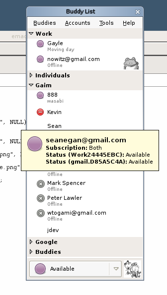
On 9/26/06, Etan Reisner <de...@ed...> wrote: > On Tue, 26 Sep 2006, Sean Egan wrote: > > <snip> > > > More updates: > > Hylke made an MSN butterfly, and I updated > > http://gaim.sf.net/sean/some-more-protocols.png > > He also made some emblems: http://gaim.sf.net/sean/emblems.tar.gz . > > The bot is awesome. The die is pretty cool, and some of the others are > > still being worked out. > > I'm adjusting well to the Purple Orb. Other variations of circles: > > http://gaim.sf.net/sean/person2.png > > http://gaim.sf.net/sean/person32.png > > I don't think we want a smiley for our icon, to start with I just don't > like it, but also it's a bit too close to our current Yahoo icon for my > liking. > > I really like the idea of putting something in the purple circle, but I > don't like the + I think it's going to be too easily confused with an > expander (that is you might think the + was an emblem of sorts). I was > thinking maybe a 'P' for an M&Ms like feel. I agree here...too close to the Yahoo icon. I don't mind the "+", but yeah...it seems like an expander. (side topic) Would we want differentiation between normal buddies and buddies you can expand? > > > Re: clock vs notepad. What do you think of making a notepad the icon > > for EXTENDED_AWAY and making AIM's "away" an EXTENDED_AWAY state? This > > way the metaphor makes a bit more sense. I'm thinking of a little shop > > with one of those "We'll be back in 15 minutes clock signs" versus a > > shop with a "Gone Fishing" sign, or something. I don't know. In either > > case, AIM users will be happy with a notepad and MSN users will be > > happy with a clock. > > > > In either case, I'm getting used to the clock. It doesn't take long. > > I think I like that idea. Ditto.. > > > Question: iChat and the clients it inspired use a 16x16ish icon in > > what we consider Big List. What do you guys think of: > > http://actsofvolition.com/images/screenshots/gaim/gaim-mock-16px.png > > as opposed to > > http://gaim.sf.net/sean/gaim4.png ? > > > > It seems like iChat and its inspired clients all use variations of the > > randomly colored orbs, and so it makes more sense for them to be > > small, since 22x22 icons of green circle doesn't gain much over 16x16 > > pixels of green circle. Our icons tend to be more detailed so we can > > benefit more from the additional 8. Still, my girlfriend is convinced > > Gaim will be ugly as long as those additional 8 pixels are there. > > > > Thoughts? > > > > -s. > > I think if we were going to go with some sort of small icon in the big > list we would need the icon to take up exactly the size of the top row > of text, this may or may not be the case I can't tell from the shot. > Other than that I think I like the extra color/stuff with the large > icons, though perhaps a middle size might be something to consider. > > -Etan What about vertically centering the 16x16 icon with the buddy? So that it is linked to the two lines, between them visually. Right now it feels off, but I think that's because it's off from what I'd consider "center" for icons in the big list. -Megan |
