Menu
▾
▴
Re: [Gaim-cabal] Status icons again
|
From: Sean E. <sea...@gm...> - 2006-09-26 20:30:26
|
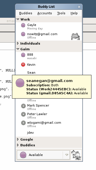
On 9/25/06, Mark Doliner <ma...@ki...> wrote: > How is that settlement going, anyhoo? Slowly, as usual. Unfortunately, we're not AOL's biggest priority, and they seem to have some other legal issues they have to deal with. I'll be sure to keep everyone updated as soon as I get word. More updates: Hylke made an MSN butterfly, and I updated http://gaim.sf.net/sean/some-more-protocols.png He also made some emblems: http://gaim.sf.net/sean/emblems.tar.gz . The bot is awesome. The die is pretty cool, and some of the others are still being worked out. I'm adjusting well to the Purple Orb. Other variations of circles: http://gaim.sf.net/sean/person2.png http://gaim.sf.net/sean/person32.png Re: clock vs notepad. What do you think of making a notepad the icon for EXTENDED_AWAY and making AIM's "away" an EXTENDED_AWAY state? This way the metaphor makes a bit more sense. I'm thinking of a little shop with one of those "We'll be back in 15 minutes clock signs" versus a shop with a "Gone Fishing" sign, or something. I don't know. In either case, AIM users will be happy with a notepad and MSN users will be happy with a clock. In either case, I'm getting used to the clock. It doesn't take long. Question: iChat and the clients it inspired use a 16x16ish icon in what we consider Big List. What do you guys think of: http://actsofvolition.com/images/screenshots/gaim/gaim-mock-16px.png as opposed to http://gaim.sf.net/sean/gaim4.png ? It seems like iChat and its inspired clients all use variations of the randomly colored orbs, and so it makes more sense for them to be small, since 22x22 icons of green circle doesn't gain much over 16x16 pixels of green circle. Our icons tend to be more detailed so we can benefit more from the additional 8. Still, my girlfriend is convinced Gaim will be ugly as long as those additional 8 pixels are there. Thoughts? -s. |
