[Feedreader-development] Review of FR user interface
Brought to you by:
toomastoots
|
From: Kristjan J. <kri...@sl...> - 2003-03-31 20:03:25
|
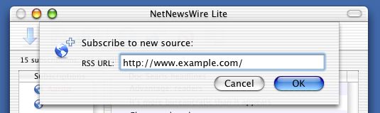
MAIN WINDOW=20 --- "New..." button --- 1) Maybe it's just me, but I feel most applications have "New" button = left side of the toolbar. To be consistent I'd suggest to swap the "New" = and "Update" buttons. Up for discussion. 2) "New..." button dropdown menu is compete mess.=20 - What on earth is "External" and "Local" feeds? Ok, I know, I chatted = with Toomas and "Local" feeds seems to be a work-in-progress to create = outcoming (exportable) feeds. Can I use such a functionality? No, at = least not at a first glance - the internal feed stays empty, I'm not = explained how to create new items there. Solution: Remove the "Local" menu opion until the actual functionality = is there. Just keep two options "New feed" and "New folder". - Why the "New..." menu is auto-hiding? = http://www.feedreader.com/node.php?id=3D259 (like Word and other = Microsoft applications, where not-so-often-used menu options are hidden = from users). C'mon - there's only 3 options, auto-hiding them is really = annoying. - Will "Add new feedlist" be back in the menu?=20 --- Seach headlines --- Dialog color scheme is weird. Shouldn't the text entry field be white = (not gray) to be consistent with the rest of the application? --- Feedlist (the leftmost pane) --- 1) The rightbutton menu usage should be reconsidered: - Why there's no rightbutton menu on "My feeds"?=20 - Why folder-creating is available under the toolbar, not in the = feedlist itself (like standard Windows explorer tree)? - Why I can't add or delete feedlists? 2) The name "Estonians channels" are misleading. Are we using the term = "channel" elsewhere? No? Be consistent, use the term "feed" thoroughly.=20 Solution: rename it to "Estonian feeds"=20 3) Favourites. Ok, I see these are my IE favourites, but what the hell they are doing = here, in Feedreader?=20 -- Feed items (the upper-right pane) --- "Date" and "Headline" column headers are clickable, but clicking on them = does nothing. I'd expect clicking will change the ordering and sorting = of items (like Outlook). Solutions: - allow ordering and sorting - alternatively, just remove clickability --- Statusbar --- Why there's two progressbars, one continious, one stepped? Can't we = settle with one? DIALOGS --- Add new feed --- 1) There's currently two titles on the dialog: "New feed wizard" + "[XML] Adding new feed" IHMO such a duplication is unneccessary. We do not have to emphasize = that we are using "wizard" here.=20 Solution: - Just use a string "Add new feed" in titlebar, remove the second = "Adding new feed" line.=20 - Also remove XML icon, it's usage here is incorrect. We need a proper = icon/graphic here.=20 Btw, no second page of wizard ("Please enter the name of the feed") the = [XML] icon is mysteriously gone already :) 2) "Username" and "Password" are too intrusive in first step of the = wizard. They seem to FORCE user to fill these fields - there's no = information are these fields optional or not (In fact, the whole dialog = looks like a standard login box, more or less). Solutions: - Write short explanation what these fields are and stress that they are = OPTIONAL.=20 - One should also consider to make the dialog expand/collapse in the = bottom (like the Windows login box) - something like "v Advanced = options". When expanded, power user can specify login/password, when = collapsed, novice user just won't see the fields.=20 - Ideally these fields should be on the second step of wizard, but I = understand this is not possible to implement - FR must connect and = validate feed (using loging/password info if neccessary) before moving = from step 1 to step 2, right? 3) Change "Next" to "Next >" and "Previous" to "< Previous" See also http://ranchero.com/images/nnw/subscribe1.jpg and http://www.feedreader.com/node.php?id=3D253 --- Subscribe from "Available feeds" --- The "Subscribe" button what appears on toolbar is almost unnoticable for = user.=20 I suggest to introduce a narrow information bar above the headline pane, = with a text like "You can subscribe this feed by clicking here: = [subscribe]". The bar should appear just like "Search" pane, sliding = from the top. =20 --- Feed properties --- - Once again, I am against the [XML] image. Yep, I know the dialog badly = lacks color, but the [XML] is meant to be the link, and should have a = tooltip when hovering above the icon. Using it here as a static = illustation is misguiding. Solution: create a new fancy icon :) - Again, IHMO "Username" and "Password" should not be emphasized - they = should be moved to the bottom, separated with a horizontal line (with a = be a short explaination?) - BTW, you can put these fields on a same line: Username: [ ] Password: [ ] - "Directly show headline link" Whatthehellizit? I'm clueless. - "Archive" and "Refresh feed" show "Default" as a standard option. Why = not display the *actual default value* instead?=20 If one really wants to stress that we are dealing with defaults (why?), = he could write "50 headlines - default" or similar. When I am new to FR, I might not even touched the global properties and = never changed defaults, so I never know what the actual value is. - Left side of the "Refresh feed" field must be aligned with other = fields, right now it is shorter than others. --- (Global) Properties --- There's currently two methods of sturcturing - tabs and checkbox-list. = Why not settle for classic tree+properties pane, like IE, Mozilla and = numerious other applications? See NewzCrawler preferences windows: = http://www.feedreader.com/module.php?mod=3Dimage&uid=3D2 (of course it = is bloated, using too much structuring, but you will get the idea) Such way options can still be nested/structured, but properties dialog = itself is far more logical and familiar to user.=20 Current checkbox-list does not provide enough flexibility. What if I = want to add a different kind of field to "General > Misc > Play sounds", = say a button "Select a sound sample"? I'd start with following: - replace current checbox-list component with standard tree+properties = component - create properties pages for "Startup" and "Miscallenous" (not "Misc"! = -=20 do not use abbreviations) - merge the "Appearance" checbox-list and "Appearance" tab into a single = "Appearance" properties page. - move "Connection", and "Webserver" properties under the general tree, = get rid of tabs. In next step we can start discussing better structure/arrangement of the = properties. -- About Feedreader -- - "Version" and "Build" number fields look like a text-entry fields. = Can't they be outputted as a plain text, not as a form control? - Check for new version work ok, but leaves the user clueless. Right, = new version is avaliable...now what? The dialog should give me some = clues how to proceed, at least provide a link to www.feedreader.com page = (even better, a downloads page) More to come :) Regards, Kristjan |
