[Bug]: Weird layout of items in navigation rail on small screen sizes
Official Jetpack Compose samples.
Brought to you by:
nerodisney
Originally created by: RivanParmar
Originally owned by: Gurupreet
Reply
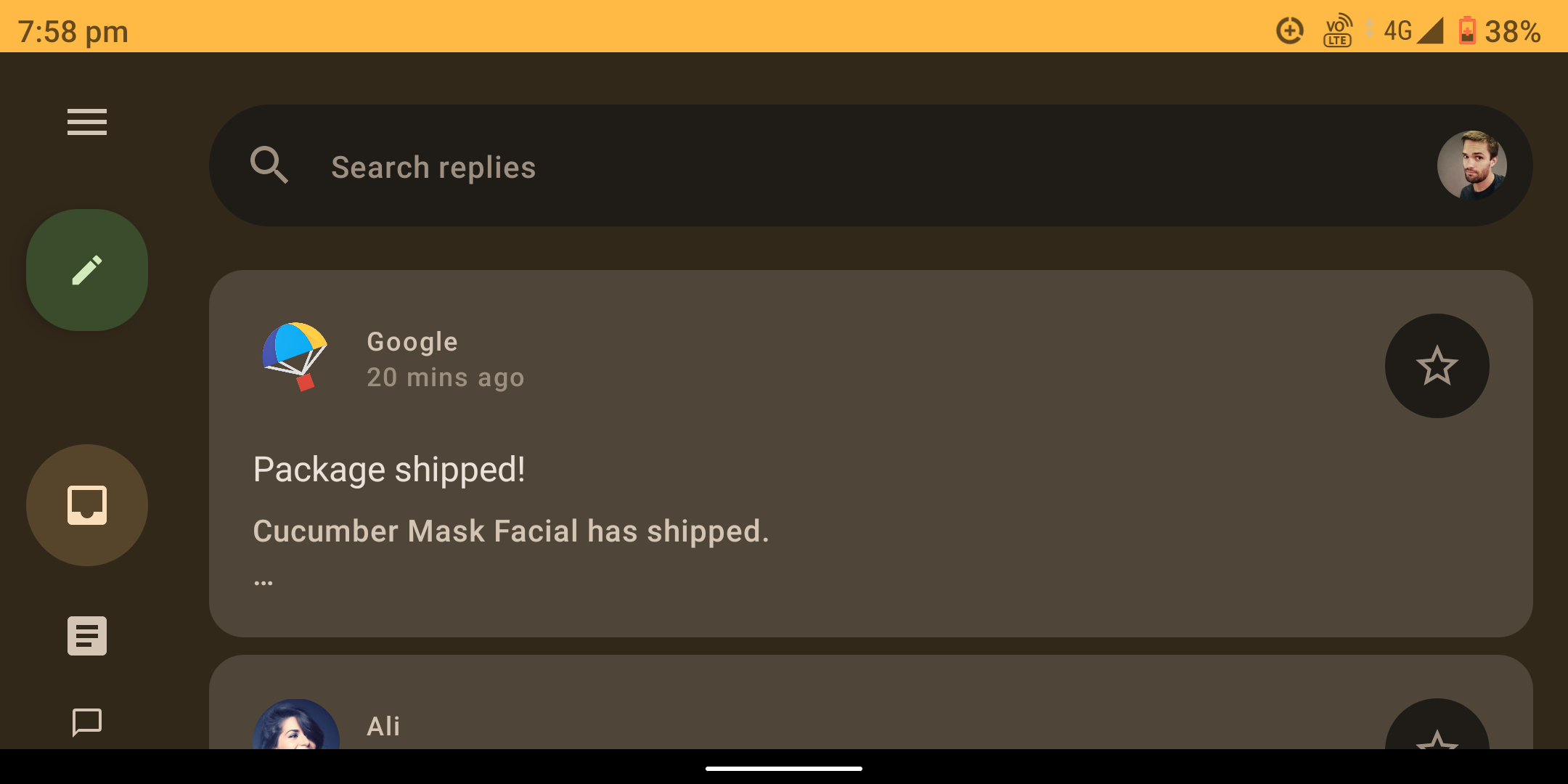
The Reply app uses a Navigation Rail on large screen devices. However, it even uses it on a small screen device in landscape mode. But due to the custom layout of items in the navigation rail, the items don't fit into the screen on small devices as seen in the picture below:
Moreover, since this is an official sample app, it should follow the Material 3 guidelines which state that:
Navigation rails shouldn't be used for:
Small screen sizes
No response

Originally posted by: RivanParmar
If possible, then I would like to work on this issue. But would like some guidance on whether to remove the navigation rail in landscape mode on small screen sizes and use a navigation bar or to fix the layout as per the screen size.
Originally posted by: stale[bot]
This issue has been automatically marked as stale because it has not had any recent activity. Please comment here if it is still valid so that we can reprioritize it. Thank you for your contributions.