Menu
▾
▴
Tree [1d8a40] main 1.0.2 / History
| File | Date | Author | Commit |
|---|---|---|---|
| css | 2022-01-26 |
 Mateusz Leciejewski
|
[217aa2] update |
| img | 2022-01-26 |
Mateusz Leciejewski
|
[217aa2] update |
| js | 2022-01-26 |
Mateusz Leciejewski
|
[217aa2] update |
| src | 2022-01-26 |
Mateusz Leciejewski
|
[217aa2] update |
| .DS_Store | 2022-01-26 |
 Adam Jakubowski
|
[1d8a40] Update |
| License.pdf | 2022-01-26 |
Mateusz Leciejewski
|
[217aa2] update |
| README.md | 2022-01-26 |
Mateusz
|
[a48310] Update README.md |
| awesome.html | 2022-01-26 |
Mateusz
|
[fe6ee8] Update awesome.html |
| basic.html | 2022-01-26 |
Mateusz
|
[2f7663] Update basic.html |
| collapsible.html | 2022-01-26 |
Mateusz
|
[d53f65] Update collapsible.html |
| colorful.html | 2022-01-26 |
Mateusz
|
[8100f2] Update colorful.html |
| gradient.html | 2022-01-26 |
Mateusz
|
[f3a49c] Update gradient.html |
| package.json | 2022-01-26 |
Adam Jakubowski
|
[1d8a40] Update |
| simple.html | 2022-01-26 |
Mateusz
|
[405741] Update simple.html |
| window.html | 2022-01-26 |
Mateusz
|
[98c0b8] Update window.html |
Read Me
Responsive Chat built with Bootstrap 5. Many variants of the chat UI - mobile app, messages box, desktop widget and more.
Check out Bootstrap Chat Documentation for detailed instructions & even more examples.
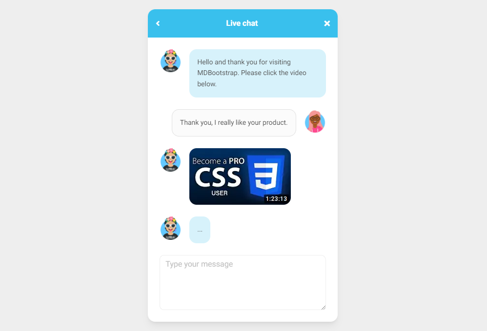
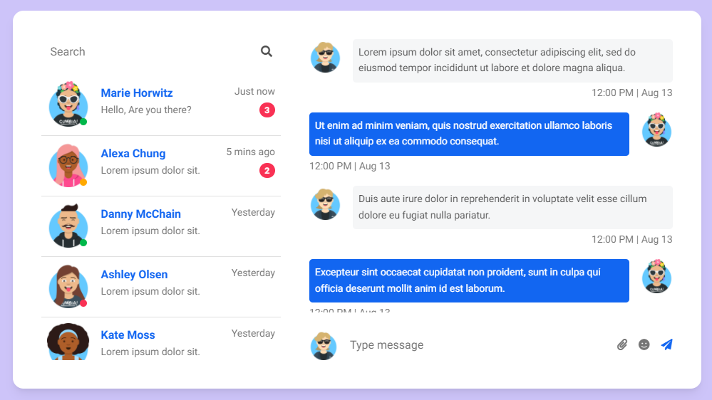
Basic example
<section style="background-color: #eee;">
  <div class="container py-5">

    <div class="row d-flex justify-content-center">
      <div class="col-md-8 col-lg-6 col-xl-4">

        <div class="card" id="chat1" style="border-radius: 15px;">
          <div
            class="card-header d-flex justify-content-between align-items-center p-3 bg-info text-white border-bottom-0"
            style="border-top-left-radius: 15px; border-top-right-radius: 15px;">
            <i class="fas fa-angle-left"></i>
            <p class="mb-0 fw-bold">Live chat</p>
            <i class="fas fa-times"></i>
          </div>
          <div class="card-body">

            <div class="d-flex flex-row justify-content-start mb-4">
              <img src="https://mdbcdn.b-cdn.net/img/Photos/new-templates/bootstrap-chat/ava1-bg.webp" alt="avatar 1"
                style="width: 45px; height: 100%;">
              <div class="p-3 ms-3" style="border-radius: 15px; background-color: rgba(57, 192, 237,.2);">
                <p class="small mb-0">Hello and thank you for visiting MDBootstrap. Please click the video below.</p>
              </div>
            </div>

            <div class="d-flex flex-row justify-content-end mb-4">
              <div class="p-3 me-3 border" style="border-radius: 15px; background-color: #fbfbfb;">
                <p class="small mb-0">Thank you, I really like your product.</p>
              </div>
              <img src="https://mdbcdn.b-cdn.net/img/Photos/new-templates/bootstrap-chat/ava2-bg.webp" alt="avatar 1"
                style="width: 45px; height: 100%;">
            </div>

            <div class="d-flex flex-row justify-content-start mb-4">
              <img src="https://mdbcdn.b-cdn.net/img/Photos/new-templates/bootstrap-chat/ava1-bg.webp" alt="avatar 1"
                style="width: 45px; height: 100%;">
              <div class="ms-3" style="border-radius: 15px;">
                <div class="bg-image">
                  <img src="https://mdbcdn.b-cdn.net/img/Photos/new-templates/bootstrap-chat/screenshot1.webp"
                    style="border-radius: 15px;" alt="video">
                  <a href="#!">
                    <div class="mask"></div>
                  </a>
                </div>
              </div>
            </div>

            <div class="d-flex flex-row justify-content-start mb-4">
              <img src="https://mdbcdn.b-cdn.net/img/Photos/new-templates/bootstrap-chat/ava1-bg.webp" alt="avatar 1"
                style="width: 45px; height: 100%;">
              <div class="p-3 ms-3" style="border-radius: 15px; background-color: rgba(57, 192, 237,.2);">
                <p class="small mb-0">...</p>
              </div>
            </div>

            <div class="form-outline">
              <textarea class="form-control" id="textAreaExample" rows="4"></textarea>
              <label class="form-label" for="textAreaExample">Type your message</label>
            </div>

          </div>
        </div>

      </div>
    </div>

  </div>
</section>
CSS
#chat1 .form-outline .form-control~.form-notch div {
  pointer-events: none;
  border: 1px solid;
  border-color: #eee;
  box-sizing: border-box;
  background: transparent;
}

#chat1 .form-outline .form-control~.form-notch .form-notch-leading {
  left: 0;
  top: 0;
  height: 100%;
  border-right: none;
  border-radius: .65rem 0 0 .65rem;
}

#chat1 .form-outline .form-control~.form-notch .form-notch-middle {
  flex: 0 0 auto;
  max-width: calc(100% - 1rem);
  height: 100%;
  border-right: none;
  border-left: none;
}

#chat1 .form-outline .form-control~.form-notch .form-notch-trailing {
  flex-grow: 1;
  height: 100%;
  border-left: none;
  border-radius: 0 .65rem .65rem 0;
}

#chat1 .form-outline .form-control:focus~.form-notch .form-notch-leading {
  border-top: 0.125rem solid #39c0ed;
  border-bottom: 0.125rem solid #39c0ed;
  border-left: 0.125rem solid #39c0ed;
}

#chat1 .form-outline .form-control:focus~.form-notch .form-notch-leading,
#chat1 .form-outline .form-control.active~.form-notch .form-notch-leading {
  border-right: none;
  transition: all 0.2s linear;
}

#chat1 .form-outline .form-control:focus~.form-notch .form-notch-middle {
  border-bottom: 0.125rem solid;
  border-color: #39c0ed;
}

#chat1 .form-outline .form-control:focus~.form-notch .form-notch-middle,
#chat1 .form-outline .form-control.active~.form-notch .form-notch-middle {
  border-top: none;
  border-right: none;
  border-left: none;
  transition: all 0.2s linear;
}

#chat1 .form-outline .form-control:focus~.form-notch .form-notch-trailing {
  border-top: 0.125rem solid #39c0ed;
  border-bottom: 0.125rem solid #39c0ed;
  border-right: 0.125rem solid #39c0ed;
}

#chat1 .form-outline .form-control:focus~.form-notch .form-notch-trailing,
#chat1 .form-outline .form-control.active~.form-notch .form-notch-trailing {
  border-left: none;
  transition: all 0.2s linear;
}

#chat1 .form-outline .form-control:focus~.form-label {
  color: #39c0ed;
}

#chat1 .form-outline .form-control~.form-label {
  color: #bfbfbf;
}
How to use?
-
Download MDB 5 - free UI KIT
-
Choose your favourite customized component and click on the image
-
Copy & paste the code into your MDB project
▶️ Subscribe to YouTube channel for web development tutorials & resources
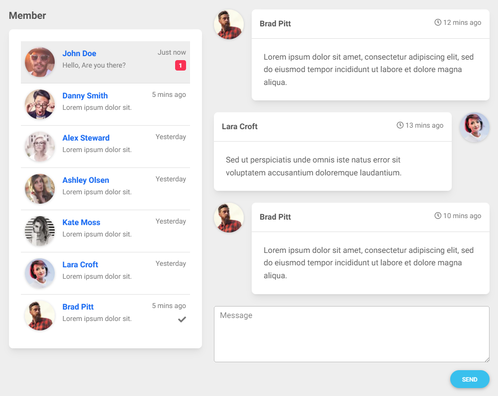
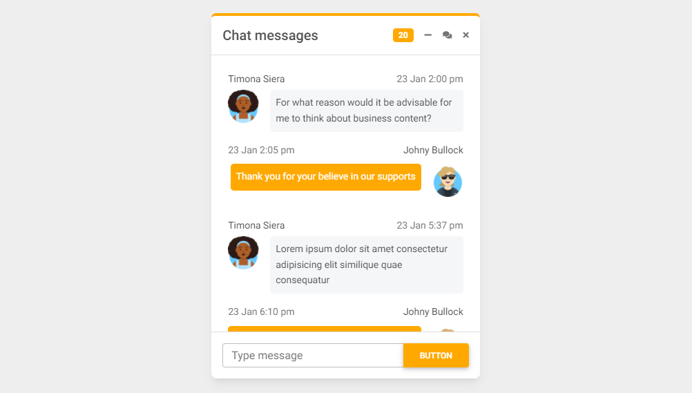
More examples
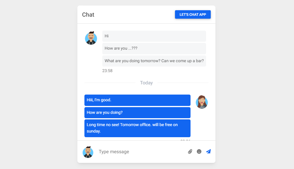
Chat window with gradient background:
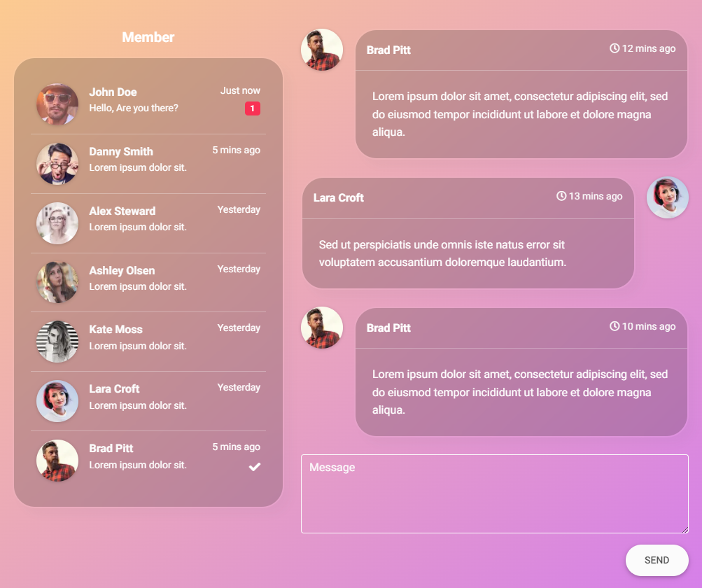
Chat window with colorful background:

More extended Bootstrap documentation
- Bootstrap Address Form
- Bootstrap Avatar
- Bootstrap Back To Top Button
- Bootstrap Carousel Slider with Thumbnails
- Bootstrap Chat
- Bootstrap Code Blocks
- Bootstrap Comments
- Bootstrap Comparison Table
- Bootstrap Credit Card Form
- Bootstrap Drawer
- Bootstrap Nested Dropdown
- Bootstrap FAQ component / section
- Bootstrap Gallery
- Bootstrap Hamburger Menu
- Bootstrap Invoice
- Bootstrap Jumbotron
- Bootstrap Login Form
- Bootstrap Maps
- Bootstrap Media Object
- Bootstrap Mega Menu
- Bootstrap Multiselect
- Bootstrap News Feed
- Bootstrap Offcanvas
- Bootstrap Order Details
- Bootstrap Page Transitions
- Bootstrap Payment Forms
- Bootstrap Product Cards
- Bootstrap Profiles
- Bootstrap Quotes
- Bootstrap Registration Form
- Bootstrap Expanding Search Bar
- Bootstrap Shopping Carts
- Bootstrap Side Navbar
- Bootstrap Sidebar
- Bootstrap Social Media Icons & Buttons
- Bootstrap Square Buttons
- Bootstrap Survey Form
- Bootstrap Testimonial Slider
- Bootstrap Testimonials
- Bootstrap Textarea
- Bootstrap Timeline
- Bootstrap To Do List
- Bootstrap Video Carousel / Gallery
- Bootstrap Weather