Business meetings are an inescapable reality of the modern world just like traffic jams or doing your taxes. We are all aware that collaboration, key decision making and bringing all parties up to speed isn’t always something that can be achieved via email. Still, most of us dread the word “meetings”, even when we’re the ones responsible for sharing updates. We’re quick to imagine prolonged, sterile discussions and reading through endless sets of incomprehensible data that leave participants baffled and confused. But it doesn’t have to be this way! We met up with Tim Stumbles of Office Timeline, whose mission is to put an end to long, boring and unproductive meetings. How? By ushering in a new paradigm in data visualization with the help of quick and easy-to-make timelines and roadmaps.
Q: First of all, could you give us a short synopsis of Office Timeline’s story? How did it all start?
A: Gladly! We founded the company back in 2010, in Seattle. Office Timeline represents the embodiment of our vision to radically shift people’s perception of project meetings. Having sat through more than our fair share while working in corporate, we began to discover patterns and gained a lot of insight on the differences between a super productive project review meeting and a complete snooze-fest. Surprisingly, it was always less about the information itself and more about how it was being communicated. A presentation that features sterile data tables and endless numbers is not only uninspiring for the audience, but also confusing. It’s hard to drive the point home just by reading off a spreadsheet.
We eventually discovered there was a common denominator that all captivating and compelling presentations shared: clear visual representations of the information. Our brain has a tough time making sense of data presented as-is, in written form. This in turn leads to fatigue and boredom, as our thoughts begin to trail away from the discussion, because there’s no meaningful narrative to keep us hooked.

What the mind really needs is a little assistance piecing the puzzle together and that’s when our lightbulb moment happened. What if we could help people tell a better story, one that engages viewers on multiple levels? Office Timeline is essentially all about reshaping complex bulks of project data into an intuitive and easily digestible journey, one that helps transcend the knowledge gaps between the speaker and the audience.
Q: What exactly is Office Timeline? Can you tell us more about the type of visuals it creates?
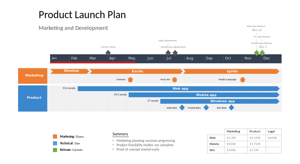
A: At its core, Office Timeline is designed as an add-in for PowerPoint that integrates seamlessly with the popular presentation software and leverages its strengths to create Gantt charts, roadmaps, timelines and swimlane diagrams. By arranging events in chronological order on a graphic, it can offer high-level overviews of all stages in a project. In turn, this makes planning a considerably easier task for virtually any industry.
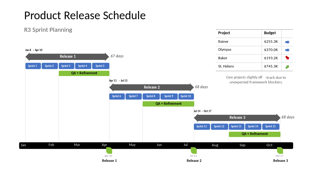
Our users don’t require any prior design experience to generate beautiful, clear and easy to understand slides that add a wow factor to their presentation. They can create the visuals from scratch or starting from the many professional and customizable templates pre-built in the application. Even complex, multi-staged projects can be visualized easily by consolidating tasks and milestones in relevant swimlanes. Project duration is no object either; whether it spans across several decades or one hour, the timeband is incredibly flexible.
Q: Tell us more about your user base. Who are they? What are the pain points you’re helping them address?
A: I would simply say anyone who’s ever needed to work on a project, regardless if “project manager” is part of their job title. Statistics tell us that over 80% of projects where communication is highly effective tend to meet their original goals, compared to only 52% of the ones where communication is lacking. It’s not so much about people’s hard skills; those can be improved through training and on-the-job experience. However, if everyone’s confused and pulling in different directions, it inevitably leads to a stalemate.
How can we help prevent that? To us, the answer is obvious: put things into a clear visual context. Think about how much easier it is for a pharmaceutical researcher to explain the statistical significance of their clinical trial findings to their sponsors with a graphical narrative. Or for a marketing manager to showcase the results of a campaign over the course of a trimester with a timeline. The crux of the matter is that success for these professionals means presenting the fruits of their labor through immersive storytelling that keeps audiences engaged and enlightened.
And, obviously, here we’re talking about people who don’t have enough hours in the day. They don’t have time to fiddle with the graphics and make them ‘pretty’ or ‘eye-catching’. The best-value solution in their case comes from being able to automate the design process as much as possible and create reusable graphics without skimping on aesthetics. This is exactly what we want to offer them.
Q: What would you say makes Office Timeline stand out among other project management software?
A: If a product – be it software or physical – has a steep learning curve or takes a long time to produce results, no one will use it. When we set out to create Office Timeline, our heads were buzzing with all sorts of ideas about what it should do, how it should look and behave, and so on. However, we always kept in mind that first and foremost, it should be user-friendly, and this has helped us stay on track.

What you’ll notice right off the bat is that once you’ve installed the add-in, it feels like it’s been a part of the PowerPoint ribbon forever. The interface blends neatly against the backdrop and the controls rely on the familiar drag & drop motion that’s already second nature to Microsoft Office users. Start out with a default template and in just a few minutes you’ve already got the hang of it. Customization options for the color, shape and position of milestones and tasks are readily available on the side Style Pane and the changes you make take effect instantly.
You also have the ability to replicate properties to all similar elements, save templates and share your work, rather than waste time carrying out repetitive operations. Integration with Excel, Microsoft Project, Smartsheet or Wrike allow Office Timeline to visually reinterpret the data you already have in these applications as a timeline, roadmap or Gantt chart, with just a few clicks.
Basically, the idea here is that anyone can do a fantastic project presentation, you don’t need complex project management software or expensive design applications. Office Timeline facilitates communication by leveraging the power of beautiful visuals at the touch of a button, so our users can dedicate more time to work on the projects that are important to them.