Menu
▾
▴
matplotlib-users
|
From: Lionel R. <lro...@li...> - 2006-04-04 09:48:41
|
Hi all, I'm new in the matplotlib word, and I try to plot a windrose, but I don't find any function doing that. Then, trying to solve that by the polar plot, I don't find how to say matplotlib to plot bar char on polar axes. Can someone gives me a way? thanks -- Lionel Roubeyrie - lro...@li... LIMAIR http://www.limair.asso.fr |
|
From: Sudheer J. <sud...@ya...> - 2013-03-19 09:22:46
Attachments:
rama_cur90E.png
|
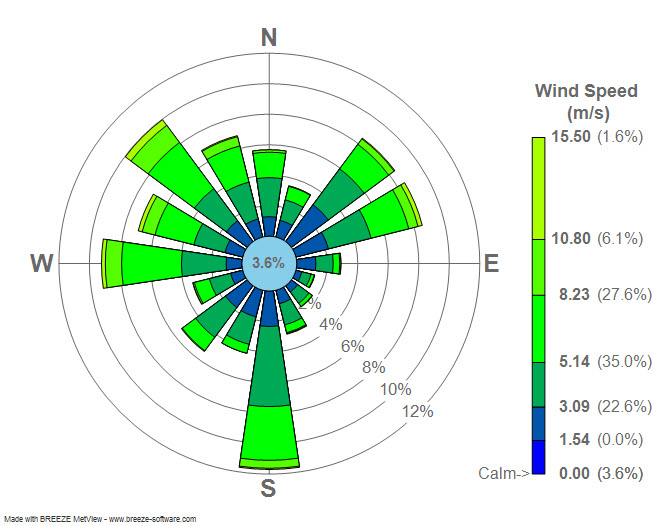
Dear users, Attached is a windrose diagram created by using https://sourceforge.net/project/showfiles.php?group_id=239240&package_id=290902 . Can any one tell me if the numbers displayed in the attached plot is % of wind directions in each category? or are they represent some other numbers? http://3.bp.blogspot.com/_4ZlrnfU7IT8/TPxpftZGzfI/AAAAAAAAADA/uq9cF3PTpR8/s1600/Wind_rose_plot.jpg *************************************************************** Sudheer Joseph Indian National Centre for Ocean Information Services Ministry of Earth Sciences, Govt. of India POST BOX NO: 21, IDA Jeedeemetla P.O. Via Pragathi Nagar,Kukatpally, Hyderabad; Pin:5000 55 Tel:+91-40-23886047(O),Fax:+91-40-23895011(O), Tel:+91-40-23044600(R),Tel:+91-40-9440832534(Mobile) E-mail:sjo...@gm...;sud...@ya... Web- http://oppamthadathil.tripod.com *************************************************************** |
|
From: Paul H. <pmh...@gm...> - 2013-03-19 18:00:41
|
On Tue, Mar 19, 2013 at 2:22 AM, Sudheer Joseph <sud...@ya...>wrote: > Dear users, > Attached is a windrose diagram created by using > https://sourceforge.net/project/showfiles.php?group_id=239240&package_id=290902. Can any one tell me if the numbers displayed in the attached plot is % of > wind directions in each category? or are they represent some other numbers? > > > http://3.bp.blogspot.com/_4ZlrnfU7IT8/TPxpftZGzfI/AAAAAAAAADA/uq9cF3PTpR8/s1600/Wind_rose_plot.jpg > > Sudheer, That's correct. The total length of the bars is the percentage of time that the wind is blowing *from* that direction. See my implementation here: https://github.com/phobson/python-metar/blob/master/metar/graphics.py#L135 Side note, you're emails are consistently formatted pretty strangely and can be difficult to read. Perhaps stick with the same font that is in your email signature? |
|
From: Shahar Shani-K. <ka...@po...> - 2013-03-19 20:06:09
|
Just a thought: Shouldn't the bars terminate with a arc rather then a straight line? What value should one reading this diagram look at? The one at the center of the "bar" or the "corners" these values can be quite different. Sent from my iPhone On Mar 19, 2013, at 8:00 PM, Paul Hobson <pmh...@gm...> wrote: > On Tue, Mar 19, 2013 at 2:22 AM, Sudheer Joseph <sud...@ya...> wrote: >> Dear users, >> Attached is a windrose diagram created by using https://sourceforge.net/project/showfiles.php?group_id=239240&package_id=290902 . Can any one tell me if the numbers displayed in the attached plot is % of wind directions in each category? or are they represent some other numbers? >> >> http://3.bp.blogspot.com/_4ZlrnfU7IT8/TPxpftZGzfI/AAAAAAAAADA/uq9cF3PTpR8/s1600/Wind_rose_plot.jpg > > Sudheer, > > That's correct. The total length of the bars is the percentage of time that the wind is blowing *from* that direction. > See my implementation here: https://github.com/phobson/python-metar/blob/master/metar/graphics.py#L135 > > Side note, you're emails are consistently formatted pretty strangely and can be difficult to read. Perhaps stick with the same font that is in your email signature? > ------------------------------------------------------------------------------ > Everyone hates slow websites. So do we. > Make your web apps faster with AppDynamics > Download AppDynamics Lite for free today: > http://p.sf.net/sfu/appdyn_d2d_mar > _______________________________________________ > Matplotlib-users mailing list > Mat...@li... > https://lists.sourceforge.net/lists/listinfo/matplotlib-users |
|
From: Sudheer J. <sud...@ya...> - 2013-03-20 00:45:53
|
Thank you Paul, I think the font issue is the mischief of Yahoo. I think I should send mail in text mode rather than html then the issue will not be there I hope. The signature is in normal text mode I saved. Please revert back if my mail shows font issues again so that I can try some thing different. However when I see it in Yahoo there is no issues though.. with best regards, Sudheer *************************************************************** Sudheer Joseph Indian National Centre for Ocean Information Services Ministry of Earth Sciences, Govt. of India POST BOX NO: 21, IDA Jeedeemetla P.O. Via Pragathi Nagar,Kukatpally, Hyderabad; Pin:5000 55 Tel:+91-40-23886047(O),Fax:+91-40-23895011(O), Tel:+91-40-23044600(R),Tel:+91-40-9440832534(Mobile) E-mail:sjo...@gm...;sud...@ya... Web- http://oppamthadathil.tripod.com *************************************************************** >________________________________ > From: Paul Hobson <pmh...@gm...> >To: Sudheer Joseph <sud...@ya...> >Cc: "mat...@li..." <mat...@li...> >Sent: Tuesday, 19 March 2013 11:30 PM >Subject: Re: [Matplotlib-users] windrose > > >On Tue, Mar 19, 2013 at 2:22 AM, Sudheer Joseph <sud...@ya...> wrote: > >Dear users, >> Attached is a windrose diagram created by using https://sourceforge.net/project/showfiles.php?group_id=239240&package_id=290902 . Can any one tell me if the numbers displayed in the attached plot is % of wind directions in each category? or are they represent some other numbers? >> >> >>http://3.bp.blogspot.com/_4ZlrnfU7IT8/TPxpftZGzfI/AAAAAAAAADA/uq9cF3PTpR8/s1600/Wind_rose_plot.jpg >> > > >Sudheer, > > >That's correct. The total length of the bars is the percentage of time that the wind is blowing *from* that direction. >See my implementation here: https://github.com/phobson/python-metar/blob/master/metar/graphics.py#L135 > > >Side note, you're emails are consistently formatted pretty strangely and can be difficult to read. Perhaps stick with the same font that is in your email signature? > > |
|
From: Sudheer J. <sud...@ya...> - 2013-04-04 04:45:40
|
Dear users, Below is a sample script I got from windrose pack. I would like to place 2 windroses side by side so that a comparison can be made. For example I have created additional variables ws1 wd1, and I would like that to be placed in the same row as a 1 row 2 column way. Any help in this regard will be great. (I tried subplot(221) subplot(222) but it do not work as the windrose uses new axis each time.) from windrose import WindroseAxes from matplotlib import pyplot as plt import matplotlib.cm as cm from numpy.random import random from numpy import arange #Create wind speed and direction variables ws = random(500)*6 wd = random(500)*360 ws1 = random(500)*6 wd1 = random(500)*360 def new_axes(): fig = plt.figure(figsize=(8, 8), dpi=80, facecolor='w', edgecolor='w') rect = [0.1, 0.1, 0.8, 0.8] ax = WindroseAxes(fig, rect, axisbg='w') fig.add_axes(ax) return ax def set_legend(ax): l = ax.legend(axespad=-0.10) plt.setp(l.get_texts(), fontsize=8) #windrose like a stacked histogram with normed (displayed in percent) results ax = new_axes() ax.bar(wd, ws, normed=True, opening=0.8, edgecolor='white') set_legend(ax) #Another stacked histogram representation, not normed, with bins limits ##print ax._info plt.show() *************************************************************** Sudheer Joseph Indian National Centre for Ocean Information Services Ministry of Earth Sciences, Govt. of India POST BOX NO: 21, IDA Jeedeemetla P.O. Via Pragathi Nagar,Kukatpally, Hyderabad; Pin:5000 55 Tel:+91-40-23886047(O),Fax:+91-40-23895011(O), Tel:+91-40-23044600(R),Tel:+91-40-9440832534(Mobile) E-mail:sjo...@gm...;sud...@ya... Web- http://oppamthadathil.tripod.com *************************************************************** |
|
From: Scott S. <sco...@gm...> - 2013-04-04 07:08:25
|
On 4 April 2013 06:45, Sudheer Joseph <sud...@ya...> wrote: > Below is a sample script I got from windrose pack. I would like to place 2 windroses side by side ... > > from windrose import WindroseAxes > from matplotlib import pyplot as plt ... > def new_axes(): > fig = plt.figure(figsize=(8, 8), dpi=80, facecolor='w', edgecolor='w') > rect = [0.1, 0.1, 0.8, 0.8] > ax = WindroseAxes(fig, rect, axisbg='w') > fig.add_axes(ax) > return ax I'm not familiar with the windrose package, but it looks like the rect parameter to WindroseAxes specifies the size of the generated axes in figure co-ordinates (see http://matplotlib.org/api/figure_api.html?highlight=add_axes#matplotlib.figure.Figure.add_axes). You should be able to pass in a different list of co-ordinates for each WindroseAxes to get side-by-side axes on the same figure... Cheers, Scott |
|
From: Sudheer J. <sud...@ya...> - 2013-04-05 01:54:55
|
Thank you Scott, Some how I am not getting the trick of the rect = [0.1, 0.1, 0.8, 0.8] I tried rect1= [0.1,0.1,.4,.4] and rect2=[.4,.4,.8,.8] but did not work Sudheer *************************************************************** Sudheer Joseph Indian National Centre for Ocean Information Services Ministry of Earth Sciences, Govt. of India POST BOX NO: 21, IDA Jeedeemetla P.O. Via Pragathi Nagar,Kukatpally, Hyderabad; Pin:5000 55 Tel:+91-40-23886047(O),Fax:+91-40-23895011(O), Tel:+91-40-23044600(R),Tel:+91-40-9440832534(Mobile) E-mail:sjo...@gm...;sud...@ya... Web- http://oppamthadathil.tripod.com *************************************************************** ----- Original Message ----- > From: Scott Sinclair <sco...@gm...> > To: "mat...@li..." <mat...@li...> > Cc: > Sent: Thursday, 4 April 2013 12:37 PM > Subject: Re: [Matplotlib-users] windrose > > On 4 April 2013 06:45, Sudheer Joseph <sud...@ya...> wrote: >> Below is a sample script I got from windrose pack. I would like > to place 2 windroses side by side > ... >> >> from windrose import WindroseAxes >> from matplotlib import pyplot as plt > ... >> def new_axes(): >> fig = plt.figure(figsize=(8, 8), dpi=80, facecolor='w', > edgecolor='w') >> rect = [0.1, 0.1, 0.8, 0.8] >> ax = WindroseAxes(fig, rect, axisbg='w') >> fig.add_axes(ax) >> return ax > > I'm not familiar with the windrose package, but it looks like the rect > parameter to WindroseAxes specifies the size of the generated axes in > figure co-ordinates (see > http://matplotlib.org/api/figure_api.html?highlight=add_axes#matplotlib.figure.Figure.add_axes). > You should be able to pass in a different list of co-ordinates for > each WindroseAxes to get side-by-side axes on the same figure... > > Cheers, > Scott > > ------------------------------------------------------------------------------ > Minimize network downtime and maximize team effectiveness. > Reduce network management and security costs.Learn how to hire > the most talented Cisco Certified professionals. Visit the > Employer Resources Portal > http://www.cisco.com/web/learning/employer_resources/index.html > _______________________________________________ > Matplotlib-users mailing list > Mat...@li... > https://lists.sourceforge.net/lists/listinfo/matplotlib-users > |
|
From: Scott S. <sco...@gm...> - 2013-04-05 13:07:13
|
On 5 April 2013 03:54, Sudheer Joseph <sud...@ya...> wrote: > Some how I am not getting the trick of the > rect = [0.1, 0.1, 0.8, 0.8] > > I tried > rect1= [0.1,0.1,.4,.4] > and rect2=[.4,.4,.8,.8] > but did not work You don't say exactly what you did, and how it didn't work... If you read http://matplotlib.org/api/figure_api.html?highlight=add_axes#matplotlib.figure.Figure.add_axes it says "Add an axes at position rect [left, bottom, width, height]...". So you need to specify sensible values in rect1 and rect2. The following works fine for me: import matplotlib.pyplot as plt fig = plt.figure() rect1 = [0.1, 0.1, 0.4, 0.4] rect2 = [0.55, 0.1, 0.4, 0.4] ax1 = fig.add_axes(rect1) ax2 = fig.add_axes(rect2) ax1.plot(range(3)) ax2.plot(range(4, 8)) plt.show() So I would expect that you can adapt your original code to something like the following (untested): from windrose import WindroseAxes from matplotlib import pyplot as plt from numpy.random import random def new_axes(fig, rect): ax = WindroseAxes(fig, rect, axisbg='w') fig.add_axes(ax) return ax def set_legend(ax): l = ax.legend(axespad=-0.10) plt.setp(l.get_texts(), fontsize=8) #Create wind speed and direction variables ws = random(500)*6 wd = random(500)*360 ws1 = random(500)*6 wd1 = random(500)*360 rect1 = [0.1, 0.1, 0.4, 0.4] rect2 = [0.55, 0.1, 0.4, 0.4] fig = plt.figure(figsize=(8, 8), dpi=80, facecolor='w', edgecolor='w') ax1 = new_axes(fig, rect1) ax2 = new_axes(fig, rect2) #windrose like a stacked histogram with normed (displayed in percent) results ax1.bar(wd, ws, normed=True, opening=0.8, edgecolor='white') set_legend(ax1) #windrose like a stacked histogram with normed (displayed in percent) results ax2.bar(wd1, ws1, normed=True, opening=0.8, edgecolor='white') set_legend(ax2) plt.show() Cheers, Scott |
|
From: Sudheer J. <sud...@ya...> - 2013-04-05 16:54:21
|
Thank You Scott, I mistook the values I assumed .1 to .8 as the total x size and expected half of it should provide me 2 half boxes. thanks a lot for clarification. with best regards, Sudheer *************************************************************** Sudheer Joseph Indian National Centre for Ocean Information Services Ministry of Earth Sciences, Govt. of India POST BOX NO: 21, IDA Jeedeemetla P.O. Via Pragathi Nagar,Kukatpally, Hyderabad; Pin:5000 55 Tel:+91-40-23886047(O),Fax:+91-40-23895011(O), Tel:+91-40-23044600(R),Tel:+91-40-9440832534(Mobile) E-mail:sjo...@gm...;sud...@ya... Web- http://oppamthadathil.tripod.com *************************************************************** ----- Original Message ----- > From: Scott Sinclair <sco...@gm...> > To: "mat...@li..." <mat...@li...> > Cc: > Sent: Friday, 5 April 2013 6:36 PM > Subject: Re: [Matplotlib-users] windrose > > On 5 April 2013 03:54, Sudheer Joseph <sud...@ya...> wrote: >> Some how I am not getting the trick of the >> rect = [0.1, 0.1, 0.8, 0.8] >> >> I tried >> rect1= [0.1,0.1,.4,.4] >> and rect2=[.4,.4,.8,.8] >> but did not work > > You don't say exactly what you did, and how it didn't work... > > If you read > http://matplotlib.org/api/figure_api.html?highlight=add_axes#matplotlib.figure.Figure.add_axes > it says "Add an axes at position rect [left, bottom, width, > height]...". So you need to specify sensible values in rect1 and > rect2. > > The following works fine for me: > > import matplotlib.pyplot as plt > fig = plt.figure() > rect1 = [0.1, 0.1, 0.4, 0.4] > rect2 = [0.55, 0.1, 0.4, 0.4] > ax1 = fig.add_axes(rect1) > ax2 = fig.add_axes(rect2) > ax1.plot(range(3)) > ax2.plot(range(4, 8)) > plt.show() > > So I would expect that you can adapt your original code to something > like the following (untested): > > from windrose import WindroseAxes > from matplotlib import pyplot as plt > from numpy.random import random > > def new_axes(fig, rect): > ax = WindroseAxes(fig, rect, axisbg='w') > fig.add_axes(ax) > return ax > > def set_legend(ax): > l = ax.legend(axespad=-0.10) > plt.setp(l.get_texts(), fontsize=8) > > #Create wind speed and direction variables > ws = random(500)*6 > wd = random(500)*360 > ws1 = random(500)*6 > wd1 = random(500)*360 > > rect1 = [0.1, 0.1, 0.4, 0.4] > rect2 = [0.55, 0.1, 0.4, 0.4] > > fig = plt.figure(figsize=(8, 8), dpi=80, facecolor='w', > edgecolor='w') > > ax1 = new_axes(fig, rect1) > ax2 = new_axes(fig, rect2) > > #windrose like a stacked histogram with normed (displayed in percent) results > ax1.bar(wd, ws, normed=True, opening=0.8, edgecolor='white') > set_legend(ax1) > > #windrose like a stacked histogram with normed (displayed in percent) results > ax2.bar(wd1, ws1, normed=True, opening=0.8, edgecolor='white') > set_legend(ax2) > > plt.show() > > Cheers, > Scott > > ------------------------------------------------------------------------------ > Minimize network downtime and maximize team effectiveness. > Reduce network management and security costs.Learn how to hire > the most talented Cisco Certified professionals. Visit the > Employer Resources Portal > http://www.cisco.com/web/learning/employer_resources/index.html > _______________________________________________ > Matplotlib-users mailing list > Mat...@li... > https://lists.sourceforge.net/lists/listinfo/matplotlib-users > |
|
From: Eric F. <ef...@ha...> - 2006-04-04 22:38:29
|
Lionel Roubeyrie wrote: > Hi all, > I'm new in the matplotlib word, and I try to plot a windrose, but I don't find > any function doing that. Then, trying to solve that by the polar plot, I > don't find how to say matplotlib to plot bar char on polar axes. Can someone > gives me a way? > thanks > Lionel, Polar axis support is embryonic; I don't see an easy way to make a polar bar chart. You could make the bar outlines using "plot" on a polar axis. Eric |
|
From: John H. <jdh...@ac...> - 2006-04-05 05:23:28
|
>>>>> "Eric" == Eric Firing <ef...@ha...> writes:

    Eric> Polar axis support is embryonic; I don't see an easy way to
    Eric> make a polar bar chart.  You could make the bar outlines
    Eric> using "plot" on a polar axis.

Although polar support is patchy, it usually can be made to work.  Eg,
it already handles most types of objects (text, lines, collections).
I took a look and noticed that it did not draw it's patches, though it
stores them and handles the transformations properly.  This is simply
one line sin of omission (which I've fixed in svn), ie I needed to add
the patches to the list of artists being drawn in PolarAxes.draw.

Here is a little script that shows how to add "rectangles" to polar
plots (requires svn 2258)

from matplotlib.patches import Rectangle
from matplotlib.axes import PolarSubplot
import matplotlib.cm as cm
from pylab import figure, show, nx

dtheta = nx.pi/8
r = 1
theta = 0

fig = figure()
ax = PolarSubplot(fig, 111)
fig.add_axes(ax)
N = 15
for i in range(N):
    frac = float(i)/N
    rect = Rectangle( (theta, 0), dtheta, r, facecolor=cm.jet(frac))
    ax.add_patch(rect)
    theta += dtheta
    r*=1.05
ax.autoscale_view()
show()

Although I don't have experience with windrose plots, this can
probably serve as the foundation.  The autoscale view functionality is
clearly off, but it mostly works.  One can do the same with arbitrary
patches (eg Polygons), as long as you construct vertices where the
x/width attribute is interpreted as radians, and the y/height
attribute is interpreted as radius.

JDH
|
|
From: Lionel R. <lro...@li...> - 2006-04-06 09:01:46
|
Hi, sorry to ask for that, but I'm not very familiar with matplotlib svn=20 repository, and after going to sourceforge, I have done a "svn co ..." whic= h=20 copy all matplotlib branch in a local directory. Now, what do I do? What=20 files do I have to compile? Thanks PS : I have done a very little script with scipy to compute wind frequencie= s,=20 but if someone know a dedicated module which do that, I could verify my wor= k. Le Mercredi 05 Avril 2006 07:20, John Hunter a =E9crit=A0: > >>>>> "Eric" =3D=3D Eric Firing <ef...@ha...> writes: > > Eric> Polar axis support is embryonic; I don't see an easy way to > Eric> make a polar bar chart. You could make the bar outlines > Eric> using "plot" on a polar axis. > > Although polar support is patchy, it usually can be made to work. Eg, > it already handles most types of objects (text, lines, collections). > I took a look and noticed that it did not draw it's patches, though it > stores them and handles the transformations properly. This is simply > one line sin of omission (which I've fixed in svn), ie I needed to add > the patches to the list of artists being drawn in PolarAxes.draw. > > Here is a little script that shows how to add "rectangles" to polar > plots (requires svn 2258) > > from matplotlib.patches import Rectangle > from matplotlib.axes import PolarSubplot > import matplotlib.cm as cm > from pylab import figure, show, nx > > dtheta =3D nx.pi/8 > r =3D 1 > theta =3D 0 > > fig =3D figure() > ax =3D PolarSubplot(fig, 111) > fig.add_axes(ax) > N =3D 15 > for i in range(N): > frac =3D float(i)/N > rect =3D Rectangle( (theta, 0), dtheta, r, facecolor=3Dcm.jet(frac)) > ax.add_patch(rect) > theta +=3D dtheta > r*=3D1.05 > ax.autoscale_view() > show() > > Although I don't have experience with windrose plots, this can > probably serve as the foundation. The autoscale view functionality is > clearly off, but it mostly works. One can do the same with arbitrary > patches (eg Polygons), as long as you construct vertices where the > x/width attribute is interpreted as radians, and the y/height > attribute is interpreted as radius. > > JDH > > > ------------------------------------------------------- > This SF.Net email is sponsored by xPML, a groundbreaking scripting langua= ge > that extends applications into web and mobile media. Attend the live > webcast and join the prime developer group breaking into this new coding > territory! > http://sel.as-us.falkag.net/sel?cmd=3Dlnk&kid=3D110944&bid=3D241720&dat= =3D121642 > _______________________________________________ > Matplotlib-users mailing list > Mat...@li... > https://lists.sourceforge.net/lists/listinfo/matplotlib-users =2D-=20 Lionel Roubeyrie - lro...@li... LIMAIR http://www.limair.asso.fr |
|
From: Eric F. <ef...@ha...> - 2006-04-05 07:11:50
|
John, Thanks--I thought it should work, but when I tried it and it didn't, I failed to look more closely. Now a question: is there a reason why the argument order for polar plotting is (theta, r)? In thinking about polar coordinates, I always think of them in the reverse order (r, theta), and I think this is the way I have always seen polar coordinates in math and physics books. Eric John Hunter wrote: >>>>>>"Eric" == Eric Firing <ef...@ha...> writes: > > > Eric> Polar axis support is embryonic; I don't see an easy way to > Eric> make a polar bar chart. You could make the bar outlines > Eric> using "plot" on a polar axis. > > Although polar support is patchy, it usually can be made to work. Eg, > it already handles most types of objects (text, lines, collections). > I took a look and noticed that it did not draw it's patches, though it > stores them and handles the transformations properly. This is simply > one line sin of omission (which I've fixed in svn), ie I needed to add > the patches to the list of artists being drawn in PolarAxes.draw. > > Here is a little script that shows how to add "rectangles" to polar > plots (requires svn 2258) > > from matplotlib.patches import Rectangle > from matplotlib.axes import PolarSubplot > import matplotlib.cm as cm > from pylab import figure, show, nx > > dtheta = nx.pi/8 > r = 1 > theta = 0 > > fig = figure() > ax = PolarSubplot(fig, 111) > fig.add_axes(ax) > N = 15 > for i in range(N): > frac = float(i)/N > rect = Rectangle( (theta, 0), dtheta, r, facecolor=cm.jet(frac)) > ax.add_patch(rect) > theta += dtheta > r*=1.05 > ax.autoscale_view() > show() > > Although I don't have experience with windrose plots, this can > probably serve as the foundation. The autoscale view functionality is > clearly off, but it mostly works. One can do the same with arbitrary > patches (eg Polygons), as long as you construct vertices where the > x/width attribute is interpreted as radians, and the y/height > attribute is interpreted as radius. > > JDH |
|
From: John H. <jdh...@ac...> - 2006-04-06 01:33:26
|
>>>>> "Eric" == Eric Firing <ef...@ha...> writes:

    Eric> Now a question: is there a reason why the argument order for
    Eric> polar plotting is (theta, r)? In thinking about polar
    Eric> coordinates, I always think of them in the reverse order (r,
    Eric> theta), and I think this is the way I have always seen polar
    Eric> coordinates in math and physics books.

I can't remember a reason if there was one, and now that I think about
it your way probably makes more sense.  But is it worth breaking
compatibility?

JDH
|
|
From: Darren D. <dd...@co...> - 2006-04-06 01:49:20
|
On Wednesday 05 April 2006 9:30 pm, John Hunter wrote: > >>>>> "Eric" == Eric Firing <ef...@ha...> writes: > > Eric> Now a question: is there a reason why the argument order for > Eric> polar plotting is (theta, r)? In thinking about polar > Eric> coordinates, I always think of them in the reverse order (r, > Eric> theta), and I think this is the way I have always seen polar > Eric> coordinates in math and physics books. > > I can't remember a reason if there was one, and now that I think about > it your way probably makes more sense. But is it worth breaking > compatibility? I think (theta, r) makes more sense for polar plotting. Are we plotting r(theta) or theta(r)? |
|
From: Eric F. <ef...@ha...> - 2006-04-06 02:10:05
|
Darren Dale wrote: > On Wednesday 05 April 2006 9:30 pm, John Hunter wrote: > >>>>>>>"Eric" == Eric Firing <ef...@ha...> writes: >> >> Eric> Now a question: is there a reason why the argument order for >> Eric> polar plotting is (theta, r)? In thinking about polar >> Eric> coordinates, I always think of them in the reverse order (r, >> Eric> theta), and I think this is the way I have always seen polar >> Eric> coordinates in math and physics books. >> >>I can't remember a reason if there was one, and now that I think about >>it your way probably makes more sense. But is it worth breaking >>compatibility? > > > I think (theta, r) makes more sense for polar plotting. Are we plotting > r(theta) or theta(r)? Darren, John, That dawned on me this morning; for line and point plotting, theta is normally the independent variable, so the present order does make sense. Eric |
|
From: Christopher B. <Chr...@no...> - 2006-04-05 16:21:36
|
Lionel Roubeyrie wrote:
> I'm new in the matplotlib word, and I try to plot a windrose,

When you do get it figured out, be sure to post here. I know I could use
it, and I'm sure there are others.

-Chris


--
Christopher Barker, Ph.D.
Oceanographer

NOAA/OR&R/HAZMAT         (206) 526-6959   voice
7600 Sand Point Way NE   (206) 526-6329   fax
Seattle, WA  98115       (206) 526-6317   main reception

Chr...@no...
|
|
From: Lionel R. <lro...@li...> - 2006-04-10 10:15:20
|
Hi all, thanks for your help and for polar axes, I've got a good result like you can see here : http://www.limair.asso.fr/share/windrose.png If someone is interested by the code, I can send it to him (need scipy for computing frequencies). bye -- Lionel Roubeyrie - lro...@li... LIMAIR http://www.limair.asso.fr |
|
From: John H. <jdh...@ac...> - 2006-04-10 14:54:03
|
>>>>> "Lionel" == Lionel Roubeyrie <lro...@li...> writes:

    Lionel> Hi all, thanks for your help and for polar axes, I've got
    Lionel> a good result like you can see here :
    Lionel> http://www.limair.asso.fr/share/windrose.png If someone is
    Lionel> interested by the code, I can send it to him (need scipy
    Lionel> for computing frequencies).  bye

    Lionel> -- Lionel Roubeyrie - lro...@li... LIMAIR
    Lionel> http://www.limair.asso.fr


Please post it here.  With your permission, we may adapt it to make a
general purpose windrose or polar areas plotting function for
matplotlib.

We can probably work around the scipy dependency.

Thanks!
JDH
|
|
From: Lionel R. <lro...@li...> - 2006-04-10 15:24:16
Attachments:
windrose.py
|
Hi, ok for the code, here it is, and by advance, sorry for my poor english :-/ Le Lundi 10 Avril 2006 16:50, John Hunter a =E9crit=A0: > Please post it here. With your permission, we may adapt it to make a > general purpose windrose or polar areas plotting function for > matplotlib. > > We can probably work around the scipy dependency. > > Thanks! > JDH =2D-=20 Lionel Roubeyrie - lro...@li... LIMAIR http://www.limair.asso.fr |
|
From: John H. <jdh...@ac...> - 2006-04-10 15:45:22
|
>>>>> "Lionel" == Lionel Roubeyrie <lro...@li...> writes:

    Lionel> Hi, ok for the code, here it is, and by advance, sorry for
    Lionel> my poor english :-/

Hi Lionel, thanks for this code.  I took a quick peek.  matplotlib
does not accept code under the GPL license.  The license we use is
based on the python software foundation license and is more permissive
than the GPL, in that it allows people to redistribute matplotlib in
closed-source proprietary apps.  So if you would like for us to
include your windrose code (or a derivative of it) we will need it
preferably under the matplotlib license, or a BSD/MIT like license.

Here is a post I wrote earlier in another project I was involved in
about why I prefer the use of more permissive BSD-like licenses like
the python license

  https://cirl.berkeley.edu/view/Grants/LicensingPitch

Thanks!
JDH
|
|
From: Lionel R. <lro...@li...> - 2006-04-11 06:59:22
Attachments:
windrose.py
|
The same code, with the right license :-) Hope it can help someone. Le Lundi 10 Avril 2006 17:42, John Hunter a =E9crit=A0: > >>>>> "Lionel" =3D=3D Lionel Roubeyrie <lro...@li...> writes: > > Lionel> Hi, ok for the code, here it is, and by advance, sorry for > Lionel> my poor english :-/ > > Hi Lionel, thanks for this code. I took a quick peek. matplotlib > does not accept code under the GPL license. The license we use is > based on the python software foundation license and is more permissive > than the GPL, in that it allows people to redistribute matplotlib in > closed-source proprietary apps. So if you would like for us to > include your windrose code (or a derivative of it) we will need it > preferably under the matplotlib license, or a BSD/MIT like license. > > Here is a post I wrote earlier in another project I was involved in > about why I prefer the use of more permissive BSD-like licenses like > the python license > > https://cirl.berkeley.edu/view/Grants/LicensingPitch > > Thanks! > JDH > > > ------------------------------------------------------- > This SF.Net email is sponsored by xPML, a groundbreaking scripting langua= ge > that extends applications into web and mobile media. Attend the live > webcast and join the prime developer group breaking into this new coding > territory! > http://sel.as-us.falkag.net/sel?cmd=3Dlnk&kid=3D110944&bid=3D241720&dat= =3D121642 > _______________________________________________ > Matplotlib-users mailing list > Mat...@li... > https://lists.sourceforge.net/lists/listinfo/matplotlib-users =2D-=20 Lionel Roubeyrie - lro...@li... LIMAIR http://www.limair.asso.fr |
Thanks for helping keep SourceForge clean.
X